A lot of water has passed under the bridge since I posted my original list of favourite typeface pairings in 2023, so here’s an update.
A few things to note:
The list below covers only the typefaces I enjoy writing in the most, along the heading typefaces I usually pair them with.
Happily, the list of honourable mentions in each section covers most of the typefaces I enjoy reading in as well. I do occasionally use these typefaces for writing, but only when the need arises.
Within each section, typefaces are listed in alphabetical order.
Paid typefaces are flagged with “(%)” after their name.
The first time I mention a typeface I’ve added a link to where you can download or purchase it, or just find out more about it.
In case you’re interested, I have a separate post about my favourite ebook typefaces and an ongoing series on cool type pairings I’ve found on the web.
For completeness’ sake, I should say that I don’t always pair typefaces. Sometimes it’s just best to use the same typefaces for headings and titles as well :)
Serifs
I do most of my writing in serif typefaces using LibreOffice.
Calluna
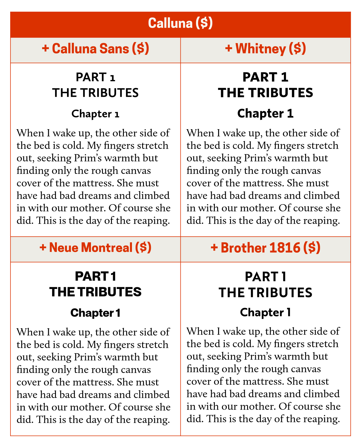
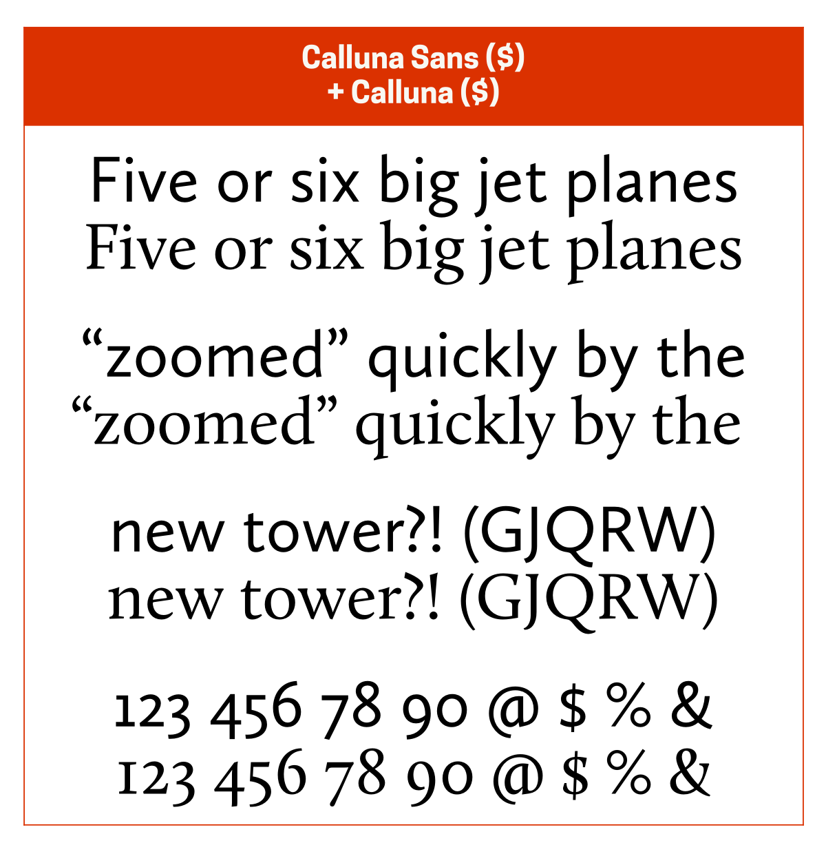
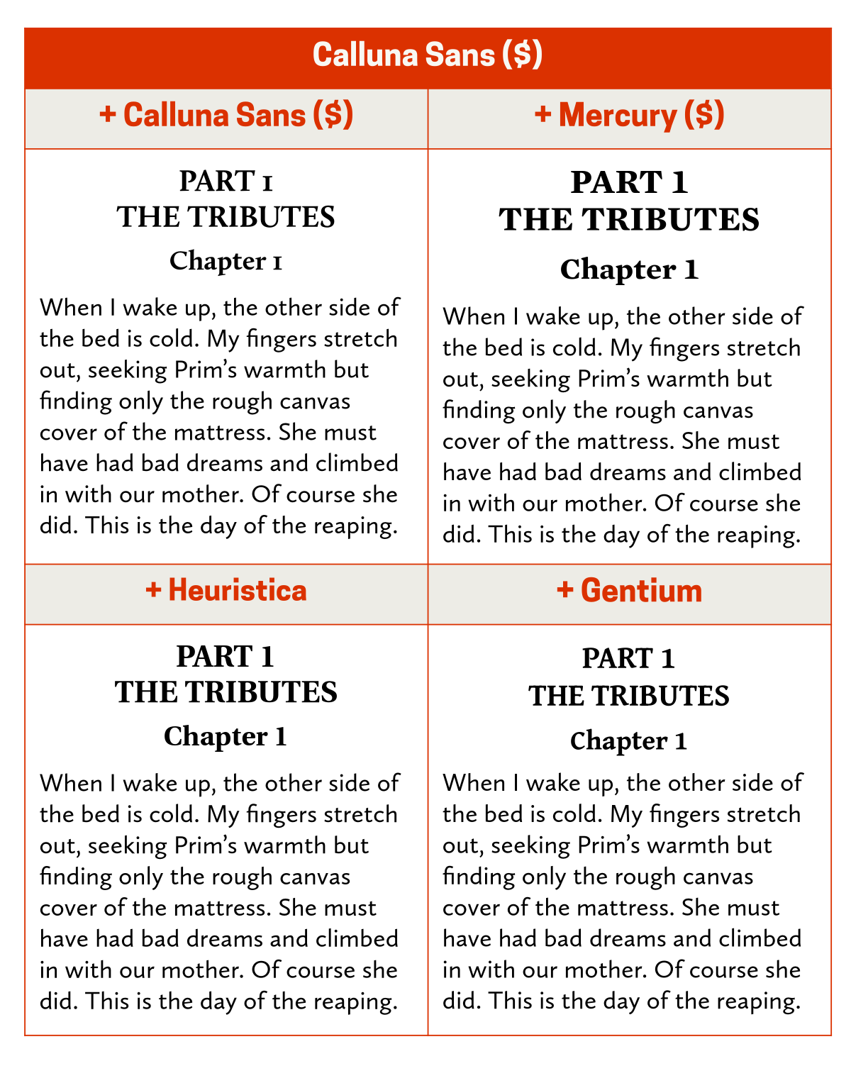
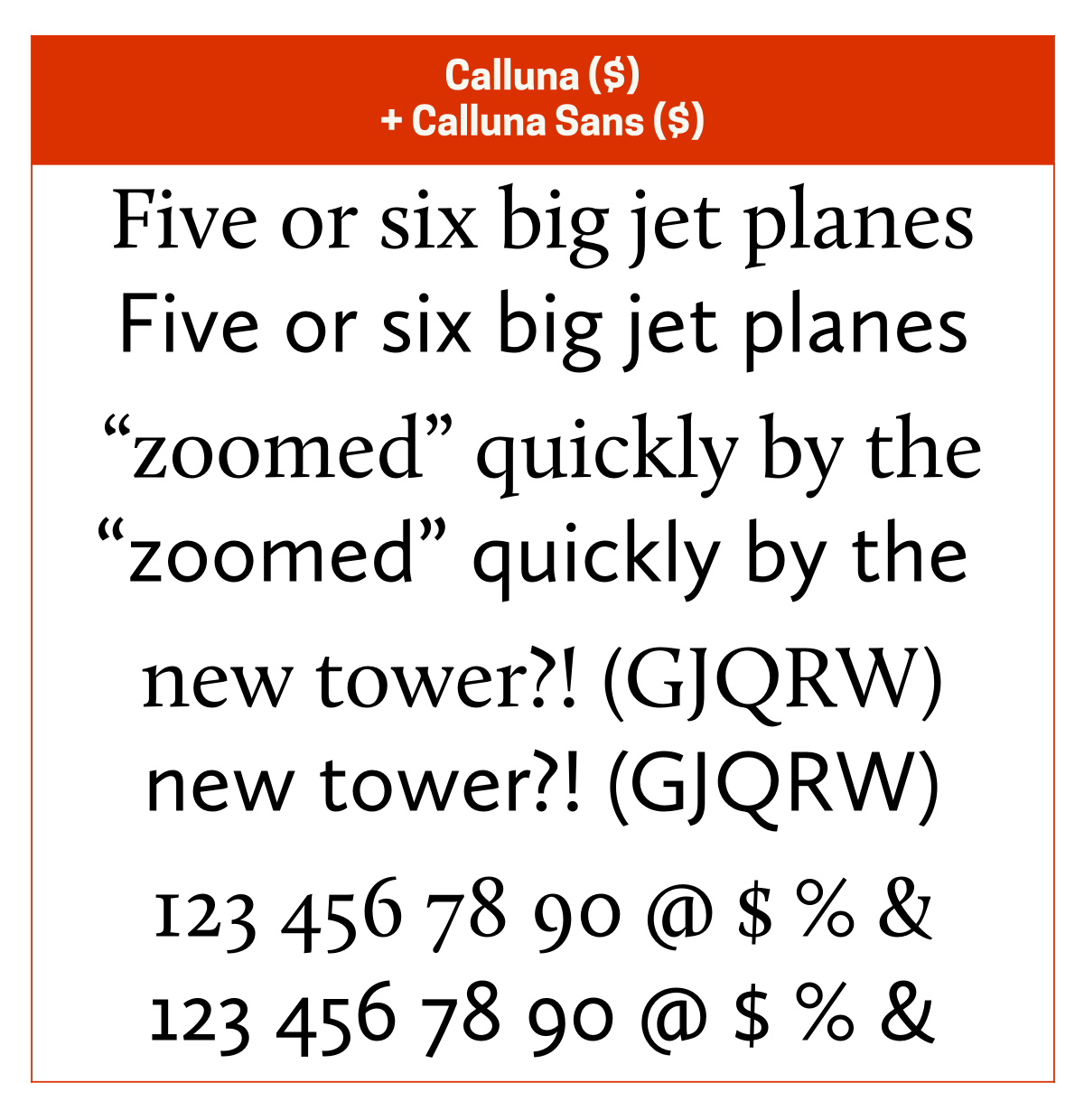
I almost always pair Calluna ($) with Calluna Sans ($). If I hadn’t purchased Calluna and Calluna Sans together, I’d probably pair Calluna with Whitney ($) for its elegance, Neue Montreal ($) for its neutrality, or Brother 1816 ($) for its geometric elegance.
Crimson Pro
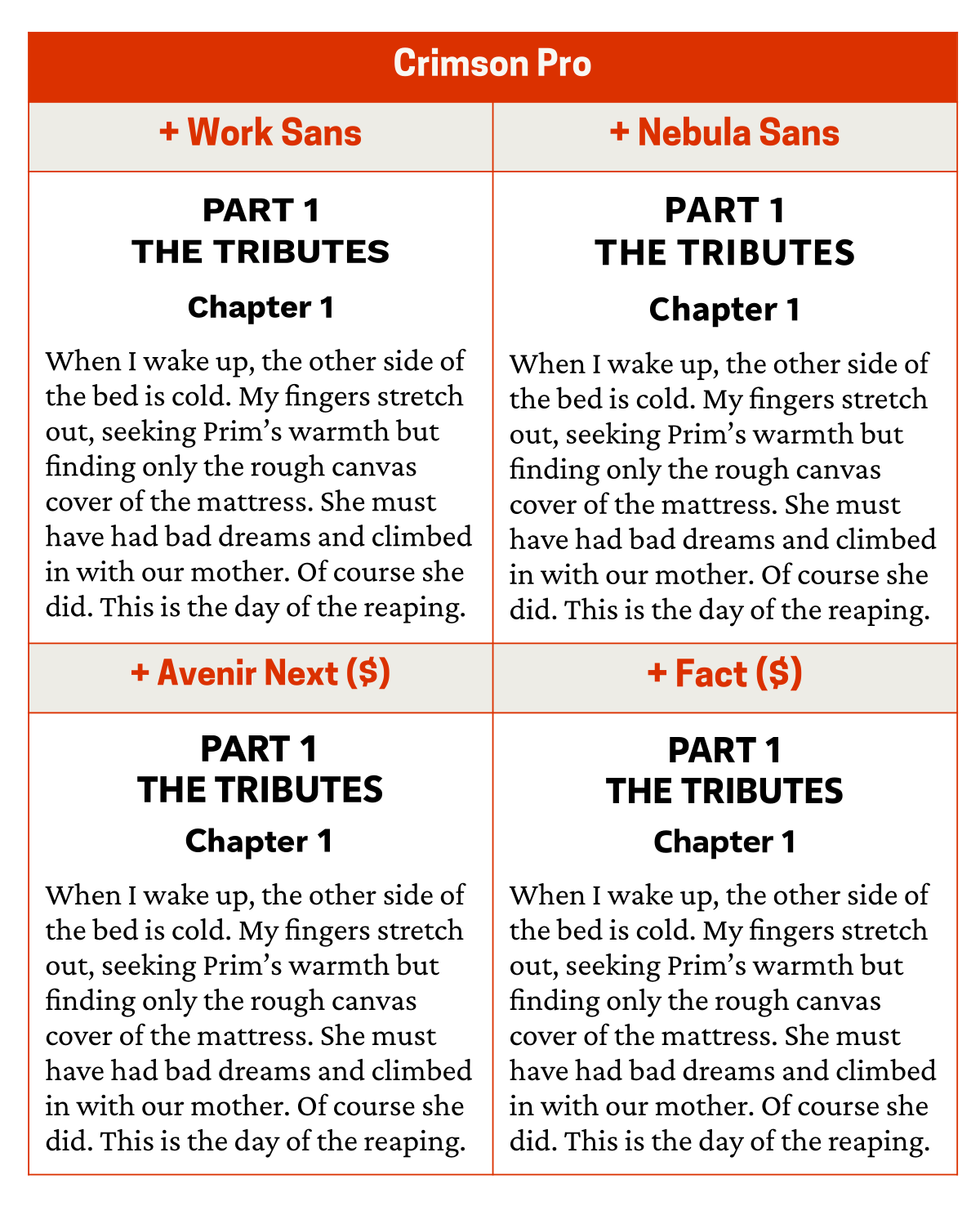
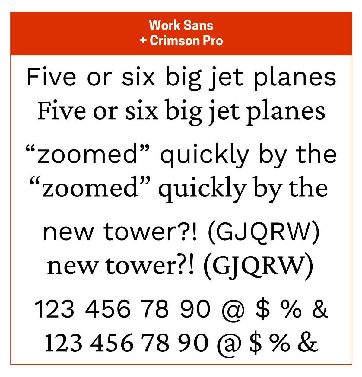
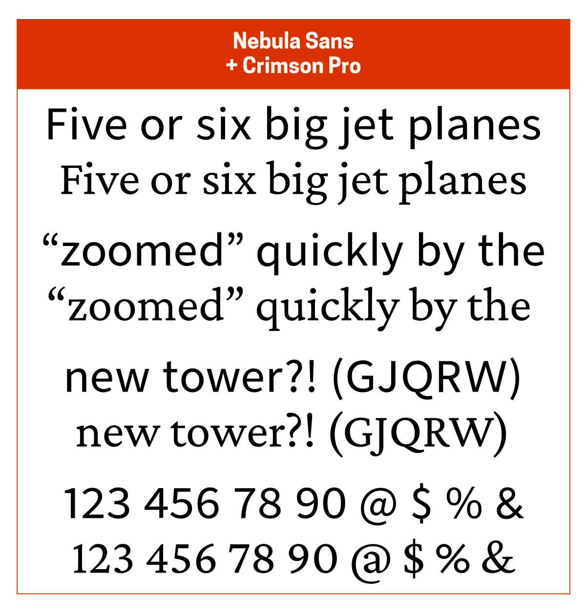
I usually pair Crimson Pro with Work Sans since the two have a similar vibe or with Nebula Sans for a slightly more elegant vibe. Other good pairing options are Avenir Next ($) for its elegant geometric nature and Fact ($) for its squarish geometric nature (which provides a nice contrast to Crimson Pro).
Crimson Pro is a modern interpretation of Garamond. Nebula Sans is a version of Source Sans 3 that’s been adjusted to look like Whitney. Fact is a modern interpretation of Frutiger.
ETbb
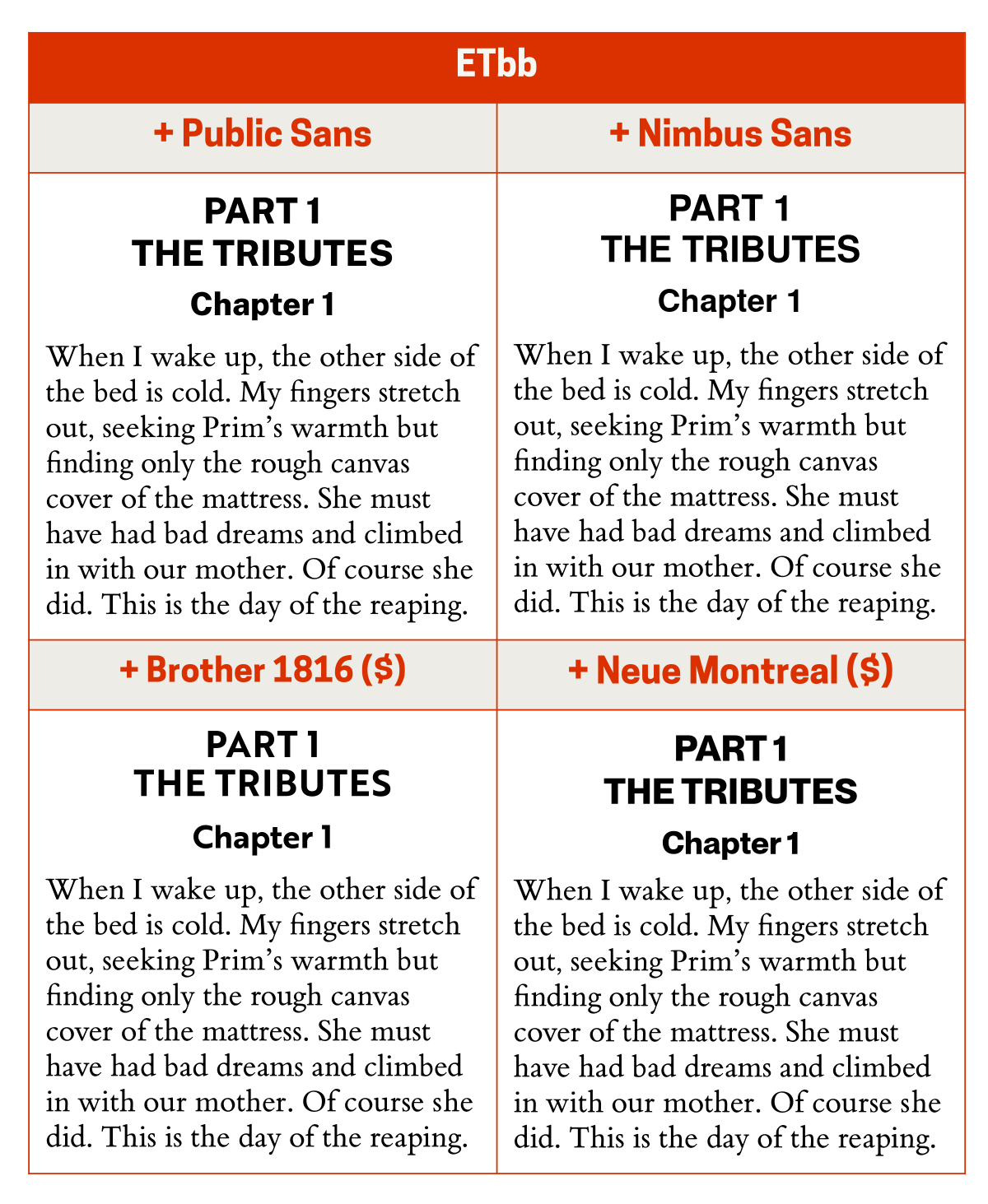
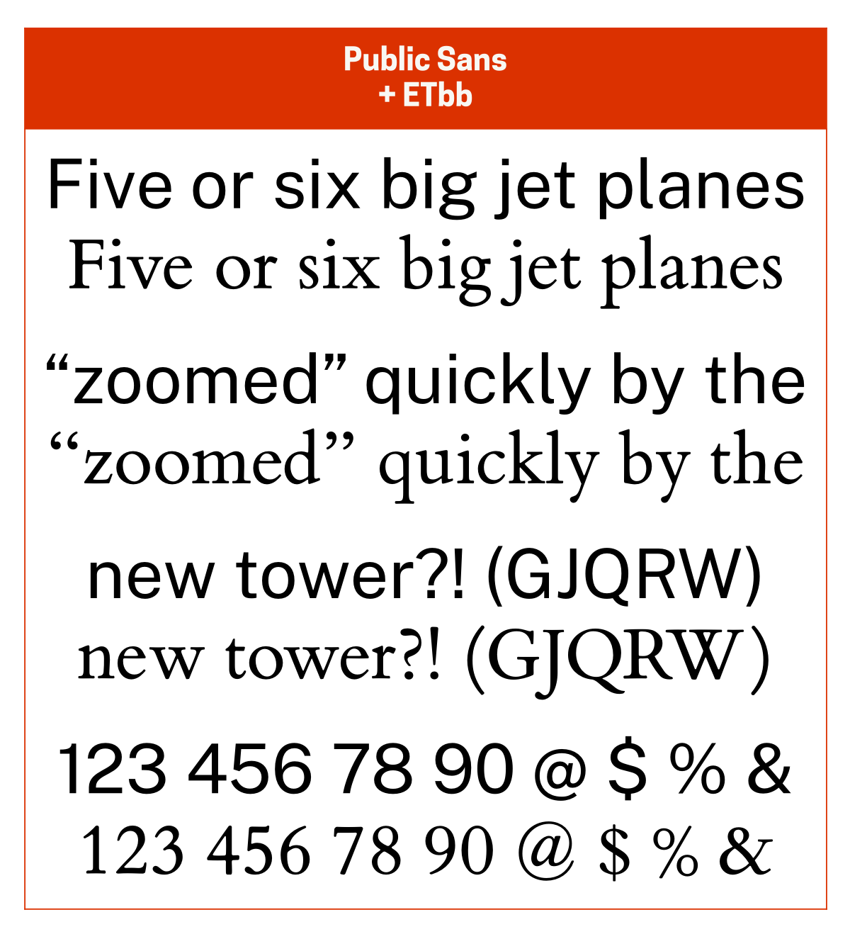
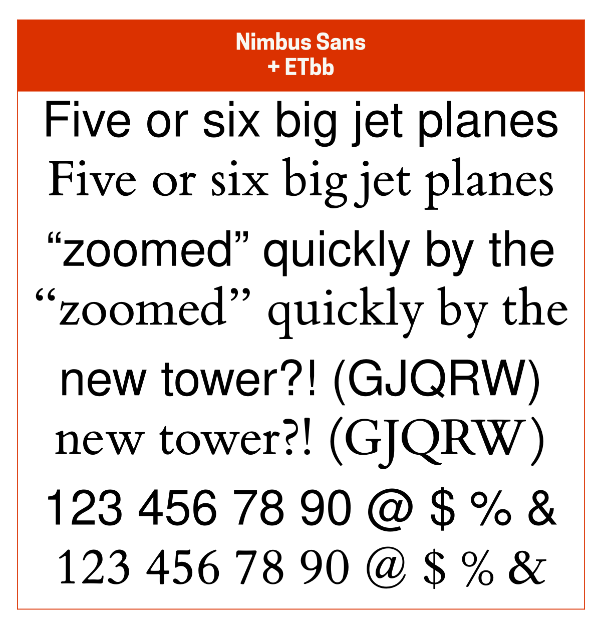
I usually pair ETbb with Public Sans or Nimbus Sans, both of which are on the friendlier side of neutral. Other good pairing options are Brother 1816 ($) for is geometric elegance and Neue Montreal ($) for its slightly-friendly neutrality.
That said, when I’m using ETbb as a reading typeface, I almost always pair it with itself.
ETbb is a version of ET Book, Edward Tufte’s modern interpretation of Bembo. Public Sans is my favourite modern interpretation of Franklin Gothic. Nimbus Sans is a version of Helvetica that’s a little more like Univers, which I really like. Neue Montreal is a great, slightly friendlier alternative to Helvetica.
Goodchild
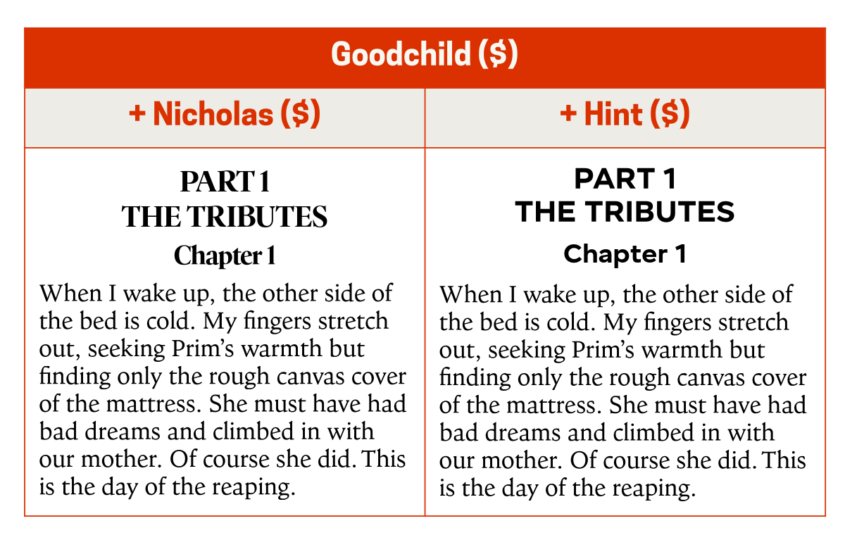
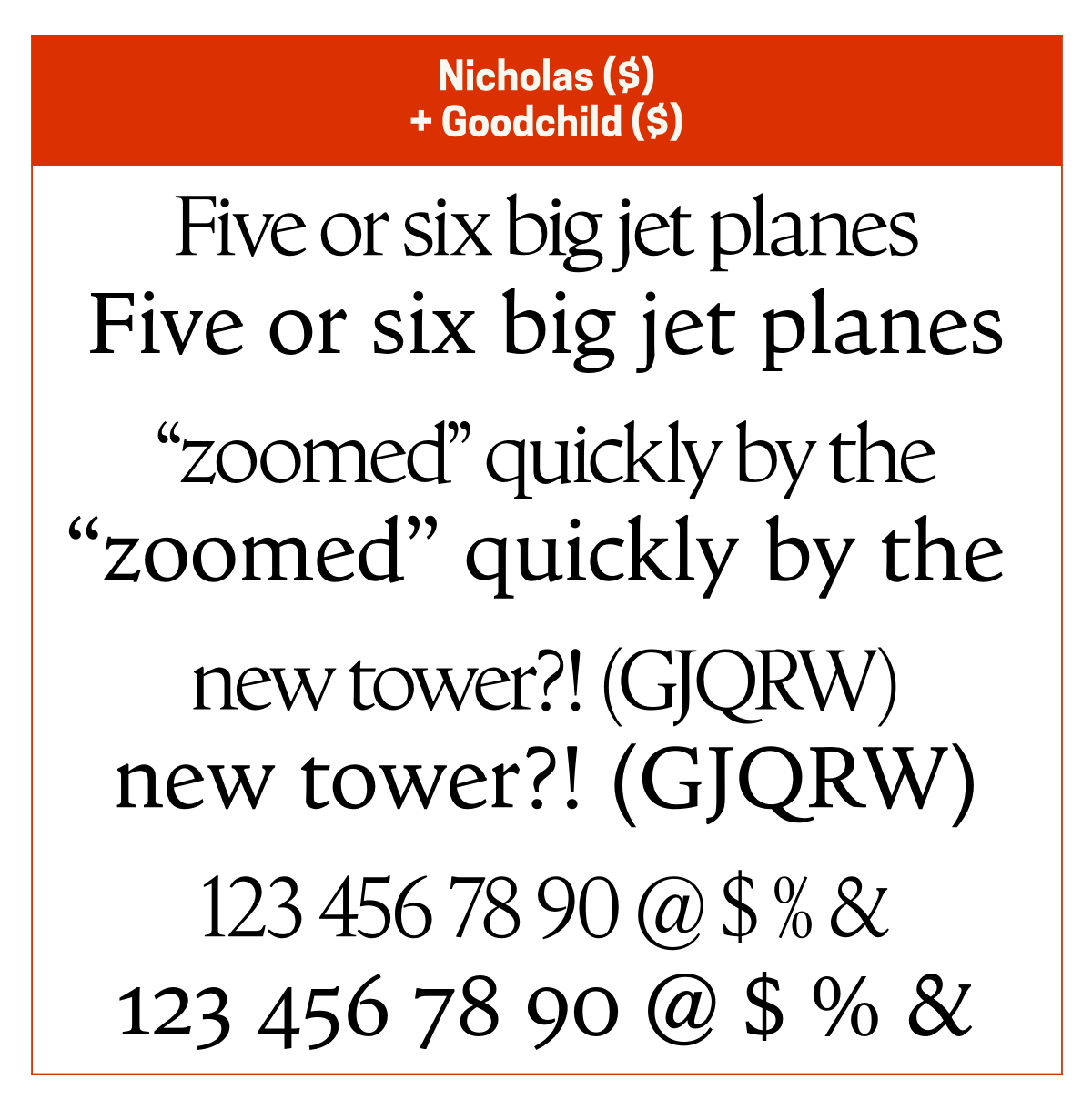
I almost always pair Goodchild ($) with Nicholas ($) since Nicholas is the “tight but not touching” headline version of Goodchild. Another good pairing option is Hint ($) since that adds a touch of neutral elegance.
Goodchild is a modern interpretation of Jenson.
Mercury
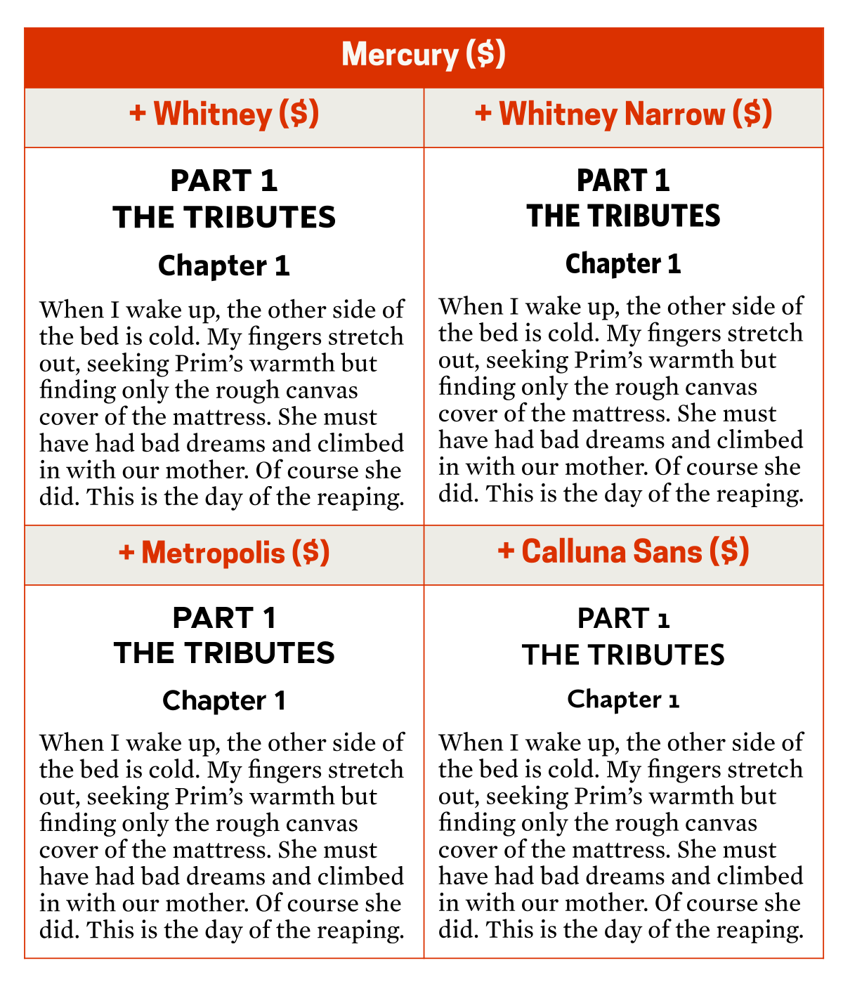
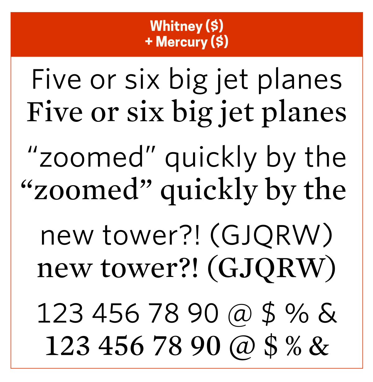
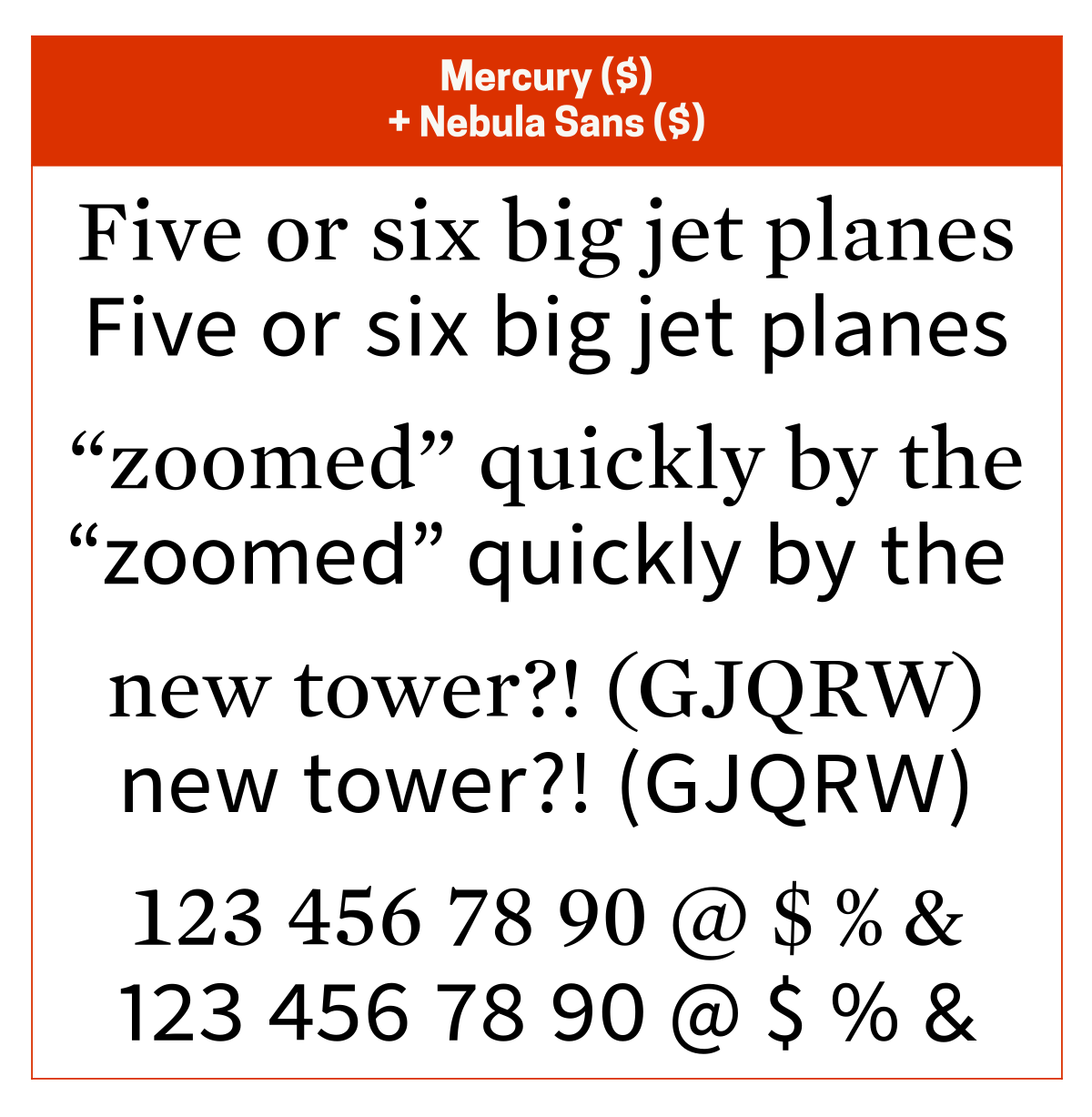
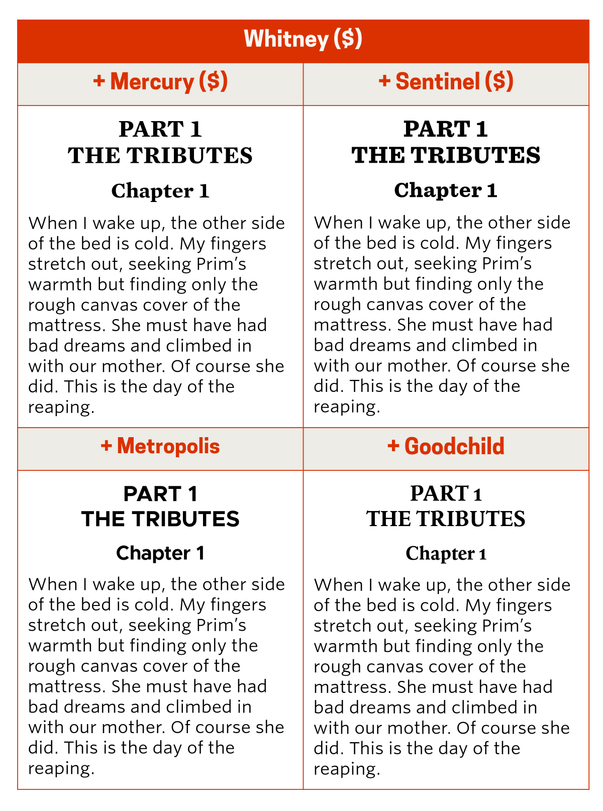
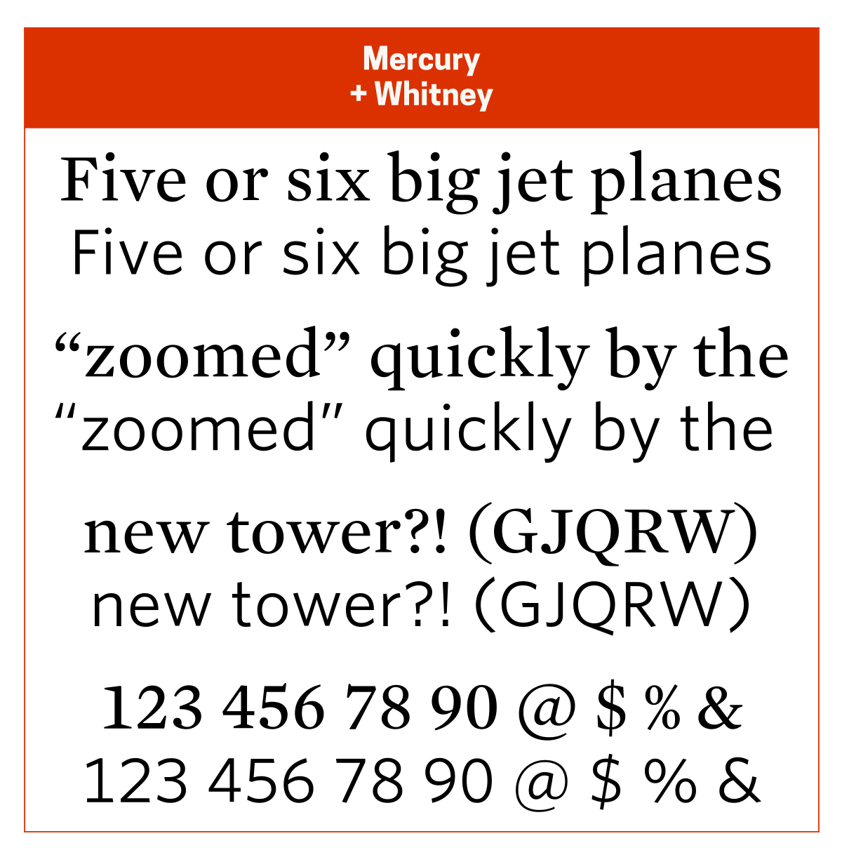
I almost always pair Mercury ($) with Whitney ($) or Whitney Narrow ($). Other good pairing options are Metropolis ($) for its neutrality and Calluna Sans ($) for its elegance. The Mercury + Whitney combo is my default in LibreOffice Writer.
Metropolis is an interpretation of Gotham, the latter being from the same type foundry as Mercury and Whitney.
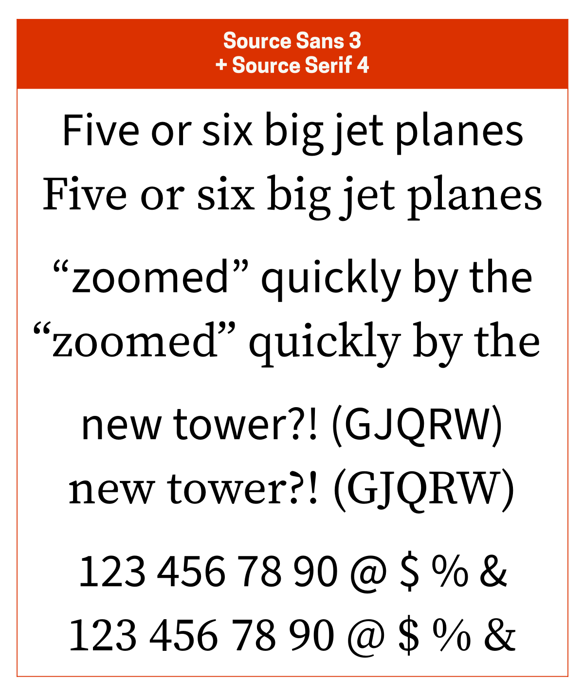
Source Serif 4
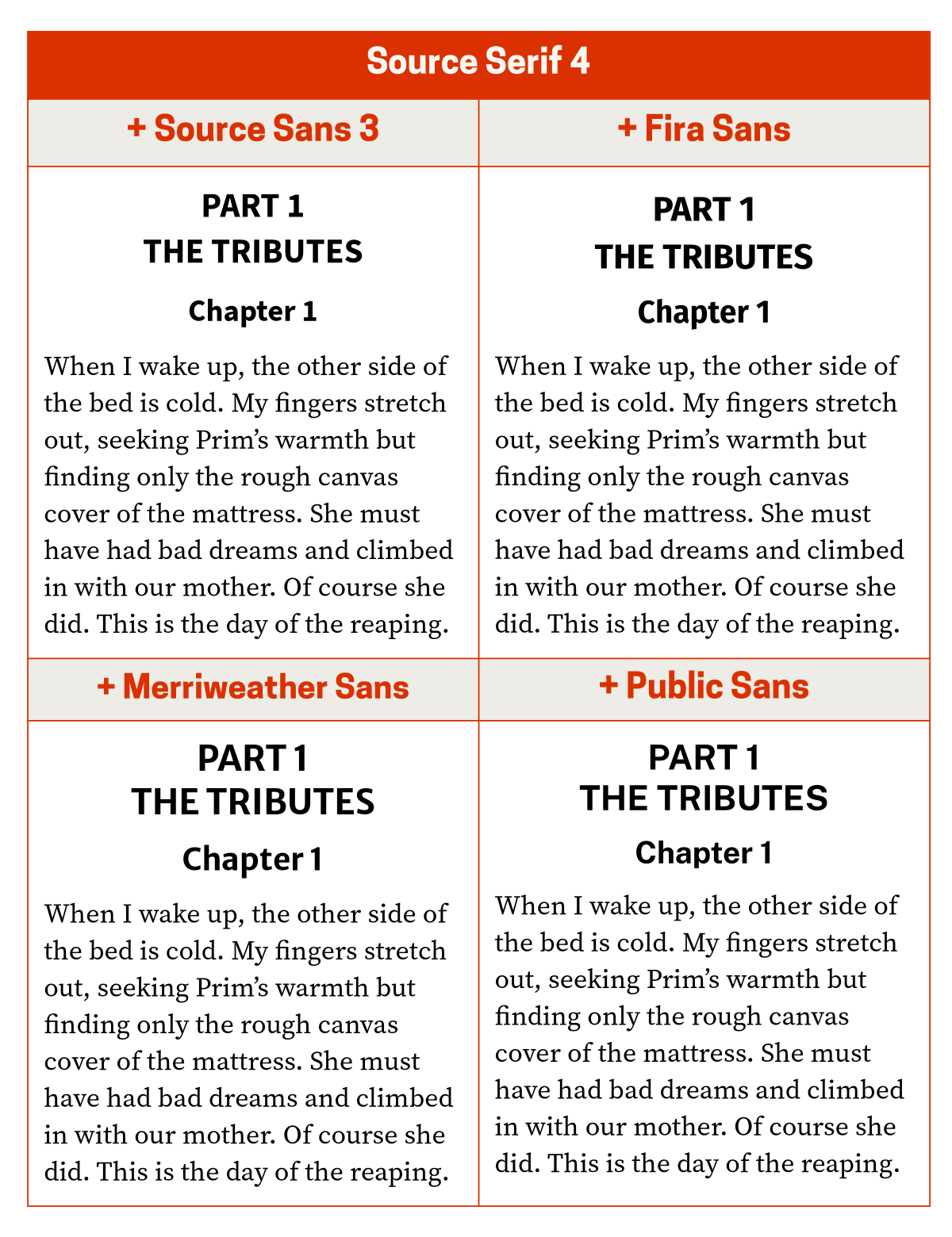
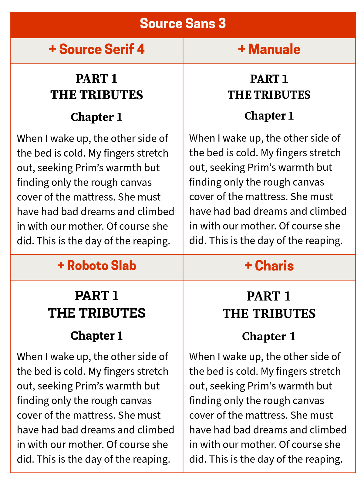
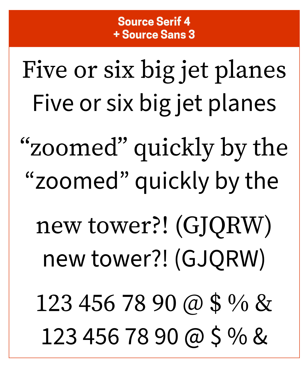
I almost always pair Source Serif 4 with Source Sans 3. Other good pairing options are Fira Sans to add a bit more character, Merriweather Sans to add a bit more elegance, and Public Sans to add a more classic, friendly vibe. The Source Serif 4 + Source Sans 3 combo is what I usually use when sending an editable document to someone (with fonts embedded).
Public Sans is my favourite modern interpretation of Franklin Gothic.
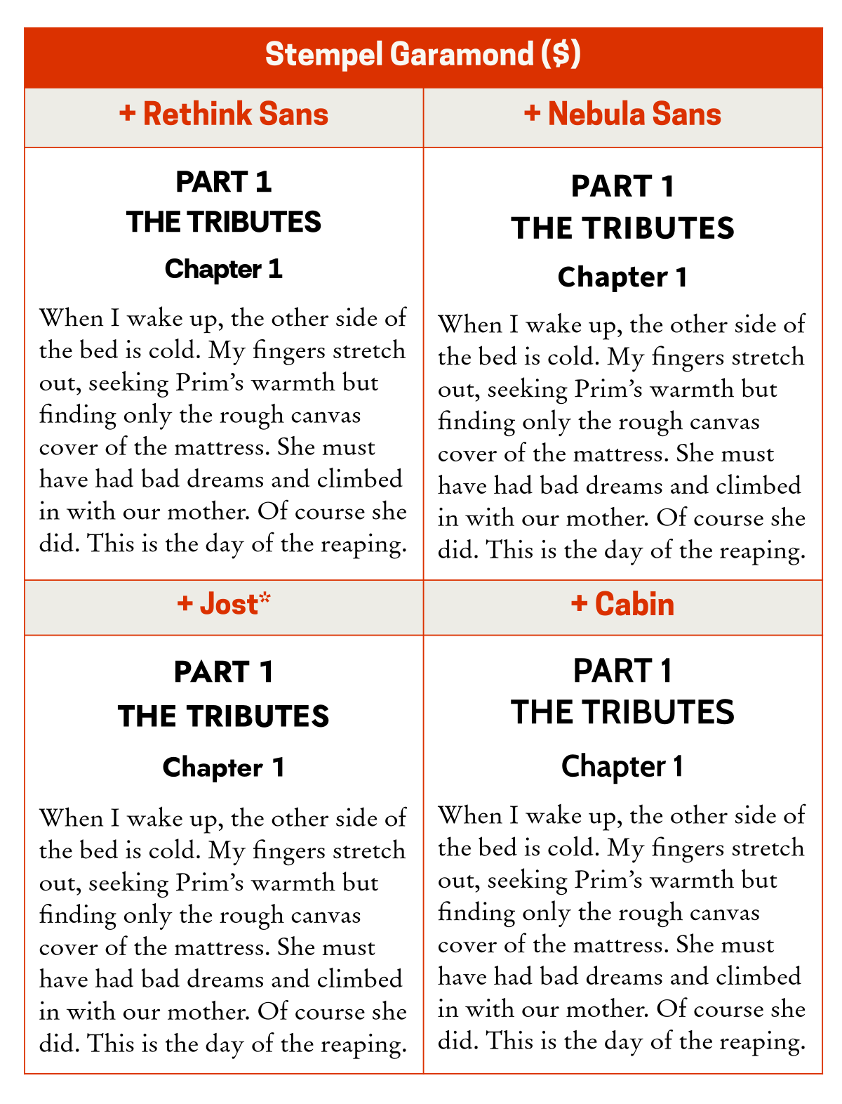
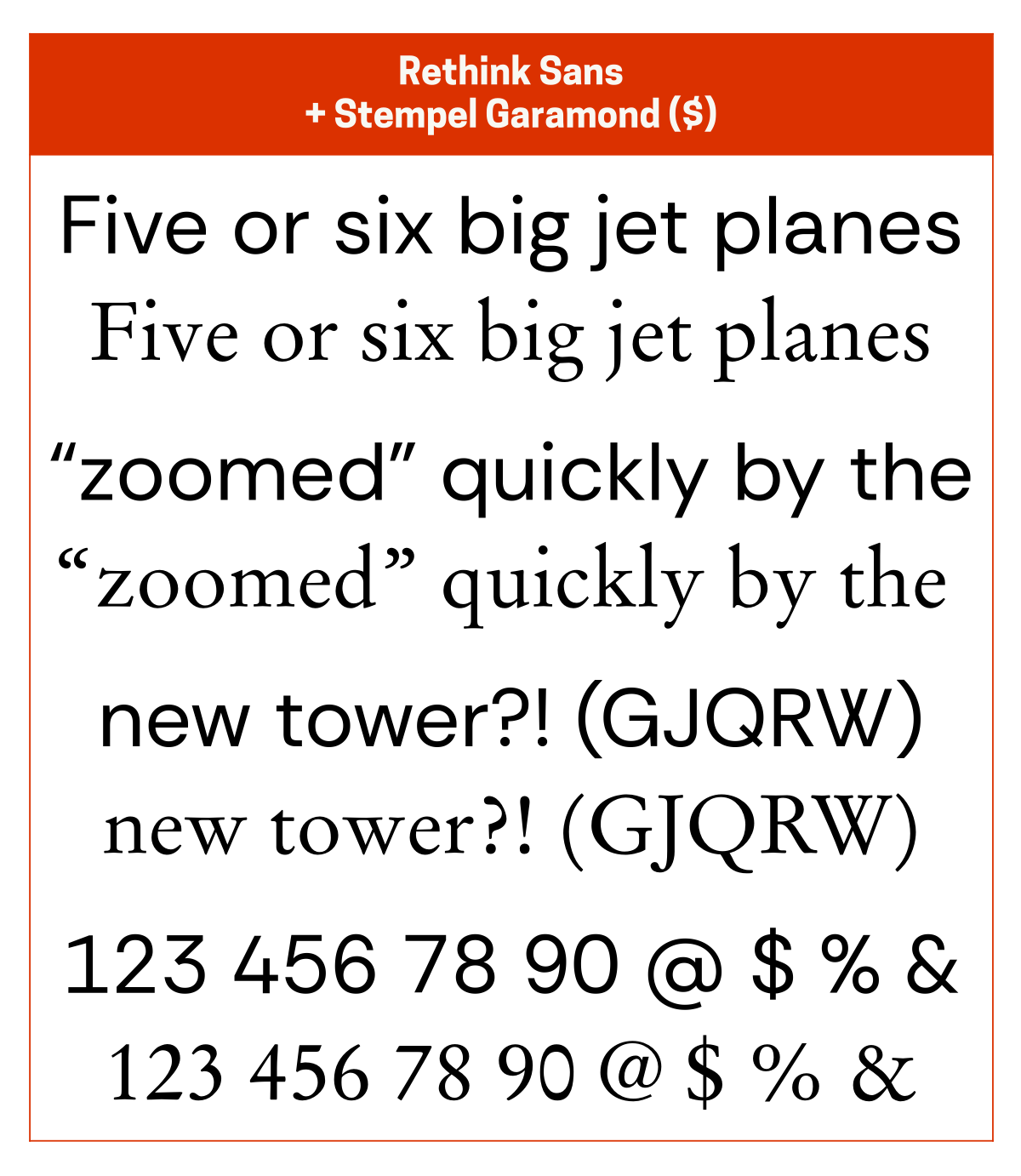
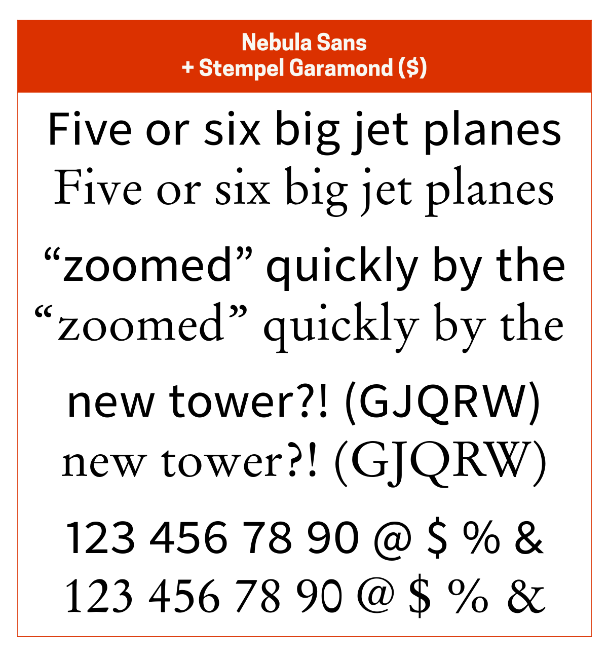
Stempel Garamond
I pair Stempel Garamond ($) with Rethink Sans since they have a similar vibe or with Nebula Sans for its solid elegance. Other good pairing options are Jost* for its geometric elegance and Cabin for its geometric friendliness. Stempel Garamond also works well with something neutral like Helvetica.
Stempel Garamond is a modern interpretation of Garamond. I’m not a big user of Garamond, but this version is my favourite. Rethink Sans is a fork of DM Sans, which itself is a fork of Poppins. Jost* is a modern interpretation of Futura. Cabin is a modern interpretation of Gill Sans.
TT Jenevers
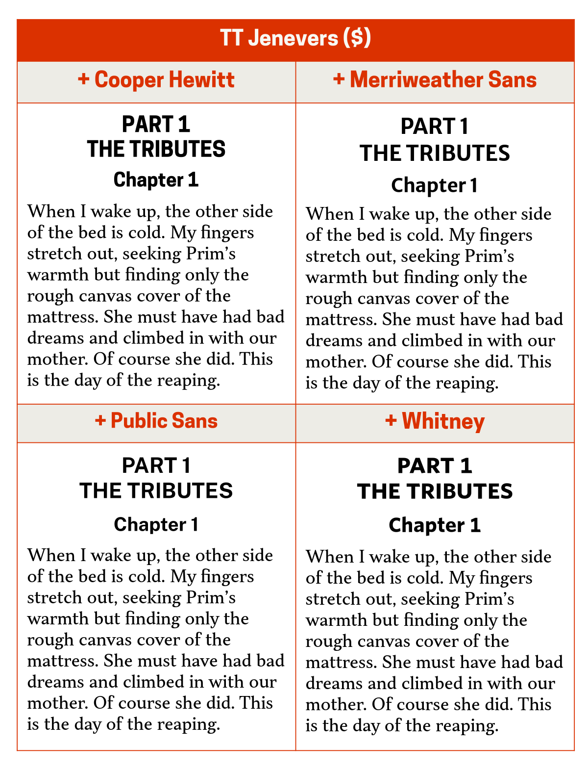
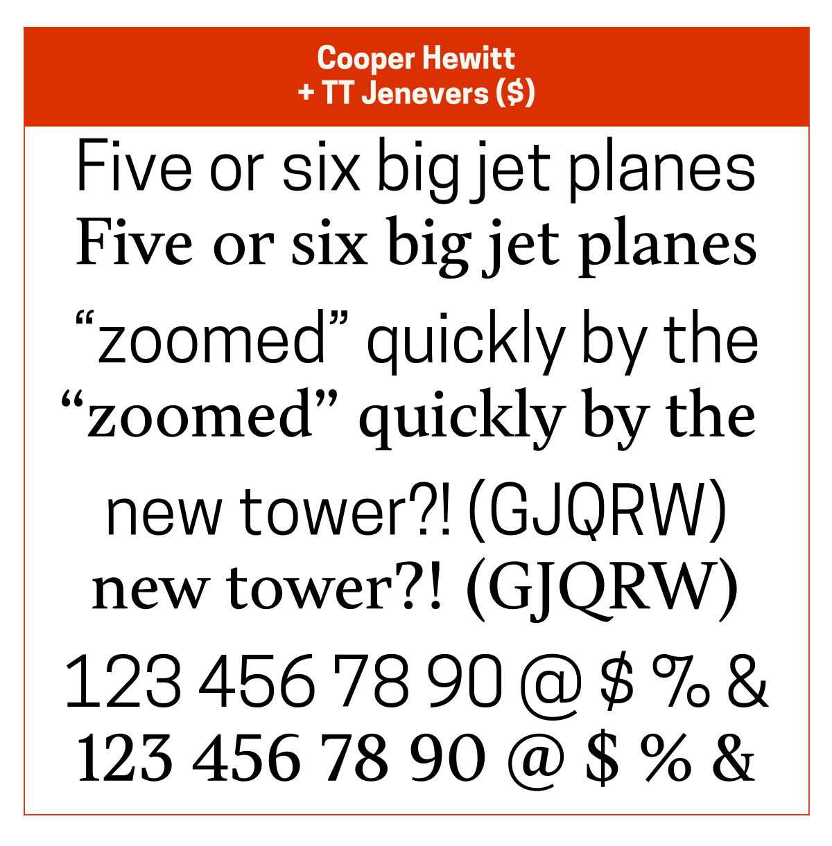
If I’m not pairing TT Jenevers ($) with itself (usually its Extra Bold weight), I pair TT Jenevers with Cooper Hewitt for its classic, geometric vibe. Other good pairing options are Merriweather Sans which adds a bit of geometric elegance, Public Sans which adds a bit of friendliness, and Whitney ($) which adds a bit of friendly elegance.
Willy Caslon
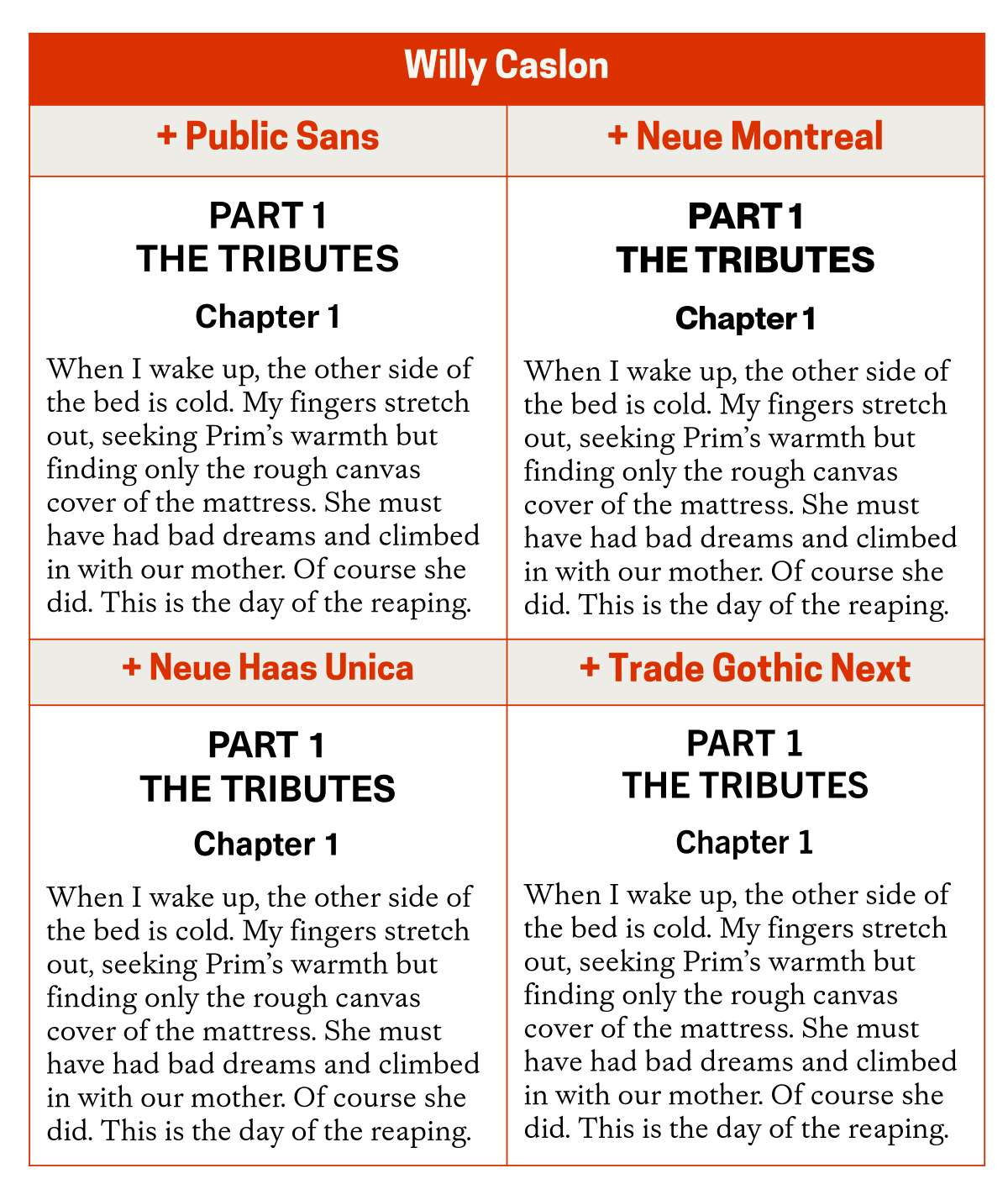
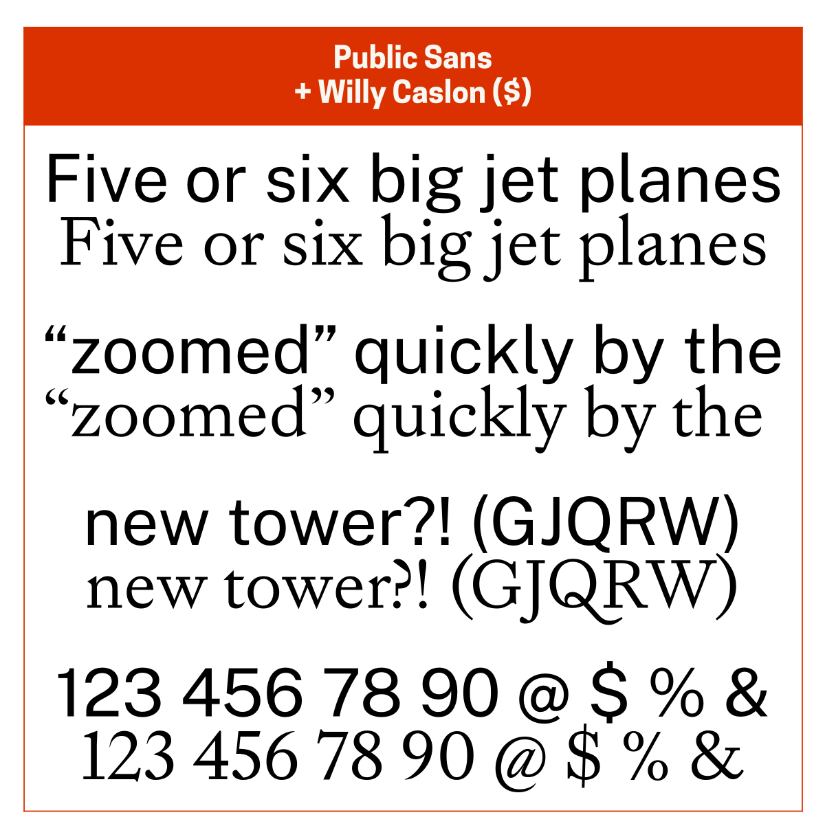
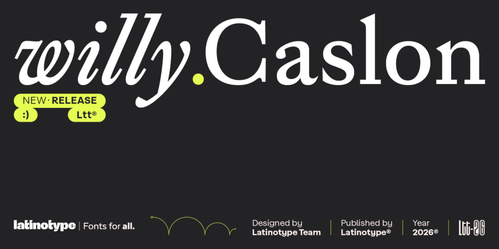
I pair Willy Caslon ($) with Public Sans, since they both have the modernised-classic vibe. Other good pairing options are Neue Montreal ($) for its friendly neutrality, Neue Haas Unica ($) for its warm neutrality, and Trade Gothic Next ($) for its classic, friendly vibe.
Willy Caslon is a modern interpretation of Caslon. Public Sans is a modern interpretation of Franklin Gothic. Neue Montreal is a modern interpretation of Helvetica. Neue Haas Unica is modern interpretation of Unica, which was an amalgam of Univers and Helvetica. Trade Gothic Next is a version of News Gothic, which is the regular-weight version of the original Franklin Gothic.
Honourable mentions
These are the body text typefaces I use for writing only when the need arises, along with the typefaces I like to pair them with.
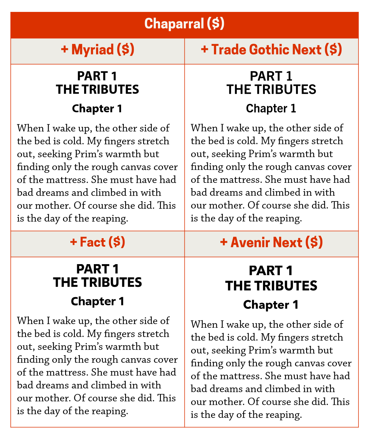
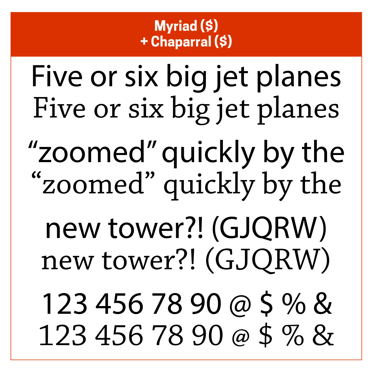
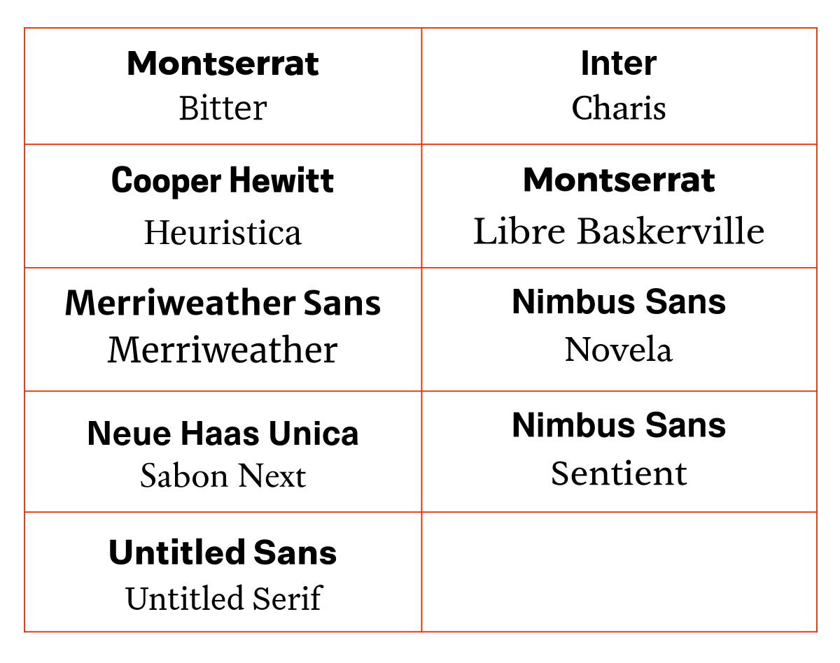
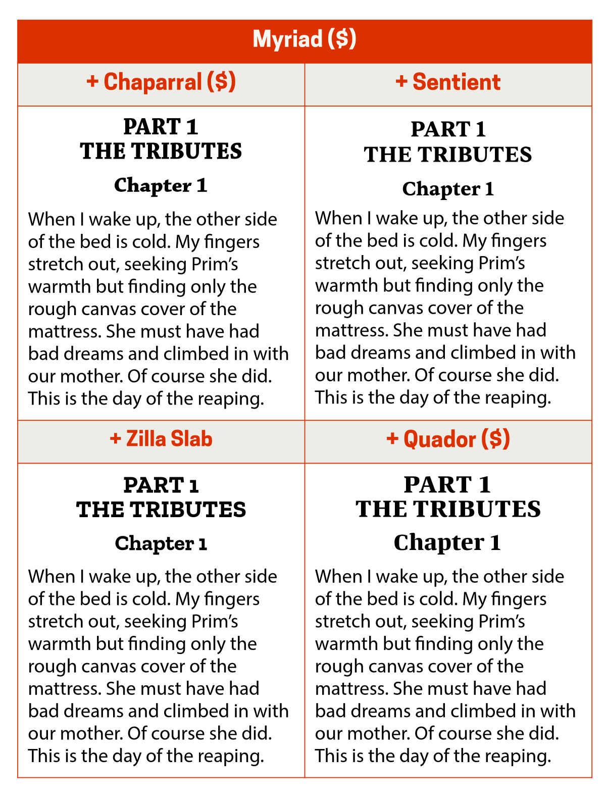
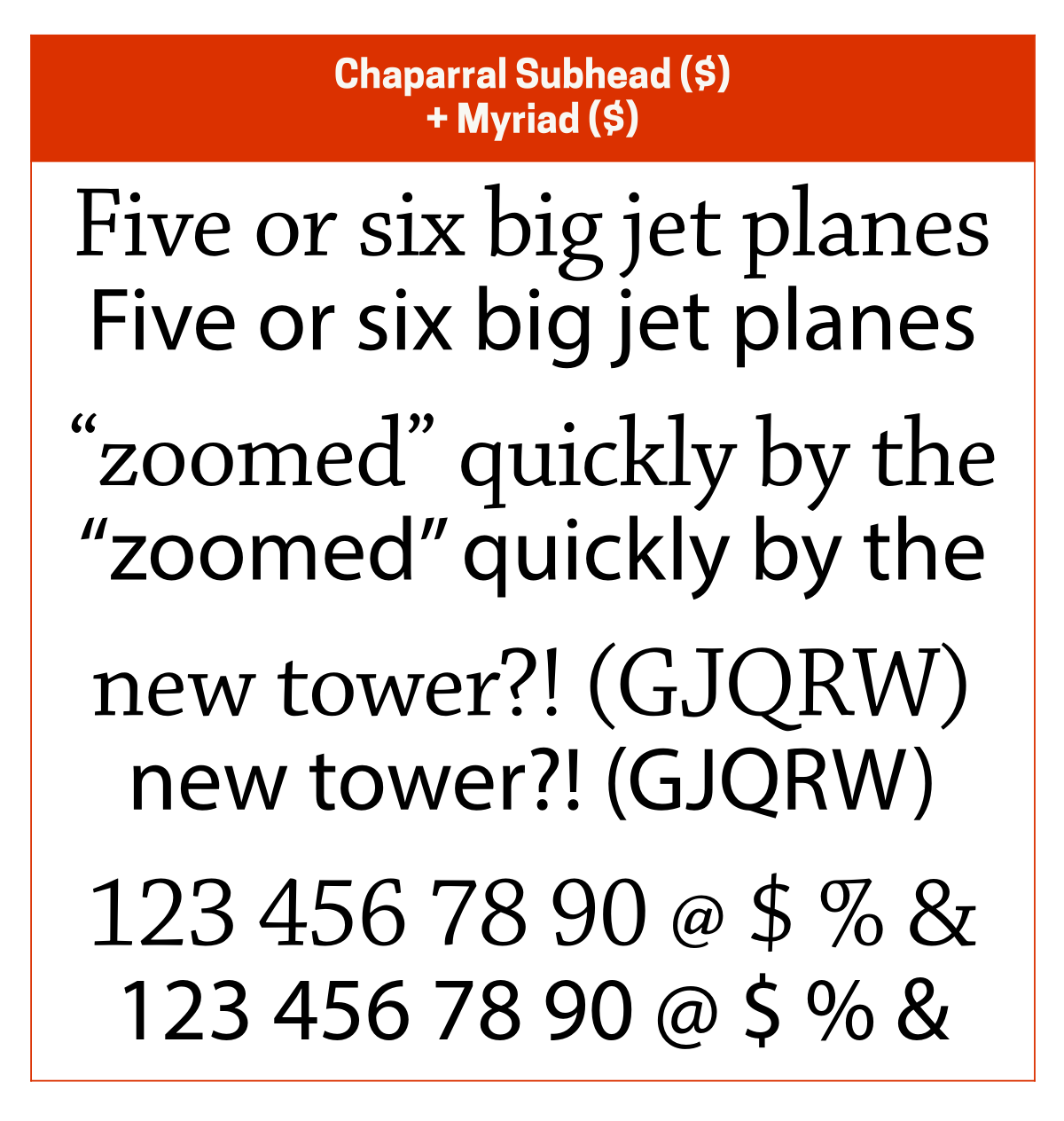
Chaparral ($): Myriad Condensed ($) (modern interpretation of Franklin Gothic), Chaparral Display/Subhead ($)
Charis (updated version of Charter): Inter, Cooper Hewitt, General Sans, Cabin.
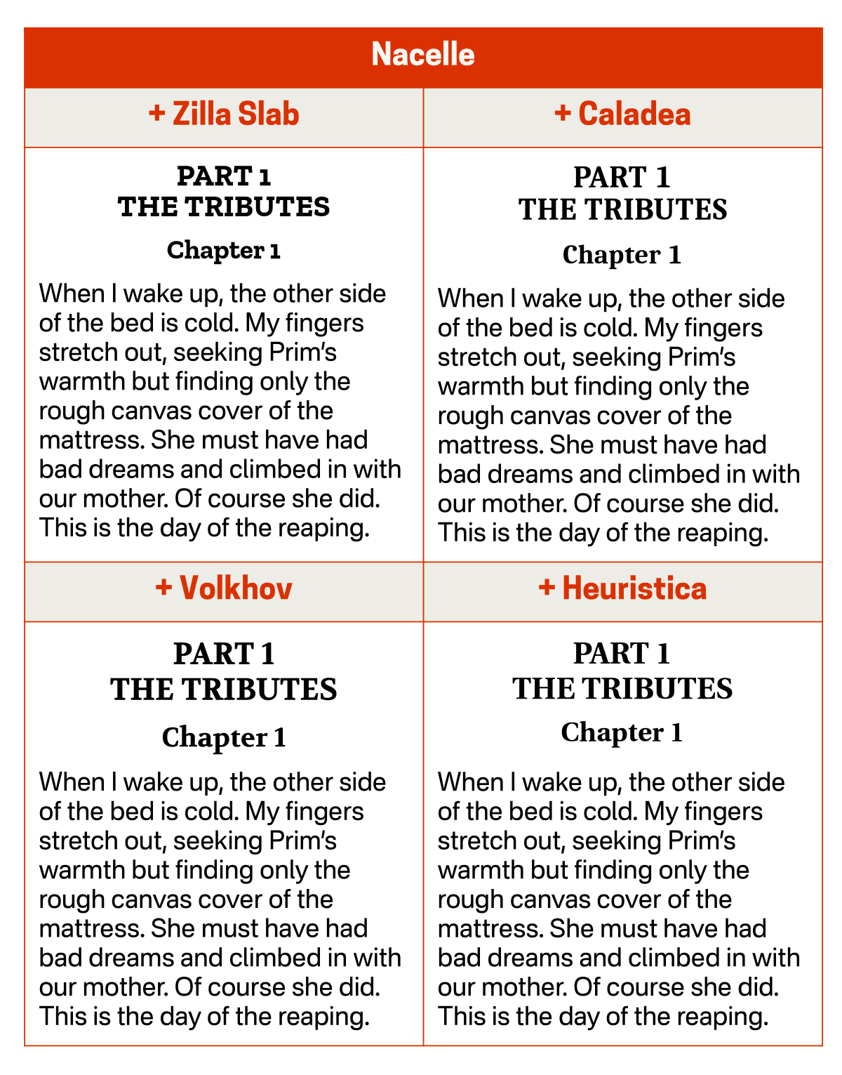
Heuristica (extended version of Utopia): Cooper Hewitt, Public Sans, Cabin, Inter.
Merriweather: Merriweather Sans, Oswald, Poppins, Brother 1816 ($).
Sabon Next ($): Neue Haas Unica ($), Nimbus Sans, Avenir Next ($), Ideal Sans ($).
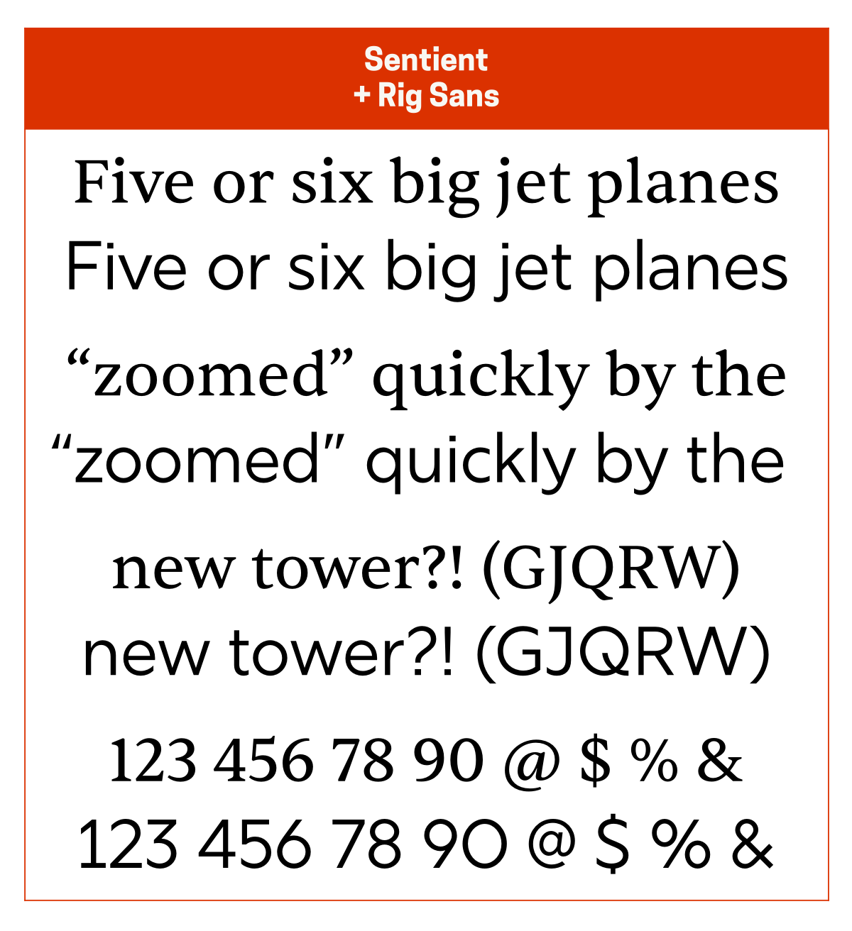
Sentient: Nimbus Sans, General Sans, Nebula Sans, Merriweather Sans.
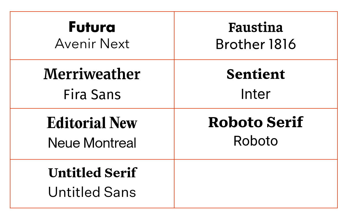
Finally, I should mention that, even though I don’t currently use these typefaces (they’re on my wish list), the Untitled Serif ($) + Untitled Sans ($) pairing is excellent.
Sans serifs
Calluna Sans
I almost always pair Calluna Sans ($) with Calluna ($). If I hadn’t purchased Calluna Sans and Calluna together, I’d probably pair Calluna with Mercury ($) or Heuristica for their authoritativeness or Gentium (probably Extra Bold) for its warmer vibe.
Heuristica is an extended version of Utopia and is a good, free alternative to Mercury.
Fact
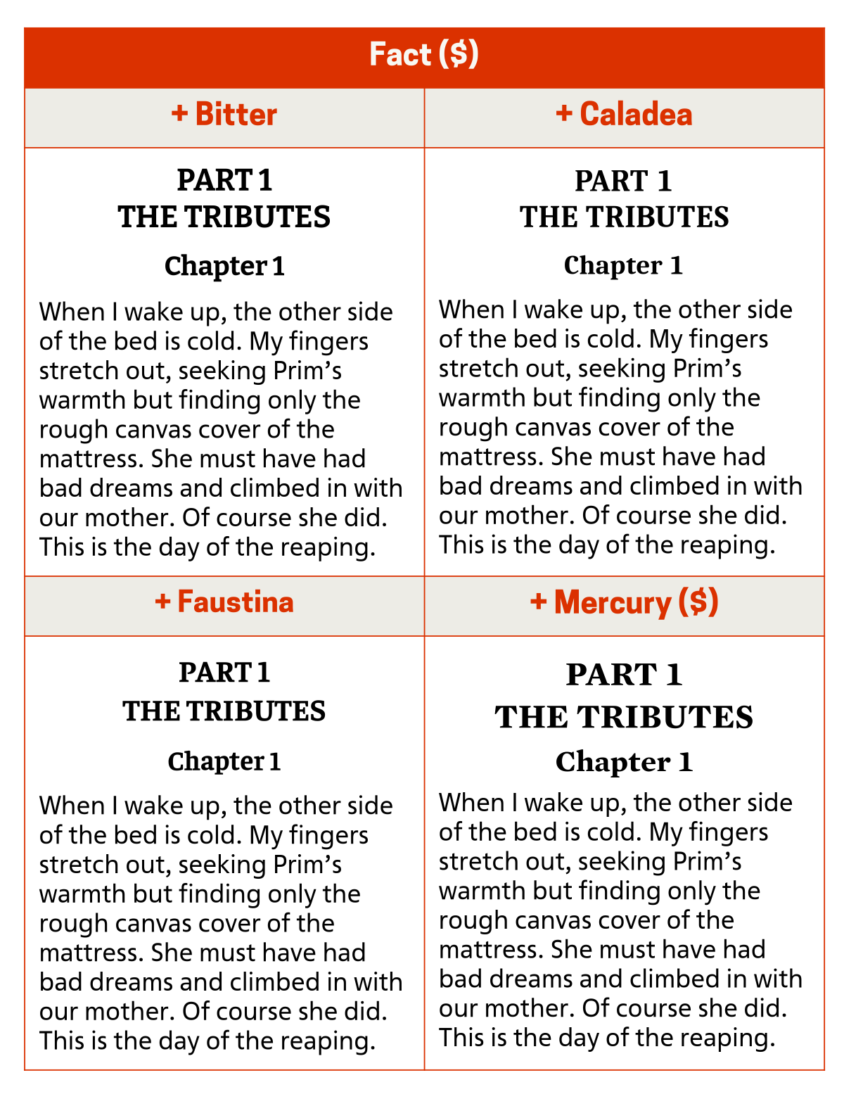
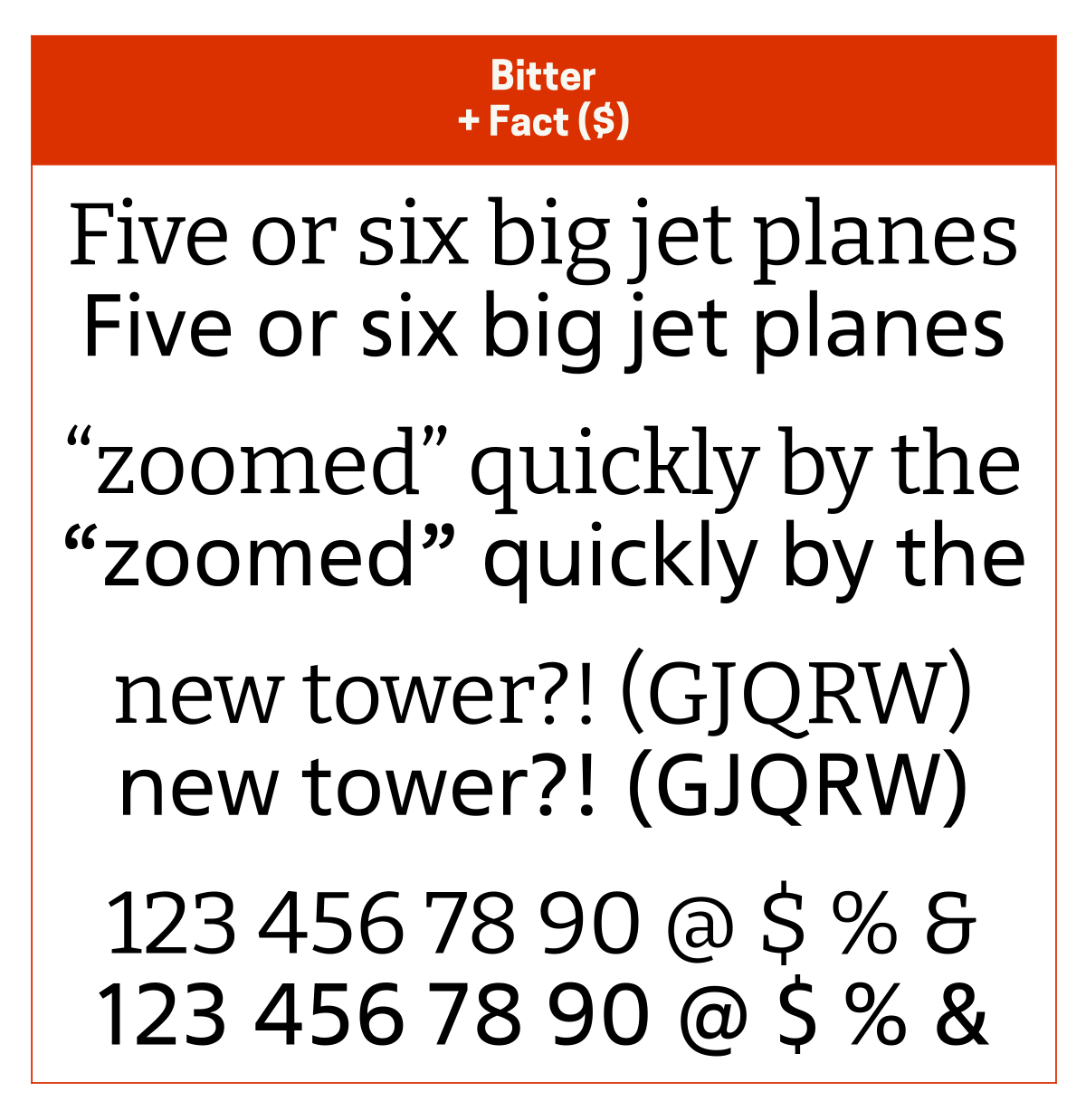
I usually pair Fact ($) with Bitter since the letterforms of both are based on rounded rectangles. Other good pairing options are Caladea for its friendliness, Faustina for its modern rounded-rectangular warmth, and Mercury ($) for its authoritativeness.
Fact is a modern interpretation of Frutiger.
General Sans
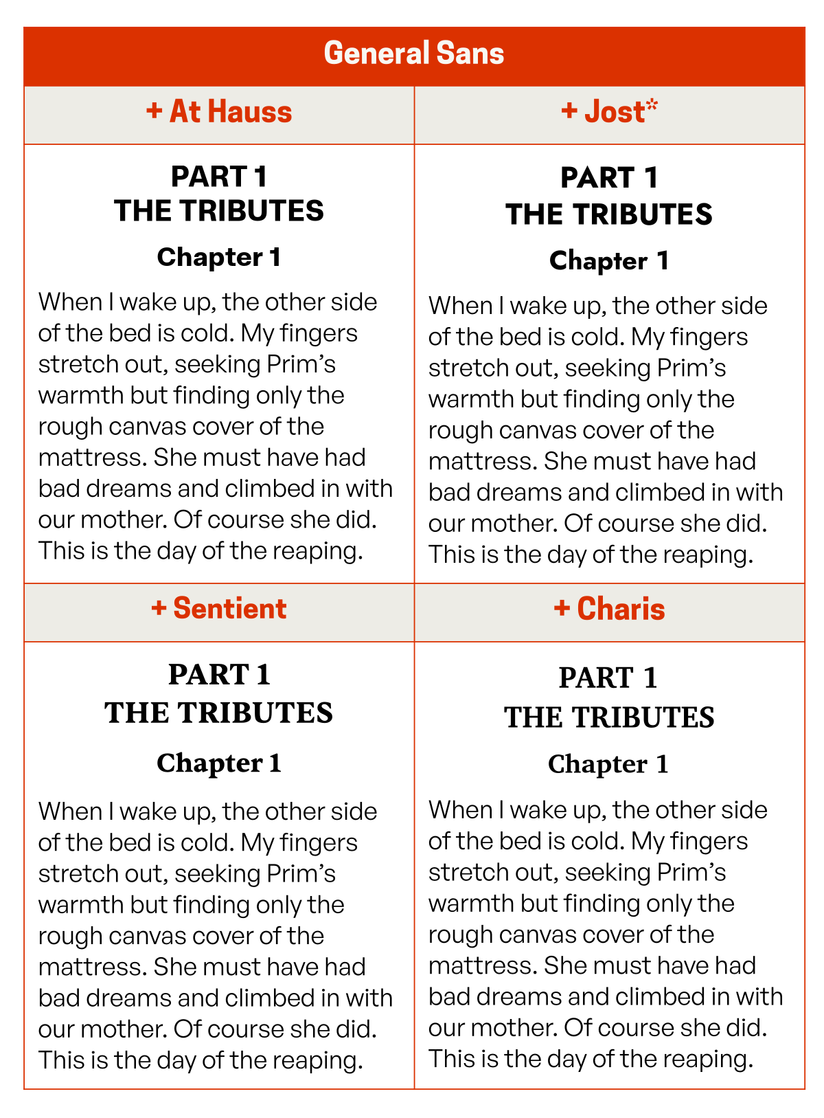
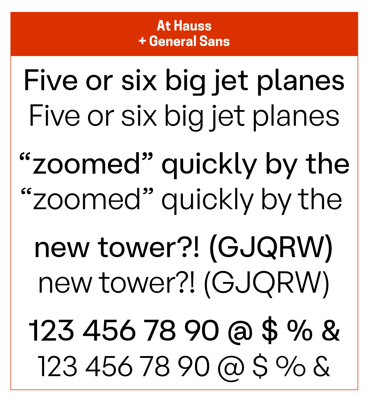
I usually pair General Sans with At Hauss ($) since they’re both quite similar (ie At Hauss could almost pass as the display version of General Sans). Other good pairing options are Jost* for its geometric sharpness, Charis for its modern friendliness, and Sentient for old-school its charm and warmth.
Jost* is a modern interpretation of Futura. At Hauss may be a paid typeface, but its non-commercial version costs only €9!
Hint
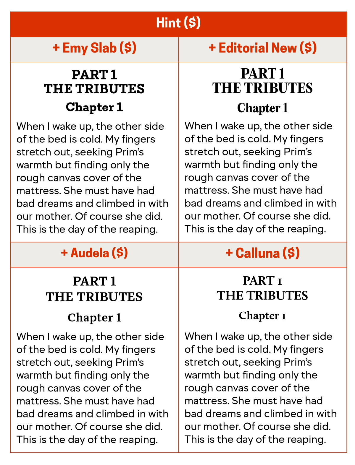
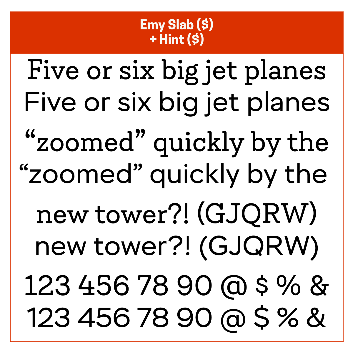
I usually pair Hint ($) with Emy Slab ($) since they’re both slightly elegant but otherwise solid typefaces. Other good pairing options are Editorial New ($) to add some modern style, Audela ($) to add a little chunkier solidity, and Calluna ($) to add some friendlier style.
Hint is my preferred alternative to Avenir.
Ideal Sans
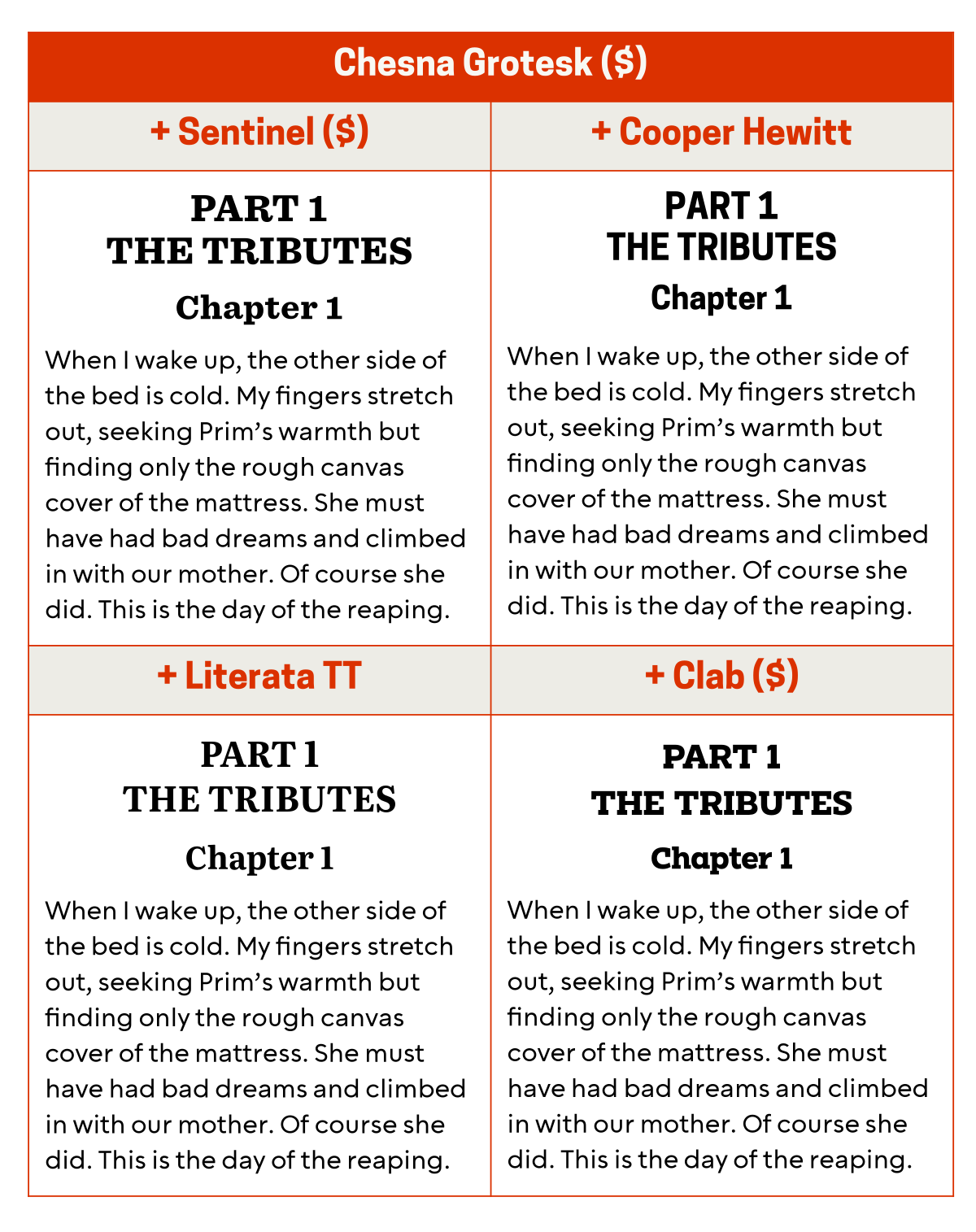
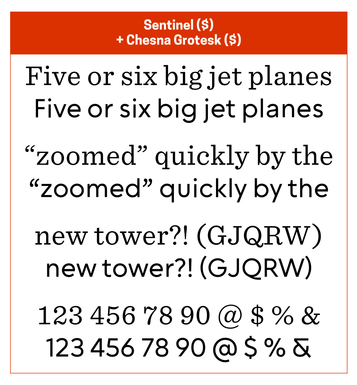
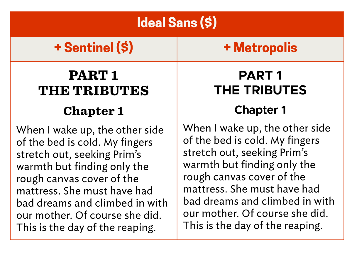
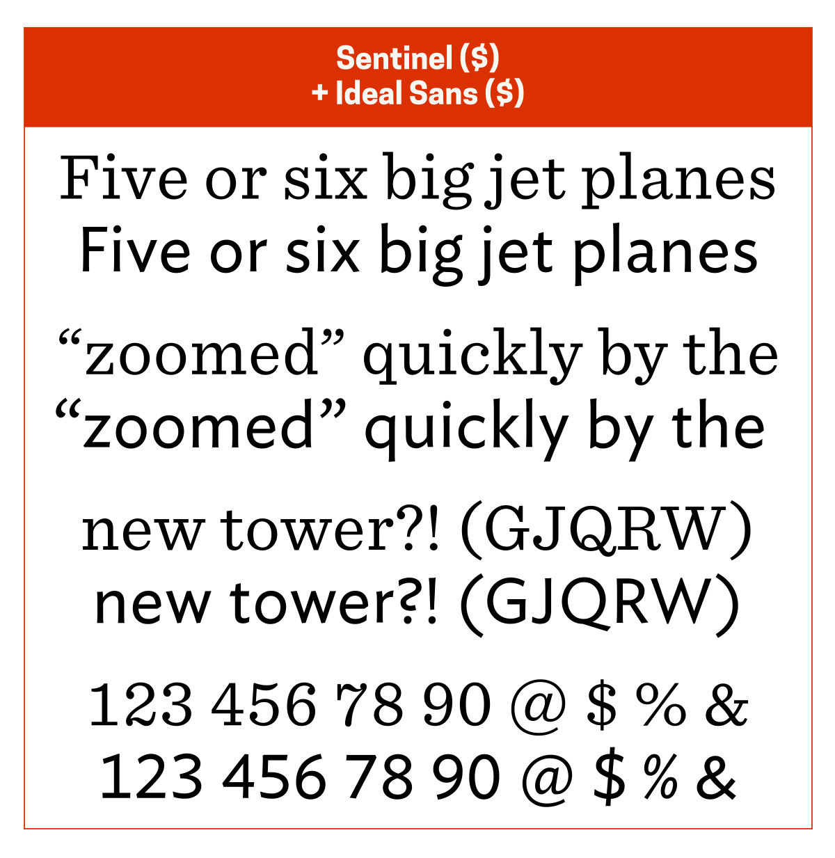
I almost always pair Ideal Sans ($) with Sentinel ($) since they both have the same vibe and are from the same type foundry. Another good pairing option is Metropolis for its modern solidity.
Metropolis is an interpretation of Gotham, the latter being from the same type foundry as Ideal Sans and Sentinel.
Nebula Sans
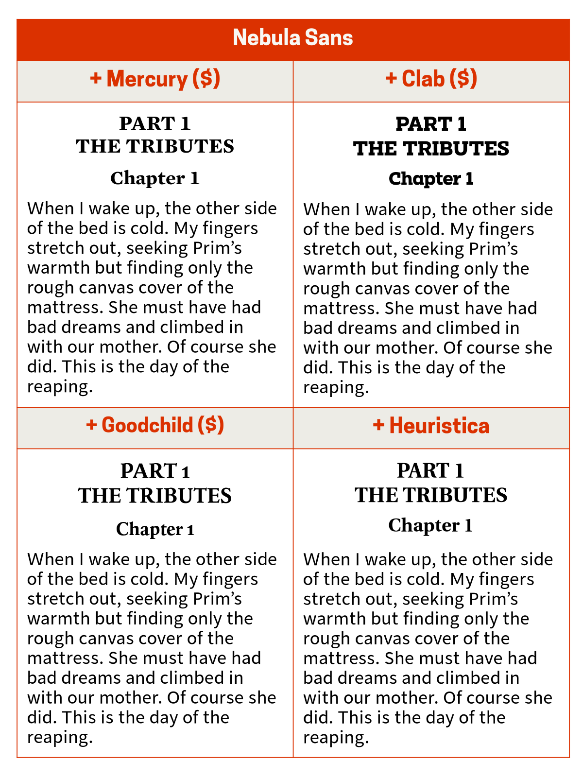
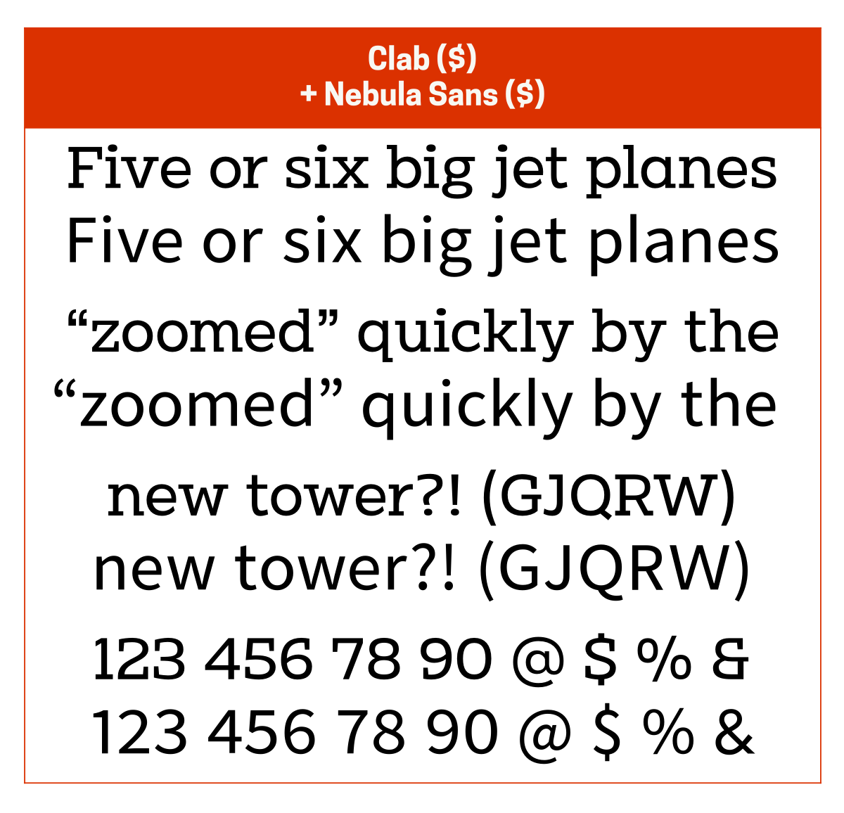
I usually pair Nebula Sans with Mercury ($) since they have a similar vibe or with Clab ($) if I want a slightly more solid vibe. Other good pairing options are Goodchild ($) for its modern elegance and Heuristica for its modern friendliness.
Nebula Sans is a version of Source Sans 3 that’s been adjusted to look like Whitney. Heuristica is an extended version of Utopia and is a good, free alternative to Mercury.
Officer Sans
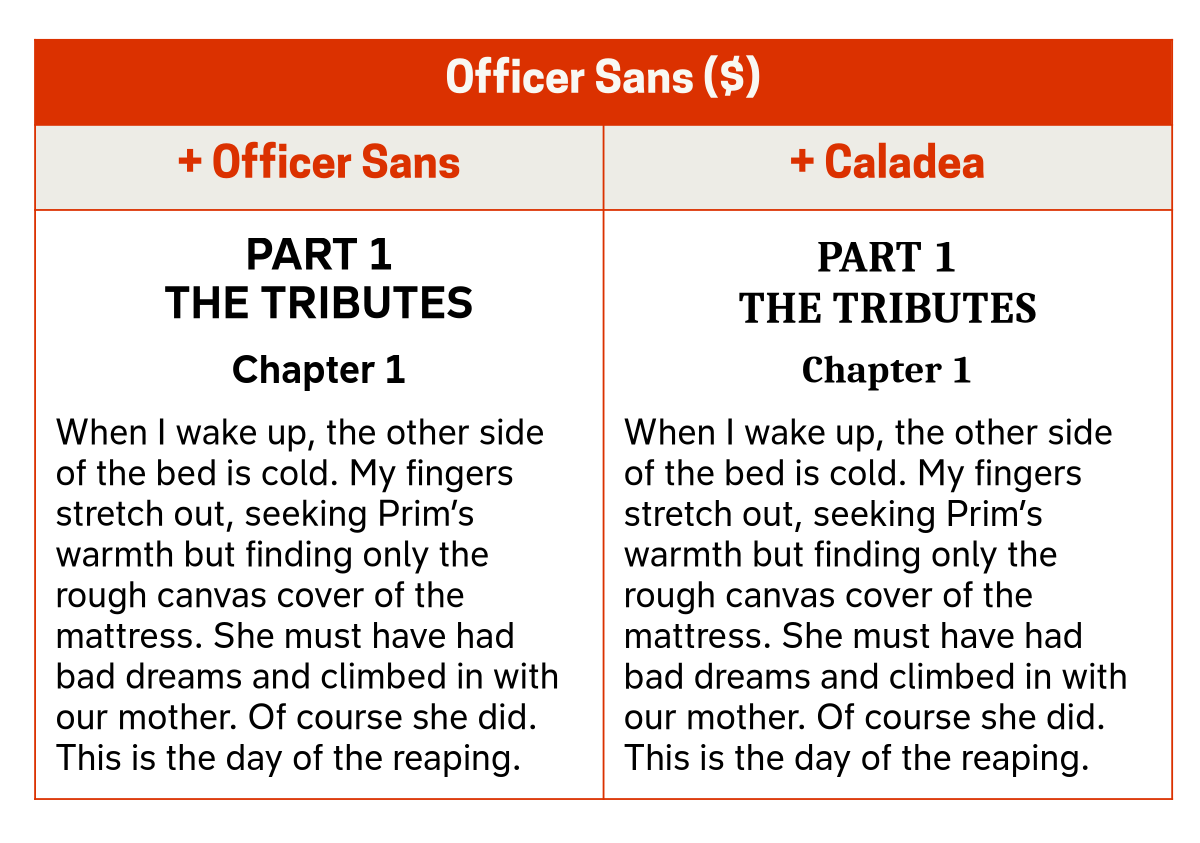
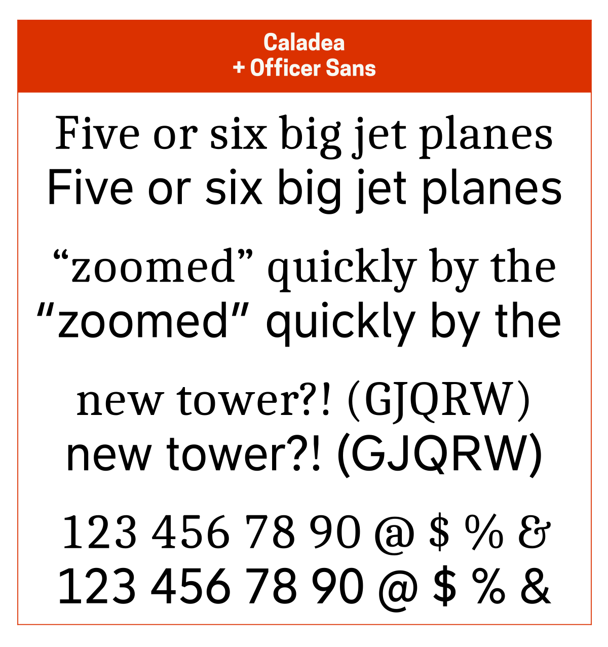
I pair Officer Sans (free) with itself or with Caladea for its friendliness.
You can get the basic version of Office Sans for free, but there is also a full Officer Sans family that you can purchase.
Public Sans
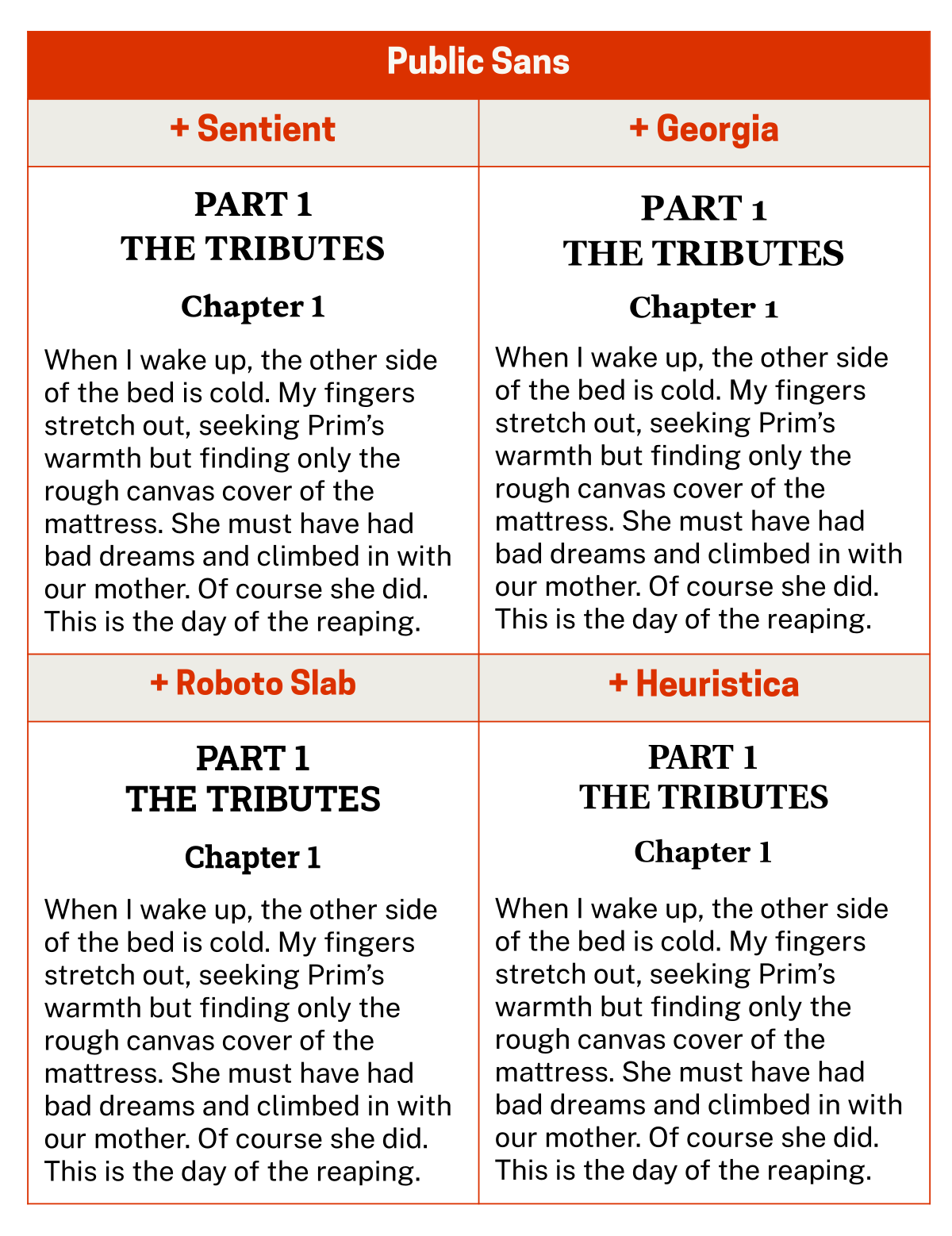
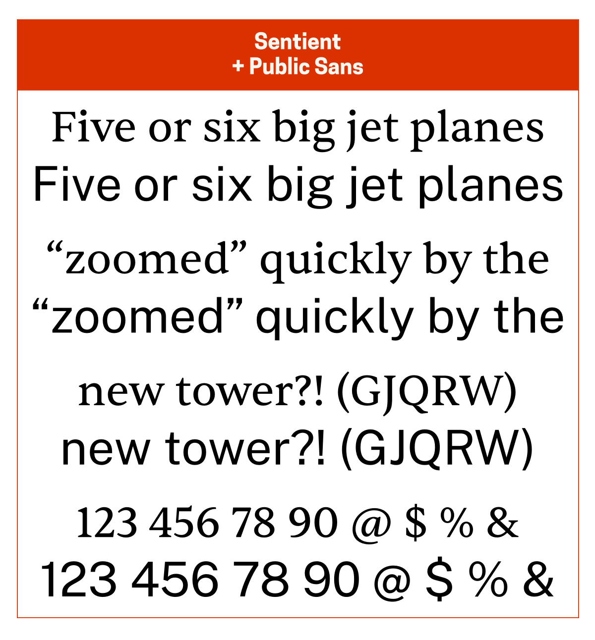
If I’m not pairing Public Sans with itself, I usually pair it with Sentient since they have a similar vibe (friendly, classic). Other good pairing options are Georgia (or Gelasio) for its retro charm, Roboto Slab for its solidity, and Heuristica for its modern friendliness.
Public Sans is my favourite modern interpretation of Franklin Gothic. Gelasio is an open source version of Georgia. Heuristica is an extended version of Utopia and is a good, free alternative to Mercury.
Rig Sans
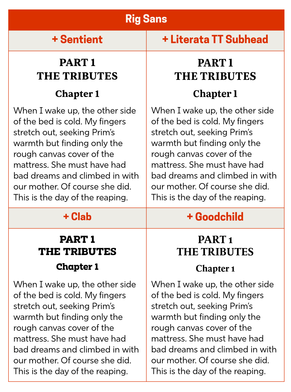
If I’m not pairing Rig Sans ($) with itself, I usually pair it with Sentient since the latter adds a bit of classic charm to the text. Other good pairing potions are Literata TT Subhead for its solid warmth, Clab ($) for its elegant authoritativeness, and Goodchild ($) for its modern elegance.
Rig Sans is the typeface I go to every time I’m tempted to use something like Verdana.
Source Sans 3
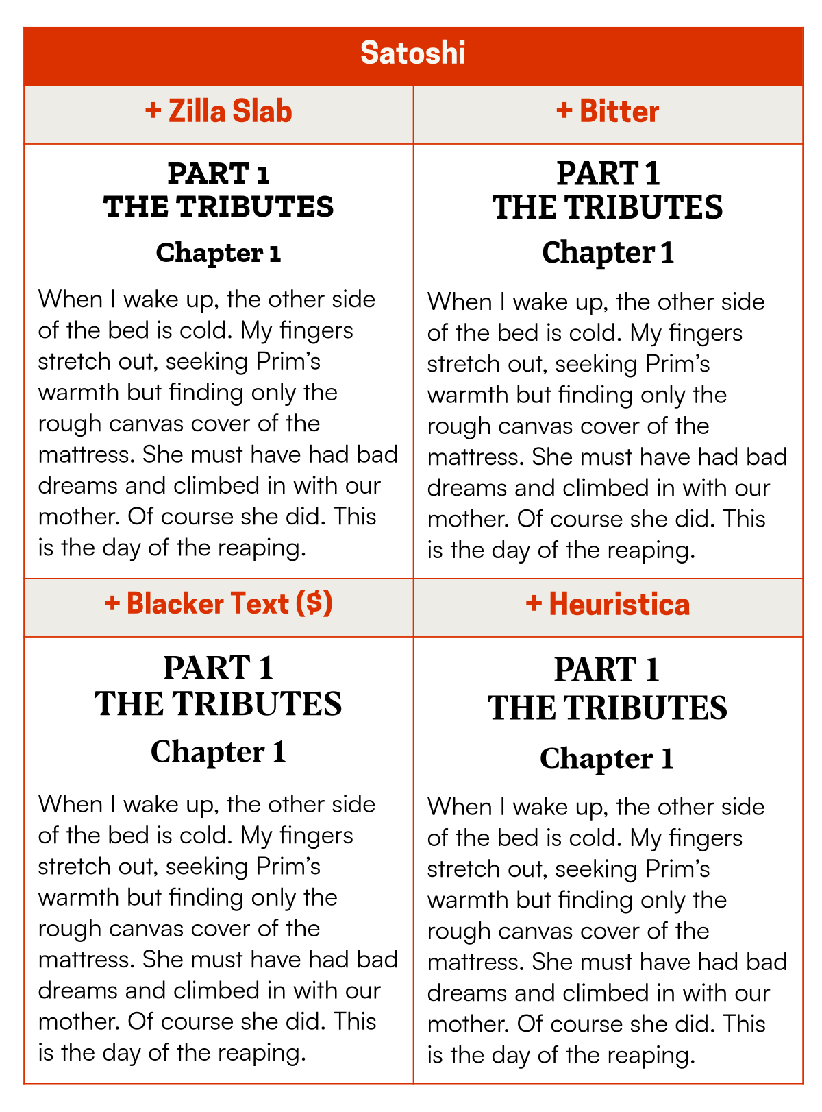
I almost always pair Source Sans 3 with Source Serif 4 since they’re part of the same family. Other good pairing options are Manuale for its rounded-rectangular sharpness, Roboto Slab for its solidity, and Charis for its modern friendliness.
Metropolis is an interpretation of Gotham, the latter being from the same type foundry as Whitney and Sentinel.
Honourable mentions
These are the body text typefaces I use for writing only when the need arises, along with the typefaces I like to pair them with.
Avenir Next ($): Futura ($), Blacker Display ($), Quador Display ($), Clab ($)
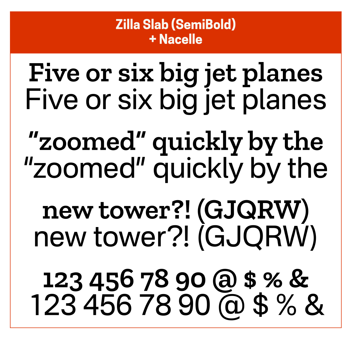
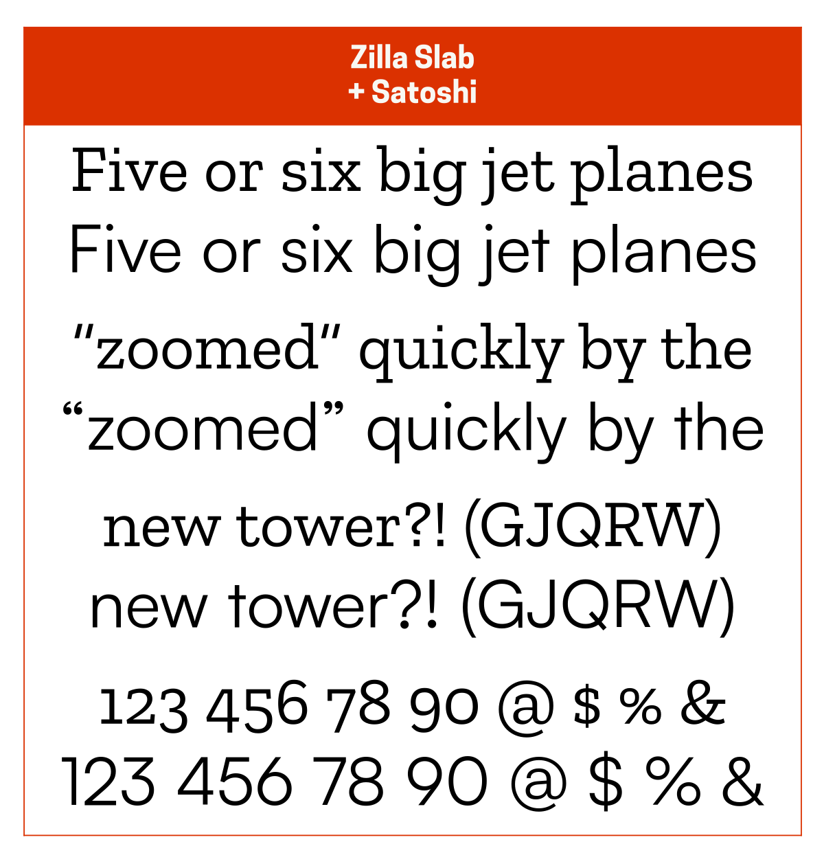
Brother 1816 ($): Faustina, Heuristica, Goodchild ($), Zilla Slab
Fira Sans: Merriweather, Roboto Slab, Heuristica, Inter Display
Neue Montreal ($): Editorial New ($), Nicholas ($), Sentinel ($)
Finally, as mentioned in the serif section above, even though I don’t currently use these typefaces (they’re on my wish list), the Untitled Sans ($) + Untitled Serif ($) pairing is excellent.
Monospace
I’m only including this section for completeness’ sake because, whenever I use a monospace typeface, I pair it with itself.
¯\_(ツ)_/¯
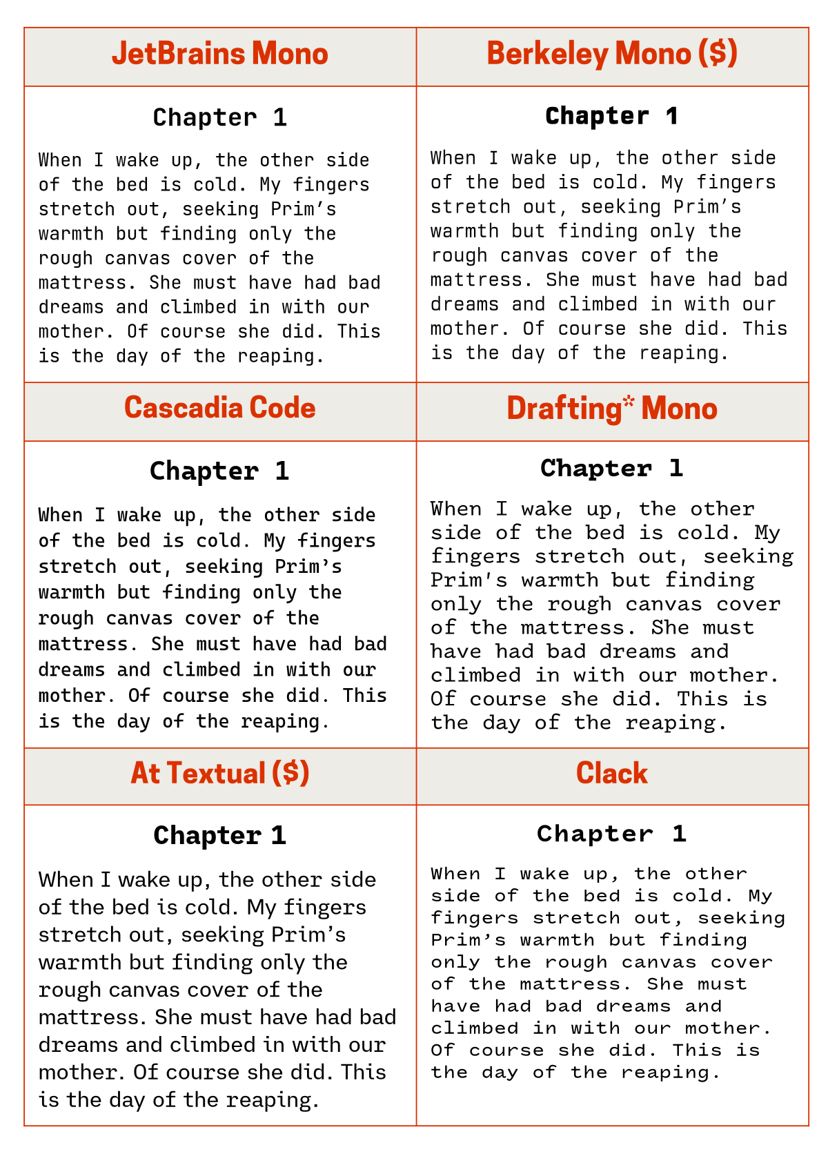
The monospace typefaces I use most often are JetBrains Mono, Berkeley Mono, and Cascadia Code. I will also occasionally use Drafting* Mono, At Textual, and Clack.
Concluding thoughts
Sorry for the long post – I had a lot to get through!
If you’ve made it all the way to the end, tell me what your favourite or go-to typeface pairings are.