Cool type pairings on the web, part 1

As a typography nerd, I notice and then investigate almost all the typefaces I see on the websites I visit. And its not just the typefaces themselves that I pay attention to, I also note the typeface pairings that have been used: meaning the combination of fonts used for body text and headings. I also check to see if there’s any interesting use of typography in the other text elements (pull quotes, bylines, footers, etc).

This post is the first in an ongoing series in which I’ll share the cool font pairings I find online. I’m doing this because I want to (a) share cool stuff with others who might find this interesting and (b) build a type-pairing catalogue for my own future inspiration.

Though let me begin, rather self indulgently, with my own website :)

Insanity Works

This website’s current type pairing is Chaparral (Carol Twombly; Adobe) for body text and Myriad Condensed (Carol Twombly, Robert Slimbach; Adobe) for headings. I wrote in 2023 about how happy I was when the Adobe Fonts catalogue was added to Squarespace (the platform on which this website is hosted) because these two fonts became available for use.

Before then, I used the closest Google Fonts alternatives to those typefaces: Merriweather (Eben Sorkin; Sorkin Type, Google Fonts) for body text and Oswald (Vernon Adams, Kalapi Gajjar; Cyreal) for headings.

Two graphics showing text set in (1) Chaparral and Myriad Condensed and (2) Merriweather and Oswald. The text has the title, “Chapter 1: SOUL-EATER” and is from Naomi Novik’s book, ‘A Deadly Education’.

Chaparral is a hybrid serif/slab-serif typeface. I love how beautiful and graceful it is, even while it retains the friendliness and authoritativeness of its slab serif foundation. Myriad, which is reworking of Franklin/News Gothic, is an excellent combination of elegant, friendly, and authoritative. I think the two typefaces complement each other really well.

Merriweather and Oswald also complement each other nicely, though their vibe is more modern. Merriweather is a traditional typeface (with Garamond as its inspiration) that was adapted for use on screens. It is classic and elegant, but also an everyday workhorse. Oswald is based on Alternate Gothic (a lighter, narrower version of Franklin Gothic) and this slightly-condensed reworking was also designed to be used on screens.

Going back in time

If we go further back in this history of this website – between 2007 and 2012, which was before I switched to the Squarespace – I used Georgia (Matthew Carter; Microsoft) for both body text and headings.

And if we go all the way back to when I first created this site – so from 2004 to 2007, when default, web-safe fonts ruled the day – I had everything set in Verdana (Matthew Carter, Thomas Rickner; Microsoft).

Two graphics showing text set in Georgia and Verdana, respectively. The text has the title, “Chapter 1: SOUL-EATER” and is from Naomi Novik’s book, ‘A Deadly Education’.

Georgia and Verdana were designed to be screen-first typefaces, specifically typefaces that looked good on the lower-resolution computer screens that were prevalent at the time (ie the mid-1990s). They were designed as serif/sans-serif companions to each other and both are solid, authoritative, and highly-readable typefaces.

Al Jazeera

Speaking of Georgia, a website that uses this typeface effectively is Al Jazeera.

The use of Georgia (Microsoft) for body text and Roboto (Google Fonts) for headings gives the Al Jazeera website a clean, no-nonsense, trustworthy vibe.

[Note: screenshots from websites have been heavily edited to focus on only the fonts used.]

Screenshot from the Al Jazeera website of an article titled, “Frida Kahlo painting sells for $54.7m, breaking record for female artists”.

Roboto started out a “frankenfont”, meaning an unwieldy combination Helvetica, Myriad, Frutiger, Univers, FF DIN, and Ronnia. Fortunately, its design team kept working on it and, by around 2014, it had become a much more unified and harmonised typeface. These days it is the most used font on Google Fonts and, despite its overuse, I still like using it and seeing it being used.

The Guardian

Diametrically opposed to Al Jazeera’s “let’s use default/standard typefaces” approach is The Guardian that uses a family of bespoke typefaces.

This website uses Guardian Egyptian Text for body text and Guardian Egyptian Headline for headings. It also uses Guardian Sans for various other bits of text. These are all part of a superfamily of typefaces commissioned by the Guardian for its rebrand in 2005 and designed by Paul Barnes and Christian Schwartz (with Panagiotis Haratzopoulos and Ilya Ruderman) from Commercial Type.

Screenshot from The Guardian website of an article titled, “Frida Kahlo self-portrait sells for $54.7m to set new auction record for a female artist”.

The Guardian’s highly sophisticated use of typography comes from its print newspaper origins, and I love that its designers have carried over that sophistication into its digital versions. Also, I think Guardian Egyptian is my all-time favourite newspaper typeface.

In typography, ‘Egyptian’ is the older, art-based name for what we now call slab serif typefaces. Guardian Egyptian is a warm and organic-looking slab serif that still retains its solid authoritativeness.

Wired

Let me conclude this post by talking about Wired, a magazine that I’ve been reading since it launched on the web as HotWired in 1994 – back when it used “Arial,Helvetica,Verdana” as its HTML font stack!

These days Wired uses Breve Text (Dino dos Santos; DSType, Monotype) for body text; Wired Display (Abbreviated Foundry) for headings; Apercu (Colophon Foundry) for intro and lead-in text; and Wired Mono (Formula Type) for bylines and article metadata.

Screenshot from the Wired website of an article titled, “British Churches Are Putting Their Faith in Heat Pumps”.

Like the Guardian, Wired got its start in print and this is reflected in its sophisticated use of typography, digital design/typesetting, and the use of publishing elements like lead-in text that aren’t commonly used on the web. (In a magazine, ‘lead-in’ refers to the words set in all-capital letters at the start of an article’s main text.)

Both Breve Text and Wired Display are modern typefaces with a lot of personality, which suits a publication like Wired that reports on the cutting edge of technology. Apercu, meanwhile, is an amalgamation of ITC Johnston, Gill Sans, Neuzeit, and Franklin Gothic, which makes it a little quirky and gives it a lot of character. This contrasting of very modern typefaces with a quirky-classic one makes for a hugely compelling website design.

More to come

I have many more websites to talk about in this series, but I think that’ll do it for now.

If you have a website type pairing that you particularly like, please tell me about it. I’d love to take a look and then add it to my catalogue. Thanks!

Monotype font licencing shake-down

tl;dr Don’t try to shake-down a typography nerd with your dubious, automated claims about his employer using unlicensed fonts.

How it started

It started with a LinkedIn InMail message (sanitised to protect privacy):

Subject: [Urgent] Font Software Licensing Review

Hi Ameel

I hope you’re doing well.

I’m [NAME] from Monotype and have been trying to reach you at [WORK EMAIL ADDRESS], but I’m unsure if my emails have been received.

Our team has identified Monotype font software embedded in the websites/apps of [YOUR COMPANY], but we couldn’t locate the corresponding licenses in our database.

Would you be able to share the correct email address so I can provide more details and documentation? Alternatively, you’re welcome to reach out to me directly at [SENDER’S EMAIL ADDRESS]

I appreciate your time and look forward to resolving this with you at your earliest convenience.

Best regards,

[NAME]

Business Development Representative | Monotype, Australia

I was puzzled by this for two reasons:

  1. This person had my correct work email address, but at no point had they sent me an email about this issue or about anything else. I checked. (Starting with a lie? Not a good look.)

  2. As far as I knew, my employer didn’t use any Monotype fonts on its websites and apps.

Always good to check

Just in case there was any merit to this claim, I did a quick review and found that I was right. In Australia we have one corporate website, one retail website, and one retail app (with iOS and Android versions) and all of those use our official font which, for better or for worse, is Open Sans.

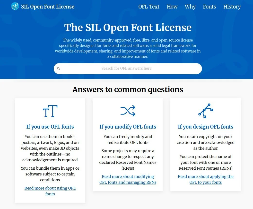
Now, not only is Open Sans not a Monotype typeface, it is available under the SIL Open Font License (OFL) meaning we can use this typeface for literally anything except selling the font itself. So that couldn’t be what this person was talking about.

Screenshot of the SIL Open Font Licence home page. Text below the heading reads, “The widely used, community-approved, free, libre, and open source license specifically designed for fonts and related software: a solid legal framework for worldwide development, sharing, and improvement of fonts and related software in a collaborative manner.”

Next I checked our international retail websites and our project and partnership websites, since all of those have their own branding.

I found that on the websites we directly manage, we use these typefaces:

  • Roboto, available under the SIL OFL

  • Asap, available under the SIL OFL

So no issue there.

And on the websites our partners manage, we use these typefaces:

  • Public Sans, available under the SIL OFL,

  • Network Sans, a custom font created for the government agency that built the website this is used on so they wouldn’t need a licence, and

  • Proxima Nova, the only font that does require a licence, except that Monotype doesn’t sell a licence to it.

So no issue there either.

Promotional graphics displaying the Roboto, Asap, Public Sans, Network Sans, and Proxima Nova typefaces.

With those initial checks done, I reached out to our digital team (who build and manage our websites and apps) with a screenshot of the LinkedIn message I’d received and a summary of my investigation. I asked them how they wanted me to reply.

I needed to check with these folks first because my team and I only look after the corporate website. My employer’s overall digital presence – including the back-end of the corporate website – is managed by the digital team.

Turns out a couple of people from the digital and design teams had received identical messages from this Monotype “Business Development Representative”.

A few internal back-and-forth emails later we decided that:

  • Instead of all of us responding, only one nominated person from the digital team would respond.

  • But before responding, the digital team would do their own investigation into the fonts we use and the licences we own so we could verify everything was in compliance.

Of course that’s not how things actually went down.

Three-panel meme showing Oprah Winfrey pointing at members of her TV talk show audience apparently shouting, at least according to the text captions at the bottom of each panel, “You get a LinkedIn message!”

Fishing (phishing?) around

What the Monotype rep did next is kind of what a malicious hacker does when they’re trying to get someone from your company to click on a link that’ll install malware on your computer. Over the next couple of weeks, the rep messaged a dozen or so more people from different parts of the business, hoping to hook just one person who would reply to the scary message they were sending.

Now I’d already emailed my design, brand, and digital team colleagues to tell them about this mass-messaging campaign and our plan of action for it, but the Monotype rep expanded their campaign to include people from our procurement team, who I hadn’t thought to forewarn.

So not long after, I received a message from one of my procurement team colleagues who’d been forwarded that LinkedIn message from their senior manager with an instruction to deal with this. I explained to my colleague that, as far as I could tell, this Monotype campaign was similar to the domain name scams the procurement team is already familiar with. So please sit tight till our digital team colleagues have completed their audit and then we’ll figure out which one person should start the conversation with Monotype.

But, like any successful phishing campaign, the Monotype rep’s LinkedIn messages eventually reached someone who did respond. This was another person in the procurement team and, just to be completely clear, I don’t blame them for responding. They were just doing their job of protecting our business from potential copyright liability.

Being forced to deal with the issue

Since I’d handed this over to the digital team, I hadn’t kept track of how things were progressing. I was brought back into the discussion when our brand manager included me in an email thread between her and the procurement person who’d responded to Monotype.

I quickly brought this second procurement person up to speed with our earlier plan of action and then I looped in the digital team again. Turns out the digital team had completed their audit, found that we were in compliance, but had gotten busy with other work so no one had responded to Monotype. *sigh*

Screenshot from the TV series ‘Star Trek: The Next Generation’ showing the character of Captain Jean-Luc Picard sitting in the captain’s chair with his hand covering his face, typically referred to as a “face palm” gesture.

Now, of course, everyone was on the back foot because our new procurement rep had shared the PDF that Monotype had sent, listing all the places where we were using Monotype fonts without a proper licence.

And, to quote from the procurement rep’s email:

Supplier has confirmed two options:

Past Use License Agreement is used (PULA) to cover the usage for the period without a license if the software is to be removed.

Process the PULA with a Go Forward license agreement to allow compliant continued use of the fonts in use.

Reading that, I got this procurement rep to quickly convene a meeting with everyone involved, though it turned out the person from the digital team who’d done the font audit had gone on annual leave.

The rest of the digital team didn’t know anything about font licencing and this was the first time this procurement rep was dealing with font licencing as well. So, partly spurred on by their senior manager’s instruction to deal with this, the procurement rep was seriously considering paying the licencing fee that Monotype had asked for, just to make this whole headache go away.

This is where I jumped in and told everyone to hold up. I said I would take the lead on this internally and I would take over the discussion we were having with Monotype as well. The procurement rep, I think somewhat relieved to have this taken out of their hands, agreed.

Why did I insist on taking this over? Two reasons:

  • I’m a bit of a typography nerd so I know what I’m talking about and

  • a quick look at the document Monotype had sent over with the list our alleged copyright infringements had told me that everything the Monotype rep was alleging was wrong.

Screenshot from the film ‘Star Wars: The Rise of Skywalker’ in which the character Luke Skywalker is saying, “Amazing. Every word of what you just said was wrong.”

Never send an AI to do a human’s job

An April 2025 blog post from Studio Twofold’s Jamie Walker titled ‘Unlicensed Fonts: The Hidden Risk in your Branding’ opens with:

Lately, we’ve seen a noticeable uptick in copyright issues related to both images and fonts. Several clients have reached out after receiving emails about fonts [an] agency used on their site years ago.

Naturally, they’re a bit rattled — and with good reason. These kinds of copyright claims can come with hefty fees if you’re found to be in breach.

Further down Jamie writes:

Smaller businesses can get caught off guard — and with AI now scanning the web for even the tiniest copyright infringements, it’s more important than ever to stay protected.

Think they’re only picking on the small guys? Think again. Even giants have been caught out – proving no one is too big to face the music (or in this case, the typography).

Basically, the reason so many organisations are getting out-of-the-blue copyright claims these days is because major copyright holders have started using automated, AI-powered copyright infringement detection software, of which there is a lot out there. *sigh*

Monotype seems to have used one of these products too, because the two fonts its report claimed we were using without a valid licence are:

Let’s take those one at a time, shall we?

Screenshot from the film ‘The Princess Bride’ in which the character Inigo Montoya is saying, “Let me explain. No, there is too much. Let me sum up.”

What’s in a name?

The first thing I did as I read the report was look up the Credit Cards font on MyFonts.com, Monotype’s online store front.

Credit Cards is a pictogram font that contains these icons:

Screenshot from the MyFonts.com website showing the glyphs contained within the Credit Cards font.

When I saw that I thought to myself, “Why would we want to use those icons in our apps?”

Next I read Monotype’s report in detail and saw this screenshot. This is from an analysis of our app’s payload and is the apparent proof that Credit Cards is being used in our smartphone apps:

Screenshot of a table in a PDF file showing a 70 kilobyte size font file with the extension TTF and the filename, “CREDC” followed by three underscore characters.

Having worked with a great many font files over the years, when I saw that filename I thought to myself, “Are we sure that’s actually the Credit Cards font that Monotype claims it is?”

So I checked. I did a web search for fonts with “credit card” in their name and very quickly found one called ‘Credit Card’ – singular – from K-Type. This is a regular text font (as opposed to an icon font) that looks like the raised text that’s printed on credit cards.

Screenshot from the K-Type website showing the description and sales page of a font named Credit Card. The description starts with, “Credit Card is an all capitals font for simulating bank cards.”

Now that I was something I could see us using in our apps.

Happily, Credit Card is free for personal use so I downloaded it and looked at the zip file. And guess what the filename of the font is?

Screenshot of software showing the contents of a zip file. A file among this list is highlighted. Its name is “CREDC” followed by three underscore characters. It has the extension TTF and is approximately 70 kilobytes in size.

Yup, the filename is CREDC___.ttf – which is exactly the filename that was in the app payload analysis from Monotype.

Seeing this, I reached out to my design team contact who then got me in touch with the person who manages our smartphone apps. From them I found out that, sure enough, the only font over and above Open Sans that we use in our smartphone apps is Credit Card by K-Type.

SCORE: Ameel 1, Monotype 0

Proxima Nova, really?

Unlike the Credit Cards font, our use of Mark Simonson’s Proxima Nova was never in contention. We clearly use it in one of our project websites. My employer didn’t actually build that website – we bought this under-construction project from another entity – but this website is very much our responsibility now.

The problem for Monotype here was that it no longer sells licences to Proxima Nova. There was a time you could buy a licence to Proxima Nova from Fonts.com, which was Linotype’s online marketplace. But Monotype bought Linotype and eventually killed off Fonts.com and, some time after that (I don’t know when or why), the font’s designer stopped selling licences to Proxima Nova through MyFonts.com.

Screenshot from the MyFonts website showing a page with an error message that reads, “The font is no longer available for purchase”.

Of course learning this fact didn’t mean that I was just going to stop my investigation. I reached out to a person, who reached out to a person, who reached out to the design agency that designed (and still maintains) our project website. The design agency contact did their own investigation and quickly confirmed that, yes, they do indeed have a licence to use Proxima Nova on this site – one that they had purchased from Adobe several years ago.

SCORE: Ameel 2, Monotype 0

Closing the book on this whole affair

Armed with this knowledge, I got the procurement person to introduce me to the Monotype rep. The rep and one of their colleagues were very eager to talk, replying to this introductory email within fifteen minutes. They wanted to organise a meeting so they could finally get the font licencing agreement signed. Instead what they got was a long email from me in which I explained the situation in detail, complete with annotated screenshots like the one above :)

The Monotype rep chewed on this for a few days and then made one final attempt at getting money out of us. They agreed that they were currently unable to sell a licence to Proxima Nova, but it turns out Monotype is one of K-Type’s authorised resellers and [they] “currently cannot see the license on our files for this use” – meaning there wasn’t a record of us purchasing a licence to Credit Card from Monotype. So could we please “confirm if there is one that we for some reason are unable to see in our systems?”.

*sigh*

I wrote back and told them the reason Monotype doesn’t have a record of this licence is because we purchased a one-off Enterprise Licence directly from K-Type several years ago.

This was several weeks ago and I haven’t heard a peep from them since.

¯\_(ツ)_/¯

Graphic showing cracked green paint on pavement on top of which white coloured text has been overlaid. The text is a quote from Ben Goldacre that reads, “I think you’ll find it’s a bit more complicated than that”.

Two sides to the story

Despite my making light of the situation, I don’t actually hate Monotype for doing this. Using fonts without purchasing a proper license (or purchasing the fonts outright) is stealing and you absolutely should not do it.

The fact that font licensing can be a complicated issue is not an excuse; lots of things are complicated and we figure them out.

More importantly, I think the type designers and type foundries that create fonts should be fairly compensated for their work. Paying for fonts, or an ongoing licence to those fonts, is how you do that.

In short, you should pay for fonts and you should call out people and organisations when they use fonts without a proper licence.

(For completeness’ sake, I should say that I also don’t mind that Monotype used automated systems to find copyright violations. The internet is so large that it’s impossible to manually find all the people who have stolen your stuff!)

It’s not what you do, it’s how you do it

That said, I hate how Monotype’s business development people went about doing this. Much like the blatantly overzealous content blockers on YouTube, the Monotype reps who reached out to us didn’t even bother to verify whether the report their AI spat out at them showed an actual copyright violation or not.

I mean, I know why they didn’t double-check. Just like with scammers and phishers, this is a volume game, not an accuracy or fairness game. You bombard people with messages, scaring them with your (potentially unverified) claims, and eventually some of the thousands of people you’ve messaged will reply. You then rush these folks into paying a licence fee because your targets don’t have enough information about font licencing and, frankly, they just want the problem to go away. This is a shitty way to do business and it reflects poorly on your organisation.

Screenshot from the Nebula.tv website showing a documentary with the title ‘Nebula Sans’. The short description of this documentary reads, “The story of a font built on principle, free to use for anyone who needs it.”

You’re not making any friends

Not that reputation seems to matter too much to popular digital marketplaces – Amazon being the poster child for this. They’re big, they’re arguably enshittified, and all they appear to care about is making as much money as possible.

I mean there’s a reason why so many type designers urge people not to licence fonts – even their own fonts – from MyFonts and instead buy or licence fonts directly from designer and type foundry websites. And, barring that, buying or licencing fonts from smaller, independent stores like Fontspring instead.

This is also why TypeType and Fontstand offer font subscriptions that are alternatives to those from Adobe Fonts and Monotype.

And this is why, for example, the independent video streaming site Nebula was forced to design their custom Nebula Sans font. Nebula’s website and streaming apps used to use the Screen Smart version of the Whitney font from Hoefler&Co. But when Monotype purchased Hoefler&Co, the new Monotype licencing/royalty structure meant that a licence to Whitney was suddenly unaffordable to Nebula. Since paying that (apparently much) higher amount to Monotype wasn’t going to be financially sustainable, Nebula instead paid Paul D. Hunt, the original designer of the excellent Source Sans font, to modify his font so it would be a drop-in replacement for Whitney in all of Nebula’s digital products. And because Source Sans was released under the SIL Open Font License, Nebula also released Nebula Sans under this OFL.

If that’s how much effort folks are willing to make to to avoid using your company, you probably already know that you’re not very well loved.

Screenshot of a website banner that shows the date range, “November 6 – December 4” and reads, in fancy, bright-pink, all capital letters, “cyber sale” and, “shop now”.

What do do?

So what’s my take-away from all this?

  • Don’t use scammy tactics to scare people into purchasing your shit. And if you are going to use those tactics, at least don’t be wrong about it!

  • If anything like this happens to you or your employer, find the relevant nerd in your friend group or organisation and ask for their help.

  • If you can, avoid licencing fonts from Monotype. Get your fonts directly from the original designers and type foundries, or maybe from smaller, independent marketplaces like Fontspring (which has its big annual “cyber sale” on till 4 December, by the way).

  • If you’d rather avoid the hassle of font licencing altogether, then do what my employer did and pick an excellent, versatile OFL font and use that instead. Though, if you want to stand out from the crowd, please consider avoiding the most popular fonts on Google Fonts.

Oh, and while I’m far from an expert on typography, if you need a hand with anything font-related, please reach out. I’d be happy to help in any way that I can :)

Using Joplin to sync notes on Linux

In my last post I talked about being forced to drop Sync.com as my cloud file synchronisation solution when I moved to Linux because Sync doesn’t have a native Linux client. (I now use the excellent, cross-platform Tresorit, fyi.)

You know what I didn’t have to drop when I moved to Linux because it does have an excellent Linux client? Joplin, my open-source, cloud-synchronised note taking solution.

Screenshot of the Joplin website home page. A large graphic at the top of the page explains that "Joplin is an open source note-taking app."

The tools I use to stay in sync

These are all the tools I use to keep my thoughts, notes, lists, tasks, and bookmarks synchronised across my four primary personal devices (desktop computer, laptop computer, tablet, and smartphone) and, when needed, my two work devices (laptop computer and work smartphone).

Long, secure notes: Joplin

The primary tool I use to capture all my thinking, planning, researching, documenting, and cataloguing is Joplin (created and maintained by London-based developer Laurent Cozic).

I love Joplin because:

  • it’s free (though I support its development via a Patreon membership),

  • it’s open source (at least the desktop client is),

  • it’s cross-platform (yay Linux client!),

  • it lets you use a range of back-end cloud storage options to sync your notes (otherwise at heart it’s an offline-first note-taking app),

  • it lets you use Markdown to structure you text, and

  • it provides end-to-end encryption (E2EE) for all you notes.

Unlike a lot of other, and perhaps, more popular note-taking tools – the commercial kind that you have to pay for – Joplin isn’t trying to be the everything-tool for everyone. It does a few things, and it does those well. It is relatively uncomplicated and its apps are all lightweight.

I especially like that you can choose among a bunch of cloud storage options to store and sync your notes in the back end. I already have 1TB of space on OneDrive (through our Microsoft 365 Family subscription) so I use that to sync my notes. And since all my notes are end-to-end encrypted, I have no security or privacy concerns with using OneDrive’s cloud storage for this purpose.

(Joplin has since launched Joplin Cloud to provide its own back-end cloud note-syncing functionality. This back-end synchronisation server is the only part of Joplin that’s not open-source.)

Short, casual notes: Google Keep

I use Google Keep because it consistently has the fastest and most reliable note synchronisation. Also, its lightweight apps works brilliantly on Android, iOS, and the web.

Content in Keep is (surprisingly for Google) private, but I don’t save anything secret here because your notes can still be subpoenaed.

Kanban board: KanbanFlow

KanbanFlow is a simple, lightweight kanban board / project management tool from CodeKick out of Gothenburg, Sweden.

I don’t use this for project management though, I use it to maintain the lists of books, TV series, and movies I want to watch next. (I’ve written about this use case before, if you’re interested.)

If I did need a project management tool though, I’d switch to the paid version of KanbanFlow.

(Trello used to be my preferred kanban tool but its developers kept adding features I didn’t want or need, to the point that it was no longer a fun, easy, lightweight web or smartphone app to use. It got even more complicated to use after Atlassian purchased it and added it to their suite of team-oriented products.)

Screenshot of the KanbanFlow website home page. A heading at the top of the page reads, "Lean project management. Simplified." and, "Boost your personal or team productivity".

Shopping and other lists: Microsoft To Do

Nadia and I have tried a bunch of list-making apps over the years, but Microsoft’s To Do is the simplest, most convenient, and most reliable of the lot.

(Our Family subscription to Microsoft 365 is why this app was even an option for us in the first place, by the way.)

Bookmarks and read-later links: Pinboard

Pinboard is an incredibly simple, very fast, and super efficient, web-based bookmarking tool that lets you bookmark webpages and, importantly, tag them for easy indexing.

It also has an ‘unread’ tag that lets you use this as a place to store all your read-later links. My read-later app of choice used to be the now-defunct Pocket, but I switched to Pinboard a few years ago and never looked back.

(For completeness’ sake I should mention that I use Firefox and Vivaldi browser accounts to sync my day-to-day web bookmarks, browsing history, and browser settings.)

Passwords and TOTP: Bitwarden, Aegis Authenticator

I use the amazing, open-source Bitwarden to generate, store, and sync all my passwords and the fantastic, open-source Aegis Authenticator to generate all my time-based one-time passcodes (TOTP).

Why sync notes in the first place?

Growing up I captured my notes, thoughts, and shopping lists using paper notebooks, notepads, and lined notepaper that I stored and organised in ring binders (complete with dividers and colour-coded tabs).

Once I got a job and stopped needing to carry ring binders around, I took notes on nicer notebooks from Moleskine, Leuchtturm 1917, and Field Notes. These paper-based methods saw me through my bachelors degree, masters degree, several jobs, and even my bullet journaling era (like in the scanned page above).

These days its easier to carry only a smartphone in your pocket instead of also carrying a notepad and pen with you everywhere. I’m more digital than most people, so it was inevitable that my note-taking would go all-digital sooner rather than later.

That switch happened in 2010 when I got an Evernote account and moved all my note-taking online. I loved Evernote because I could easily organise, index, and search through my notes. I could also access all of my notes, all of the time, regardless of where I was and which digital device I happened to be using.

The rise and fall of Evernote

Evernote was great in those early days so I signed up to a Premium subscription in 2012. I loved using it for everything from note taking, to cataloguing recipes, to saving blog posts and newspaper articles for later reading,

But as its desktop, web, and smartphone apps became increasingly complicated, bloated, and slow, the less I wanted to use it.

Evernote eventually went down the enshittification route so I dropped it altogether, as did many others.

Screenshot of an email from Evernote with the heading, "Keep Evernote on all your devices" that explains, "In 30 days you will be able to sync your notes to a maximum of 2 devices using Evernote Basic".

Short foray into OneNote and Google Docs

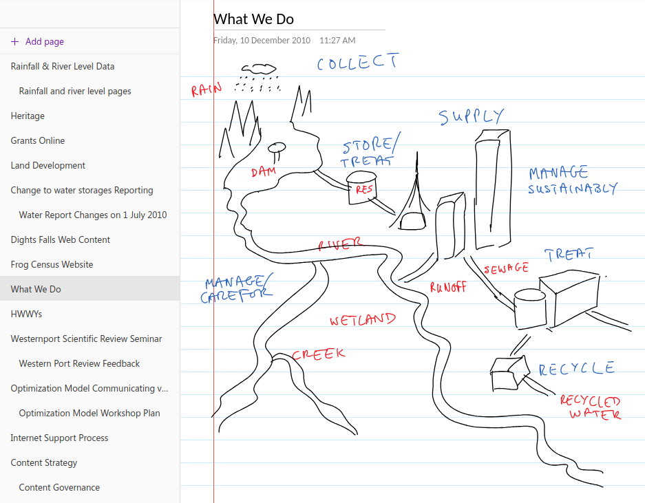
I tried Microsoft’s OneNote for a while because I’d bought a tablet PC and OneNote let me take hand-written notes (using the stylus) on its desktop version – like in the screenshot below.

However OneNote didn’t have cloud sync to begin with, and when that functionality did arrive, is wasn’t particularly good, so I stopped using this too. (It was also always slower than Evernote and too unstructured for my liking anyway.)

Screenshot from the OneNote app showing a page titled 'What We Do' that contains a hand-drawn diagram showing the water cycle from rain to ocean-runoff.

For a while I also explored taking all my notes in Google Docs and storing everything in a specific note-taking folder. This worked fine for some longer, more complicated notes, but it was never convenient for everything. Google Docs is optimised for document writing, not simple note taking, after all.

Settling down with Joplin and, at work, plain text files

Eventually I found Joplin, fell in love with it, and then migrated all my personal notes over in January 2020. I haven’t found, or even needed to look for, a better alternative since.

Funnily enough, a version of that notes-in-Google-Docs idea is what I ended up adopting for note-taking at work. For several years now I’ve been taking all my work notes in plain old text files that I edit using Notepad++ and store in my work OneDrive.

I use a combination of four text files:

  • tasks.txt, in which I maintain a list of daily, weekly, quarterly, and yearly tasks for myself and my team

  • coordination.txt, in which I jot down my meeting notes

  • projects.txt, in which I write notes about the large projects I’m working on

  • people.txt, into which I take notes during the one-on-one meetings I have with my manager and my direct reports

Every Monday I create new versions of those text files (with Monday’s date in the filename), deleting notes from previous weeks that I no longer need for my current work. This way my active files remain short and focused, and it’s still pretty easy for me to search through earlier weeks’ files if I need to find something older.

(I used to use Trello at work for tracking personal tasks, coordinating team tasks, and for managing team projects, but our IT team “rationalised” our suite of tools and now we’re stuck with Microsoft Planner which is…not great.)

Screenshot from OneDrive showing a list of text files in a folder titled 'Meeting notes'. The text files shown are called Projects and Tasks and they all have a date included in the filename.

Investigating alternatives (or not)

I said I haven’t felt the need to look for Joplin alternatives, and that’s true, but I did play around with Standard Notes for a little while. This is a paid service that I thought might be a good, E2EE alternative to Google Keep. Unfortunately it was slow to sync and its app was glitchy on my phone so I didn’t trial it for long.

And before you ask, I’ve never bothered with tools like Notion, Obsidian, Logseq, and their ilk. Those are all too complicated – they’re a “knowledge base”, a “workspace”, and other fancy descriptors like that – plus I feel paid apps like Notion will eventually go down the enshittification route, just like Evernote did. Notion is already touting itself as the “the AI workspace where teams and AI agents get more done together”. Ugh.

Happy days

To summarise, these are the tools I use:

Oh, and I use plain old text files (using Notepad++) for taking notes at work.

It’s taken me a while to get to where I am and I’m very happy with the set of tools I’ve settled on.

Do you have a primary note-taking tool? If so, what is it? I’d love to know.

Using Tresorit to sync files on Linux

The ability to automatically synchronise files across devices via the internet (and also save a copy in the cloud) hasn’t been around for very long.

Heck, most people didn’t have multiple devices to sync files across till the early 2000s. And when we did get start using multiple devices, we used floppy discs, USB sticks, and external hard drives to move our files around.

Early forays: Dropbox and Google Drive

I started my file sync journey in July 2011 with Dropbox, but I moved quickly to Google Drive just two days after Google Drive launched in April 2012.

I upgraded to a paid Google Drive plan in May 2014, which gave me a massive 100GB of storage space. A few storage-space upgrades later and I’m currently on a 2TB plan.

I need all that space because, since 2004, I’ve been storing all my full-resolution camera and smartphone photos and videos on Google Photos (which is part of Google Drive). [1] And Google Drive is still what I use when I need to share large files with folks other than Nadia.

Screenshot of a 2012 email from Google welcoming the recipient to their new Google Drive account.

Private and secure: Sync.com

While I love Google Drive and its technology, it is not a secure place to store your private, sensitive, or secret files. So since December 2019, I’ve been using the excellent Sync.com to securely store and sync my files across devices.

Sync does end-to-end-encryption (E2EE), meaning your files are encrypted before they leave your computer using a passphrase only you know. That means no one at Sync can decrypt your files. Nor, for that matter, can a government that subpoenas your files or a hacker that steals your files from Sync’s servers.

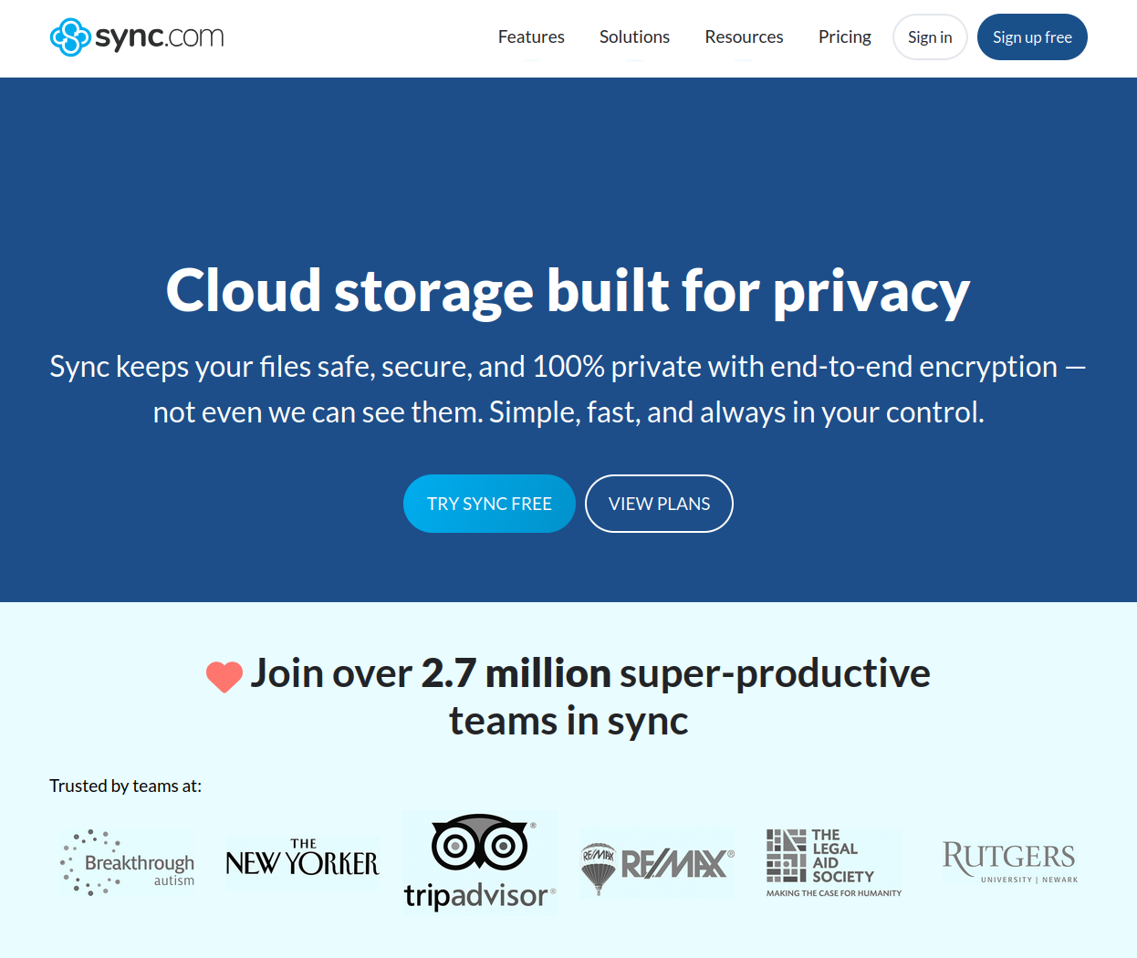
I love Sync and have been using its paid, 2TB storage-space tier for almost six years. Unfortunately, Sync does not have a Linux client. So with my recent switch to MX Linux on my desktop, I needed to find a new, cross-platform cloud sync and storage provider.

Screenshot of the Sync.com website home page. A large graphic at the top of the page has the title, "Cloud storage built for privacy" and text that reads, "Sync keeps your files safe, secure, and 100% private with end-to-end encryption".

Cloud storage vs cloud sync

There are several great cloud storage providers you can use in 2025, but very few that also offer cloud sync functionality. What’s the difference between the cloud storage and sync?

With cloud storage your files are saved primarily in the cloud. This frees up space on your computer, such as a laptop with limited hard drive space, because once you add a file to your cloud storage folder, it gets uploaded to the cloud and then deleted from your local machine.

What you’re left with on your computer is a file link that will automatically download a temporary copy your file when you click on it and then keep this file open in a viewer, player, or editor. The instant you close this file, its new version (if any) will be reuploaded to the cloud and the version left on your computer will be deleted.

With cloud sync your files are saved primarily on your computers. These files are copied to the cloud and then synchronised across the devices that you connect to this service.

Both types of services keep your files in sync, but only cloud sync creates local/offline copies your files and then keeps those in sync across multiple locations (ie your devices and the cloud).

I wanted a cloud sync solution, not a cloud storage solution. I have two 2TB solid-state hard drives and one 8TB spinning hard drive installed in my desktop, I don’t need to free up space here! Importantly, I always want a local copy of all my files.

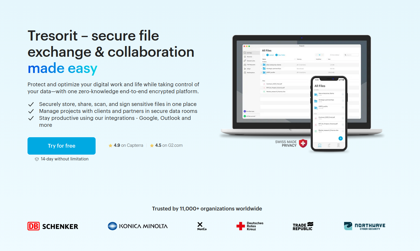
So while I explored and trialled services like pCloud, Internxt, and Dropbox Advanced (which offers E2EE, though only in designated folders), among a few others, the only one that offered actual file syncing in Linux was Swiss Post’s Tresorit.

Screenshot of the Tresorit website home page. A large graphic at the top of the page had the heading, "Tresorit - secure file exchange & collaboration made easy" and a button that reads, "Try for free".

Before you ask…

Before you ask, yes, I could have “rolled my own cloud” using Nextcloud, either at home or with a third-party Nextcloud provider. Doing so was going to be too much of a hassle (plus an additional expense) and I didn’t want the responsibility of managing my own cloud storage.

I could also have used a tool like Cryptomator to encrypt all my files before uploading them to a service like Google Drive (where I already have lots of storage space). I tried this and it didn’t work very well on my Linux install, and I wasn’t going to trust my file sync with something that wasn’t bulletproof. Also, Google Drive only offers cloud storage on Linux, not cloud sync, so that wouldn’t have worked anyway.

Finally, I could have used rclone to encrypt and sync all my files using existing services like Google Drive as the back-end. The configuration and maintenance hassle of setting this up was too much effort. Also, this solution wouldn’t have given me the added functionality of being able to share files securely with Nadia.

Oh, and I couldn’t use something like Syncthing because that only does direct device-to-device file syncing and the devices I wanted to keep in sync weren’t going to be switched on and connected to the internet at the same time. That means I needed a solution with an intermediate cloud-storage step. (And with Syncthing I also wouldn’t have been able to share files security with Nadia.) [2]

The one service I would have used, had it been available for Linux, was Proton Drive since this offers both file sync and E2EE. Nadia and I are also on a Proton Duo plan so this wouldn’t have cost us any extra either. Unfortunately, Proton Drive’s native Linux app isn’t ready yet and probably won’t be ready for another year or two (it’s on the product roadmap but is not a priority).

Photo of a puffy, bright white dog on a leash. The dog is standing in a large, green field and is looking at another dog off camera.

Going all-in on Tresorit

So after weeks of research and testing of multiple tools and online services, I trialled Tresorit and then subscribed to an annual, individual SecureCloud plan with 1TB of storage space. Shortly after that, I signed Nadia up to one of these plans as well.

I have now synced my desktop computer’s Documents, Music, Pictures, Templates, and a few other folders to Tresorit.

On my laptop I’ve done a selective sync and synchronised only the Documents folder. This way the files that I use most often on my laptop, which are all in the Documents folder, are always in sync with my desktop. Meanwhile, all the other (usually larger) files that I don’t use as often are just a quick download away for when I need them on my laptop.

How am I liking Tresorit? I love it!

The initial file upload process took a while – I was uploading around 400GB of data, after all! – but I’ve been using Tresorit for almost two months now and its Linux app is rock solid and its sync speeds are good.

Overall, I am very happy with my decision and I’m glad I found a great alternative to Sync. Yes, I am paying a little more than I was for Sync (a Canadian company), but businesses in Europe tend to pay more taxes and also treat their employees better, and I’m all for supporting healthy, happy, sustainable workplaces :)

Would I recommend Tresorit to others? Absolutely! Especially if you’re after a great, cross-platform, cloud sync (and cloud storage) solution for yourself or your business.


[1] In 2004 this was called Picasa, with its Picasa Web Albums functionality. Google Photos succeeded Picasa in May 2015.

[2] I do, however, use Syncthing to sync files between my desktop and Android phone. These are mainly the FLAC and MP3 files I use to listen to high-resolution music on my phone.

The POSSE approach to your online presence

In 2019 I explained how I was going to decentralise my online presence by cross-posting all my really interesting content to both social media and this blog. Since then I’ve posted all my content here first, and then shared snippets of that everywhere else.

This is not a new idea, of course, and I’ve been preaching variations of this owned-media-first approach for years at the places I’ve worked.

Screenshot of a flow chart from a slide deck. The flowchart shows stories pitched by Jetstar to the media with a wide arrow. A much narrower arrow goes from the media to the audience. Parallel to this is a wide, darker coloured arrow showing stories written on our own platforms. An identically-wide arrow goes from there to the audience, along with a smaller arrow showing stories on our own platforms being picked up by the media.

However this week, thanks to Molly White’s [citation needed] newsletter, I discovered that the phrase that’s been used to describe this approach since 2012 is POSSE, which stands for Publish (on your) Own Site, Syndicate Elsewhere.

I thought I’d note that here and share a few interesting and relevant POSSE-related links:

  • The first item in the ‘Worth a read’ section of [citation needed] ‘Issue 69 – Nice’ (2 Nov 2024) is Molly White’s most recent mention of POSSE.

  • She talked about this approach in more detail in an earlier edition of her newsletter: ‘POSSE: Reclaiming social media in a fragmented world’ (27 Sep 2024).

  • Cory Doctorow is someone who follows the POSSE approach and in his most recent Pluralistic newsletter instalment, ‘Bluesky and enshittification’ (2 Nov 2024), he talks about why he isn’t joining Bluesky.

  • Here are the IndieWeb wiki articles on ‘POSSE’ and ‘PESOS’ (Publish Everywhere, Syndicate (to your) Own Site.

  • Finally, David Pierce wrote a good article in The Verge about POSSE that is worth reading: ‘The poster’s guide to the internet of the future’ (24 Oct 2023).

Close-up photo showing a person typing on a laptop. (@Glenn Carstens-Peters on Unsplash)

Syndicate or post natively?

The one aspect of POSSE I don’t do is the automatic syndication my content to other channels.

While I love using RSS to read content from lots of different sources, I don’t like doing the opposite: using a tool to automatically write content to lots of different sources.

I did use IFFT back in the day to automatically post my Flickr photos to Instagram and Twitter, but I don’t do that anymore.

I enjoy posting natively on the channels I use and, in turn, seeing what everyone else is posting there.

The only automation that comes in handy is Buffer, and that’s to schedule photo posts to Mastodon and Bluesky in the middle of the day when my desktop computer (where all my mirrorless camera photos are saved) is turned off.

It’s not easy, but it’s worth it

If you’re someone who wants more ownership of the content you’re putting into various social media walled gardens, I recommend you check out the POSSE approach and join us in a more decentralised web.

Squarespace sold to private equity

Well, shit.

Squarespace has, for all intents and purposes, been sold to Permira, a British private equity firm, for $6.9 billion. As a result, the company will go private by the end of the year – meaning it’ll no longer be publicly listed on the New York Stock Exchange.

Screenshot of the top of a news article dated 13 May 2024 from the Squarespace Investor Centre with the title ‘Squarespace to Go Private in $6.9B All-Cash Transaction with Permira’.

While I’m happy for CEO Anthony Casalena and his team at Squarespace, being sold to a private equity firm is traditionally a step towards enshittification.

This does me a concern because my personal website (what you’re reading this on/from) is built on Squarespace, as are two other websites that I manage. I love Squarespace and have been a customer since May 2012. I really don’t want to have to move to another no-code web host if this place goes downhill over the next few months or years.

The problem with private equity

“Why might things go downhill?” you ask. Well, when private equity firms buy companies they tend to squeeze all the value out of them before selling them off as empty, discarded shells.

To quote Cory Doctorow:

Fans of the Sopranos will remember the “bust out” as a mob tactic in which a business is taken over, loaded up with debt, and driven into the ground, wrecking the lives of the business’s workers, customers and suppliers. When the mafia does this, we call it a bust out; when Wall Street does it, we call it “private equity.”

Or Nicholas Shaxson, writing in the Guardian:

To their critics, private equity firms are blood-suckers that load healthy companies with debt then asset-strip them, leaving lifeless husks. The private equity titans counter with the opposite tale: they buy underperforming firms, install whizzy IT systems and inject far-sighted management, borrow money to juice up performance, and turn them into roaring engines of capitalism, making everyone rich. As ever, the reality is a mix of the two.

The core of private equity’s problem – for society, but not for its investors – is that many of the tricks in private equity’s toolbox just redistribute the pie upwards, generating immense profits but deepening inequality and sapping growth.

And research tells us that business bought by private equity firms go bankrupt ten times more often than other businesses.

So, yeah. I’m concerned.  

A sliver of hope?

All that said, Casalena is staying on as CEO and Board Chair, and two other major long-term investors are “re-investing” in Squarespace as well. So that might be good news.

And looking through the other technology companies that Permira has invested in, the sense I get is that, while those companies might be somewhat expensive, at least they’re not shit.

So there is hope that we won’t get screwed over too badly.

Not that I’m going to wait to find out. I’ll start playing around with alternatives over the next few months and get ready to move when the time comes. If the time comes. *crosses fingers*


Networking, security & backups in 2024

I made a couple of upgrades to our home network recently so I thought I’d map it out and talk about it a little.

Home network

About a year and a half ago we bought a house. One of its major selling points (at least for me) was that it came pre-wired, with ethernet cables already installed in the walls.

Here’s how I used that to set up our home network – one that provides high quality wired or Wi-Fi internet access in all rooms, bathrooms, and outside areas.

Network diagram titled ‘Home network’. The diagram shows four room locations, one roaming location, and wired ethernet cables in the wall of the house. The garage is where the internet is connected via an NBN modem is. That room also has a router, switch, NAS, and printer – all of which have wired connections. The downstairs living room has a network switch, TV, UHD player, and home theatre – all of which have wired connections. The upstairs retreat has a Wi-Fi extender + switch and TV, UHD player, and home theatre. All but the home theatre have wired connections. The upstairs home office has a desktop with a wired connection. Finally, we have some roaming phones, tablets, laptops, etc that are connected via Wi-Fi.

I had two main goals when planning this network:

  • Put all bandwidth-heavy activities on the wired network. This includes things like 4K media streaming to our TVs and the backing up of large media files from my desktop to the NAS. Doing that leaves the Wi-Fi network free for our laptops, phones, and smart home gadgets.

  • Make sure our work laptops are a single wall away from a Wi-Fi access point. Both Nadia and I work from home at least two days a week and both of us do lots of video conferencing. So our work laptops (which we use upstairs) need to have access to a strong Wi-Fi signal.

Happily I was able to achieve both of those goals.

With this set-up Nadia and I can do simultaneous video conferencing for work without any issues. And I can do things like download hundreds of gigabytes of computer game data to my desktop without interfering with the TV show Nadia that is streaming downstairs.

New router and a UPS

A couple of weeks ago I replaced our ailing primary router (all its ethernet ports had died) with a Synology WRX560. And because our secondary router is a Synology RT2600ac with the latest firmware installed, I’ve been able to configure that as an extender. So now we have a mesh Wi-Fi network throughout the house.

Finally, this weekend I put our primary router, NBN modem, and NAS behind a CyberPower UPS. I’m pretty sure our previous router developed its issues because of recent power surges and outages. This UPS has automatic voltage regulation so it’ll protect our primary networking devices (and NAS) while also giving us about an hour of back-up battery power.

Protecting our data and network

With everything always connected, I need to make sure our devices and gadgets are secure. I do this using the Swiss cheese model of layered network security.

All security layers have some holes (like a slice of Swiss cheese does) but, by adding multiple layers with differently-arranged holes, you can minimize the chance of anything getting through.

In our case we have protections at the router layer, operating system layer, and browser layer.

Screenshot of a diagram titled ‘Security strategy’. The diagram has three columns with icons for browser, operating system, and router. Each column is split into incoming and outgoing directions, with risk mitigation measures listed under each one. The router column has active threat protection, two-factor authentication, and auto lock-out under incoming; and it has Cloudflare DNS under outgoing. The operating system column has active threat protection, full drive encryption, and 3-2-1+ backups under incoming; and it has NextDNS under outgoing. The browser column has password manager, two-factor authentication, DNS over HTTPS, HTTPS-only, and uBlock origin under outgoing.

Incoming controls

Active defense against incoming attacks is managed through threat protection at the router and operating system levels.

Passive defense is managed by using things like full drive encryption (which means upgrading to Windows 11 Pro so we can use BitLocker) and a comprehensive back-up strategy (more on this in a minute).

Outgoing controls

Since malware and ransomware attacks are often triggered by what you do in your browser, we use layers of outgoing security to protect against this:

  • Our primary router is configured to use Cloudflare’s DNS service,

  • our operating systems (in our computers, phones, and tablets) are all configured to use NextDNS, and

  • our web browsers all use uBlock Origin and a bunch of other security and privacy-forward configurations.

Finally, all our online accounts use unique, long, randomly-generated passwords that are managed by the Bitwarden password manager. And we have two-factor authentication set-up (using Aegis) on all the accounts that offer this feature.

Recovering from a disaster

If, in spite of all those protections, things do go horribly wrong – or maybe if there’s a fire or natural disaster – our last line of defence is a comprehensive back-up strategy.

A 3-2-1 back-up strategy – the least you should be aiming for – says you need to have:

  • 3 copies of your data,

  • on 2 different mediums,

  • with at least 1 copy in the cloud.

We have a 4-4-2 back-up strategy with:

  • 4 copies of our data,

  • on 4 different mediums,

  • with 2 copies in the cloud.

Screenshot if a graphic titled ‘Back-up strategy’. The screenshot shows backups from a desktop. There are constant, selective back-ups to a cloud sync location; hourly, selective back-ups to a cloud backup location; and hourly, comprehensive back-ups to a NAS backup location.

How I do it

I use Sync.com to maintain a constant, synchronized copy of all my important files in the cloud. This gives me two copies, on two different mediums, with at least one copy in the cloud.

I then use Arq to simultaneously (a) backup a selection of key files to a cloud storage bucket and (b) backup all my files (which includes large, replaceable media files) to our network attached storage (NAS) at home. So that’s two more copies, on two additional mediums, one of which is in the cloud.

Naturally all these files are encrypted before leaving my computer and access to the NAS and all those cloud services is protected with unique, long, random passwords and two-factor authentication.

Keeping up with our needs

Doing all this takes time and effort, and it doesn’t come cheap. But so much of our lives is online these days that the cost of inaction – and the risk of losing that much of our lives – is much higher than the cost of doing everything I’ve talked about above.

It wasn’t always like this for us, of course. Our cost and effort has kept pace with what we’ve been able to afford along the way. We’re just privileged to be in a position where we can do something this sophisticated and automated. (Gone are the good old days of backing up to multiple 3½ inch floppy disks and, later, USB sticks.)

I hope, regardless of your personal set-up, that you too are doing the best you can to keep yourself connected, but protected.

Journey to my favourite typefaces

I have used and played around with many, many typefaces (and their fonts) over the years. These are my current favourites.

Graphic titled ‘Typefaces I like and that I use more than others’ that shows several typefaces categorised under the headings: ‘Sans used frequently’, ‘Sans used when needed’, ‘Sans used when infrequently’, ‘Mono for text, coding apps’, ‘Mix used on our websites’, ‘Serif used frequently’, ‘Serif used when needed’, ‘Serif used when infrequently’, ‘Serif used for reading’, ‘Slab used as needed’.

How did these become my favourites?

I started, like almost everyone does, by using the default typefaces that come with operating systems and word processors.

Not long after, however, I got into typography in a big way. I bought books, did a lot of online learning, and played around with dozens of typefaces and fonts. I used to build and manage websites for a living, so this was partly professionally motivated.

Over time I upgraded to the more interesting, versatile, and practical typefaces listed above. I thought I’d take this opportunity to share some of the mini typographical journeys I took along the way.

Typeface or font?

Before we continue, there is one thing I should clarify:

  • Typeface = the design of the letterforms and accessories (ie numbers, punctuation)

  • Font = the actual item that produces the letterform, meaning everything from the 12-point piece of metal that gets inked and punched into a piece of paper all the way to the digital file that contains the code for, say, ‘Helvetica Neue Italic’.

To use a book analogy: This Is How You Lose the Time War is the typeface while its hardcover, paperback, EPUB, and PDF versions are its fonts.

Most people’s introduction to typefaces is via the fonts installed on their computer though, so non-design folks tend to use the two words interchangeably. I will not.

Mini typographical journeys

Arial: default typeface in Microsoft Word on Microsoft Windows

Graphic titled ‘Upgrading sans #1 - Arial’. The graphic contains four boxes, grouped by default/free typefaces and purchased/paid typefaces. The four featured typefaces are Arial, Avenir Next LT, Whitney, and Inter.

TOP LEFT: Arial is a well-designed and incredibly useful typeface, and I still use it every day at work (though not by choice). It is, however, a boring default that it is now considered the most neutral of typefaces.

TOP RIGHT: Once I became aware of other, more interesting typefaces, I immediately gravitated towards Avenir as the typeface I’d much rather use instead. Unfortunately, Avenir costs several hundred dollars. Fortunately, Avenir Next has been included as part of Microsoft Office since 2019 and so I now have access to a really good version of this typeface.

BOTTOM RIGHT: Not long after I fell in love with Avenir, I discovered Whitney and fell in love with that even more. Whitney is more practical and versatile than Avenir (at least for my purposes) and is also conveniently packaged for office applications (eg Word and PowerPoint). It costs a lot less than Avenir but is still a decently priced typeface. So yay for getting a bonus at work and treating myself to something nice :)

BOTTOM LEFT: More recently I came across the free and open-source typeface Inter, which is an excellent, more interesting alternative to Arial. (Inter is a version of Roboto that’s been optimised for interfaces, by the way. So a good alternative to this would be Roboto itself.)

Helvetica: default typeface in Microsoft Word on Apple Macintosh

Graphic titled ‘Upgrading sans #2 - Helvetica’. The graphic contains four boxes, grouped by default/free typefaces and purchased/paid typefaces. The four featured typefaces are Helvetica, Frutiger Next, Fact, and Inter.

TOP LEFT: Helvetica, the digitised and slightly upgraded version of Neue Haas Grotesk, is another excellent typeface. But, like Arial, it is now an overused default. (FYI Arial and Helvetica are not the same typeface. [1])

TOP RIGHT: Helvetica is used frequently for signage, but for that purpose I much prefer Frutiger. Frutiger, however, is expensive. Also, its has different revisions and interpretations, each with its own strengths and weaknesses.

BOTTOM RIGHT: Fact is an excellent typeface inspired by Frutiger that costs a lot less and is much more versatile (it has 96 styles and supports 100 languages). It is also on sale these days in case you are interested.

BOTTOM LEFT: Inter (a version of Roboto that’s been optimised for user interfaces) is a great alternative to both Helvetica and Frutiger, and it is also completely free.

Trebuchet MS: my favourite default typeface for creative uses

Graphic titled ‘Upgrading sans #3 - Trebuchet’. The graphic contains four boxes, grouped by default/free typefaces and purchased/paid typefaces. The four featured typefaces are Trebuchet MS, Montserrat, Whitney Narrow, and Ideal Sans.

TOP LEFT: With Arial and Helvetica out of the way, let’s talk about my favourite default typeface: Trebuchet MS [2]. This is a friendly sans serif font that I love to use when writing, and for the longest time it was my default email typeface. Trebuchet MS is also a “web safe font”, meaning it is universally installed across all browsers and devices. Unfortunately, it had its heyday on the web in 2009 and it is quite limited by modern font standards (its bold isn’t particularly bold, for example).

BOTTOM LEFT: Enter Fira Sans, a lovely, comprehensive, well-designed typeface that is much better than Trebuchet MS in all ways. This is my current typeface of choice when using Google Docs.

BOTTOM RIGHT: Lovely as Fira Sans is, I think Whitney Narrow is nicer. When I’m not using Google Docs, I use Whitney Narrow instead of Fira Sans.

TOP RIGHT: The one downside to Whitney Narrow is that it isn’t as rounded and friendly as Trebuchet MS, which brings us to the typeface I use most often these days: Ideal Sans. In fact, I’m writing this post in Microsoft Word using Ideal Sans right now.

Tahoma: my favourite default typeface for professional uses

Graphic titled ‘Upgrading sans #4 - Tahoma’. The graphic contains three boxes, grouped by default/free typefaces and purchased/paid typefaces. The three featured typefaces are Tahoma, Fira Sans, and DIN Next LT.

TOP LEFT: Back in the 1990s when I used Trebuchet MS for all my creative work, I used Tahoma for all my professional work. (Tahoma is basically a narrower, more tightly spaced version of Verdana.)

BOTTOM LEFT: But this too I replaced with the more friendly and full-featured Fira Sans.

BOTTOM RIGHT: In some situations, though, I use DIN. Originally created for road signage, it actually works well in text-dense designs and infographics. In fact, my resume is in DIN.

Verdana: the most legible web safe sans serif typeface

Graphic titled ‘Upgrading sans #5 - Verdana’. The graphic contains three boxes, grouped by default/free typefaces and upgraded/free typefaces. The three featured typefaces are Verdana, Open Sans, and General Sans.

TOP LEFT: Like Trebuchet MS and Tahoma, Verdana was designed as a typeface to be used on computer screens. And, like those two, it is also a core font for the web. I like Verdana. It isn’t particularly friendly or elegant, but it is my typeface of choice for email.

BOTTOM LEFT: Verdana might have been incredibly popular on the web in the 1990s and 2000s, but in the 2010s that crown was taken by the more elegant Open Sans. I like Open Sans too, but OMG is it overused.

TOP RIGHT: If I do need to use a typeface like Verdana or the excellent Montserrat – both of which are a little overused – more often than not I’ll reach for General Sans. Where Verdana is big, with perhaps an overwhelming focus on legibility, General Sans is compact and geometric, but somehow doesn’t look condensed, which I think is cool.

Calibri: the newer default typeface in Microsoft Word

Graphic titled ‘Upgrading sans #6 - Calibri’. The graphic contains three boxes, grouped by default/free typefaces and purchased/paid typefaces. The three featured typefaces are Calibri, Source Sans, and Whitney Narrow.

TOP LEFT: In 2007 Calibri replaced Times New Roman as the default typeface in Microsoft Word. I used Calibri for a while, but I never fell in love with it. After all, its defining character trait is ‘friendly neutral’. By the way, starting in 2024, Aptos will by the new default typeface in Word.

BOTTOM LEFT: Almost immediately after Source Sans was released in 2012, I started using that instead of Calibri. Source Sans is a free, high-quality typeface from Adobe.  

BOTTOM RIGHT: And once I’d bought Whitney Narrow, that took over from Source Sans in most situations.

Times New Roman: the default serif typeface in Microsoft Word

Graphic titled ‘Upgrading serif #1 - Times New Roman’. The graphic contains two boxes, grouped by default/free typefaces and upgraded/free typefaces. The two featured typefaces are Times New Roman and Source Sans.

LEFT: I’ve used Times New Roman a lot over the years and let me tell you that I do not like it very much. Sure it has its uses, but I’ve never been a fan.

RIGHT: As soon as I got my hands on Source Serif, it was all over for Times New Roman.

Garamond: a more elegant typeface that had a terrible font

Graphic titled ‘Upgrading serif #2 - Garamond’. The graphic contains two boxes, grouped by default/free typefaces and purchased/paid typefaces. The two featured typefaces are Garamond and Stempel Garamond LT.

LEFT: I love the Garamond typeface, but the Garamond font that comes with Word is terrible.

RIGHT: The Linotype foundry has an excellent version of Garamond created originally by the Stempel Type Foundry in the 1920s. I snapped up Stempel Garamond LT when it was on sale once and I’ve never looked back.

Georgia: the most legible web safe serif typeface

Graphic titled ‘Upgrading serif #3 - Georgia’. The graphic contains four boxes, grouped by default/free typefaces and purchased/paid typefaces. The four featured typefaces are Georgia, Merriweather, Charter, and Mercury.

TOP LEFT: I like Georgia. It’s not particularly elegant or refined. But like Verdana, with its focus on legibility, it gets the job done. For years my personal website used Georgia for its body text typeface.

BOTTOM LEFT: I love Merriweather. Ever since Google Fonts came on to the scene, I’ve used Merriweather for my website’s body text typeface. Indeed, that’s the typeface you’re reading this in now. [UPDATE: This is no longer true.]

TOP RIGHT: When not publishing online, I will sometimes use Charter as my Georgia replacement. Charter is older than Georgia, and it was designed by Matthew Carter, the same type designer who created both Georgia and Verdana.

BOTTOM RIGHT: When I do need a truly excellent, versatile, and highly legible serif typeface, most of the time I’ll turn to Mercury.

Honourable mentions

I haven’t talked about monospace or slab serif typefaces; this post is long enough as it is. But a couple of quick shout-outs.

Two graphics, side-by-side. One is titled ‘Graphics’ and features the Zilla Slab typeface. The other is titled ‘Coding apps’ and features the JetBrains Mono typeface.

LEFT: Zilla Slab is a free and open-source slab serif typeface created by the Mozilla Foundation. All the headings in the graphics used in this post are set in Zilla Slab.

RIGHT: JetBrains Mono is my coding typeface of choice. I blogged about this a couple of years ago.

Two graphics, side-by-side. One is titled ‘Text apps’ and features the Berkeley Mono and JetBrains Mono typefaces. The other is titled ‘Reading apps’ and features the Literata and Bookerly typefaces.

LEFT: Joplin and Notepad++ are, respectively, my note-taking and text-editing apps of choice. I use monospace typefaces in both. Berkeley Mono is gorgeous and joy to work in. It is a paid typeface, but it’s worth it (I got it on sale when it first launched). JetBrains Mono I’ve already talked about above. It is a free typeface.

RIGHT: Literata is a free and open-source typeface commissioned by Google for its Google Play Books app. Bookerly is a proprietary typeface (though available for download) commissioned by Amazon for its Amazon Kindle e-reader devices and apps.

Two graphics, side-by-side. One is titled ‘Elegant neutral’ and features the Neue Haas Unica typeface. The other is titled ‘Modern slab’ and features the Sentinel typeface.

LEFT: Neue Haas Unica is an elegant hybrid of Helvetica, Univers, and Akzidenz Grotesk. I don’t use this style of typeface very often, which is why it hasn’t come up before, but I do really like this interpretation. Also if you don’t get it as part of a bundle like I did several years ago, Neue Haas Unica is pretty expensive. Which is why it’s much easier to recommend Inter or Roboto everyone. (They’re both free!)

RIGHT: I’m not a big user of old style, Clarendon-esque typefaces, but I do like Sentinel. If nothing else, it pairs brilliantly with Ideal Sans.

Final thoughts

So there you have it. More than you probably wanted or needed to know about why I use the typefaces I do. I don’t know if you had fun reading it, but I enjoyed living it and then telling the mini stories about it. And, of course, I enjoyed creating all those typography graphics since, frankly, that’s half the fun of writing posts like this :)

One last thing I should mention is that, when I bought Whitney a long time ago, I discovered that Hoefler&Co is my favourite type foundry. The folks there created Whitney, Whitney Narrow, Ideal Sans, Sentinel, and Mercury – all of which I’ve bought over the years. I’m pretty sure I’m going to buy more of their typefaces in the future. It’s nice when you find a bunch of designers who really float your boat.

May you find the type foundries, type designers, or even just a bunch of typefaces that bring you joy.


Footnotes

[1] Many people think that Arial is a copy of Helvetica. It is not. Arial is designed to be a drop-in replacement for Helvetica, yes, but it is technically a copy of the older-than-both Akzidenz Grotesk. When Helvetica was created, the designers hoped it would be as popular as Akzidenz Grotesk. More on all that here, if you’re interested.

[2] Trebuchet MS was also inspired by Akzidenz Grotesk.

Strike another one off the list

When you stop supporting your community, your community stops supporting you.

I pay for my favourite social media sites (#privileged) but I now only pay for Tumblr, having cancelled my Twitter subscription earlier (we all know why) and now Reddit.

Screenshot of a pop-up window on a website asking to confirm that the user wants to cancel their (Reddit) Premium subscription.

I fully support platforms working to build multiple revenue streams, by the way, which is why I pay for them in the first place.

Heck, I’ve been paying for Reddit Premium since 2016!

Screenshot of a Reddit ‘trophy case’ box showing four trophies: Ten-Year Club, Gilding V, Verified Email, and Reddit Premium (since July 2016)

But there are ways to charge for usage and then there are ways to charge for usage.

That’s enshittification for you, right? *sigh*

I guess over the next few months we’ll see just how far along the “…and find out” stage we’re at for Reddit.

And I'm back on Flickr

After almost six years of not publishing anything on Flickr, I am now back on that platform.

Why? Because it’s nice to have a presence on a platform that lets you publish a public photo stream. (Unlike Instagram, which I wrote about a few months ago.)

It’s not just that though. Flickr lets you organise your photos into albums and publishes the EXIF metadata of the photos you have uploaded. You can also tag your photos, add them to public galleries, favourite other people’s photos, and even sell your photos.

Basically, it’s a great place to share your photos — and it works well for both amateur and professional photographers alike.

Closing the gap

I’ve now spent the last few days uploading five years’ worth of ‘missing’ photos to my Flickr profile. These are the photos I originally posted only to various social media channels or to this blog.

Now there is no gap between when I stopped publishing photos to Flickr back in 2017 and when I’ve resumed publishing there now (in December 2022).

If you’re someone who follows me on Flickr, I apologise for all the photo spam! Fortunately, that’s all done now.

Diagram showing four timelines. The one on top is labeled ‘Flickr’ and is in two parts. Its first part starts on 2 Mar 2007 and ends on 7 May 2017. Its second part, which is shaded in orange, starts from 30 Dec 2022 and continues to present day. The two middle timelines are labelled ‘Instagram only’ (2017-2019) and ‘Instagram’ (8 Nov 2012 to 9 Apr 2019). The bottom timeline is labelled ‘Random tangent blog’ (1 Jan 2019 to now) and this is also coloured orange.

Double the fun

Going forward I will post all my photos to this blog as well as to Flickr.

And, while you’re welcome to scroll back through this blog to see all the photos I’ve shared over the years, it’ll probably be easier to see them all in one place on Flickr :)

2022 NBN update: 3% faster

Every time we move house my first blog post is always an update on what the NBN internet speeds are at our new place. This time is no exception.

What is different this time is that, instead of renting, we’ve now bought a house in Melbourne’s northern suburbs. (Yay!)

Compared to our last place, the upload and download speeds at our new house are around 3% faster – which is cool.

A graphic titled ‘2022 NBN update: speeds up 3%’. The graphic shows two sets of bar charts, one with a heading of ‘average download speeds’ and the other with a heading of ‘average upload speeds’ — both showing download/upload speeds in megabits per second, or Mbps.

There are six bars in each chart, one each for the years 2009, 2015, 2016, 2018, 2020, and 2022. Both download and upload bars increase dramatically in size from 2009 (when the internet connection types was ADSL) to 2015 (when the internet connection type was FTTB).

The bars were highest in 2018, with 105.2 Mbps download speeds and 37.2 Mbps upload speeds in Kingsville. The connection type in this location was FTTP. In 2022 the bars show 94.7 Mbps download speeds and 18.9 Mbps upload speeds in Melbourne’s north. The connection type in this location is FTTC.

Our NBN connection type is still FTTC though. But that’s okay, the speeds we’re currently getting are sufficient for our needs.

There’s just two of us here, so Nadia and I can stream multiple 4K videos simultaneously without a hitch. And both of us can seamlessly participate in 1080p video conferences at the same time as well.

Of course, the second NBN Co give us the opportunity to upgrade our connection to FTTP, we’ll jump on that straight away :)

For now, though, I’m super happy with what we’ve got.

Medibank data breach

Finally got the email [1] from Medibank saying that my old membership data with them was stolen by cyber criminals.

Screenshot of an email with the heading ‘An important update from Medibank’.

The email reads: “Dear Ameel, We’re deeply sorry to inform you that some data relating to your former membership has been stolen in the recent cybercrime event. This email details what specific membership data was stolen, outlines actions you can take to safeguard your online identity, and the services available through our Cyber Response Support Program”.

The email then goes on to list what categories of data have and have not been stolen. The data stolen is name, gender, date of birth, email, address, phone number, policy number, and passport number. The data not stolen is credit card and banking details, and health claims data.

I left Medibank in 2009 so, with the exception of my name, gender, and date of birth [2], all the other data they have one me is now outdated and irrelevant.

And while it’s not great that various cybercriminals now have this data, in the broader scheme of things ‘tis but a flesh wound. After all, there’s not much that cybercriminals can do with a single old residential address, an old pre-paid phone number, and an expired Pakistani passport number :)

(Why Medibank kept all my customer data thirteen years after I closed my account with them is a whole other issue, of course. *sigh*)


[1] I got the email from them on 15 November 2022.

[2] You can find all this about me using open-source intelligence gathering anyway — like by looking through my social media feeds and seeing when my friends have wished me ‘happy birthday’, for example.

My lost years on Instagram

I’m not a fan of tightly gated internet communities. By ‘tightly gated’ I mean communities (ie social networks) that don’t provide public RSS feeds and also don’t let you view anyone’s content without being logged in yourself.

Instagram is one such gated community.

All my photos used to be publicly accessible

Before 2007 I didn’t publicly share many photos online. Those that I did, I uploaded as albums to this website – like my engagement and wedding photos.

Then in 2007 I joined Flickr and started posting all my photos there. Flickr was an excellent site, and I even had a paid account for several years.

Instagram launched its Android app in April 2012, so a few months later I started posting photos there as well. During this period I cross-posted all my photos to both Instagram and Flickr.

Flickr stagnated, Instagram innovated

Unfortunately, Yahoo! pretty much stopped investing in Flickr. So, while Instagram was becoming increasingly easier and more fun to use, Flickr stayed where it was.

That’s why from 2017 I stopped cross-posting, and instead posted all my photos to Instagram only.

Facebook locked down Instagram

In the earlier days of Instagram you could still browse someone’s profile and look through all their photos without needing an Instagram account yourself. But, over time, Facebook made Instagram an increasingly tighter gated community.

Recognising this was happening, from the start of 2019 I started cross posting all my photos to this blog. That’s where we are now.

Diagram showing four timelines. Three of these are light grey in colour and are labeled ‘Flickr’ (2 Mar 2007 to 7 May 2017), ‘Instagram’ (8 Nov 2012 to 9 Apr 2019), and ‘Random tangent blog’ (1 Jan 2019 to now). One is orange in colour and is labeled ‘Instagram only’ (2017-2019).

Unlocking two years of ‘lost’ photos

What all this means is that I have almost two years’ worth of photos locked inside Instagram’s walled garden. This is what I’m now here to fix.

Over the next four posts I’ll re-share all my Instagram photos from 2017 and 2018 that are currently only available on that platform.

Here goes…

Humans love telling stories

Tom Eastman posted this back in 2018:

Screenshot of a tweet from Tom Eastman posted on 4 December 2018 that reads “I’m old enough to remember when the Internet wasn’t a group of five websites, each consisting of screenshots of text from the other four”.

He’s not wrong, and I get the point he’s trying to make: the internet is full of walled gardens and, by design, it’s difficult to talk across the boundaries.

But a few thousand years ago this could’ve been someone complaining that their valley is a group of five villages, each consisting of people telling stories they heard in the other four.

So while, yes, it is shitty that there isn’t more interoperability across social networks, I think it’s beautiful that humans love sharing stories they’ve seen and heard elsewhere with their own tribes — and that we’ll continue to do so, no matter what walls people build around us for their own financial benefit.

15 years of blogging

Today is my fifteenth blogging anniversary!

Well, at least that’s how long I’ve been blogging on insanityworks.org using syndicated blogging software. Before that I would add occasional life updates to a couple of static pages on this site.

Screenshot of an old webpage with a block of text titled “Summer/Winter 2006 onwards: Melbourne Business School”.

It’s been interesting to see how internet communication has changed over the years that I’ve been doing this. We started with plain blogging (with blog rings for discovery and RSS for pull notifications) and then added microblogging, photo sharing, videoblogging, podcasts, and now mailing lists.

Interest in longform personal blogging dropped off many years ago thanks to the rise of

  • microblogging (tweets take so much less effort to write),

  • photo sharing (super easy to share just a photo with a caption), and

  • video blogging (simultaneously both easier and more difficult to do).

The shuttering of Google Reader only sped things along.

At the same time commercialisation got a lot of personal bloggers to start blogging professionally instead.

Now podcasting is following a similar trajectory: we’ve gone from lots of small personal podcasts to increasingly commercial interests muscling in to this space. And what are TikTok videos if not a mashup of microblogs and video blogs?

Long exposure photo of a train going down a track behind some trees.

There has been movement in both directions though. People write lengthy, threaded microblogs which are basically just longform blogs split into small paragraphs. And lots of branding- and commercially-minded people have moved their writing to subscription-only mailing lists instead of public blogs. So the era of longer writing is having a bit of a comeback.

That said, us personal bloggers have kept on keeping on all these years. There were lean times during which I didn’t blog much, yes, but I’ve been pretty consistent these last few years. And I’m quite happy with the volume and quality of my current blogging output.

So here’s to fifteen more years!

Year in review 2021

Every January I do a review of where I spent my time, money, and attention in the year just ended. This lets me add or remove subscriptions, memberships, recurring payments, and social media follows. It also lets me see if I have any biases or blind spots, or if I’m unknowingly stuck in any kind of echo chamber.

This year I’ve decided to document and share some of my 2021 review.

Podcasts

I subscribed to 41 podcasts in 2021:

  • I listened to every single episode of 83% of them

  • 46% of them I supported financially in one way or another (eg memberships, recurring Patreon support, digital subscriptions, one-off donations)

  • Women and non-binary people hosted 54% of the podcasts I listened to

  • I mostly listened to technology podcasts (eg This Week in Tech, Security Now, Rocket, Command Line Heroes, Darknet Diaries)

People

I directly supported 12 people through recurring payments in 2021:

  • Most of these people are YouTubers (or at least started on that platform)

  • 67% of them identified as female or non-binary

News and information

I paid for eight news and information sources (through recurring subscriptions):

  1. The Guardian

  2. The Conversation

  3. Wired

  4. Quartz

  5. The Sizzle newsletter

  6. CHOICE magazine

  7. Offscreen magazine

  8. Hodinkee magazine

Given that list, it makes sense that Blindspotter thinks my media diet:

  • leans left + centre (with the Conversation, the Guardian, and ABC Australia as my top 3 news sources) and

  • is somewhat narrow (since its sourced mostly from independently owned sources).

(This analysis was based off 53 of my most recent tweets that contained a link to a news article, by the way, so take it with a grain of salt.)

Do I want to engage more with media sources that lean to the right or are owned by large media conglomerates? Not really. Which means I’m quite happy with my current media balance.

My current media diet matches the latest ABC Vote Compass analysis of my political leanings (from the 2019 Australian Federal election) which puts me somewhere between the Greens and the Australian Labor Party. So that checks out.

Subscriptions and donations

I like getting and using things for free, but I pay for what’s important to me and what I can afford at the time.

So over 2021:

Twitter

The social network I participate in the most is Twitter.

Over 2021:

  • I posted 1,010 tweets, 33% of which were replies

  • I tweeted the most in June and August (131 and 139 tweets in those months, respectively)

  • On average my tweets get 198 impressions, and 5.8% of people who see my tweets engage with them (like, reply, retweet, etc)

  • My most popular tweet in 2021 got 45,237 impressions

  • My most engaging tweets in 2021 (of which there were a few) got 33.3% engagement

Overall, I’m happy with how much energy I put into Twitter and how much engagement I have with the people on this social network.

Over the year I also used tools like (the free versions of) Followerwonk and followerAudit to analyse my Twitter graph, which told me interesting things like:

  • I follow more female users (29%) than male users (22%) – though this tool only estimates within the gender binary

  • That said, gender isn’t relevant to most (49%) of the Twitter users I follow (eg they’re not personal accounts)

  • 5.6% of my followers are estimated to be fake, which is lower than the 7% world average

  • 92% of the people I follow have been on Twitter for more than 5 years (I myself have been on Twitter for more than 13 years)

Finally, to get the most out of Twitter, I did these things:

  • I followed really good users and several interesting topics

  • I maintained a bunch of lists to keep my main feed from being overrun by stuff I didn’t want to see all the time (and then I used TweetDeck to track what’s been said by users in those lists)

  • I audited the users I follow, and then did at least two bulk unfollows last year

You have to put in the work if you want to have a good experience on your social network of choice. That’s what I did with Twitter, and that’s why it continues to be one of my favourite places to hang out.

(FYI. Most of the rest of my online energy goes into YouTube, Reddit, tumblr, and the broader decentralised, RSS-based web via NewsBlur.)

Where to from here?

I did do more analysis than this, but I’m not going talk about it all here.

Though maybe I should mention that the ‘Wedding song lyrics’ page on this website continues to be the most popular page year after year. I’m glad I refreshed it a few months ago, correcting some lyrics and adding audio references for all the songs I’ve catalogued there.

What I’ll do now is spend the next few days unfollowing and unsubscribing on Twitter, Reddit, YouTube, NewsBlur, and email. That should be fun, and it’ll help get 2022 off to a good start.

I intend to have a fantastic 2022 and I trust you do too. I hope this year exceeds all your expectations and that you have a truly fantabulous time!

Picking a typeface for writing code

Do you have a favourite typeface for writing code? (Assuming you write code, of course.)

If not, CodingFont is a brilliant website that will help you find your preferred coding typeface — tournament style!

The process is simple and elegant: you compare code written in two popular coding typefaces side-by-side, then you pick the one you prefer. Do this over and over again and, through the process of elimination, you’re left with the coding typeface you like the most.

In my case that’s JetBrains Mono. (Though I’m also happy to code in both Fira Code and Source Code Pro.)

I love typography and have literally spent days pouring over typefaces, comparing them closely, and then picking the ones I want to use in different scenarios. Like this comparison I did when I wanted to select a typeface for all the charts and diagrams I post on this blog:

Which is why all my charts and diagrams are now in Fira Sans or Ideal Sans. (Where they used to be in DIN Next or Open Sans.)

CodingFont lets you do this type of side-by-side comparison without any of the hassle. So, if you’re a coder – or even someone who regularly uses monospaced fonts – then this is totally worth a try.

Have fun!

2020 NBN update: now with FTTC

I’ve been tracking the NBN speeds we’ve been getting in the last four houses we’ve lived in. (NBN is Australia’s National Broadband Network, by the way.)

Since 2015, when we swapped our ADSL connection for the NBN, every time we’ve moved house our speeds have been gotten better. That’s mainly because, when picking a place to rent, we’ve only looked at houses with Fibre to the Premises (FTTP) connections. (Also because the NBN network itself has been getting incrementally better.)

This time, because we wanted a specific type of house within our price range, we decided to compromise a little and go for a place with a Fibre to the Curb (FTTC) connection. The performance of FTTC connections depends very much on how far your house is from the fibre-optic distribution point on your street. We lucked out and found a house we wanted to rent that is directly across the street from one of these points.

Speeds I can live with

Compared to the house we just moved from, our download have dropped only 12.7% to 91.9Mbps, which I’m super happy about.

Unfortunately our upload speeds dropped by 51.2% to 18.5Mbps, which isn’t ideal.

Given how much time Nadia and I spend on video conference calls for work, this drop in upload speeds might be an issue if we’re both on a video call at the same time. I guess we’ll wait and see how the connection performs when that situation arises in the next few weeks.

Other changes: latency, technology

There are two other differences compared to our previous NBN connection.

First, our connection latency has increased 78% from 3ms to 5ms. You don’t notice that too much day-to-day, though, so this hasn’t been an issue so far.

Second, given the technology change from FTTP to FTTC, we had to change modems because the fantastic Synology RT2600ac we were using doesn’t support VLANs (virtual local area networks).

UPDATE (24 Aug 2022): With a firmware upgrade to SRM 1.3, the Synology RT2600ac router does now support VLANs (announcement; feature support; configuration info). A big thank-you to to Craig in the comments for letting me know about this update!

FTTC is more of a shared connection than FTTP, so you need to use a VLAN-capable modem to connect to the internet. But all is well because I quickly bought a Netgear Nighthawk AX8, which is an equally fantastic modem that does support VLANs (and, specifically, 802.1Q VLAN tagging).

(If any of you are wanting to connect your Netgear Nighthawk AX8 to an FTTC connection, by the way, follow the configuration that rhys375 figured out you need to get this working.)

A mixed bag, but I’m okay with it

Overall I’m comfortable with our new speeds. I might think differently if we have issues with simultaneous video conferencing, but I don’t expect this to be a major issue.

So, onwards and only slightly downwards! And let’s hope the NBN network keeps getting better and better as time goes by.

Bypassing the YouTube recommendation algorithm

How many times have you watched a YouTube video that’s ended with a variation of this phrase: “please like and subscribe, and remember to click that bell icon so you get notified every time I upload a new video”?

If you watch YouTube as much as I do [1], you hear this All. The. Time.

What’s with the bell icon?

Why are YouTubers so insistent that viewers clicking that bell icon?

Veritasium (Derek Muller) explains this in his recent ‘My Video Went Viral. Here's Why’ video. In that he presents his “theory of everything when it comes to YouTube”. If you’re a big watcher of YouTube videos, I highly recommended you watch it.

But, basically: clicking that bell icon is great because doing so lets you, essentially, bypass part of YouTube’s recommendation algorithm (while also, technically, giving it more data). This, of course, is the algorithm that, among other things, determines which eight recommended videos you’ll see at the top of your YouTube home page.

If, however, you watch videos from your favourite channel by clicking on a YouTube notification instead, two things happen.

  1. You don’t have to wait for your favourite channel’s newest video to appear in your recommendations list. This is great because now you don’t miss a video just because the algorithm determined, for whatever reason, to not feature that video in your top recommendations.

  2. Once you’ve watched the videos from your favourite channels, YouTube doesn’t need to recommend them to you anymore. That means it can now recommend other things in your recommendations list. Which, depending on how you look at it, can be an excellent outcome.

But…I use an older magic

That, however, is not the method I use. It would make sense if I did – I do subscribe to 454 channels on YouTube, after all. But I really don’t want to be bombarded with all those notifications and emails.

Instead, I use a much older, much simpler, and much less obtrusive way of keeping track of every video a channel uploads: RSS.

Yes, I subscribe to the RSS feed of all the channels I want to watch most (if not all) the videos from :)

Some of the learning and science YouTube channels (and blogs) that I subscribe to.

Some of the learning and science YouTube channels (and blogs) that I subscribe to.

Depending on which RSS news reader you use, this is super easy to do. My reader of choice is NewsBlur so all I need to do is copy-paste a YouTube channel’s URL into NewsBlur’s add-feed dialog and, voilà, I am subscribed to a full feed of this channel’s videos.

So, if you’re someone who watches a lot of YouTube and also uses an RSS feed reader, I highly recommend you give this method a try. It will make your life much easier and you’ll be free of those pesky notifications.

[1] About and hour and half a day, on average.