Using Joplin to sync notes on Linux

In my last post I talked about being forced to drop Sync.com as my cloud file sync solution when I moved to Linux because Sync doesn’t have a native Linux client. (I now use the excellent, cross-platform Tresorit, fyi.)

You know what I didn’t have to drop when I moved to Linux because it does have an excellent Linux client? Joplin, my open-source, cloud-synchronised note taking solution.

Screenshot of the Joplin website home page. A large graphic at the top of the page explains that "Joplin is an open source note-taking app."

The tools I use to stay in sync

These are all the tools I use to keep my thoughts, notes, lists, tasks, and bookmarks synchronised across my four primary personal devices (desktop computer, laptop computer, tablet, and smartphone) and, when needed, my two work devices (laptop computer and work smartphone).

Long, secure notes: Joplin

If there’s one, primary tool I use to capture all my thinking, planning, researching, documenting, and cataloguing, it’s Joplin (created and maintained by London-based developer Laurent Cozic).

I love Joplin because:

  • it’s free (though I support its development via a Patreon membership),

  • it’s open source (at least the desktop client is),

  • it’s cross-platform (yay Linux client!),

  • it lets you use a range of back-end cloud storage options to sync your notes (otherwise at heart it’s an offline-first note-taking app),

  • it lets you use Markdown to structure you text, and

  • it provides end-to-end encryption (E2EE) for all you notes.

Unlike a lot of other, and perhaps, more popular note-taking tools – the commercial kind that you have to pay for – Joplin isn’t trying to be the everything-tool for everyone. It does a few things, and it does those well. It is relatively uncomplicated and its apps are all lightweight.

I especially like that you can choose among a bunch of cloud storage options to store and sync your notes in the back end. I already have 1TB of space on OneDrive (through our Microsoft 365 Family subscription) so I use that to sync my notes. And since all my notes are end-to-end encrypted, I have no security or privacy concerns with using OneDrive’s cloud storage for this purpose.

(Joplin has since launched Joplin Cloud to provide its own back-end cloud note-syncing functionality. This back-end synchronisation server is the only part of Joplin that’s not open-source, by the way.)

Short, casual notes: Google Keep

I use Google Keep because it consistently has the fastest and most reliable note synchronisation. Also, its lightweight app works brilliantly on Android, iOS, and the web.

Content in Keep is (surprisingly for Google) private, but I don’t save anything secret here because your notes can still be subpoenaed.

Kanban board: KanbanFlow

KanbanFlow is a simple, lightweight kanban board / project management tool from CodeKick out of Gothenburg, Sweden.

I don’t use this for project management though, I use it to maintain the lists of books, TV series, and movies I want to watch next. (I’ve written about this use case before, if you’re interested.)

If I did need a project management tool though, I’d switch to the paid version of KanbanFlow.

(Trello used to be my preferred kanban tool but its developers kept adding features I didn’t want or need, to the point that it was no longer a fun, easy, lightweight web or smartphone app to use. It got even more complicated to use after Atlassian purchased it an added it to their suite of team-oriented products.)

Screenshot of the KanbanFlow website home page. A heading at the top of the page reads, "Lean project management. Simplified." and, "Boost your personal or team productivity".

Shopping and other lists: Microsoft To Do

Nadia and I have tried a bunch of list-making apps over the years, but Microsoft’s To Do is the simplest, most convenient, and most reliable of the lot. (Our Family subscription to Microsoft 365 is why this app was even an option in the first place, by the way.)

Bookmarks and read-later links: Pinboard

Pinboard is an incredibly simple, very fast, and super efficient, web-based bookmarking tool that lets you bookmark webpages and, importantly, tag them all for easy indexing.

It also has an ‘unread’ tag that lets you use it as a place to store all your read-later links. My read-later app of choice used to be the now-defunct Pocket, but I switched to Pinboard a few years ago and never looked back.

(For completeness’ sake I should mention that I use Firefox and Vivaldi browser accounts to sync my day-to-day web bookmarks, browsing history, and browser settings.)

Passwords and TOTP: Bitwarden, Aegis Authenticator

I use the amazing, open-source Bitwarden to generate, store, and sync all my passwords and the fantastic, open-source Aegis Authenticator to generate all my time-based one-time passcodes (TOTP).

Why sync notes in the first place?

Growing up I captured my notes, thoughts, and shopping lists using paper notebooks, notepads, and lined notepaper that I stored and organised in ring binders (complete with dividers and colour-coded tabs). Once I got a job and stopped needing to carry ring binders around, I took notes on nicer notebooks from Moleskine, Leuchtturm 1917, and Field Notes. These paper-based methods saw me through my bachelors degree, masters degree, several jobs, and even my bullet journaling era.

These days its easier to carry only a smartphone in your pocket instead of also carrying a notepad and pen with you everywhere. I’m more digital than most people, so it was inevitable that my note-taking would go all-digital sooner rather than later.

That switch happened in 2010 when I got an Evernote account and moved all my note-taking online. I loved Evernote because I could easily organise, index, and search through my notes. Also, I could access all of my notes, all of the time, regardless of which digital device I happened to be using.

The rise and fall of Evernote

Evernote was great in those early days so I signed up to a Premium subscription in 2012. I loved using it for everything from note taking, to cataloguing recipes, to saving blog posts and newspaper articles for later reading,

But as its desktop, web, and smartphone apps became increasingly complicated, bloated, and slow, the less I wanted to use it.

Evernote eventually went down the enshittification route so I dropped it altogether, as did many others.

Screenshot of an email from Evernote with the heading, "Keep Evernote on all your devices" that explains, "In 30 days you will be able to sync your notes to a maximum of 2 devices using Evernote Basic".

Short foray into OneNote and Google Docs

I tried Microsoft’s OneNote for a while because I’d bought a tablet PC and OneNote let me take hand-written notes (using the stylus) on its desktop version. However OneNote didn’t have cloud sync to begin with, and when that functionality did arrive, is wasn’t particularly good, so I stopped using this too. (It was also always slower than Evernote and too unstructured for my liking.)

Screenshot from the OneNote app showing a page titled 'What We Do' that contains a hand-drawn diagram showing the water cycle from rain to ocean-runoff.

For a while I also explored taking all my notes in Google Docs and storing everything in a specific note-taking folder. This worked fine for some longer, more complicated notes, but it was never convenient for everything. Google Docs is optimised for document writing, not simple note taking, after all.

Settling down with Joplin and, at work, plain text files

Eventually I found Joplin, fell in love with it, and then migrated all my personal notes over in January 2020. I haven’t found, or even needed to look for, a better alternative since.

Funnily enough, a version of that notes-in-Google-Docs idea is what I ended up adopting for note-taking at work. For several years now I’ve been taking all my work notes in plain old text files that I edit using Notepad++ and store in my work OneDrive.

I use a combination of four text files:

  • tasks.txt in which I maintain a list of daily, weekly, quarterly, and yearly tasks for myself and my team

  • coordination.txt in which I jot down my meeting notes

  • projects.txt in which I write notes about the large projects I’m working on

  • people.txt into which I take notes during the one-on-one meetings I have with my manager and my direct reports

Every Monday I create new versions of those text files (with Monday’s date in the filename), deleting notes from previous weeks that I don’t need for any of my current work. This way my current files remain short and focused, and it’s still pretty easy for me to search through earlier weeks’ files if I need to find something older.

(I used to use Trello at work for tracking personal tasks, coordinating team tasks, and for managing team projects, but we our IT team “rationalised” our suite of tools and now we’re stuck with Microsoft Planner which is…not great.)

Screenshot from OneDrive showing a list of text files in a folder titled 'Meeting notes'. The text files shown are called Projects and Tasks and they all have a date included in the filename.

Investigating alternatives (or not)

I said I haven’t felt the need to look for Joplin alternatives, and that’s true, but I did play around with Standard Notes for a little while. This is a paid service that I thought might be a good, end-to-end encrypted alternative to Google Keep. Unfortunately it was slow to sync and its app was glitchy on my phone so I didn’t trial it for long.

And before you ask, I’ve never bothered with tools like Notion, Obsidian, Logseq, and their ilk. Those are all too complicated – they’re a “knowledge base”, a “workspace”, and other fancy descriptors like that – plus I feel like paid apps like Notion will eventually go down the enshittification route, just like Evernote did. Notion is already touting itself as the “the AI workspace where teams and AI agents get more done together”. Ugh.

Happy days

To summarise, these are the tools I use:

Oh, and I use plain old text files (using Notepad++) for taking notes at work :)

It’s taken me a while to get to where I am and I’m very happy with the set of tools I’ve settled on :)

Do you have a primary note-taking tool? If so, what is it? I’d love to know.

Using Tresorit to sync files on Linux

The ability to automatically synchronise files across devices via the internet (and also save a copy in the cloud) hasn’t been around for very long.

Heck, most people didn’t have multiple devices to sync files across till the early 2000s. And when we did get start using multiple devices, we used floppy discs, USB sticks, and external hard drives to move our files around.

Early forays: Dropbox and Google Drive

I started my file sync journey in July 2011 with Dropbox, but I moved quickly to Google Drive just two days after Google Drive launched in April 2012.

I upgraded to a paid Google Drive plan in May 2014, which gave me a massive 100GB of storage space. A few storage-space upgrades later and I’m currently on a 2TB plan.

I need all that space because, since 2004, I’ve been storing all my full-resolution camera and smartphone photos and videos on Google Photos (which is part of Google Drive). [1] And Google Drive is still what I use when I need to share large files with folks other than Nadia.

Screenshot of a 2012 email from Google welcoming the recipient to their new Google Drive account.

Private and secure: Sync.com

While I love Google Drive and its technology, it is not a secure place to store your private, sensitive, or secret files. So since December 2019, I’ve been using the excellent Sync.com to securely store and sync my files across devices.

Sync does end-to-end-encryption (E2EE), meaning your files are encrypted before they leave your computer using a passphrase only you know. That means no one at Sync can decrypt your files. Nor, for that matter, can a government that subpoenas your files or a hacker that steals your files from Sync’s servers.

I love Sync and have been using its paid, 2TB storage-space tier for almost six years. Unfortunately, Sync does not have a Linux client. So with my recent switch to MX Linux on my desktop, I needed to find a new, cross-platform cloud sync and storage provider.

Screenshot of the Sync.com website home page. A large graphic at the top of the page has the title, "Cloud storage built for privacy" and text that reads, "Sync keeps your files safe, secure, and 100% private with end-to-end encryption".

Cloud storage vs cloud sync

There are several great cloud storage providers you can use in 2025, but very few that also offer cloud sync functionality. What’s the difference between the cloud storage and sync?

With cloud storage your files are saved primarily in the cloud. This frees up space on your computer, such as a laptop with limited hard drive space, because once you add a file to your cloud storage folder, it gets uploaded to the cloud and then deleted from your local machine.

What you’re left with on your computer is a file link that will automatically download a temporary copy your file when you click on it and then keep this file open in a viewer, player, or editor. The instant you close this file, its new version (if any) will be reuploaded to the cloud and the version left on your computer will be deleted.

With cloud sync your files are saved primarily on your computers. These files are copied to the cloud and then synchronised across the devices that you connect to this service.

Both types of services keep your files in sync, but only cloud sync creates local/offline copies your files and then keeps those in sync across multiple locations (ie your devices and the cloud).

I wanted a cloud sync solution, not a cloud storage solution. I have two 2TB solid-state hard drives and one 8TB spinning hard drive installed in my desktop, I don’t need to free up space here! Importantly, I always want a local copy of all my files.

So while I explored and trialled services like pCloud, Internxt, and Dropbox Advanced (which offers E2EE, though only in designated folders), among a few others, the only one that offered actual file syncing in Linux was Swiss Post’s Tresorit.

Screenshot of the Tresorit website home page. A large graphic at the top of the page had the heading, "Tresorit - secure file exchange & collaboration made easy" and a button that reads, "Try for free".

Before you ask…

Before you ask, yes, I could have “rolled my own cloud” using Nextcloud, either at home or with a third-party Nextcloud provider. Doing so was going to be too much of a hassle (plus an additional expense) and I didn’t want the responsibility of managing my own cloud storage.

I could also have used a tool like Cryptomator to encrypt all my files before uploading them to a service like Google Drive (where I already have lots of storage space). I tried this and it didn’t work very well on my Linux install, and I wasn’t going to trust my file sync with something that wasn’t bulletproof. Also, Google Drive only offers cloud storage on Linux, not cloud sync, so that wouldn’t have worked anyway.

Finally, I could have used rclone to encrypt and sync all my files using existing services like Google Drive as the back-end. The configuration and maintenance hassle of setting this up was too much effort. Also, this solution wouldn’t have given me the added functionality of being able to share files securely with Nadia.

Oh, and I couldn’t use something like Syncthing because that only does direct device-to-device file syncing and the devices I wanted to keep in sync weren’t going to be switched on and connected to the internet at the same time. That means I needed a solution with an intermediate cloud-storage step. (And with Syncthing I also wouldn’t have been able to share files security with Nadia.) [2]

The one service I would have used, had it been available for Linux, was Proton Drive since this offers both file sync and E2EE. Nadia and I are also on a Proton Duo plan so this wouldn’t have cost us any extra either. Unfortunately, Proton Drive’s native Linux app isn’t ready yet and probably won’t be ready for another year or two (it’s on the product roadmap but is not a priority).

Photo of a puffy, bright white dog on a leash. The dog is standing in a large, green field and is looking at another dog off camera.

Going all-in on Tresorit

So after weeks of research and testing of multiple tools and online services, I trialled Tresorit and then subscribed to an annual, individual SecureCloud plan with 1TB of storage space. Shortly after that, I signed Nadia up to one of these plans as well.

I have now synced my desktop computer’s Documents, Music, Pictures, Templates, and a few other folders to Tresorit.

On my laptop I’ve done a selective sync and synchronised only the Documents folder. This way the files that I use most often on my laptop, which are all in the Documents folder, are always in sync with my desktop. Meanwhile, all the other (usually larger) files that I don’t use as often are just a quick download away for when I need them on my laptop.

How am I liking Tresorit? I love it!

The initial file upload process took a while – I was uploading around 400GB of data, after all! – but I’ve been using Tresorit for almost two months now and its Linux app is rock solid and its sync speeds are good.

Overall, I am very happy with my decision and I’m glad I found a great alternative to Sync. Yes, I am paying a little more than I was for Sync (a Canadian company), but businesses in Europe tend to pay more taxes and also treat their employees better, and I’m all for supporting healthy, happy, sustainable workplaces :)

Would I recommend Tresorit to others? Absolutely! Especially if you’re after a great, cross-platform, cloud sync (and cloud storage) solution for yourself or your business.


[1] In 2004 this was called Picasa, with its Picasa Web Albums functionality. Google Photos succeeded Picasa in May 2015.

[2] I do, however, use Syncthing to sync files between my desktop and Android phone. These are mainly the FLAC and MP3 files I use to listen to high-resolution music on my phone.

Why I picked MX Linux over other Linux distros

When I moved my desktop PC from Windows to Linux a few months ago, the Linux distribution I picked was MX Linux. In this post I explain why.

What’s a Linux distribution?

In case you’re new to Linux and don’t know what a “distribution” is:

A Linux distribution, often shortened to “distro,” is a packaged version of Linux that comes with the Linux kernel plus a collection of software and utilities that make the OS functional and user-friendly.

If you want to know more, here are a few resources to get you up started, with the quote above coming from the first one in this list:

Graphic showing the logos and titles of nine Linux distributions: Linux Mint, Ubuntu, MX Linux, Arch Linux, Gentoo Linux, Slackware, Debian, Fedora, openSUSE

How do you choose a Linux distro?

There are hundreds, if not thousands, of blog posts, articles, and videos on how to choose a Linux distro that’ll work best for you.

Here are two good articles:

And if you’re already familiar with Linux, here’s an excellent interactive guide (available in 19 languages, no less!) that walks your through the process:

Most of these resources ask you to consider a bunch of factors that will help you create a short list of distros to try.

Narrowing down the list of suitable distros

I used a combined list of those decision-factors to add and remove distros from my eventual shortlist.

My level of experience with Linux: intermediate-to-advanced. I have enough experience with Linux that I am comfortable diagnosing issues and looking/asking for help. This let me keep specialised and potentially complicated distros in my list.

Effort I want to make in building and maintaining my system: low-to-medium. Even though I can, I don’t want to do lots of tinkering and exploring with my operating system (OS). I just want my OS to disappear into the background while I do other things. Because of this, I removed most specialised and complicated distros from my list.

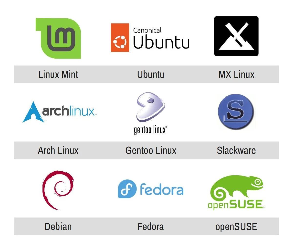
Package management preference, if any: ideally, APT. This let me remove all Arch-based distros from my shortlist, for example (though that was partly also in response to the effort question, above).

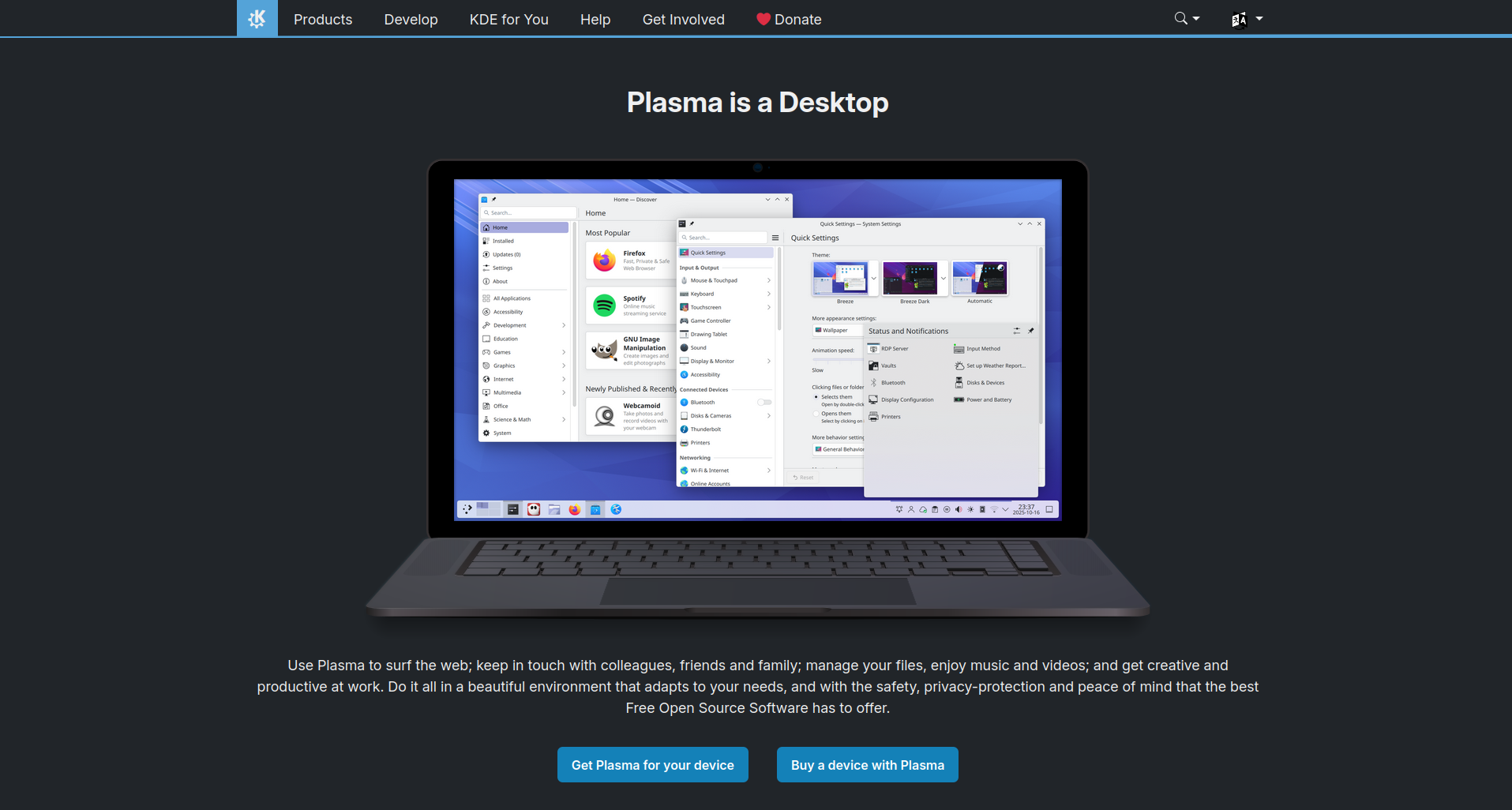
Operating system look-and-feel (eg for people new to Linux, we ask: Windows-like or Mac-like?): Windows-like, though highly customisable. Basically, I wanted to use KDE Plasma as my desktop environment. I kind of also didn’t have a choice because, unlike GNOME and Cinnamon, KDE does an actually good job with fractional scaling (eg scaling the whole screen up to 125%) and I needed this functionality for my laptop. [1]

Hardware compatibility requirements (especially if you have much older or much newer hardware): mixed. My desktop computer is only a year old, with an NVIDIA RTX4080 graphics card, so I needed a distro that could support recent hardware. This removed a bunch if distros from contention. My desktop is also attached to an ultra-widescreen monitor that supports high dynamic range (HDR) colour. I was hoping to find a distro that could take full advantage of this capability but, sadly, that was not to be and I’ve had to switch my monitor to its standard dynamic range (SDR) mode. My peripherals, on the other hand, are either older or more readily compatible with Linux so none of those were an issue. Finally, I wanted to run the same distro on my desktop and my laptop, but my laptop is an older (2021), refurbished Lenovo ThinkPad so that was never going to pose any compatibility issues.

Software compatibility requirements (only really relevant if you’re a gamer, coder, multimedia creator, or other type of specialist user; or someone with specific accessibility requirements): gamer/multimedia creator. I wanted the ability to play games through Steam (nothing very new or resource-intensive) and the ability to do multimedia editing (audio, video, photography). I didn’t need a gaming- or multimedia-focused distro to do all this though, so these requirements didn’t add or remove anything from the list.

Default software preferences: none. I’m happy to install all the software I need (ie I don’t need my distro to pre-install anything for me), so this preference didn’t add or remove anything from the list either.

Distro community size (aka your potential tech support needs, because larger and more well-known distros tend to have more users, a wider install base, and more online answers to questions you might have along the way): medium-to-large. Because my desktop hardware is relatively new, I knew I’d need a bit of support for it, so I wanted a more tried-and-true distro. This eliminated a bunch of smaller distros. Though, as luck would have it, I’d end up eliminating almost all the super-popular distros for other reasons. Oh well.

System stability (which basically boils down the the choice between a super stable OS or one that gets more frequent OS and software updates): more stable than not. I like using the latest and greatest software and hardware, but I don’t need to do so. And while I didn’t particularly want to be on an Long Term Support (LTS) release schedule, which is typically on a two-year cycle, I also didn’t want to be on a rolling release, in which new features added as soon as they’re stable enough.

FOSS ideological preferences: no strong preference. I prefer to use free and open-source (FOSS) software over proprietary software whenever I can, but I’m perfectly happy to use proprietary software as well.

Big-tech ideological preferences: avoid big-tech as much as possible. I’m trying hard to stay away from “big tech” as much as I can – that term being relative in the Linux world. I don’t like larger companies that enshittify their products or try to throw their weight around in the community. This basically meant avoiding Canonical, and therefore all flavours of Ubuntu, and IBM-owned Red Hat, which makes only enterprise versions of Linux so none of their products were in contention anyway. (openSUSE is the only large tech company in the Linux space that I like.)

Willingness to pay: happy to. Almost all end-user Linux distros are free, but a couple charge an optional small amount to help fund their development and I’m someone who regularly provides financial support to the software and online services that I use. So when I came across a Zorin OS Pro – a very polished, very Windows-like distro that charges an optional one-time payment of AUD $78 – it jumped to the top of my list before being quickly eliminated because it uses GNOME and not KDE. Oh well.

Privacy preferences: consumer-level strict. Most Linux distros offer great privacy, but a handful connect to third-parties or collect telemetry data, meaning they have the ability to track how you’re using your computer. I absolutely do not want to use technology that tracks me, but I’m also not a privacy nut – meaning I’m not going to use Tails or Kali Linux, which I would say are “professional-level strict” with their privacy and security. This basically just meant that I eliminated all the distros created by Canonical.

Creating my shortlist

Since the KDE Plasma desktop environment is such a foundational part of my requirements, I first searched for the most recommended KDE-based distros [2] and came up with this initial shortlist – though each entry came with caveats:

  • Kubuntu. Kubuntu is a Canonical product so I couldn’t use it out of the box. I’d have to run some post-install scripts to get rid of snap package support and Canonical’s telemetry.

  • TUXEDO OS. This distro is made for TUXEDO branded computers but the OS itself can be installed on other computers as well.

  • openSUSE Tumbleweed. Tumbleweed is a rolling release, but it is a very stable one so I’m okay with that. However its package manager is Zypper (which uses RPM packages) and not APT (which uses DEB packages) so that’d be a bit of a compromise.

  • Fedora KDE. Fedora has a fixed release cycle (updated every six months) and uses the DNF package manager (which uses RPM packages) so not exactly what I was after. Also it doesn’t have great support for newer hardware and proprietary software. But this is a distro I used for many years on my old laptop, so it’s something I’m quite familiar with.

My initial shortlist was concerning because the first distro is created by Canonical (which I’m trying to avoid) and the last two distros use RPM packages (which some of the software I want to use doesn’t have support for), leaving me with just a single option – which isn’t a short list as such.

So after searching for more recommended KDE-based distros, and then going through the long list of factors above and slightly relaxing one or two of my requirements (ie allowing for less well-known and less frequently-updated distros), I added two other distros to my final shortlist:

  • Nitrux OS. Nitrux has a smaller install base and is based on Debian.

  • MX Linux. MX has a medium-sized install base and is also based on Debian.

The cool thing with both distros is that they’re based on Debian and not Ubuntu. There are many, many Debian guides and resources out there so, even if I couldn’t find a specific Nitrux OS or MX Linux guide for any issue I might have, there’s a good change I’d find a Debian-specific guide instead.

Oh, and before you ask: I didn’t shortlist Debian itself because of its slower, two-year release cycle. I wanted something with at least slightly more frequent releases, which MX Linux has with its point releases.

Photo of the silhouette of a person wearing a hoodie sitting in a dark room in front of several flat screen monitors that are displaying colourful lines of software code and text

Photo by Kevin Horvat on Unsplash

Testing my shortlist

The cool thing with Linux is that you don’t have to rely on other people’s opinions on which distro will work best for you.

Yes, you can watch a tonne of review and comparison videos, but you can – and you should – just run each distro off a “live USB” (aka bootable USB) and try it out for yourself.

You can then install all your distros – either one after the other or in all of them parallel on the same computer or same live USB – and play around with them for a bit before committing to the one you like best.

So that’s what I set out to do.

Happily (or unhappily, depending on how you look at it) just the live-USB step eliminated three of distros:

  • Fedora KDE wouldn’t even boot! I installed its bootable ISO to multiple USB sticks using different installers (Fedora Media Writer, balenaEtcher, and Rufus). These USBs booted-up just fine on my laptop, but none of them worked on my desktop. I don’t know what the hardware compatibility issue was, but I didn’t want to spend time figuring it out.

  • TUXEDO OS booted up properly, but it ran slowly and kept crashing – likely another, though different, compatibility issue with my desktop hardware.

  • openSUSE Tumbleweed booted, but it didn’t recognise my screen’s resolution and the OS installer wouldn’t launch from within the live USB. This didn’t give me much confidence in its ability to run on my desktop’s hardware.

As for the rest:

  • Nitrux OS I eliminated because it is planning to drop KDE Plasma in the future. I never even ran its live USB version.

  • Like Fedora’s KDE “spin”, MX Linux’s KDE version also didn’t boot. But I was told it was easy enough to install its flagship Xfce version and then just switch to KDE afterwards, so I didn’t immediately eliminate this option.

  • Kubuntu booted up easily and worked flawlessly. But I knew that if I was going to use it, I’d have to rip out its guts and modify how it worked. And, honestly, I didn’t have the energy to do that. I’d wanted my OS installation and maintenance to be easy, remember? So while I mostly-eliminated this option, I did keep it as last-resort compromise if literally nothing else worked.

Desktop wallpaper graphic depicting a forest and mountain range in which the MX Linux logo has been incorporated into mountains shown in the background

Getting MX Linux to work

To recap, after my initial round of testing and elimination, MX Linux was the last distro standing and I was determined to make it work for me.

So I installed the Xfce desktop version of MX Linux and, lo and behold, it worked perfectly and installed without a hitch. I immediately installed the KDE desktop on top of this, and that installed just fine too. Success!

But then I restarted my computer and it wouldn’t boot, screeching to a halt at the same spot in the boot-up process where the MX Linux KDE live USB crashed. Great.

The irritating thing was that the MX Linux KDE distro worked beautifully on my ThinkPad laptop, and even on my older gaming laptop with an NVIDIA GPU, so I knew the issue was with my desktop’s relatively newer hardware.

It took a couple of hours, but I finally figured out the problem: my desktop’s hardware absolutely does not support SDDM, the Simple Desktop Display Manager that launches the log-in screen. MX Linux’s Xfce desktop environment worked perfect because it uses the LightDM display manager. When I’d installed KDE on top of MX Linux earlier, I’d been given the option to switch display managers to SDDM and, since SDDM is the recommended display manager for KDE, I had said yes. *sigh* [3]

So I reinstalled MX Linux with Xfce, reinstalled the KDE desktop, but this time did not switch away from LightDM. And everything worked!

That’s where I am now: running MX Linux with the KDE Plasma desktop environment. Yes, the KDE Plasma that comes with MX Linux is the older 5.27 version (compared to its current 6.4 version) but everything runs beautifully and I’m loving my set-up!

MX Linux with a KDE Plasma desktop running on my computer with an ultra widescreen monitor (3840×166px).

Keeping MX Linux running

Has it been smooth sailing with MX Linux over the last few months? For the most part, yes! I haven’t wanted or needed to switch back to Windows 11 even once.

In fact, the Windows software I thought I’d miss the most works perfectly well on my set up via Wine (a Windows emulation layer that you can “install” Windows software in Linux).

The only issue I’ve had is with Linux software that relies on the systemd initialisation system to set things up. MX Linux doesn’t use systemd any more, though you can switch to its systemd version at boot time, if needed. But that’s okay, it was easy to find alternative software that didn’t rely on systemd.

It did, of course, take a while to get everything set up the way I like. But I took extensive notes and kept a detail log of every bit of software I installed and every configuration change I made, so I’ve been able to replicate this set-up on my laptop as well. Now my system is running exactly how I want it to on both computers.

To keep things fun, I did install openSUSE Tumbleweed on my older gaming laptop and I’m having fun playing around with that set-up – especially since that does have the latest version of KDE Plasma installed.

What next?

So what’s next in my desktop Linux journey? Not much on the OS side, actually. (Though I do want to keep playing around with openSUSE on my older laptop.)

All the work I need to do is on the software side, and that’s mainly finding Linux alternatives to Windows software and then using these alternatives till I’m as proficient as I was before I made the switch.

It did take me a while to figure out my new file storage, back-up, and cloud-sync strategy though, but I’ll talk about all that in future blog posts :)

For now I’m just going to enjoy doing things on my computer while the OS fades into the background without spying on me and tracking my every move. Woohoo!


[1] I wanted to use the same distro on my desktop and my laptop. I had Linux Mint installed on my laptop for the longest time, but Cinnamon’s poorly-implemented fractional scaling was really starting to grate on me me so I’d gone back to 100% scaling. (When I scaled my screen up to 125% or 150%, YouTube videos wouldn’t play properly and playing those videos would max-out CPU resources.) I really like Linux Mint and would use it everywhere if I could, and since it’s basically a version of Ubuntu without all of Canonical’s crap shoved into it, it works perfectly on all my hardware. The only thing that stops me from using Linux Mint is that it no longer supports KDE. It now comes with its own Cinnamon desktop, which is based on GNOME. Yes, you can install KDE on Linux Mint afterwards, but I’d much rather use a distro that supports KDE officially.

[2] In case you’re wondering, these were the most-recommended KDE distros that I eliminated straight away for various reasons: KDE Neon because it isn’t particularly stable, nor is it meant to be; KaOS because it’s a rolling release, which I’d rather not use; and CatchyOS, EndeavourOS, Garuda Linux, and Manjaro because they’re all based on Arch.

[3] Fedora uses the SDDM display manager, which is potentially why its live USB never even booted on my desktop. ¯\_(ツ)_/¯

Switching (mostly) to Linux

Three months ago I wrote about how, for my personal use at least, I’ve changed office suites, moving from Microsoft Office to LibreOffice.

I’ve now made a corresponding change to my primary desktop operating system, moving from Microsoft Windows to Linux – specifically from Windows 11 to MX Linux with the KDE desktop environment.

Screenshot of the MX Linux website homepage

Why the change?

My reasons for the switch are pretty straightforward: I am increasingly unhappy with the decisions Microsoft is taking around Windows.

For example:

  • I’m tired of having unwanted large language model (LLM) chat interfaces and other artificial intelligence (AI) functionality integrated into Windows and Microsoft software with no ability to opt-out or turn this functionality off.

  • I’m wary of the telemetry that Microsoft adds to its products and the monitoring it does of all its customers.

  • I’m exhausted by the constant tinkering and unasked-for “improvements” Microsoft keeps making to its operating system (OS), giving their OS no chance to settle and stabilise.

Overall, I’m angry about big tech’s technology lock-in and the ongoing enshittification of their products and services.

Why Linux?

Fortunately, Linux [1] takes a far different approach from Microsoft.

For example:

  • Linux is mostly community driven and its developers are much more open to feedback from users.

  • There are many competing implementations of the Linux operating system – meaning there a great many Linux distributions to choose from – so it is difficult for any single group or organisation to lock-in its users and then enshittify its products and services.

  • Modern Linux is surprisingly user friendly, which makes it relatively easy for most people – even power users – to switch to this as their primary OS.

That said, it helps that I’ve been using UNIX and Linux for almost 30 years [2], so the idea of moving my life over to Linux was a lot less daunting to me. Quite the opposite, in fact, since I’ve really enjoyed the process of learning and experimenting as I’ve made the move :)

What now?

I’ve almost completely migrated my day-to-day computing life over to Linux and, over the next several weeks, I plan to write posts about:

  • Why I picked MX Linux over other Linux distributions

  • How I’ve had to reorganise the way I store, sync, and back up all my data

  • What steps I took to make the switch from Windows to Linux

  • What I’ve learned about specific Linux applications along the way

For now let me just say that I’m super happy with my move and I’m really enjoying my computing life right now :)


[1] Or GNU/Linux, if you want to get into that naming controversy!

[2] My earliest experience (circa 1996) was with IBM AIX, FreeBSD, and Red Hat Linux. Since then I’ve tried many, many, other distros, with Fedora (KDE desktop), Linux Mint (Cinnamon desktop), and openSUSE Tumbleweed (KDE desktop) being my favourites.

My word processor usage history

I’m always looking for an excuse to create a graphic, and now that I’m also looking for an excuse to play around with LibreOffice Impress, I figured I’d document all the word processors I’ve used over the years, since those were my gateway into using full office suites.

(In case you missed it, in my previous post I explained why I’m dumping Microsoft Office for LibreOffice.)

Randomly, while doing research for this post, I was surprised to learn that Microsoft Word isn’t even the most popular word processor in the world. That crown goes to Google Docs which has almost three times as many users as Word does!

It’s been fun learning how to use Impress, especially since I am such a PowerPoint super user. It’s been frustrating at times, sure, but still fun :)

Anyway, here’s the graphic (created in Impress and exported as a PNG).

Timeline graphic (similar to a Gantt chart) that is titled ‘My word processor usage history’. It shows a list of all word processors used from 1987 to 2035 in a list, with usage bar charts labelled by year next to each row. The chart data is as follows: WordStar 3.0 (DOS) 1987–1990; WordPerfect 5.1 (DOS) 1992–1993; WordPerfect 6.0 (Windows) 1993–1994; Word for Windows 6.0 1994–1995; Word for Windows 95 1995–1997; Word 97 1997–2000; Word 2000 2000–2003; Word 2003 2003–2006; OpenOffice.org 2.0 2005–2006; Word 2006 2006–2010; Google Docs 2009–2025; Word 2010 2010–2013; Word 2013 2013; Microsoft 365 v15 to v17 2013–2025; LibreOffice Writer 7.0 2020–2023; LibreOffice Writer v24.0 to 25.2 2024–2025.


By the way, this isn’t the first office suite-related chart I’ve created. Here’s one from 2013 about how you can track my career progression through which parts of the Microsoft Office suite I use the most: ‘My Career Progression Through Microsoft Products’.

It’s also not the first time I’ve written about my history with Office products. Here’s one from 2018 celebrating twenty years of using PowerPoint: ‘20 years since my first PowerPoint presentation’.

Switching (mostly) to LibreOffice

I love Microsoft Office and I consider myself a power user of Word, Excel, and PowerPoint, but it’s time to start disentangling myself from the Microsoft ecosystem.

I’ve already made good progress on the operating system (OS) front, with Linux Mint as the primary OS on my laptop. But I’m now taking things up a notch by making LibreOffice my primary office suite.

Why now, though? This meme explains it best.

Photo of a teenage schoolgirl pinned up against a wall by the bell of a massive tuba that is completely enveloping her head. The bell of a tuba is the big, round bit at the front from where the sound comes out. This tuba is behind held by another schoolgirl who is standing in front of the first one. Text overlaid across the girl at the receiving end of the tuba reads, “Me trying to do a basic task I’ve managed to do every day without incident for many years”. Text overlaid across the tuba reads, “AI” (that is, artificial intelligence). Text overlaid across the girl holding the tuba reads, “Every organisation on Earth”.

Shove Copilot into everything

Yes, Microsoft is shoving Copilot into all parts of its Office productivity suite.

When you open a blank Word document, you get asked what you want to write. #RevengeOfClippy

Screenshot of a Microsoft Word window with a red arrow annotation pointing to a Copilot prompt above the blank word document. The text in the prompt reads, “Describe what you’d like to write”.

When you write some text in Word, the Copilot icon follows you down every single line of the page, hovering creepily just off the left margin.

Screenshot of the text in a Microsoft Word document with a red arrow annotation pointing to the Copilot icon hovering immediately off the left margin of one of the lines (the line that the cursor is presumably on).

When you’re working in Excel, that Copilot icon is with you in Every Single Cell.

Screenshot of the cells in a Microsoft Excel spreadsheet with a red arrow annotation pointing to the Copilot icon hovering off the top-right corner of the selected cell.

And when you’re in PowerPoint, Copilot is not only in the menu bar (“New Slide with Copilot”), its icon also hovers off the top-left corner of each slide, messing with your slide zoom level.

Screenshot of a Microsoft PowerPoint window with red arrows annotations pointing to two things. The first is a new button in the toolbar next to the ‘New Slide’ button. This new button reads, ‘New Slide with Copilot’. The second is a Copilot icon hovering off the top-left corner of the blank slide.

All this reminds me of that scene from the movie WALL-E in which the captain of the evacuee ship Axiom comes to the realisation that AUTO, the ship’s AI autopilot, has been hovering ominously over the shoulder of all the past captains and is, indeed, the antagonist.

Screenshot from the animated film WALL-E. The scene shows the bridge of the spaceship Axiom, specifically one of the walls of the bridge on which there is a row of holographic portraits of all the ships captains. Hovering over the left shoulder of each captain is AUTO, the ship’s autopilot AI.

Wait, does this mean you hate AI?

No, I don’t hate AI.

AI is cool and I’ve enjoyed using aspects of it for many years. Heck, I’ve been a fan of AI since I took Introduction to Artificial Intelligence in my computer science undergrad back in the late 1990s. I even got an A- in that subject :)

What I hate are these things.

Desperate tech giants

I hate the AI bubble we’re currently going through. It was caused entirely by tech giants that are desperate to gain (or at least not to lose) their first-mover advantage.

These tech giants are throwing stupid amounts of money at getting their brand of AI in front of everyone in the hopes that they get to be the ones to make billions of dollars off this revolutionary technology in the future.

They’re also stealing all the intellectual property they can get their hands on and are consuming ridiculous amounts of energy while doing so – all in an effort to work harder, not smarter, and hoping that this approach will give them a leg-up in the short term.

Well fuck them.

Throwing shit at the wall

The inevitable outcome of this desperation is tech companies throwing shit (AI-powered apps, features, tools, and functionality) at the wall (which, in this metaphor, is us) hoping that some of it sticks and that people actually find something they want to use.

This is much like the “killer app” madness from a few years ago when hordes of tech bros were scrambling to make an app so useful that it would justify people’s ongoing use of their platform – which they would then eventually attempt to monetise. The same is happening now with standalone AI apps (like all the generative AI ones) and AI functionality added to existing apps (like adding Copilot in Microsoft Office).

Everything is branded AI now

I hate that everyone is jumping on the AI bandwagon.

AI has been through several hype cycles and, when there’s money to be made, every algorithm is suddenly said to be based on AI.

Of course each hype cycle has historically been followed by an ‘AI winter’ during which the term AI becomes so toxic that people start calling their work other things – like ‘machine learning’ and ‘neural networks’ and other such euphemisms.

But for now, the bandwagon effect means that algorithmic functionality that Microsoft offered a few years ago under a different name is now being called AI and then shoved in our faces.

LLMs are maths pretending to be language

The AI tech that’s led the charge in the current hype cycle is large language models (LLMs).

The problem with LLMs is that:

  • they aren’t actually intelligent;

  • they don’t genuinely understand what you’re saying, asking, or implying;

  • they make mistakes, like, all the time;

  • their outputs can be biased one way or another by their creators;

  • they can’t be contained and controlled (ie they can be jail broken surprisingly easily); and

  • people believe them.

Importantly, LLMs aren’t the be-all and end-all of modern AI. They’re a hammer that everyone has gotten a hold of and, boy, isn’t everything they’re trying to do now starting to look like a nail?

The beatings will continue until morale improves

All that said, the thing that shits me the most as far as Microsoft Office is concerned is the lack of choice in all these AI “upgrades” we’ve being blessed with. We never asked Microsoft to add this AI functionality to their software and there is no way to opt out of it or disable it.

So fuck Microsoft specifically.

Goodbye, old friend

I’m sad to be using less of Microsoft Office. It’s a great tool and I’ve been happy to pay an annual subscription for it for the last twelve years (I signed up the instant it became available in Australia in 2013!). But there is a limit to how much enshittification I can take before I walk.

I’m not going to cancel my subscription though. I’ll probably still need bits of Office at some point in the future. Also, I have a family subscription and the other people on the plan need this for their work.

And I’ll still be using all of Microsoft Office at work.

But going forward, for my personal usage, I will use LibreOffice for all my document, spreadsheet, and presentation creation needs.

Hello, new friend!

I love learning how to use software that’s (relatively) new to me and, eventually, becoming a power user of it. That is very much what I intend to do with LibreOffice.

So let the fun begin!


PS, this isn’t the first time I’ve written about hating Copilot in Microsoft Office. Here’s what wrote about six months ago, before I realised that Microsoft wasn’t going to let this go and I decided to make the switch to LibreOffice: ‘Copilot’s integration into Microsoft office is really shitting me’.

Also, if you’re interested, I created a chart that shows my word processor usage history, from Word Star 3.0 for DOS in the 1980s to today :)

Leaving the Amazon Kindle ecosystem

The Amazon Kindle is an amazing product that revolutionised the world of reading when it was launched in 2007.

Sadly, it is now time for me to completely leave this ecosystem.

Happily, there are other, non-shitty ecosystems that you can get into instead.

More on all that in a minute.

Long-time Kindle user

I got my first Kindle in 2010 as a birthday present from Nadia. This was a second generation Kindle and the first model that was available outside of the US, hence its ‘Kindle 2 international’ name.

The first ebooks I bought were Stieg Larsson’s Millennium series and Larsson was the first author to sell over a million books on Kindle.

Screenshot of an Amazon Kindle library showing the purchase of ‘The Girl with the Dragon Tattoo (Millennium series Book 1)’ by Stieg Larsson on 14 September 2010.

I even got this Kindle signed by James “The Amazing” Randi when I attended The Amaz!ng Meeting in Sydney towards the end of 2010 :)

Photo of the back of an Amazon Kindle device that’s been signed in gold marker. The signature reads, “To Ameel – James Randi”.

Since 2010, various versions and iterations of Kindles have been my default book reading device.

Close-up photo of a man holding a Kindle Oasis device while sitting in a residential garden. The eReader’s screen shows the cover of the book, ‘The Left-Handed Booksellers of London’ by Garth Nix.

As a result, Nadia and I have built an extensive ebook collection.

Screenshot of an Amazon account ‘Digital Content’ screen showing 760 ebooks and 75 audiobooks.

I also have a decent audiobook collection on Audible, which is great for books like Andy Weir’s Project Hail Mary, in which your experience is elevated by the sound effects, or Ann Leckie’s Ancillary Justice, in which the narration really helps you with the pronunciation of names.

Screenshot of an Audible library listing three books: ‘Project Hail Mary’ by Andy Weir; ‘Lock In (Narrated by Amber Benson)’ by John Scalzi; and ‘Ancillary Justice: The Imperial Radch Series, Books 1’ by Ann Leckie.

Amazon purchased Audible in 2008 and, for a while, they were fantastic stewards of this service. For example, they launched the Audible Frontiers imprint through which they started recording science fiction and fantasy books that deserved to be heard; and they launched the ‘Whispersync for Voice’ feature that allowed you to switch seamlessly between the Kindle ebook and Audible audiobook versions of the book you were reading.

All of this was really cool and, as a result, I have been heavily invested in the Kindle-Audible ecosystem for years.

Not all sunshine and rainbows

Your books are not yours

The biggest issue with the Kindle and Audible ecosystem has always been that you don’t actually “buy” any books, you only “licence” them.

What this means is that Amazon can delete any book from your library if it itself loses the licence to that book – like it did in 2009 with, ironically, George Orwell’s Nineteen Eighty-Four and Animal Farm. Though in that specific case it was because Amazon discovered it didn’t own the correct licence in the first place. ¯\_(ツ)_/¯

You also can’t resell, back-up, or archive the books you thought you had purchased, and your kids can’t inherit your ebook collection either. In fact, if you delete your Amazon account, all your books go with it.

This has not been a concern to me because there are, um, workarounds to these restrictions for both Kindle and Audible.

Animated GIF showing a man tapping his head as if to say, “that’s smart”.

Market power and DRM

Even though this ecosystem’s licencing restrictions weren’t an issue for me, Amazon’s market dominance and, later, market abuse became an issue, especially on the audiobook side. This became so egregious that, in 2014, Cory Doctorow stopped selling his audiobooks via Audible.

It took me a little longer to catch on, so with the exception of Project Hail Mary in 2021, I stopped buying audiobooks from Audible in 2017. These days, if I do buy an audiobook, I buy it directly from the author if I can – like I do with Doctorow’s books. (It helps, of course, that I rarely listen to audiobooks any more. These days I mostly listen to podcasts.)

Things aren’t as bad on the Kindle side since there have long been viable alternatives. Kobo launched its ebook store in 2009, for example, and then its first eReader in 2010. Authors, publishers, and other booksellers have been selling ebooks online for years as well.

Not all doom and gloom, either

Not everything about the Kindle ecosystem is bad, of course. They were pioneers and innovators in the e-ink reader space, their device-to-device synchronisation is great, their devices themselves are excellent…the list goes on.

Low ebook prices

Amazon also made the most of their market power by, basically, forcing publishers to keep mass-market ebook prices low. We all know that book publishers (like film studios and record companies) work very hard to extract as much value as they can from both creators and consumers. But, for a while, thanks to the likes of Apple (with iTunes) and Amazon (with Kindle), the price of music tracks and ebooks remained low.

To counter Amazon’s insistence on keeping ebook prices low (typically US$9.99 for most fiction books), Apple and the large book publishers colluded to raise overall ebook prices, for which they were rightly sued. The book publishers all settled so, in 2013, only Apple was found guilty of price fixing.

Ebook prices have gone up since then, but I’m sure they would have be a lot higher if publishers could have had their way all along.

Still the default choice

The upshot of all this is that, even though I’ve been buying ebooks and audiobooks from authors, publishers, and other online bookstores in parallel for years, Amazon remained my go-to place for buying ebooks.

Switching ecosystems

Laziness, inertia, and a few remnants of brand loyalty (more so after the book publishers’ collusion) kept me in the Kindle ecosystem, but Amazon’s enshittification continued, so last year I finally had the time and brain-space to start moving to a different ecosystem.

I prefer to read on e-ink devices (meaning no Apple Books or Google Books), which means the obvious alternative was the Kobo ecosystem and so that’s where I went.

Hello Kobo

I formally started my move to the Kobo ebook and audiobook ecosystem when I bought the Kobo Clara Colour eReader. I still had a few unread books on Kindle – which I’m still making my way through, by the way – but that was when I switched to using this Kobo as my primary reading device.

Making the switch was pretty easy since I already had a Kobo account. I’d created one when Humble Bundle offered a great Kobo-only deal on the entire Seanan McGuire urban fantasy book collection and, since she’s my favourite author, I used this opportunity to create an account and put one foot in the door of this nicer ecosystem. (And I’m not just saying ‘nicer’ because Kobo is a Canadian company.)

Beefing up my library

I haven’t transferred all my Kindle books to my Kobo eReader – I have them archived on my computer and I’ve read most of them anyway ­– but I have bought a bunch more ebooks since then. The recent Ursula K. Le Guin Humble Bundle helped with that too!

All this to say that I’ve already got myself a good starting library in the Kobo ecosystem, which is cool.

Screenshot of the Kobo library showing 93 ebooks.

Final nail in the Kindle coffin

For me the final nail in the coffin for the Kindle ecosystem came when Amazon announced that, from 26 February 2025, they would no longer allow you to download ebooks to your computer to transfer them via USB to your Kindle device.

Screenshot from an Amazon Kindle library pop-up window with the title, “Download & transfer via USB”. The text under this reads, “Transfer Tip: After downloading, use your USB cable to connect your computer and Kindle. Your Kindle will appear as a drive on your computer. Copy your downloaded file from your computer to your Kindle’s documents folder.” Below this is an information icon with this text next to it, “Starting February 26, 2025, the “Download & Transfer via USB” option will no longer be available. You can still send Kindle books to your Wi-Fi enabled devices by selecting the “Deliver or Remove from Device” option.” This is followed by a hyperlink that reads, “Learn more about managing downloads”.

This is the mechanism I use to archive my ebooks (ie I don’t download them to copy to my Kindle, I download them to back up my library). So, with this option gone, none of the books I’ll buy in the future will actually be mine to own.

Screenshot of a news article by Andew Liszewski from The Verge with the title, “Amazon’s killing a feature that let you download and backup Kindle books”. The article slug reads, “After February 26th, you can only download books from the Kindle store to your e-reader over Wi-Fi”.

That to me is unacceptable, so it was finally time to pull the plug and exit the entire Kindle ecosystem once and for all.

Screenshot of an article by Michael Kozlowsky in Good E-Reader with the title, “Amazon is not to be trusted anymore with their Kindle e-reader”.

Last few Kindle downloads

My first step was to download the 1-2 books I hadn’t yet downloaded from my Kindle library.

I have a recurring monthly reminder to do these downloads but, because I’d been spending all my time on my Kobo, I hadn’t kept this up.

Cancelling Kindle preorders

My second, and more future-focused, step was to cancel the three preorders I had with Kindle. Fortunately, this is really easy to do.

Screenshot of an Amazon account’s ‘Your Orders’ screen that shows two cancelled book preorders. The cancelled preorders are for ‘Overgrowth’ by Mira Grant and ‘Exit Strategy’ by Lee Child and Andrew Child.

Preordering on Kobo

My final step was to add those preorders to my Kobo account.

Though, as I discovered, I had mistakenly preordered the upcoming Mira Grant book on both ecosystems already! (Mira Grant is one of Seanan McGuire’s aliases, fyi.)

Screenshot of a Kobo library showing eight books, six of which are preorders. The preorders are for ‘Overgrowth’ by Mira Grant, ‘The Shattering Peace’ by John Scalzi, ‘Everybody Wants to Rule the World Except Me’ by Django Wexler, ‘Automatic Noodle’ by Annalee Newitz, ‘The River Has Roots’ by Amal El-Mohtar, and ‘Exit Strategy’ by Lee Child and Andrew Child. The two books in the library are, ‘The Reappearance of Rachel Price’ by Holly Jackson and ‘Under the Whispering Door’ by TJ Klune.  

End of an era

So that’s it then.

I’ll read the last few books I have left on my Kindle, buy a second Kobo device (this one for Nadia, since we share a library), and move on with my life.

It’s sad to be leaving an ecosystem that brought me so much joy and convenience, and also brought so much good to the world of reading. But once you’ve made enshittification your business strategy, the only way for your ecosystem is down. And the sooner users jump ship to a more open, distributed ecosystem, the better.

*sigh*

Screenshot of an email from Kobo with the title, “Congrats on finishing Five Survive”. An image at the top of the email shows the Rakuten Kobo logo and has the title, “We’ve got your next read covered”. Text below this reads, “We love a good ending, but there’s nothing better than a new beginning”.

Start of a new era

Fortunately, all is not lost!

There are eight days left to download your Kindle books, so there’s plenty of time to archive your whole library.

Once you’ve done that, there are three large ebook ecosystems you can easily switch to: Kobo (Canada), Apple Books (USA), and Google Books (USA). There a bunch smaller ecosystems too, of course, like Vivlio (France), Tolino (Germany), and Nook (USA). However I think most people will jump to one of the other big ones. (Unless you’re a big Barnes & Noble customer, in which case the Nook is for you.)

Alternatively, if you don’t want to get into a new, closed ecosystem, you can buy DRM-free ebooks from lots of places online (including most bookstores) and use any number of non-affiliated eReader devices to read your books, with ONYX BOOX and reMarkable being the most popular in Australia.

So let the reading continue! And hopefully this time without any DRM or shitty business strategies to slow you down :)


PS. Good E-Reader wrote a nice, long history of Kobo back in 2018 if you’re into that kind of stuff.

Blurry text after installing latest Windows 11 release (24H2)

tl;dr If you have an NVIDIA graphics card and you have your graphics scaled to 100% in Windows, go to the NVIDIA Control Panel and change the ‘Display > Adjust Desktop Side and Position > Apply the following settings: > Scaling’ setting to ‘No scaling’. This fixed the blurry text/screen issue for me.

UPDATE: This fix doesn’t work 100% of the time. Occasionally the screen will get blurry again, but only when I’ve been away from my computer for a while and so the screen has turned itself off. When that happens, I have to go back to the scaling settings and toggle between ‘Aspect ratio’ and ‘No scaling’. Doing that resets the screen and fixes the blurry text issue. Hopefully the next Windows or NVIDIA driver update fixes this problem once and for all!


If you’ve been reading this blog for a while, you’ll have gathered that I am a typography enthusiast. So you can understand how pissed-off I was when I installed the latest Windows 11 release (24H2) on my gaming PC [1] and suddenly all the text on my screen got slightly blurry.

Blurry photo of what appears to be a large screen on a table, with a large desk lamp placed next to it. (Source: Matthias Oberholzer on Unsplash)

At first I thought this was a browser issue because that’s where I first noticed the problem. But then I realised text was blurry everywhere, including in Microsoft Word and even in Windows menus and panels. And then I noticed that the sharp edges of graphics and images were blurry too. In fact, everything looked a little less sharp! That mean this was a graphics/display issue, not a font rendering issue.

The obvious first step was to update all my Intel and NVIDIA drivers, which I did. But that didn’t fix anything.

Then I did a bunch of extensive online searches, but no luck there either. No one had this specific issue after updating their Windows installs and all the troubleshooting steps that folks recommended didn’t fix my problem.

So then I did what any proper tech geek would do: I started changing and resetting all my graphics settings :)

Screenshot from the TV show The IT Crowd in which actor Chris O’Dowd has picked up the phone and has immediately said, “Hello, IT. Have you tried turning it off and on again?”.

Have you tried turning it off and on again?

If you’ve been using software as complicated as Windows for long enough, you’ll know that things get missed or overwritten without warning – especially when hardware or software is being upgraded. So I figured either one of my settings got overwritten during the upgrade or the folks at Microsoft changed something in Windows that meant my current setting was no longer the correct one.

After toggling a bunch of display settings in Windows (scaling, resolution, etc), I moved onto the NVIDIA Control Panel and there’s where I found the answer.

In the ‘Display > Adjust Desktop Size and Position’ section you have the ability to scale and size your desktop.

The default setting for this is ‘Aspect ratio’.

But if your screen is scaled to 100% and you want every software-generated pixel to map to its corresponding hardware pixel on your monitor, you’re better off turning all scaling off. So that’s what I did.

I switched to ‘No scaling’ and my screen is now perfectly sharp, and all is right with the world :)

Screenshot from the NVIDIA Control Panel app on Windows. Two sections are highlighted. The first is a radio button that reads, “No scaling”. The second describes the typical usage scenario in which you apply this setting: “Your desktop appears blurry when scaled”.

Hope this helps you if you’re having the same problem I was!


[1] Intel 13th Gen CPU, NVIDIA RTX 4080 GPU, Windows 11 Pro

Copilot’s integration in Microsoft Office is really shitting me

I pay an annual subscription fee for Microsoft Office – or what is now called ‘Microsoft 365’. That means I always get the latest versions of Microsoft’s Office apps like Word, Excel, and PowerPoint.

Well, the latest versions of these apps all now have Microsoft Copilot integrated into them in the most irritating way possible.

The revenge of Clippy

In Word, for example, Copilot muscles its way into your writing flow through an icon that appears at the start of every new paragraph on your page (highlighted by the red square in the screenshot below).  

Screenshot from Microsoft Word showing the first two paragraphs of this post being written. There is a Copilot icon in the left margin, just next to where the author is about to start typing the third paragraph. That icon has been highlighted in the screenshot by a red coloured, rounded square.

Infuriatingly, in PowerPoint this icon appears above each slide, forcing you to reduce the zoom on your slide if you want to be able to go from one slide to the next using the ‘Down’ arrow on your keyboard or the scroll wheel on your mouse with just a single keypress/scroll.

Screenshot from Microsoft PowerPoint showing a Copilot icon above the top-left corner of the slide. That icon has been highlighted in the screenshot by a red coloured, rounded square.

Tell Microsoft to stop it. Just stop it.

I’m not the only one who finds this incredibly irritating. Unfortunately, an online search on how to remove these icons gave me only questions and no answers:

I did, however, find two requests in the Microsoft Feedback Portal about these annoyances:

So if you’re someone who also uses Microsoft 365, could you please do me a favour? Sign into the Microsoft Feeback Portal to both vote for those issues and add a comment of support under each as well (since that counts for more than just your vote).

Thank you!

What does the fox say?

For the hell of it, I asked Copilot how I could remove that icon from PowerPoint and the answer it confidently gave me was completely wrong (though it all other situations in PowerPoint this answer would have been completely right).

Screenshot of a Microsoft Copilot window in which Copilot tells the user to right-click on the Copilot icon and select “Hide Icon” from the context menu.

I down-voted that answer and asked again. It gave me another wrong answer. (Though, again, if Microsoft had integrated Copilot in the usual way, this answer would have been right.)

Screenshot of a Microsoft Copilot window in which Copilot tells the user to go to File > Options > Add-ins and disable the Copilot Add-in to PowerPoint.

To its credit, when I told Copilot both answers were wrong it asked me reach out to Microsoft Support and to provide feedback on the Microsoft Q&A Community. It even offered to help me post my query and feedback. So at least that’s something.

Screenshot of a Microsoft Copilot window in which Copilot tells the user, “I understand how frustrating that can be. It seems like this is a common issue, and there isn't a straightforward way to remove the icon through the PowerPoint interface itself. I recommend reaching out to Microsoft Support for more specific assistance. They can provide guidance tailored to your version of PowerPoint and system setup. You can also post your concern on the Microsoft Q&A Community with the tags PowerPoint and Microsoft Copilot for Microsoft 365 Development. The experts there are proficient in handling such customization queries.”

The beatings will continue until morale improves

Microsoft will continue to shove Copilot down our throats until enough of us complain and maybe then they’ll give us the option to disable it. Or better yet, make its annoying icons opt-in instead of opt-out.

Though given how user-hostile and user-indifferent Microsoft has been over the last several years (aka how they’ve been on the path to enshittification), who knows if anything will change without governments fining them heavily and forcing them to change.

*sigh*

The POSSE approach to your online presence

In 2019 I explained how I was going to decentralise my online presence by cross-posting all my really interesting content to both social media and this blog. Since then I’ve posted all my content here first, and then shared snippets of that everywhere else.

This is not a new idea, of course, and I’ve been preaching variations of this owned-media-first approach for years at the places I’ve worked.

Screenshot of a flow chart from a slide deck. The flowchart shows stories pitched by Jetstar to the media with a wide arrow. A much narrower arrow goes from the media to the audience. Parallel to this is a wide, darker coloured arrow showing stories written on our own platforms. An identically-wide arrow goes from there to the audience, along with a smaller arrow showing stories on our own platforms being picked up by the media.

However this week, thanks to Molly White’s [citation needed] newsletter, I discovered that the phrase that’s been used to describe this approach since 2012 is POSSE, which stands for Publish (on your) Own Site, Syndicate Elsewhere.

I thought I’d note that here and share a few interesting and relevant POSSE-related links:

  • The first item in the ‘Worth a read’ section of [citation needed] ‘Issue 69 – Nice’ (2 Nov 2024) is Molly White’s most recent mention of POSSE.

  • She talked about this approach in more detail in an earlier edition of her newsletter: ‘POSSE: Reclaiming social media in a fragmented world’ (27 Sep 2024).

  • Cory Doctorow is someone who follows the POSSE approach and in his most recent Pluralistic newsletter instalment, ‘Bluesky and enshittification’ (2 Nov 2024), he talks about why he isn’t joining Bluesky.

  • Here are the IndieWeb wiki articles on ‘POSSE’ and ‘PESOS’ (Publish Everywhere, Syndicate (to your) Own Site.

  • Finally, David Pierce wrote a good article in The Verge about POSSE that is worth reading: ‘The poster’s guide to the internet of the future’ (24 Oct 2023).

Close-up photo showing a person typing on a laptop. (@Glenn Carstens-Peters on Unsplash)

Syndicate or post natively?

The one aspect of POSSE I don’t do is the automatic syndication my content to other channels.

While I love using RSS to read content from lots of different sources, I don’t like doing the opposite: using a tool to automatically write content to lots of different sources.

I did use IFFT back in the day to automatically post my Flickr photos to Instagram and Twitter, but I don’t do that anymore.

I enjoy posting natively on the channels I use and, in turn, seeing what everyone else is posting there.

The only automation that comes in handy is Buffer, and that’s to schedule photo posts to Mastodon and Bluesky in the middle of the day when my desktop computer (where all my mirrorless camera photos are saved) is turned off.

It’s not easy, but it’s worth it

If you’re someone who wants more ownership of the content you’re putting into various social media walled gardens, I recommend you check out the POSSE approach and join us in a more decentralised web.

Giving up on Outlook (new) at work

I like the theory of Microsoft Outlook: an all-in-one personal information manager that handles your email, calendaring, task management, contact management, and RSS news aggregation.

Outlook for Windows promo graphic showing a screenshot of Outlook (new) on a computer and smartphone screen. (Source)

In practice, however, Outlook is a pain. It doesn’t fully comply with internet standards, for example, and its Windows app takes up a lot of computing resources.

Importantly, its latest version, Outlook for Windows – aka ‘Outlook (new)’ – is terrible. And after trying it for several months at work, this week I finally switched back to ‘Outlook (classic)’.

Outlook for business promo graphic showing a screenshot of Outlook (classic) on a computer and smartphone screen. (Source)

Let me list the reasons why

Now I’m someone who loves to use bleeding-edge software. I regularly try out alpha and beta releases of various apps and, as a Linux user, I’m comfortable with apps that have a little less polish (or sometimes a lot less polish) than commercial versions of the same thing.

But there were a bunch of things in ‘Outlook (new)’ that I just couldn’t deal with anymore. I even made a list.

Some functionality was missing or severely degraded compared to the older ‘Outlook (classic)’:

  • You can’t open shared mailboxes

  • Auto-replace text is not fully functional

  • Filtering/sorting of emails is much more difficult

  • Spell-check functionality is inconsistent: sometimes it only works half-way through an email and sometimes the red squiggly lines that are supposed to appear under the misspelled word don’t align with the text (the line appears in the middle of the word or it appears a line or two above the word)

The lack of compliance with internet standards is really irritating too. Especially when it comes to paragraph spacing around bullet points because that is rendered in an inconsistent manner:

  • sometimes the paragraph space before/after your bullet points remains and

  • sometimes it disappears when the email is read or replied-to.

The most annoying annoyances

What annoys me the most, I think, is how you keep losing focus every time you perform a basic action:

  • When you press the ‘delete’ key to delete an email, focus doesn’t immediately move to the next email in the inbox. So if you press ‘delete’ again, nothing happens because no email is selected. Yes, it shows you the next email, it’s just that this email is not selected in the inbox.

  • The same happens when you (click-and-drag) move an email to another folder: it shows you the next email in your original folder, but that email isn’t selected (ie in focus).

  • When you unpin an email from the top of your inbox (which is the one piece of functionally I loved in the new Outlook), you lose focus on that now-unpinned email. So if you were thinking of moving this email to a folder (now that you’re done with it), you can’t do that easily. You have to scroll down through your inbox to find the email again. And because it’s no longer selected in your inbox, it’s not shaded in a different colour and so it doesn’t stand out.

These lost-focus annoyances all stem from the fact that ‘Outlook for Windows’ is basically a web app in installable-software wrapping. Meaning the kind of intuitive focus-shifting that you used to get in ‘Outlook (classic)’ you can’t replicate in the web version of the same thing. Or maybe you can and they just haven’t gotten around to it yet? Either way, this focus loss was really starting to shit me.

Happy days are here again

The upshot of all this is that I’m back to using ‘Office (classic)’ – which is basically the latest version of ‘Outlook for business’ from Office 2019 – and I haven’t been happier!

Oh, and in case you’re wondering. For my personal email, calendaring, etc on my Windows and Linux computers, I use the fantastic Mozilla Thunderbird (10/10 would recommend).

Thunderbird promo graphic showing a screenshot of Thunderbird on a computer screen. (Source)

Ticketmaster is a pain: "Secure Ticket selection is required"

tl;dr If you get a “Secure Ticket selection is required” error when trying to pay for a ticket on the Ticketmaster website, temporarily turn off all your adblockers and reload the webpage.


Nadia and I have gone to the Australian Open tennis tournament in Melbourne pretty much every year since 2007.

Collage of selfies of a man and woman at a tennis tournament. In most photos the pair are outdoors and are wearing hats. In one of the selfies they are standing in front of Rod Laver Arena.

So when the pre-sale for AO25 kicked off today, I went to buy us a couple of tickets.

Screenshot of an email that reads, across multiple lines, “AO25. The hottest tickets in town. Get Set! Your AO25 Pre-Sale hits today. Your access code to early tickets.”

But the Ticketmaster website kept spitting out this “Secure Ticket selection is required” error every time I tried to make the final payment.

Screenshot of a website form-submission error that reads only, “Oops! Secure Ticket selection is required.”

The problem, of course, was that there was no ‘Secure Ticket’ selection visible on this page for me to make.

So I did what any normal person would do: I fired up my favourite search engine and ran a search on that phrase :)

To my surprise, I got only a single hit to a Reddit thread from about a year ago.

Screenshot of a search engine result from the Moto GP subreddit on the topic of ‘Phillip Island race’.

Since most of the people on that thread didn’t have an answer, and the solution only comes at the end of the thread, I figured I’d write this quick post to add to those search results.

Basically, the ‘Secure Ticket’ selection loads from a third-party website and that third-party website component gets blocked by your adblocker. The fix is to temporarily turn off your all your adblockers and reload the page. When you do that, you’ll see the ‘Secure Tickets’ component that was missing from the page before.

Screenshot of a webpage component titled, ‘Secure Tickets’. This upsell tells you that “By upgrading your tickets to a Secure Ticket you will be eligible to receive a refund if you are unable to attend this event for any of the reasons in our Secure Ticket Terms and Conditions”. This component forces you to make a choice between, “Yes, please upgrade me to a Secure Ticket for an additional $8.62” and “No, thank you. I do not wish to upgrade to a Secure Ticket”.

It’s a pain that you’re forced to actively say “no” to this upsell, but I appreciate that they don’t automatically opt you in to it. (Which they’d be fined for if they did, of course.)

But it’s a bigger pain that they haven’t yet implemented this upsell into their main ecommerce sales path, and so it has to load from a third-party domain.

I would have assumed they did this deliberately, thereby forcing people to turn off their adblockers. But if that was the case, they would have told us what to do in the error message. Since they didn’t do that, we can’t attribute this stuff-up to malice – which I guess is a plus, given all the other reasons to dislike Ticketmaster!

Anyway, now you know the workaround so you know what to do if you get that error. (*sigh* What a world we live in.)


PS, for completeness’ sake: a search on Google for that error notification gave me just 14 results, with the top one being the same as the one from DuckDuckGo.

Screenshot of search engine results, the top one from the Moto GP subreddit on the topic of ‘Phillip Island race’.

Affinity six-month free trial!

I am not a fan of Adobe and I go out of my way to avoid Adobe products, which is why my image and vector editors of choice are Affinity Photo and Affinity Designer, respectively.

I’ve been using Affinity software for years and I love it. You pay a one-off fee and the software is yours for life (no subscription!).

So if you’re in the market for an image or vector editor – or desktop publishing software, for that matter – then I would highly recommend at least trying Affinity’s products.

The cool thing: everything is currently on sale for 50% off. Or you can get a six-month trial of all their products for free. Yes, completely free!

Give it a try. You won’t regret it.

Decision fatigue solved: what to watch next

How do you decide which movie or TV show you’re going to watch next?

Do you make lists? And if so, how do you organise those lists?

After years of trial-and-error and one-dimensional list making, I now have a solution that works exceptionally well for me. So let’s talk about it.

To get to my current solution I had to solve three problems.

1. Effort required to watch

Some media takes effort to consume, while other stuff is quick and easy to watch.

When I used to have all my movies and TV shows in a single, long list, deciding what to watch next became a chore in itself. As I went through the list, I’d need to keep track of which movies and TV shows I had the mental capacity to enjoy at the time. And because it took so long to pick something, I’d often just end up watching what was being broadcast on one of the movie channels instead – flicking through until I found something interesting enough.

I fixed this problem by grouping my next-watch items into three ‘brain power’ categories: 30%, 60%, and 90% brain. Now, based on how I’m feeling and how much effort I’m willing to expend, I can decide which of those shorter lists to look through. I also maintain separate lists for movies and TV shows, which makes the lists even shorter.

So what do those brain power categories mean?

30% brain

This is stuff that’s easy to watch – low emotional stakes, relatively straightforward plots; usually something fun and quick.

Action and comedy media tends to fall into this category, as does most YA stuff; some talk shows and panel shows too. Most reality TV doesn’t fit here though, since that to me is 10% brain media and I usually get bored watching it.

Some examples of 30% brain media that I’ve enjoyed watching recently are Obliterated, Wednesday, and FUBAR.

These shows might not be 30% brain for everyone, of course. But for someone like me who watches a lot of action and SFF (science fiction and fantasy), they all make for low-effort watching.

60% brain

This is stuff that has a bit of meat on it, but you don’t need to fully invest yourself emotionally to enjoy.

Plot-driven and character-driven action and drama media tends to fall into this category, as well as some SFF stuff with more advanced world building.

Some examples of 60% brain media that I’ve enjoyed watching recently are Reacher, Mr. and Mrs. Smith, and Fallout.

90% brain

This is stuff takes a bit of effort to enjoy. You need to invest yourself mentally and emotionally, but the resulting payoff is worth it.

The things that fall into this category are advanced drama, action, and SFF. Mostly stuff that you can’t or don’t want to binge-watch.

90% brain media I’ve enjoyed recently: The Peripheral, Shōgun, and Silo.

Yay for Tumblr

This way of categorising content into how much effort it takes to consume comes from Tumblr, by the way. I can’t find the original post (it was from a long time ago), but in it the poster had said they were tired and only had the energy to watch a “30% brain” TV show that night. This method of classification stuck and is now used quite frequently on that social network.

2. Priority-sorted lists

Grouping to-watch items into separate lists doesn’t solve the problem of having to go through each list every time you want to watch a movie or start a new show. So now I prioritise my lists, with the things I want to watch first placed towards the top.

Every now and then I’ll go through each list and re-sort it, moving the items I feel like watching sooner further up the list. This usually happens after I’ve listened to a podcast episode featuring someone who talks about a movie or TV show they were involved with.

3. Search-minimising processes

Maintaining three priority-sorted, brain-power grouped lists – one set for movies and one set for TV shows – didn’t solve all my problems though. I needed to create some additional processes to make everything run smoothly.

I did that by adding three more lists:

  • Inbox: This is where all new items go if it’s not already clear which brain-power list they should be sorted into.

  • Waiting: This is where I move TV shows when I’m waiting for the next season to start.

  • Watch next: This is where I put items that, regardless of brain-power level, I want to watch as soon as possible.

Now the first place I look is the ‘watch next’ list. And as I start to clear this list, I add items from the three brain-power lists to the bottom of this one.

Great success

Screenshot from KanbanFlow

I moved fully over to this system at the end of last year and it has been working incredibly well for me. So much so that a few months ago I adopted the same approach for the books I want to read.

Oh, and in case you’re wondering which tool I use to maintain these lists, I use the free version of KanbanFlow since that has all the functionality I need.

What system do you use for deciding what you’re going to to watch or read next? I’d love to know.

Refurbished ThinkPad FTW!

I bought a laptop that replaces three devices with a single one.

The best part: it’s not even a new laptop. It’s a refurbished Lenovo ThinkPad X1 Carbon (Gen 9) from 2021 that I bought from Reboot-IT :)

Product photos showing the front-on and angled views of a black, thin, and light laptop.

The three devices this replaces are my:

  1. Travel device: an underpowered and now end-of-life travel Windows tablet/laptop that, as of this month, no longer receives operating system updates;

  2. Portable device: a high-performance, but heavy and bulky gaming laptop with an almost-dead battery that I have since installed Linux on;

  3. Back-up windows device: a gaming desktop that developed a hardware fault a few months ago but is still my back-up Windows computer.

I have both Windows 11 and Linux Mint installed on my new (to me) laptop, with Linux Mint as the primary operating system.

(Windows I have on there just in case I need to use the full Microsoft Office suite for something or if my current gaming desktop dies and I urgently need to use Windows for something. Both scenarios are unlikely, but not completely out of the question.)

This isn’t even my first ThinkPad

This laptop is actually the third ThinkPad in my life. My current work laptop is also a ThinkPad X1 Carbon, though that is a sixth generation (Gen 6) model from 2018.

My first ThinkPad was a ThinkPad X210 Tablet PC that I bought in 2010. I saved up for three years to be able to afford that, and it was the most I’d ever spent on any electronic device in my life (equivalent to $4,800 in today’s money!).

Photo of a brand new, chunky, black ThinkPad tablet PC lying on a brown dining table. Lying on the left of the laptop are some users guides and warranty documentation. Lying on the right is a black, ThinkPad-branded wireless mouse.

I loved that laptop and used it for four years before replacing it with my first gaming laptop in 2014.

What’s even cooler is that it still works just fine! Here are my two ThinkPads side-by-side, with the chonky, twisty boy on the left running Ubuntu and the thin-and-light one on the right running Linux Mint.

Collage of two photos showing black ThinkPad laptops face-on. The photo on the left shows a small, chunky tablet PC and is labeled ‘Lenovo ThinkPad X201 Tablet PC (2010)’. The photo of the right shows a sleek, thin laptop and is labeled ‘Lenovo ThinkPad X1 Carbon Gen 9 (2021)’.

The joy of underpowered devices

There are three reasons I went with a refurbished laptop instead of buying a new one (like I have every few years since 2006):

  1. My primary operating system on this laptop is Linux. And, unlike Windows, Linux doesn’t need fancy new hardware to run perfectly well for years on end. So there was no need for me to buy a brand new device.

  2. Refurbished laptops are a whole lot cheaper than new ones. You can buy 7-10 year old ThinkPads for $400-600 and 3-7 year old ThinkPads for $700-900. In comparison, a current-generation ThinkPad (Gen12) with the same specs as the one I just bought will set you back $3,400. Buying used or refurbished tech isn’t for everyone, of course. But I’m enough of a tech geek to be comfortable rolling with whatever I get.

  3. I didn’t need a high-performance device. I wanted something thin and light and capable, not something screamingly fast. This is the same reason why, earlier in the year, I bought a Lenovo Tab M8 eight-inch tablet ($170 on sale) instead of an iPad Mini ($830 for the lowest-spec model). I just wanted something to read books and email on, and that tablet lets me do everything I need. Same with this laptop. I already have a powerful gaming PC for all my gaming and multimedia editing needs so I don’t need my portable device to be top-of-the-line or even from this year’s product line.

Linux as my daily driver

What I’m looking most forward to, I think, is using Linux a lot more than I have in the past.

I’ve used Linux on and off since 1996, but I’ve never had it as my primary operating system. And, in some ways, it’s still not that. My gaming desktop is supremely capable and, in most cases, that’s what I’ll use first.

But now that I have a laptop that is actually usable (unlike my old Windows tablet/laptop) and portable (unlike my old gaming laptop), I expect I’ll have Linux in front of my a lot more often. That should be fun, so onward and upward I go :)


Old desktop wallpapers

I was going through my old files recently when I came across the first computer desktop wallpaper I made with my own photos.

This collage features Rufus, our Labrador retriever, and I took these photos in 2006.

When I took the first photo I’d called down to Rufus but he hadn’t yet figured out where I was calling from. The second photo shows him figuring it out. And the third photo is his reaction upon seeing me.

Collage of three vertically-sliced photos, each taken moments apart, of a yellow Labrador retriever dog sitting on a patch of dirt and looking up at the photographer. In the first photo the dog looks puzzled as it tries to figure out where the photographer is calling him from. In the middle photo he looks up and sees the photographer. In the third photo his tail starts wagging and he is happy to see the photographer.

The collage above is a 1024×768 pixel image, so you can tell how long ago I made it!

The only other photos of mine of I’ve used as wallpapers are these ones from a trip to Alice Springs, Uluru, and Kata Tjuta in 2010.

Photo of Kata Tjuta, a group of domed rock formations in a desert that has red sand and patchy green flora (shrubs and trees) that gets denser the closer you get to the rocks.

These photos are 1920×1080 pixels in size, so you can tell I’d upgraded my monitor in the intervening years :)

Photo looking down at several footprints in red/brown desert sand.

I do love a good computer wallpaper, and I’ve collected dozens, if not hundreds, of excellent images over the years.

I’ve never used any of my other photos as wallpapers though. There’s no need to, when there are so many other excellent options out there – some of which I’ve been very happy to for, like the ones from Vlad Studio.

The monitor I’m working on now is an ultrawide 3840×1600 pixels, by the way, and this is my current wallpaper.

Close-up photo of hundreds of rounded pebbles in many dark shades of black and red.

Networking, security & backups in 2024

I made a couple of upgrades to our home network recently so I thought I’d map it out and talk about it a little.

Home network

About a year and a half ago we bought a house. One of its major selling points (at least for me) was that it came pre-wired, with ethernet cables already installed in the walls.

Here’s how I used that to set up our home network – one that provides high quality wired or Wi-Fi internet access in all rooms, bathrooms, and outside areas.

Network diagram titled ‘Home network’. The diagram shows four room locations, one roaming location, and wired ethernet cables in the wall of the house. The garage is where the internet is connected via an NBN modem is. That room also has a router, switch, NAS, and printer – all of which have wired connections. The downstairs living room has a network switch, TV, UHD player, and home theatre – all of which have wired connections. The upstairs retreat has a Wi-Fi extender + switch and TV, UHD player, and home theatre. All but the home theatre have wired connections. The upstairs home office has a desktop with a wired connection. Finally, we have some roaming phones, tablets, laptops, etc that are connected via Wi-Fi.

I had two main goals when planning this network:

  • Put all bandwidth-heavy activities on the wired network. This includes things like 4K media streaming to our TVs and the backing up of large media files from my desktop to the NAS. Doing that leaves the Wi-Fi network free for our laptops, phones, and smart home gadgets.

  • Make sure our work laptops are a single wall away from a Wi-Fi access point. Both Nadia and I work from home at least two days a week and both of us do lots of video conferencing. So our work laptops (which we use upstairs) need to have access to a strong Wi-Fi signal.

Happily I was able to achieve both of those goals.

With this set-up Nadia and I can do simultaneous video conferencing for work without any issues. And I can do things like download hundreds of gigabytes of computer game data to my desktop without interfering with the TV show Nadia that is streaming downstairs.

New router and a UPS

A couple of weeks ago I replaced our ailing primary router (all its ethernet ports had died) with a Synology WRX560. And because our secondary router is a Synology RT2600ac with the latest firmware installed, I’ve been able to configure that as an extender. So now we have a mesh Wi-Fi network throughout the house.

Finally, this weekend I put our primary router, NBN modem, and NAS behind a CyberPower UPS. I’m pretty sure our previous router developed its issues because of recent power surges and outages. This UPS has automatic voltage regulation so it’ll protect our primary networking devices (and NAS) while also giving us about an hour of back-up battery power.

Protecting our data and network

With everything always connected, I need to make sure our devices and gadgets are secure. I do this using the Swiss cheese model of layered network security.

All security layers have some holes (like a slice of Swiss cheese does) but, by adding multiple layers with differently-arranged holes, you can minimize the chance of anything getting through.

In our case we have protections at the router layer, operating system layer, and browser layer.

Screenshot of a diagram titled ‘Security strategy’. The diagram has three columns with icons for browser, operating system, and router. Each column is split into incoming and outgoing directions, with risk mitigation measures listed under each one. The router column has active threat protection, two-factor authentication, and auto lock-out under incoming; and it has Cloudflare DNS under outgoing. The operating system column has active threat protection, full drive encryption, and 3-2-1+ backups under incoming; and it has NextDNS under outgoing. The browser column has password manager, two-factor authentication, DNS over HTTPS, HTTPS-only, and uBlock origin under outgoing.

Incoming controls

Active defense against incoming attacks is managed through threat protection at the router and operating system levels.

Passive defense is managed by using things like full drive encryption (which means upgrading to Windows 11 Pro so we can use BitLocker) and a comprehensive back-up strategy (more on this in a minute).

Outgoing controls

Since malware and ransomware attacks are often triggered by what you do in your browser, we use layers of outgoing security to protect against this:

  • Our primary router is configured to use Cloudflare’s DNS service,

  • our operating systems (in our computers, phones, and tablets) are all configured to use NextDNS, and

  • our web browsers all use uBlock Origin and a bunch of other security and privacy-forward configurations.

Finally, all our online accounts use unique, long, randomly-generated passwords that are managed by the Bitwarden password manager. And we have two-factor authentication set-up (using Aegis) on all the accounts that offer this feature.

Recovering from a disaster

If, in spite of all those protections, things do go horribly wrong – or maybe if there’s a fire or natural disaster – our last line of defence is a comprehensive back-up strategy.

A 3-2-1 back-up strategy – the least you should be aiming for – says you need to have:

  • 3 copies of your data,

  • on 2 different mediums,

  • with at least 1 copy in the cloud.

We have a 4-4-2 back-up strategy with:

  • 4 copies of our data,

  • on 4 different mediums,

  • with 2 copies in the cloud.

Screenshot if a graphic titled ‘Back-up strategy’. The screenshot shows backups from a desktop. There are constant, selective back-ups to a cloud sync location; hourly, selective back-ups to a cloud backup location; and hourly, comprehensive back-ups to a NAS backup location.

How I do it

I use Sync.com to maintain a constant, synchronized copy of all my important files in the cloud. This gives me two copies, on two different mediums, with at least one copy in the cloud.

I then use Arq to simultaneously (a) backup a selection of key files to a cloud storage bucket and (b) backup all my files (which includes large, replaceable media files) to our network attached storage (NAS) at home. So that’s two more copies, on two additional mediums, one of which is in the cloud.

Naturally all these files are encrypted before leaving my computer and access to the NAS and all those cloud services is protected with unique, long, random passwords and two-factor authentication.

Keeping up with our needs

Doing all this takes time and effort, and it doesn’t come cheap. But so much of our lives is online these days that the cost of inaction – and the risk of losing that much of our lives – is much higher than the cost of doing everything I’ve talked about above.

It wasn’t always like this for us, of course. Our cost and effort has kept pace with what we’ve been able to afford along the way. We’re just privileged to be in a position where we can do something this sophisticated and automated. (Gone are the good old days of backing up to multiple 3½ inch floppy disks and, later, USB sticks.)

I hope, regardless of your personal set-up, that you too are doing the best you can to keep yourself connected, but protected.

Happy days!

The last twenty-four hours have been very exciting for me. At least in terms of typography.

That’s because, years and years after falling in love with the Chaparral typeface, I finally get to use it on my website! That and Myriad, which is the typeface I’m now using for the headings and navigation.

Wait. Something changed?

Before today I was using the excellent Merriweather for this website’s body text and Oswald for the headings and navigation.

Both those typefaces are free and open-source, and both are available through Google Fonts – which is the font collection you could pick from when building a site on Squarespace (the platform this website is running on).

Graphic showing two blocks of text side-by-side. The block on the left has the heading ‘Old’ and uses the Merriweather (body text) and Oswald (heading) typefaces. The block on the right has the heading ‘New’ and uses the Chaparral (body text) and Myriad Condensed (heading) typefaces.

I’d always thought about updating the typefaces on this site, but (a) I love Merriweather and (b) I didn’t want to go through the hassle of trying to see if there was anything better than Merriweather on Google Fonts.

Then last night I discovered that Squarespace now offers the full suite of Adobe Fonts to choose a typeface from, and so here we are :)

The decision about which typeface to use for headings and navigation was pretty easy too. I had a bunch of good options to choose from, like Proxima Nova, League Gothic, Brandon Grotesque, and Alternative Gothic (which both Oswald and League Gothic are reworkings of, by the way).

I ended up going with Myriad because (a) it’s a gorgeous typeface (basically a copy of Frutiger) and (b) both Myriad and Chaparral were created by Carol Twombly (in 1992 and 2000, respectively) when she was a type designer at Adobe. As you can see from the graphic above and, indeed from this website, the two pair really well.

Why is this a big deal to me?

This change in typeface is noteworthy because the only reason I started using Merriweather in the first place was because it is the closest free, high-quality alternative to Chaparral that was available on Google Fonts all those years ago. But now I get to use the typeface I wanted to use all along!

I am particularly pleased that, with just this small change, the vibe of this site has gone from “modern and sturdy, but also warm and readable” to “subtly classy, but also friendly, lively, and readable”.

Yay!  

Journey to my favourite typefaces

I have used and played around with many, many typefaces (and their fonts) over the years. These are my current favourites.

Graphic titled ‘Typefaces I like and that I use more than others’ that shows several typefaces categorised under the headings: ‘Sans used frequently’, ‘Sans used when needed’, ‘Sans used when infrequently’, ‘Mono for text, coding apps’, ‘Mix used on our websites’, ‘Serif used frequently’, ‘Serif used when needed’, ‘Serif used when infrequently’, ‘Serif used for reading’, ‘Slab used as needed’.

How did these become my favourites?

I started, like almost everyone does, by using the default typefaces that come with operating systems and word processors.

Not long after, however, I got into typography in a big way. I bought books, did a lot of online learning, and played around with dozens of typefaces and fonts. I used to build and manage websites for a living, so this was partly professionally motivated.

Over time I upgraded to the more interesting, versatile, and practical typefaces listed above. I thought I’d take this opportunity to share some of the mini typographical journeys I took along the way.

Typeface or font?

Before we continue, there is one thing I should clarify:

  • Typeface = the design of the letterforms and accessories (ie numbers, punctuation)

  • Font = the actual item that produces the letterform, meaning everything from the 12-point piece of metal that gets inked and punched into a piece of paper all the way to the digital file that contains the code for, say, ‘Helvetica Neue Italic’.

To use a book analogy: This Is How You Lose the Time War is the typeface while its hardcover, paperback, EPUB, and PDF versions are its fonts.

Most people’s introduction to typefaces is via the fonts installed on their computer though, so non-design folks tend to use the two words interchangeably. I will not.

Mini typographical journeys

Arial: default typeface in Microsoft Word on Microsoft Windows

Graphic titled ‘Upgrading sans #1 - Arial’. The graphic contains four boxes, grouped by default/free typefaces and purchased/paid typefaces. The four featured typefaces are Arial, Avenir Next LT, Whitney, and Inter.

TOP LEFT: Arial is a well-designed and incredibly useful typeface, and I still use it every day at work (though not by choice). It is, however, a boring default that it is now considered the most neutral of typefaces.

TOP RIGHT: Once I became aware of other, more interesting typefaces, I immediately gravitated towards Avenir as the typeface I’d much rather use instead. Unfortunately, Avenir costs several hundred dollars. Fortunately, Avenir Next has been included as part of Microsoft Office since 2019 and so I now have access to a really good version of this typeface.

BOTTOM RIGHT: Not long after I fell in love with Avenir, I discovered Whitney and fell in love with that even more. Whitney is more practical and versatile than Avenir (at least for my purposes) and is also conveniently packaged for office applications (eg Word and PowerPoint). It costs a lot less than Avenir but is still a decently priced typeface. So yay for getting a bonus at work and treating myself to something nice :)

BOTTOM LEFT: More recently I came across the free and open-source typeface Inter, which is an excellent, more interesting alternative to Arial. (Inter is a version of Roboto that’s been optimised for interfaces, by the way. So a good alternative to this would be Roboto itself.)

Helvetica: default typeface in Microsoft Word on Apple Macintosh

Graphic titled ‘Upgrading sans #2 - Helvetica’. The graphic contains four boxes, grouped by default/free typefaces and purchased/paid typefaces. The four featured typefaces are Helvetica, Frutiger Next, Fact, and Inter.

TOP LEFT: Helvetica, the digitised and slightly upgraded version of Neue Haas Grotesk, is another excellent typeface. But, like Arial, it is now an overused default. (FYI Arial and Helvetica are not the same typeface. [1])

TOP RIGHT: Helvetica is used frequently for signage, but for that purpose I much prefer Frutiger. Frutiger, however, is expensive. Also, its has different revisions and interpretations, each with its own strengths and weaknesses.

BOTTOM RIGHT: Fact is an excellent typeface inspired by Frutiger that costs a lot less and is much more versatile (it has 96 styles and supports 100 languages). It is also on sale these days in case you are interested.

BOTTOM LEFT: Inter (a version of Roboto that’s been optimised for user interfaces) is a great alternative to both Helvetica and Frutiger, and it is also completely free.

Trebuchet MS: my favourite default typeface for creative uses

Graphic titled ‘Upgrading sans #3 - Trebuchet’. The graphic contains four boxes, grouped by default/free typefaces and purchased/paid typefaces. The four featured typefaces are Trebuchet MS, Montserrat, Whitney Narrow, and Ideal Sans.

TOP LEFT: With Arial and Helvetica out of the way, let’s talk about my favourite default typeface: Trebuchet MS [2]. This is a friendly sans serif font that I love to use when writing, and for the longest time it was my default email typeface. Trebuchet MS is also a “web safe font”, meaning it is universally installed across all browsers and devices. Unfortunately, it had its heyday on the web in 2009 and it is quite limited by modern font standards (its bold isn’t particularly bold, for example).

BOTTOM LEFT: Enter Fira Sans, a lovely, comprehensive, well-designed typeface that is much better than Trebuchet MS in all ways. This is my current typeface of choice when using Google Docs.

BOTTOM RIGHT: Lovely as Fira Sans is, I think Whitney Narrow is nicer. When I’m not using Google Docs, I use Whitney Narrow instead of Fira Sans.

TOP RIGHT: The one downside to Whitney Narrow is that it isn’t as rounded and friendly as Trebuchet MS, which brings us to the typeface I use most often these days: Ideal Sans. In fact, I’m writing this post in Microsoft Word using Ideal Sans right now.

Tahoma: my favourite default typeface for professional uses

Graphic titled ‘Upgrading sans #4 - Tahoma’. The graphic contains three boxes, grouped by default/free typefaces and purchased/paid typefaces. The three featured typefaces are Tahoma, Fira Sans, and DIN Next LT.

TOP LEFT: Back in the 1990s when I used Trebuchet MS for all my creative work, I used Tahoma for all my professional work. (Tahoma is basically a narrower, more tightly spaced version of Verdana.)

BOTTOM LEFT: But this too I replaced with the more friendly and full-featured Fira Sans.

BOTTOM RIGHT: In some situations, though, I use DIN. Originally created for road signage, it actually works well in text-dense designs and infographics. In fact, my resume is in DIN.

Verdana: the most legible web safe sans serif typeface

Graphic titled ‘Upgrading sans #5 - Verdana’. The graphic contains three boxes, grouped by default/free typefaces and upgraded/free typefaces. The three featured typefaces are Verdana, Open Sans, and General Sans.

TOP LEFT: Like Trebuchet MS and Tahoma, Verdana was designed as a typeface to be used on computer screens. And, like those two, it is also a core font for the web. I like Verdana. It isn’t particularly friendly or elegant, but it is my typeface of choice for email.

BOTTOM LEFT: Verdana might have been incredibly popular on the web in the 1990s and 2000s, but in the 2010s that crown was taken by the more elegant Open Sans. I like Open Sans too, but OMG is it overused.

TOP RIGHT: If I do need to use a typeface like Verdana or the excellent Montserrat – both of which are a little overused – more often than not I’ll reach for General Sans. Where Verdana is big, with perhaps an overwhelming focus on legibility, General Sans is compact and geometric, but somehow doesn’t look condensed, which I think is cool.

Calibri: the newer default typeface in Microsoft Word

Graphic titled ‘Upgrading sans #6 - Calibri’. The graphic contains three boxes, grouped by default/free typefaces and purchased/paid typefaces. The three featured typefaces are Calibri, Source Sans, and Whitney Narrow.

TOP LEFT: In 2007 Calibri replaced Times New Roman as the default typeface in Microsoft Word. I used Calibri for a while, but I never fell in love with it. After all, its defining character trait is ‘friendly neutral’. By the way, starting in 2024, Aptos will by the new default typeface in Word.

BOTTOM LEFT: Almost immediately after Source Sans was released in 2012, I started using that instead of Calibri. Source Sans is a free, high-quality typeface from Adobe.  

BOTTOM RIGHT: And once I’d bought Whitney Narrow, that took over from Source Sans in most situations.

Times New Roman: the default serif typeface in Microsoft Word

Graphic titled ‘Upgrading serif #1 - Times New Roman’. The graphic contains two boxes, grouped by default/free typefaces and upgraded/free typefaces. The two featured typefaces are Times New Roman and Source Sans.

LEFT: I’ve used Times New Roman a lot over the years and let me tell you that I do not like it very much. Sure it has its uses, but I’ve never been a fan.

RIGHT: As soon as I got my hands on Source Serif, it was all over for Times New Roman.

Garamond: a more elegant typeface that had a terrible font

Graphic titled ‘Upgrading serif #2 - Garamond’. The graphic contains two boxes, grouped by default/free typefaces and purchased/paid typefaces. The two featured typefaces are Garamond and Stempel Garamond LT.

LEFT: I love the Garamond typeface, but the Garamond font that comes with Word is terrible.

RIGHT: The Linotype foundry has an excellent version of Garamond created originally by the Stempel Type Foundry in the 1920s. I snapped up Stempel Garamond LT when it was on sale once and I’ve never looked back.

Georgia: the most legible web safe serif typeface

Graphic titled ‘Upgrading serif #3 - Georgia’. The graphic contains four boxes, grouped by default/free typefaces and purchased/paid typefaces. The four featured typefaces are Georgia, Merriweather, Charter, and Mercury.

TOP LEFT: I like Georgia. It’s not particularly elegant or refined. But like Verdana, with its focus on legibility, it gets the job done. For years my personal website used Georgia for its body text typeface.

BOTTOM LEFT: I love Merriweather. Ever since Google Fonts came on to the scene, I’ve used Merriweather for my website’s body text typeface. Indeed, that’s the typeface you’re reading this in now. [UPDATE: This is no longer true.]

TOP RIGHT: When not publishing online, I will sometimes use Charter as my Georgia replacement. Charter is older than Georgia, and it was designed by Matthew Carter, the same type designer who created both Georgia and Verdana.

BOTTOM RIGHT: When I do need a truly excellent, versatile, and highly legible serif typeface, most of the time I’ll turn to Mercury.

Honourable mentions

I haven’t talked about monospace or slab serif typefaces; this post is long enough as it is. But a couple of quick shout-outs.

Two graphics, side-by-side. One is titled ‘Graphics’ and features the Zilla Slab typeface. The other is titled ‘Coding apps’ and features the JetBrains Mono typeface.

LEFT: Zilla Slab is a free and open-source slab serif typeface created by the Mozilla Foundation. All the headings in the graphics used in this post are set in Zilla Slab.

RIGHT: JetBrains Mono is my coding typeface of choice. I blogged about this a couple of years ago.

Two graphics, side-by-side. One is titled ‘Text apps’ and features the Berkeley Mono and JetBrains Mono typefaces. The other is titled ‘Reading apps’ and features the Literata and Bookerly typefaces.

LEFT: Joplin and Notepad++ are, respectively, my note-taking and text-editing apps of choice. I use monospace typefaces in both. Berkeley Mono is gorgeous and joy to work in. It is a paid typeface, but it’s worth it (I got it on sale when it first launched). JetBrains Mono I’ve already talked about above. It is a free typeface.

RIGHT: Literata is a free and open-source typeface commissioned by Google for its Google Play Books app. Bookerly is a proprietary typeface (though available for download) commissioned by Amazon for its Amazon Kindle e-reader devices and apps.

Two graphics, side-by-side. One is titled ‘Elegant neutral’ and features the Neue Haas Unica typeface. The other is titled ‘Modern slab’ and features the Sentinel typeface.

LEFT: Neue Haas Unica is an elegant hybrid of Helvetica, Univers, and Akzidenz Grotesk. I don’t use this style of typeface very often, which is why it hasn’t come up before, but I do really like this interpretation. Also if you don’t get it as part of a bundle like I did several years ago, Neue Haas Unica is pretty expensive. Which is why it’s much easier to recommend Inter or Roboto everyone. (They’re both free!)

RIGHT: I’m not a big user of old style, Clarendon-esque typefaces, but I do like Sentinel. If nothing else, it pairs brilliantly with Ideal Sans.

Final thoughts

So there you have it. More than you probably wanted or needed to know about why I use the typefaces I do. I don’t know if you had fun reading it, but I enjoyed living it and then telling the mini stories about it. And, of course, I enjoyed creating all those typography graphics since, frankly, that’s half the fun of writing posts like this :)

One last thing I should mention is that, when I bought Whitney a long time ago, I discovered that Hoefler&Co is my favourite type foundry. The folks there created Whitney, Whitney Narrow, Ideal Sans, Sentinel, and Mercury – all of which I’ve bought over the years. I’m pretty sure I’m going to buy more of their typefaces in the future. It’s nice when you find a bunch of designers who really float your boat.

May you find the type foundries, type designers, or even just a bunch of typefaces that bring you joy.


Footnotes

[1] Many people think that Arial is a copy of Helvetica. It is not. Arial is designed to be a drop-in replacement for Helvetica, yes, but it is technically a copy of the older-than-both Akzidenz Grotesk. When Helvetica was created, the designers hoped it would be as popular as Akzidenz Grotesk. More on all that here, if you’re interested.

[2] Trebuchet MS was also inspired by Akzidenz Grotesk.