
This post ended up being longer than planned, so…
tl;dr
Caslon is an underused typeface, and for good reason: it isn’t well know, its has some design quirks, and it has very few good/complete digital versions.
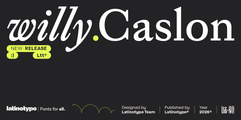
Latinotype has just released an excellent contemporary revision of Caslon with five weights (plus italics) named Willy Caslon, and it’s on sale at MyFonts right now (60% off!).
If you’ve always wanted a good digital interpretation of this style of typeface, now is your chance to pick one up.
There’s also nice write-up about Willy Caslon in WE AND THE COLOR.
Promotional graphic for the newly released Willy Caslon typeface from Latinotype. (Source: Latinotype)
Caslon doesn’t get much love
When you think of classic, Latin-script typefaces used in books, magazines, and other text-heavy printed material, a handful to mind:
Bembo (released in 1496),
Garamond (1549),
Caslon (1725),
Baskerville (1752), and
maybe Bodoni (1790). [1]
Graphic showing the opening paragraph from The Rook by Daniel O’Malley set in four different typefaces: ET Bembo, Stempel Garamond, Adobe Caslon, and Baskerville URW.
Putting Bodoni aside for the moment (since that’s not as general-purpose as the others), if you want to use one of these classic typefaces in your work in 2026, you have several high quality digital options (both revivals and interpretations) to choose from.
Of those options, these are my favourites:
Bembo: Bembo Book (Monotype); Minion (Adobe); Spectral (Production Type; free)
Garamond: Adobe Garamond (Adobe); Garamond Premier (Adobe); Stempel Garamond (Stempel/Linotype); ITC Garamond (ITC); Garamond (URW); Sabon (Linotype); Sabon Next (Linotype); Minion (Adobe); EB Garamond (Georg Duffner, Octavio Pardo; free); Crimson Pro (Jacques Le Bailly; free)
Caslon: Adobe Caslon (Adobe); Caslon 540 + Caslon Bold (Paratype); Libre Caslon Text (Impallari Type/Arrowtype; free)
Baskerville: Baskerville (URW); ITC New Baskerville (ITC); Libre Baskerville (Impallari Type; free); Baskervville (ANRT; free)
Everyone has heard of Garamond and Baskerville, and some people may also have come across Bembo because it used be bundled with Microsoft Office, but I bet most people won’t have heard of Caslon. (Though if you’re a macOS user you’ve had a version of Big Caslon included since, I think, macOS Sonoma.)
Why is Caslon not more popular these days? There are two reasons for this.
History
Caslon, developed in London by William Caslon I, was hugely popular in the British Empire and British North America when it was released in 1725. American polymath Benjamin Franklin used nothing else, for example, and the US Declaration of Independence of 1776 was printed in Caslon.
But Caslon wasn’t popular elsewhere in the world (eg in Europe where a lot of other Latin-script typefaces were being being used and developed) and then it fell out of favour globally as transitional typefaces like Baskerville rose in popularity from the mid- to late-1700s.
Caslon did have a bit of a revival in late 1800s/early 1900s, but it was again eclipsed by both newer typefaces (like Plantin, Times New Roman, Sabon, and Palatino) and revivals of older typefaces (like Bembo, Garamond, and Baskerville).
Photograph of the book ‘Death Comes for the Archbishop’ by Willa Cather published in 1927. The book’s text is set in Caslon. (Source: AbeBooks)
Digital versions
When the world moved to digital type, the classic typefaces that were popular at the time were the first ones digitised, sold, and bundled with operating systems and with design and desktop-publishing software. [2]
On the sans serif side, that meant we got typefaces like Helvetica, Arial, and Futura instead of Franklin Gothic, Univers, and DIN. And on the serif side, that meant we got typefaces like Garamond, Baskerville, and Times New Roman instead of Bembo, Caslon, and Sabon.
Operating systems and design software did sometimes bundle limited versions (only one or two weights) or lower quality versions (oversimplified) of less popular typefaces, but that was about it.
I’m a fan of Caslon
I haven’t had the opportunity to use Caslon in my own work very much, but I really like it. It looks great in the The New Yorker, for example, and that publication uses Adobe Caslon in both its print and digital editions. I also prefer Caslon (an “old style” typeface) to Times New Roman (a “transitional” typeface).
Screenshot from The New Yorker website showing two articles with the headings and text set in Adobe Caslon.
That said Caslon isn’t a go-to typeface for me, which is why I haven’t felt the need to purchase a copy of Adobe or Paratype’s Caslon yet.
The main reason I don’t reach for Caslon very often is because its digital revivals are, well, a little too accurate to the original design. [3] The original Caslon’s design has a few quirks that makes it less than ideal for the majority of my use cases.
One repeated complaint about Caslon’s design, for example, is that its uppercase characters are noticeably taller and darker than its lowercase characters. So when you’re reading a block of text, those uppercase characters jump out on the page a little, making the overall colour of the page uneven. Adobe Caslon faithfully replicates this quirk.
Graphic showing a paragraph of text set in both Adobe Caslon and Willy Caslon. Call-outs point to two capital letters in each paragraph. The call-out for Adobe Caslon reads, “Uppercase characters are taller and darker than lowercase, so they jump out at you in blocks of text”. The call-out for Willy Caslon reads, “Here they’re not as tall, and they’re also the same shade as lowercase, so they don’t jump out at you”.
What’s cool about the Latinotype interpretation of Caslon is that its designers removed the original design’s metal-type, print-era inconsistencies and added more precision and uniformity – all without neutralising the typeface’s essential character.
(Dirk Petzold’s article in WE AND THE COLOR goes into more detail about Willy Caslon’s design, if you want a deep dive.)
This is why the text set in Willy Caslon in the graphic below looks more uniform. And because it is slightly darker overall, this typeface works great on screen and in print.
Graphic showing the first two paragraphs of the Wikipedia entry for Caslon set in two different typefaces, Adobe Caslon and Willy Caslon.
(FYI, the design of Libre Caslon Text fixes the size and colour inconsistency between uppercase and lowercase characters, but leaves the rest of the design as is.)
Why am I so excited about Willy Caslon?
There are many digital versions of Caslon available (see Fontspring, MyFonts, and Type Network), but very few are fully featured and useable in modern publishing contexts.
Most are available in just a single style (regular). A few include italics or bold; some include italics and bold; and very few include the basic set of regular, italic, bold, and bold-italic.
Some versions are distressed fonts, which make them more suited for graphic design than for body text applications.
And some, like Matthew Carter’s Big Caslon, are display fonts and not text fonts.
The handful that do include the basic font set (and sometimes more, like the semi-bold and black weights) are:
Adobe Caslon (Adobe)
Caslon 540 + Caslon Bold (Paratype)
William Caslon Text (William Berkson)
Caslon Pro (SoftMaker)
Caslon FS (FontSite)
Libre Caslon Text (Impallari Type/Arrowtype; free)
I don’t have first-hand experience with all these typefaces, but the problem with pretty much all of them is that they’re either too faithful to the original design or they simplify the design so much that some of the original Caslon character is lost.
Graphic showing the word, “Quetzalcoatl” in large text set in four different typefaces: Willy Caslon, Adobe Caslon, LTC Caslon Long, Libre Caslon Text.
Willy Caslon benefits from the recent trend of type designers releasing digital interpretations of classic typefaces that retain the character of the original but are now suited to the needs of modern digital and print publishing. [4]
Promotional graphic for the newly released Willy Caslon typeface from Latinotype. (Source: Latinotype)
I, for one, am thrilled that a really good, high-useable version of Caslon is now available, and I’m looking forward to using Willy Caslon wherever and whenever I can.
[1] If you keep going forward in time, you can add these to the list of popular editorial typefaces too: Plantin (1913), Goudy Old Style (1915), Times New Roman (1931), Janson (1937), Ehrhardt (1938, 1680s), Palatino (1949), Dante (1954), Sabon (1967), Palatino (1949), Minon (1990), Hoefler Text (1991), and Adobe Jenson (1996).
[2] Yes, yes, I know I’m greatly simplifying things here. A lot went into deciding which typefaces got digitised first, including considerations around licensing, availability, practicality, and personal preference.
[3] Another reason I don’t reach for Caslon very often because its free version, Libre Caslon Text, works best at 16pt and above, so that only works for web pages and not for documents.
[4] Kris Sowersby’s Martina Plantijn (Plantijn) and American Grotesk (Franklin Gothic) are prime examples of this trend.