
On 12 August 2015, then-Premier of Victoria, Daniel Andrews, launched ‘Brand Victoria’, consolidating the disparate branding used by government bodies from across this Australian state into a unified system.
A collage of graphics showing the old Victoria, Tourism Victoria, and Melbourne logos that were replaced by a single logo and brand style.
But that’s not what I’m here to talk about.
I’m here to talk about the VIC typeface that was launched as part of this re-branding exercise.
Why talk about this typeface?
Even though it was released in 2015, I didn’t properly look into VIC till I wrote my ‘Avenir alternatives’ post in January 2026. My hope was that VIC would be a good alternative to Avenir that I could recommend.
Sadly, VIC has not been released under an open font licence. That means, while we can all download it, we’re not allowed us to use it for anything other than Victorian-Government-related work. [1]
So I dropped VIC from consideration and moved on.
Then a couple of months ago, as I was writing my ‘Avenir alternatives – follow-up’ post, I was checking out League Spartan and my brain was like, “Hey, doesn’t VIC look a lot like League Spartan? I wonder if its designers used League Spartan as its base font. You should look into that when you have the time.”
Well, I now have the time.
What do we know about VIC?
Let’s ask the internet
The first thing I do when investigating a typeface is an online search to find out everything I can about it.
When I did that for VIC, I was surprised to find only two mentions of VIC online, both in the Brand Victoria guidelines:
2018’s version 2 of the guidelines, which have since been replicated across several government department websites and PDFs.
Screenshot of version 1 of the ‘Brand Victoria’ brand guidelines PDF showing the typography section which declares VIC to be the brand font.
But that’s it.
There is literally no other mention of this typeface on the internet. No information about who designed it, no stories about its design inspiration, no reviews of the design itself. Nothing.
So that was a complete bust.
Let’s look at the font files, then
The next thing I do when investigating a typeface is examine its font files.
Here, finally, I got a tiny nugget of information about VIC because, when I looked the font files, I found they contained the text, “Copyright © 2015 by René Bieder”. So now at least I knew the name of the designer.
Screenshot of the font-properties screen for VIC Regular.
When I looked up René, I found that he’s a Berlin-based type designer who has built custom typefaces for several massive brands. There’s no mention of VIC on his website or social media channels though. My guess is that Ogilvy Australia, the agency that developed Brand Victoria for the Victorian Government, commissioned René to design this custom typeface. And because this work was done under contract, he can’t talk about it on his own channels. Which makes sense.
Guess I’m on my own
Since no one had talked about VIC anywhere online and there was nothing else to learn from the font files, it was up to me to do my own investigation.
What did I figure out about VIC?
When I said “do my own investigation” I didn’t mean I was going to call up Ogilvy to ask about this project and I wasn’t going to try and find the brand manager who worked for the Victorian Government back in 2015.
No, my plan was much simpler: look at the design of the typeface itself and make some educated guesses :) That’s where all this started in the first place anyway.
But first, some context around developing custom typography.
A custom typeface for just your brand
As the folks from TypeType explain, you have four options when creating a custom typeface (or typefaces) for your brand:
light customisation,
standard customisation,
deep customisation, and
bespoke font design.
Unless you’re a strong and established brand – like IBM, Radio Canada and the Australian Broadcast Corporation (ABC) – it’s not worth the time, effort, and money required to design a bespoke typeface.
Take the ABC, for example: this is Australia’s most trusted media brand – and one of the most trusted brands in Australia overall – so having a bespoke typeface that’s associated with only this brand is worth the expense. That’s why the ABC commissioned Australian Type Foundry to create ABC Sans.
Screenshot from a website article titled ‘How do you design your country’s national font?’ that tells the story of how the typeface ABC Sans was created.
There’s no point in reinventing the wheel
For everyone else, though, the fiscally sensible decision is to take an existing typeface and modify it for your purposes. That’s a much quicker and cheaper proposition, and it’s something brands of all sizes do all the time.
For example:
Microsoft’s Segoe (2012) is based on Frutiger,
Apple’s San Francisco (2014) is based on Helvetica and DIN,
Nebula’s Nebula Sans (2025) is based on Whitney, and
Collletttivo’s Ronzino (2025) is based on Arial.
(FYI, Nebula Sans and Ronzino are both available under and open font licence so they’re free for anyone to use.)
Graphic comparing the typefaces Segoe, San Francisco, Nebula, Sans, and Ronzino and they typefaces they are based on: respectively, Frutiger, Helvetica/DIN, Whitney, and Arial.
When I noted the similarities between League Spartan and VIC, my assumption was that the latter was essentially a modified version of the former, and it made a lot of sense that Ogilvy (on behalf of the Victorian Government) would have taken this more financially responsible approach.
Not just a single ancestor
As I dug deeper into VIC I realised that not all its letterforms looked like they were based on League Spartan. The uppercase ‘Q’ in VIC, for example, was clearly based on Futura.
Graphic showing uppercase and lowercase letters Q set in the VIC, League Spartan, and Futura typefaces. Arrows are drawn that show the uppercase Q of VIC is based on the uppercase Q of Futura, not the uppercase Q of League Spartan.
Graphic comparing text set in Futura and League Spartan. The text used is from the short story ‘Unauthorized Bread’ by Cory Doctorow.
So when deciding on what to base VIC’s uppercase ‘Q’, type designer René Bieder seems to have gone back to the granddaddy of geometric sans-serif typefaces.
Another ancestor emerges
As I continued to look at VIC’s letterforms, I noticed that some of them – especially some of the numerals – weren’t based on either League Spartan or Futura.
League Spartan and Futura both have slightly narrow letterforms. Because VIC has standard-width letterforms, I’d just assumed these were widened versions of League Spartan’s letterforms. But then I noticed that some of VIC’s letterforms were also less angular and, well, more like Helvetica.
Then I remembered there was another early Google Fonts typeface that was a version of Helvetica that borrowed a bunch of design cues from Futura. I wondered if some of VIC was based on that.
Some more context for non-type-nerds: The Google Fonts library was launched in 2010 (five years before VIC was released) and all fonts on it are released under some form of open licence, meaning anyone is able to modify or develop those fonts for their own uses. League Spartan was added to Google Fonts in 2011 and, as it turns out, so was Questrial.
Questrial, according to its designers, is “heavily influenced by Swiss design, similar to a grotesk style which is closely found in Helvetica”.
Graphic comparing text set in Helvetica and Questrial. The text used is from the short story ‘Unauthorized Bread’ by Cory Doctorow.
When you put all three of these source typefaces together – Futura, League Spartan, and Questrial – the complete picture of VIC’s ancestors emerges:
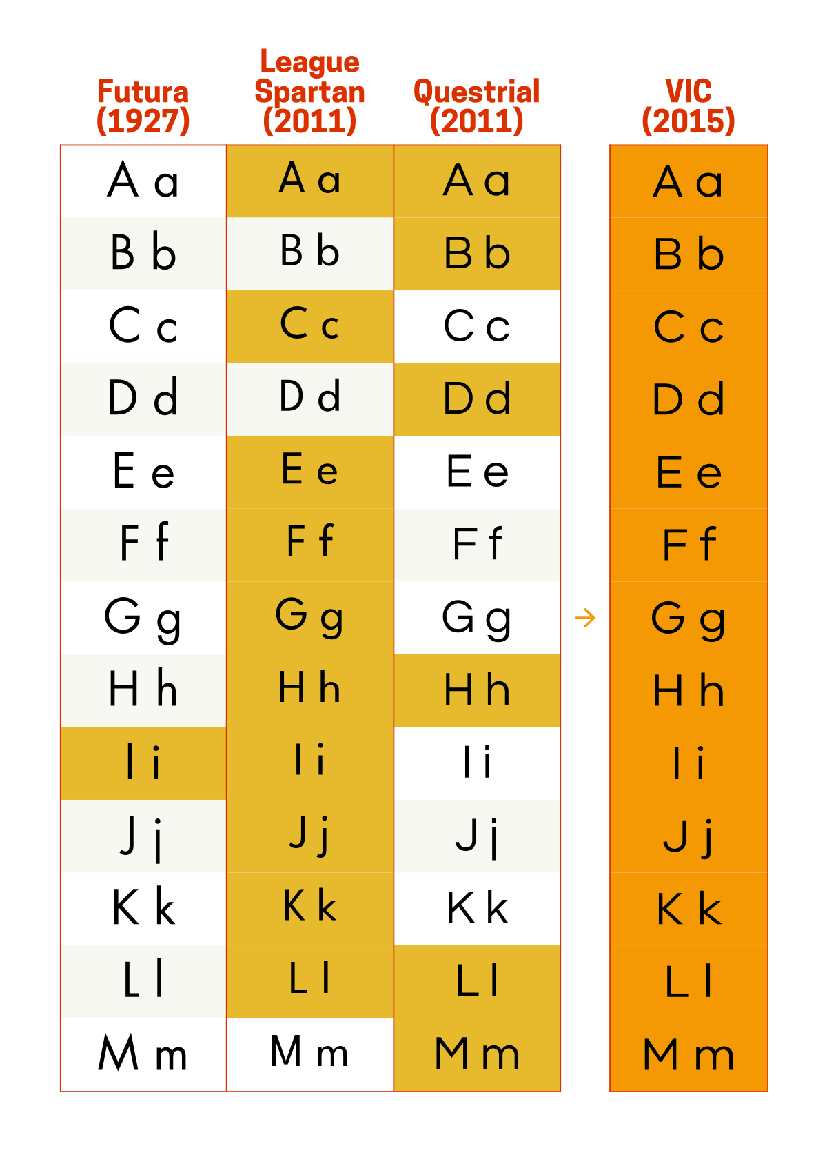
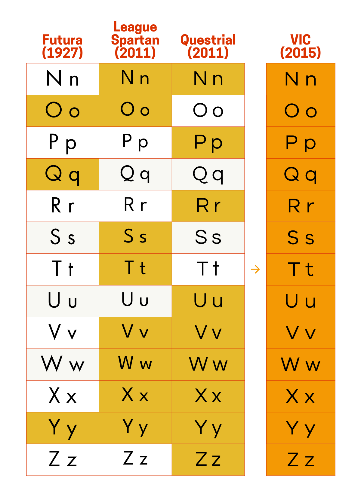
Most of VIC’s letterforms are based on Questrial or a somewhat-widened League Spartan.
A few of the letterforms are based on Futura (also slightly widened).
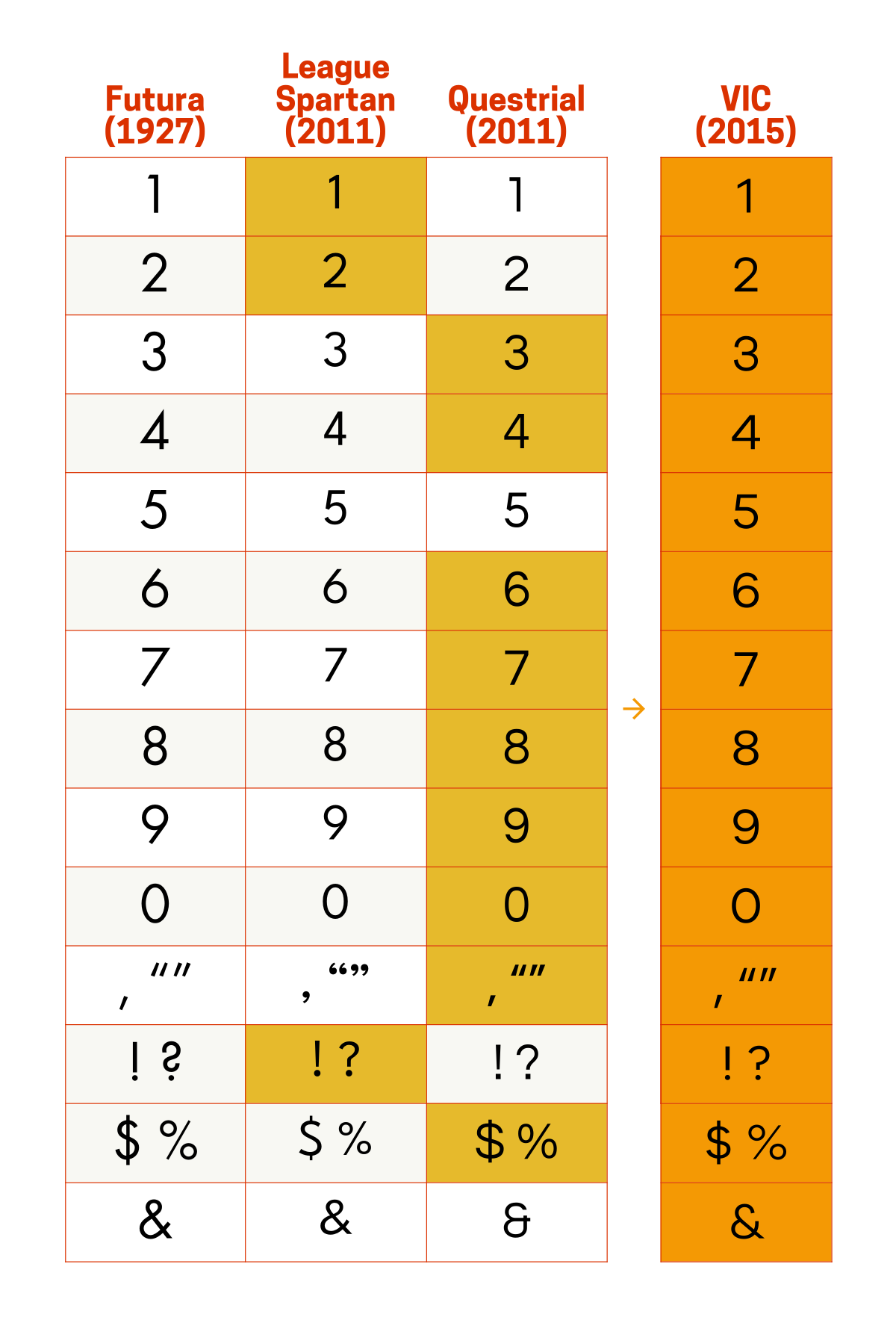
Its numbers are based mostly on Questrial.
Most of its symbols are based on Questrial, though all the tittles – which is what you call things like the dot on the lowercase ‘i’ – are circles and not squares, so those are based on League Spartan/Futura. (Questrial has square tittles.)
A few of VIC’s letterforms are unique, like the numeral ‘5’ and the ampersand.
But enough with the textual descriptions, here’s what this looks like visually. The yellow-filled squares under the Futura, League Spartan, and Questrial columns are the letterforms used in VIC.
A good font with great ancestry
So there you have it: VIC is a geometric, sans serif typeface based on (or heavily inspired by) typefaces like Futura, League Spartan, and Questrial (and, by association, partly also on Helvetica). It isn’t available under an open font licence, but it looks great and works really well for the current Victorian Government brand identity.
Screenshot of the Victorian Government website homepage.
I’m glad the Victorian Government, as advised by Ogilvy, went this route with developing a unified brand identity and custom typeface and I, for one, am a fan of how VIC works within the broader Brand Victoria design system.
[1] The Victorian Government may not have released its custom typeface under an open licence, but all these other civic brands have: PT Sans/Serif from Russia, Finlandica from Finland, Seoul Namsan from Korea, Canada 1500 from Canada, and Public Sans from USA.