Album cover feels

I took a photo that looked like an album cover, so…I made one.

High contrast, sepia photo of people wearing dark, warm clothes walking in a diagonal line through a walkway under a train line. The photo has been cropped and made to look like an album cover with the band name ‘below ground’ printed in large, all-caps text along the bottom. In the top left corner, in slightly opaque bright yellow text, is the album title ‘Volume IV’.

“But what about the three previous albums”, you ask?

Well, this is where it all started…

Photo of a harshly lit underpass, tweaked till the photo is very high contrast black and orange. The photo has been made to look like an album cover for a band named ‘Below Ground’ – which is written in large, all capital letters along the bottom of the image. The album is titled ‘Volume 1’.

Then there was the difficult sophomore album…

Photo of a tunnel with (apparently) colourful panels placed across its curved ceiling. The photo has been desaturated to a pale blue tint and had been made to look like an album cover. Along the bottom of the image, in all capital letters, is the band’s name: ‘Below Ground’. In the top left corner is the album title: ‘2’.

Followed by a critically acclaimed and welcome change in direction by the third album…

Photo of train tracks entering a train station through a tunnel with a large pedestrian crossing on top of it. The photo has been made to look like an album cover, with the band’s name ‘Below Ground’ printed in all-caps at the bottom of the image. In the top left corner is the lowercase letter i repeated three times, which are the Roman numerals for the number three deliberately written incorrectly. That is the title of this album.

Also, these look better when you put them together in a grid :)

Picking a typeface for writing code

Do you have a favourite typeface for writing code? (Assuming you write code, of course.)

If not, CodingFont is a brilliant website that will help you find your preferred coding typeface — tournament style!

The process is simple and elegant: you compare code written in two popular coding typefaces side-by-side, then you pick the one you prefer. Do this over and over again and, through the process of elimination, you’re left with the coding typeface you like the most.

In my case that’s JetBrains Mono. (Though I’m also happy to code in both Fira Code and Source Code Pro.)

I love typography and have literally spent days pouring over typefaces, comparing them closely, and then picking the ones I want to use in different scenarios. Like this comparison I did when I wanted to select a typeface for all the charts and diagrams I post on this blog:

Which is why all my charts and diagrams are now in Fira Sans or Ideal Sans. (Where they used to be in DIN Next or Open Sans.)

CodingFont lets you do this type of side-by-side comparison without any of the hassle. So, if you’re a coder – or even someone who regularly uses monospaced fonts – then this is totally worth a try.

Have fun!

Miss-a-bitchy

When you’ve found the brand that reflects your outlook on life, you might as well tell the world about it :)

A silver car is parked on the side of the a residential street. There is a sticker on the left rear window with the Mitsubishi car brand logo and text that says: miss-a-bitchy.

Footscray station architecture

I’ve always loved how, at Footscray Railway Station, designers and architects managed to meld the original red brick structures with modern metal and plastic ones so well. That contrast of straight and solid old with angular and swoopy new works so well.

Entrance at one side of a train station. There are red brick buildings in the background and a large metallic rain shelter over the ticketing turnstiles in the foreground.

Also, can I say once again how much I love Moment smartphone camera lenses? This photo wouldn’t have been possible without their 18mm wide-angle lens.

Weekend project: Fire Safety Door album covers

The tram stopped at an intersection and my eyes focused on the side of a multi-storey office building. The plain, grey door blended in easily with the plain, grey wall. The door had no handle and was flush with the wall. If you weren’t looking carefully, you wouldn’t even notice it was there. 

The only thing mildly interesting about it was the black lettering about a third of the way down. Helvetica Condensed Bold. All-caps. Three lines. 

FIRE SAFETY DOOR
DO NOT OBSTRUCT
DO NOT KEEP OPEN

“Huh,” I thought to myself, “Fire Safety Door. That’d fun name for a band. Their first two albums could even be called ‘Do Not Obstruct’ and ‘Do Not Keep Open’”. 

This was on a Friday evening on my way home from work and I realized it’d been a while since I’d done something randomly creative like designing album covers for a fake band. So I was, like, “Why not?”

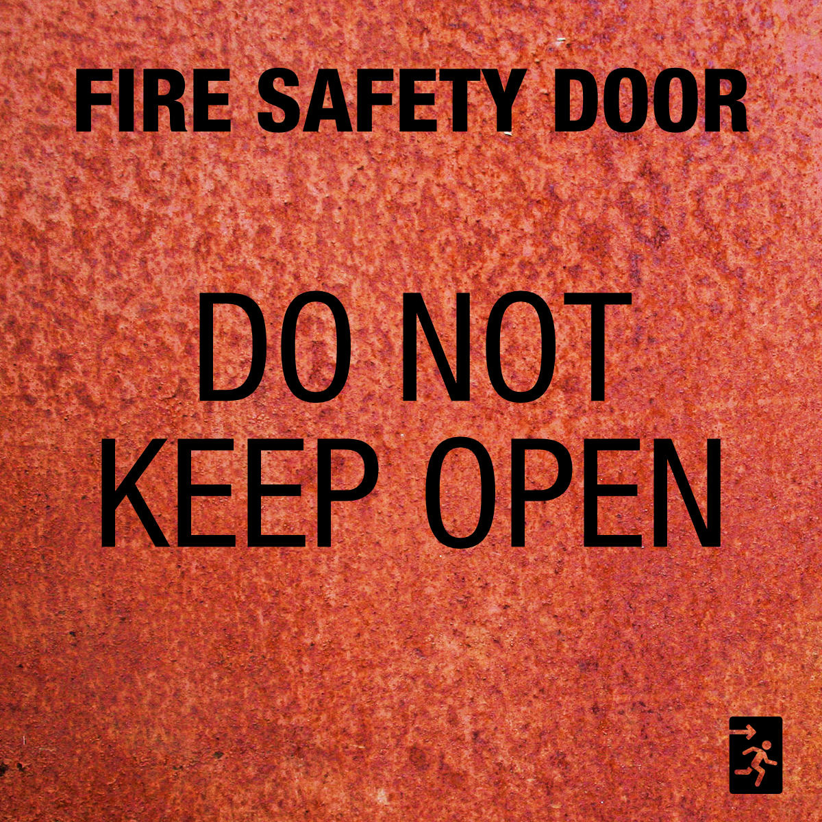
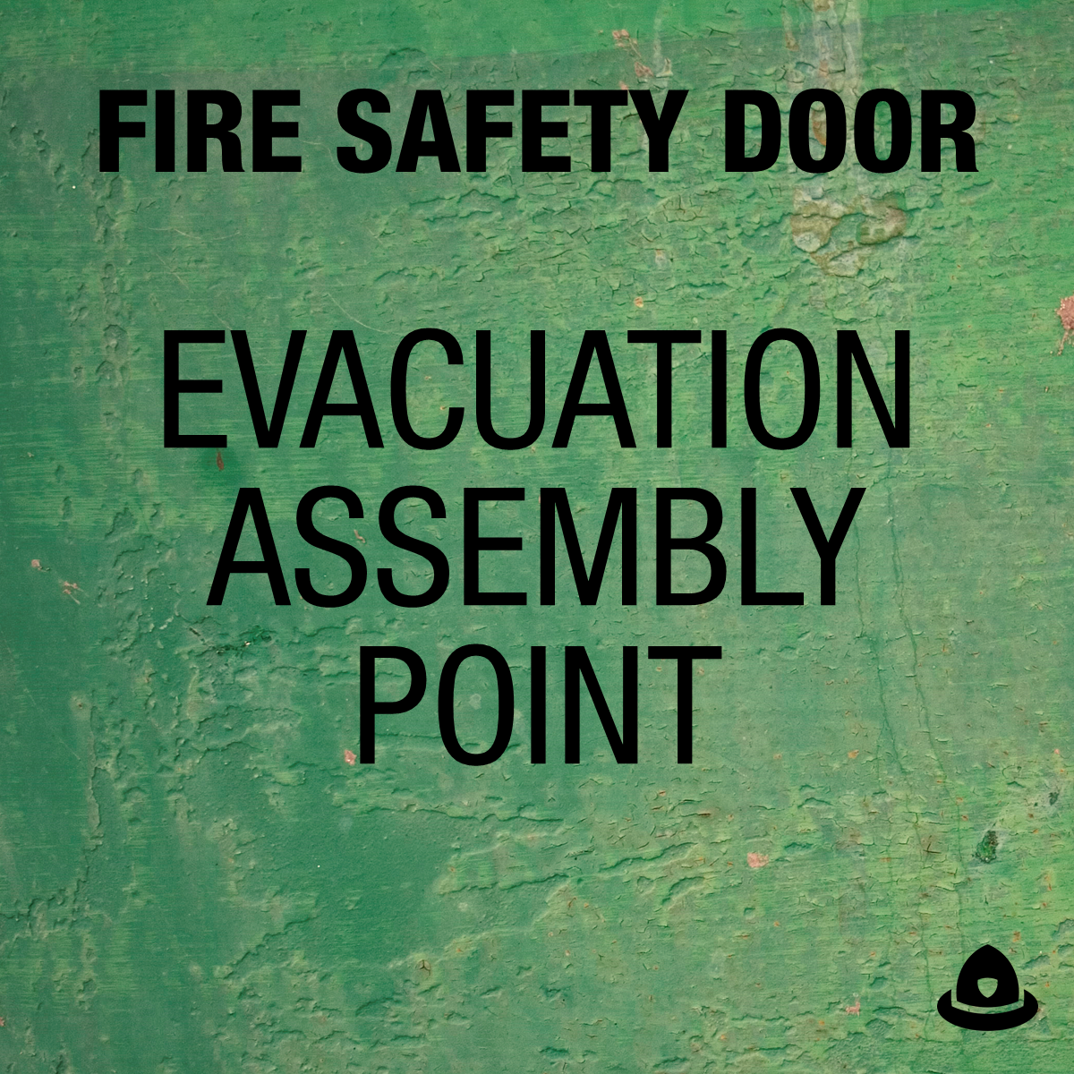
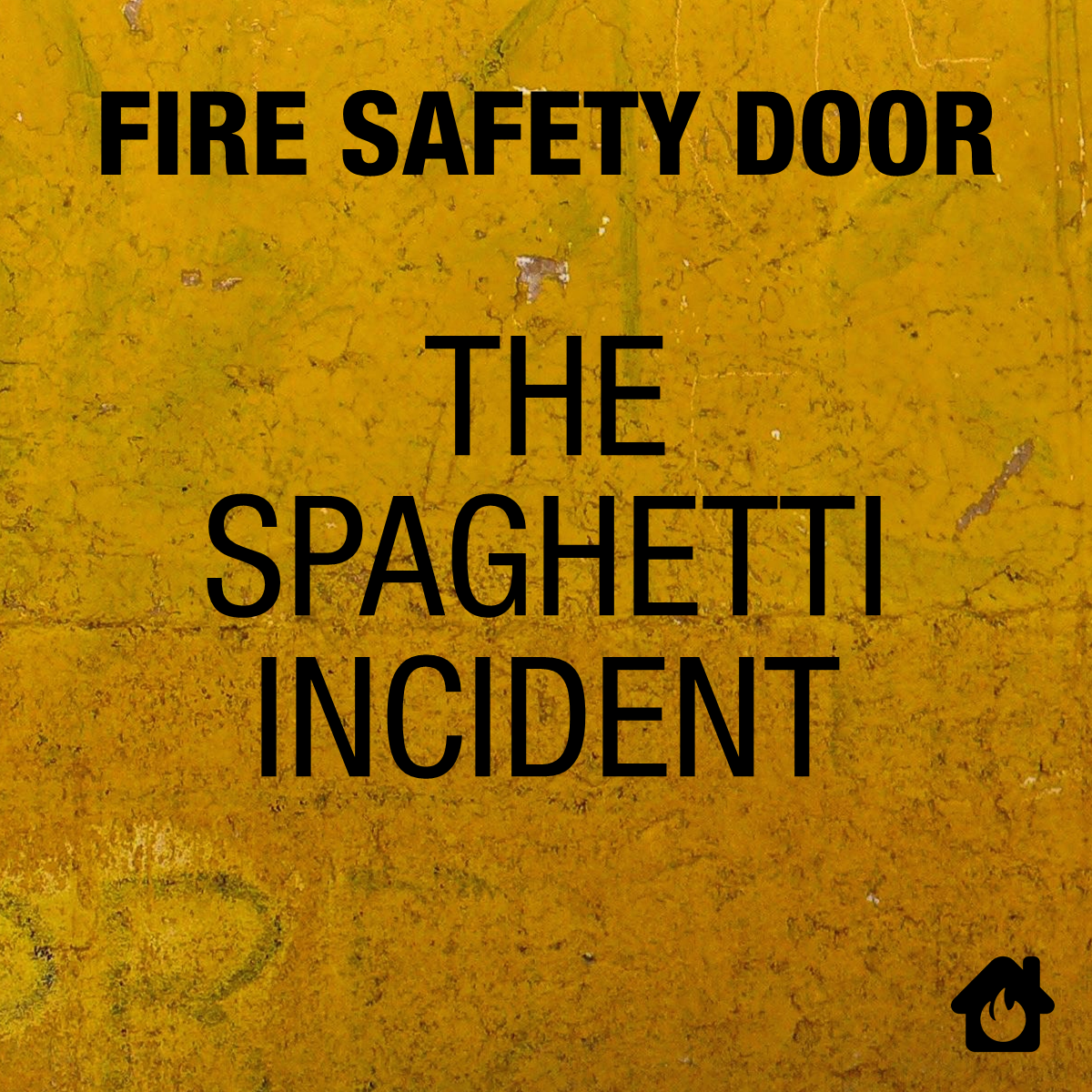
Thus I present to you the six-album discography of the alt-rock bank Fire Safety Door (click to see higher resolution versions of the album covers): 

The albums in chronological order are: 

  • Do Not Obstruct: Debut album. 
  • Do Not Keep Open: Difficult second album. 
  • Door Is Alarmed: Critically acclaimed third album. 
  • Woop Woop: Live tour album. 
  • Evacuation Assembly Point: Concept album. 
  • The Spaghetti Incident: Album of cover songs. (Yes, the original GnR album was correctly called “The Spaghetti Incident?” – complete with quotation marks. This album title is just an homage.) 

Ah, random creative outlets. They're so much fun :)