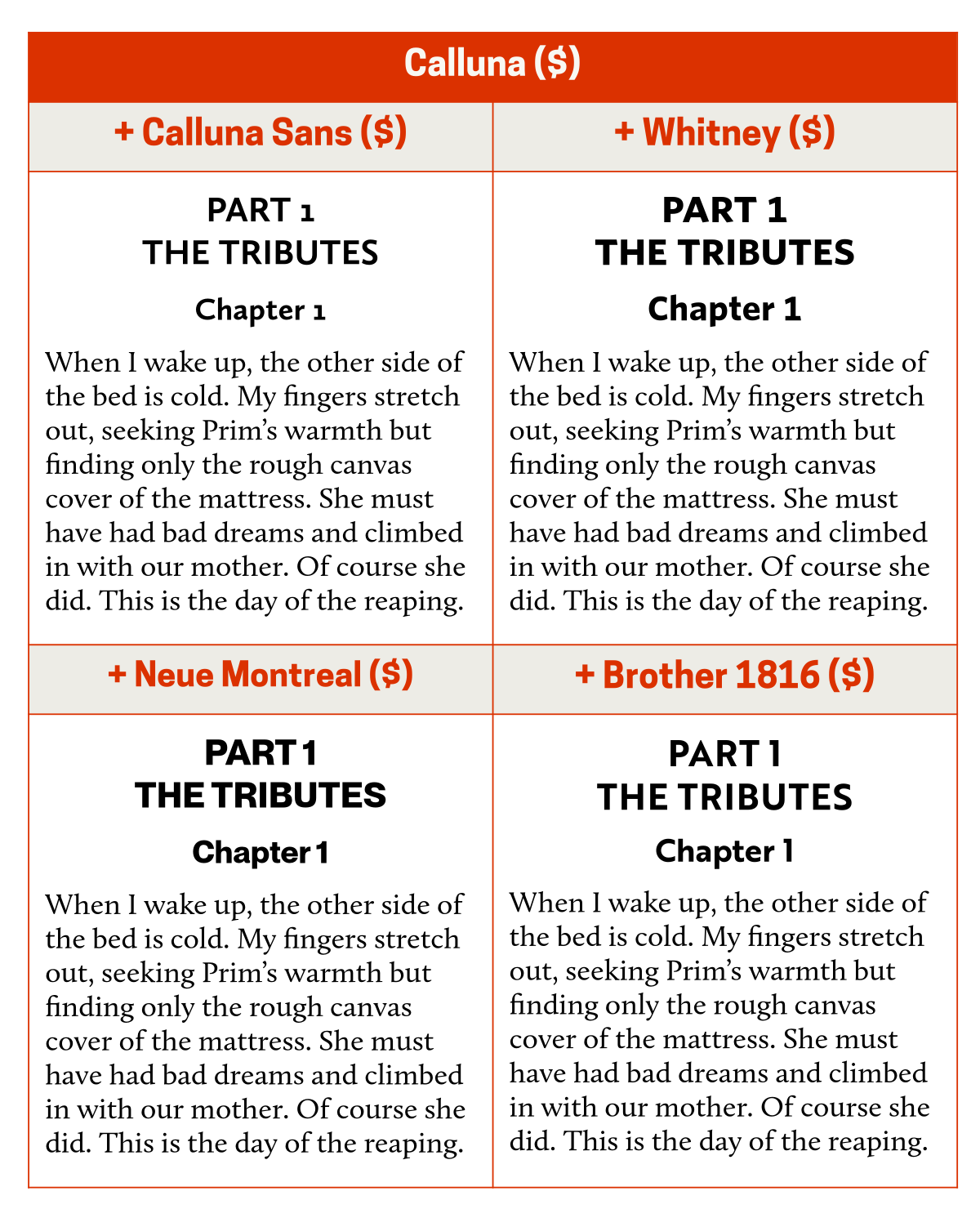
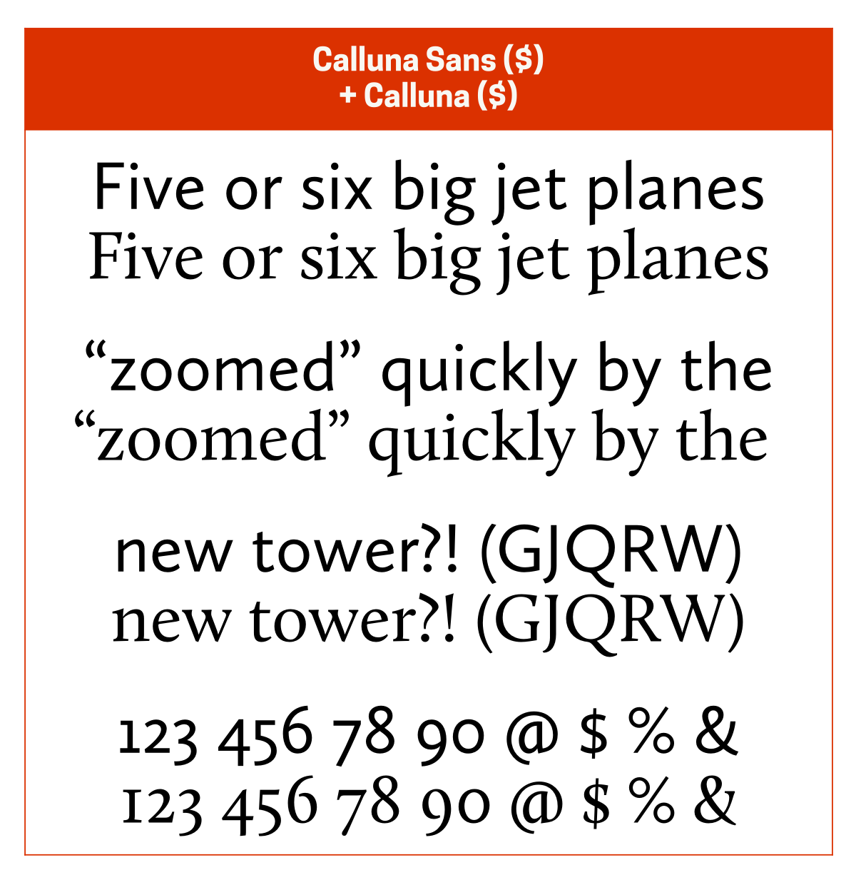
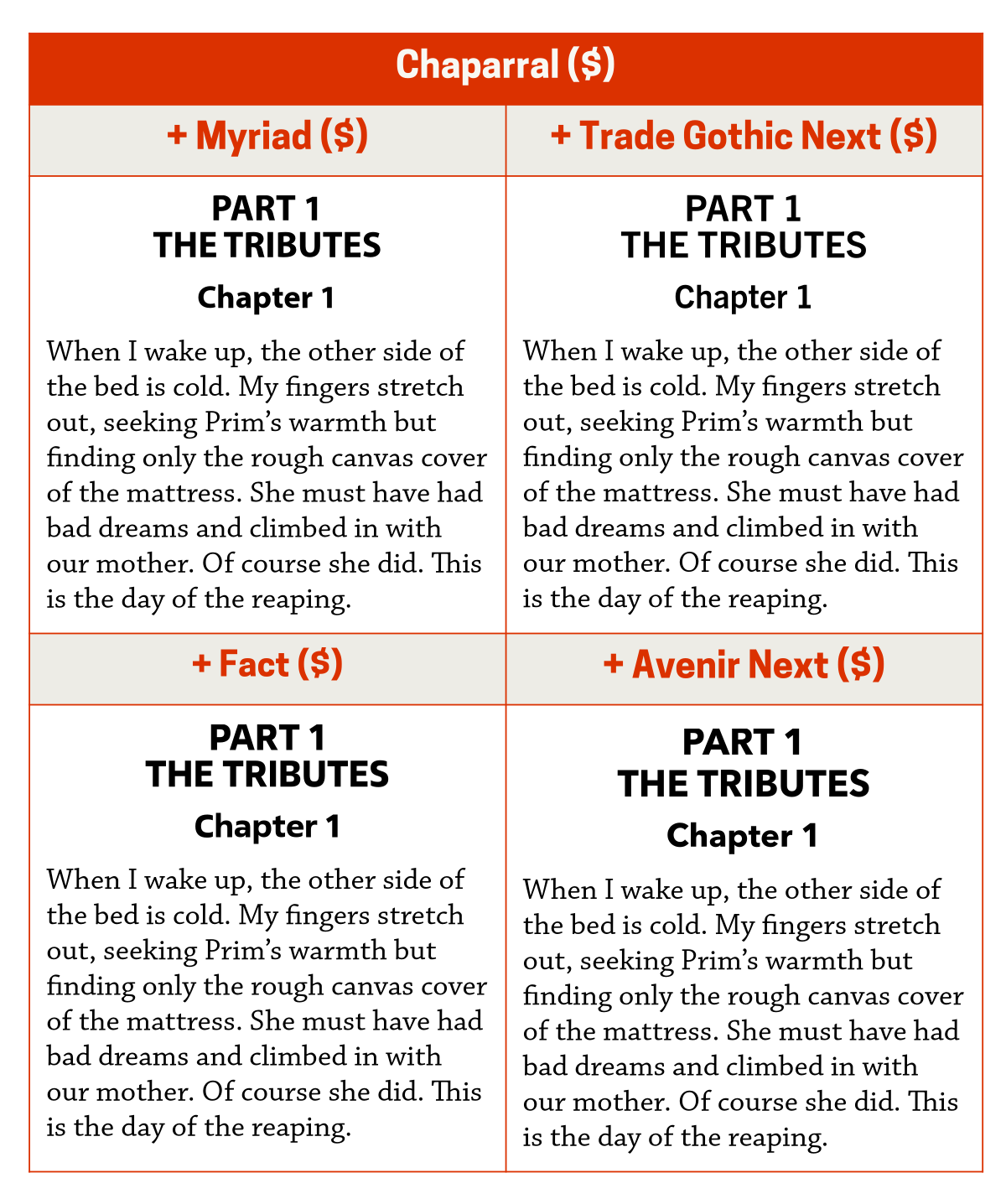
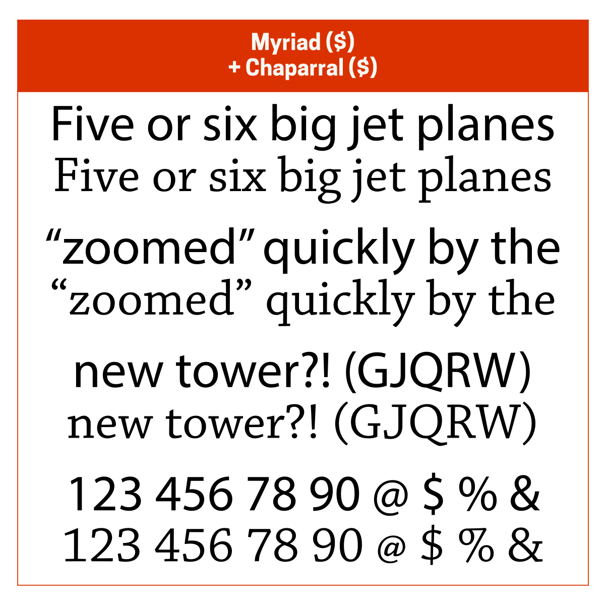
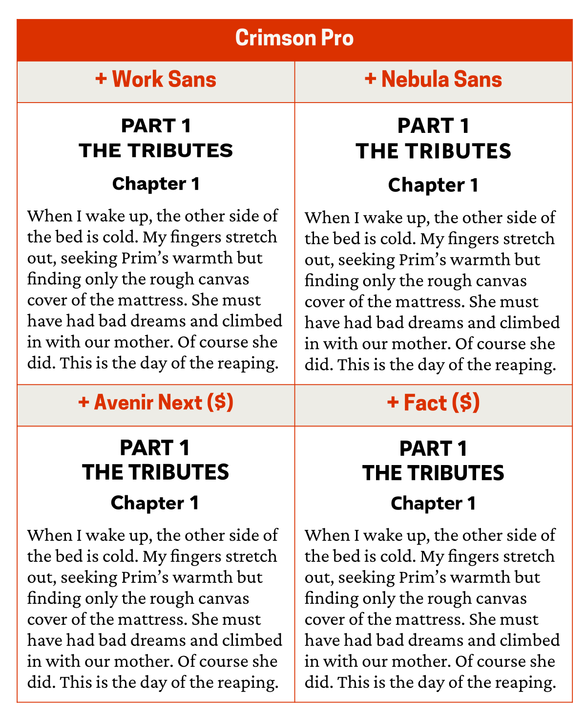
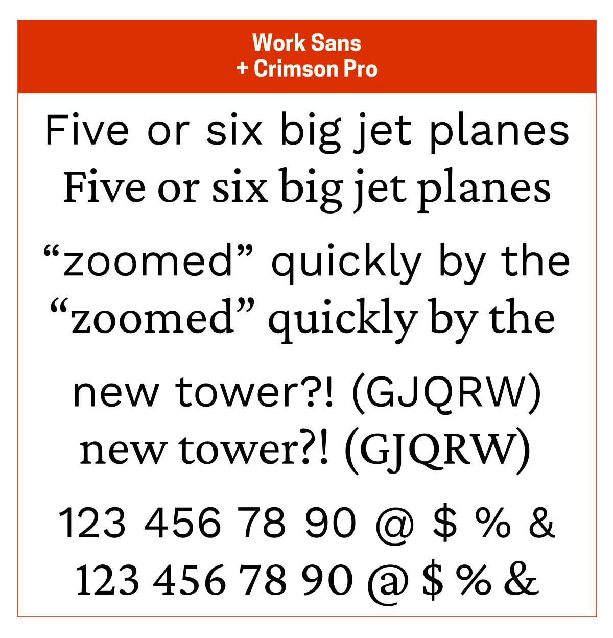
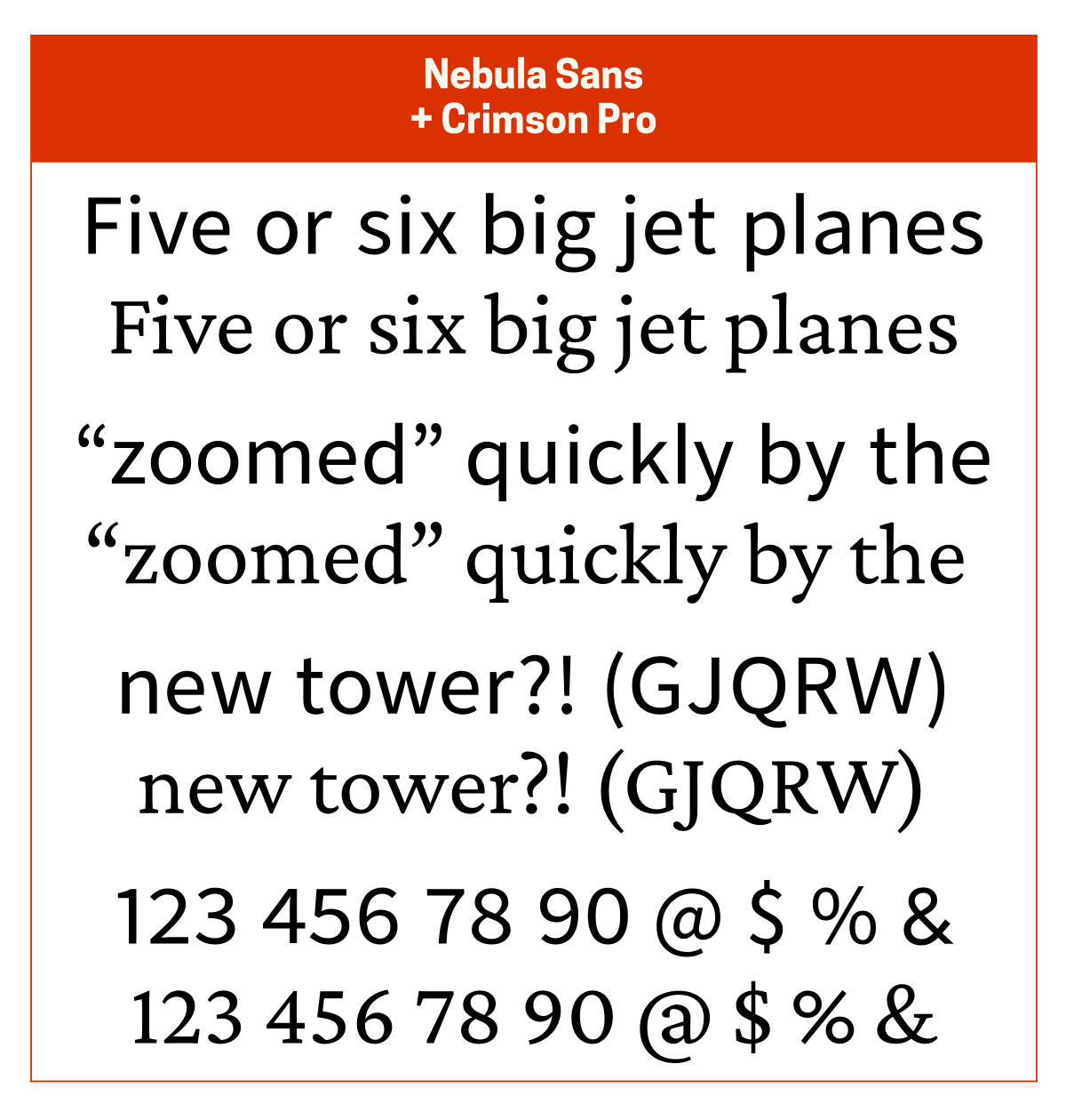
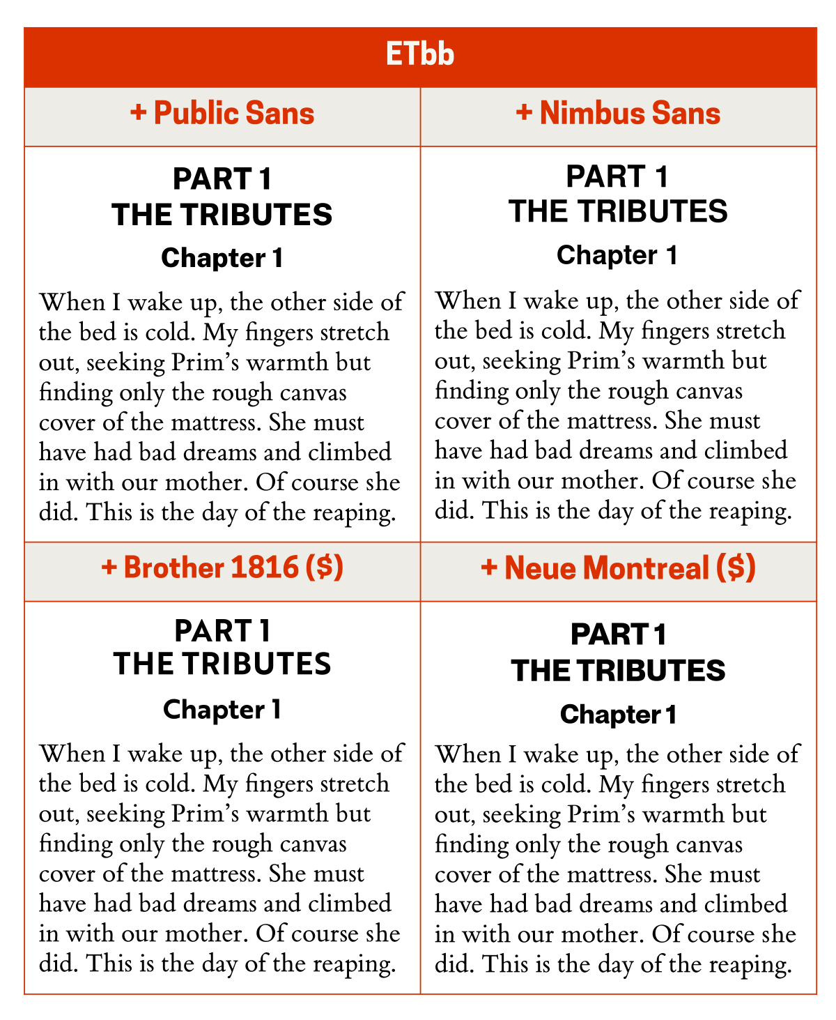
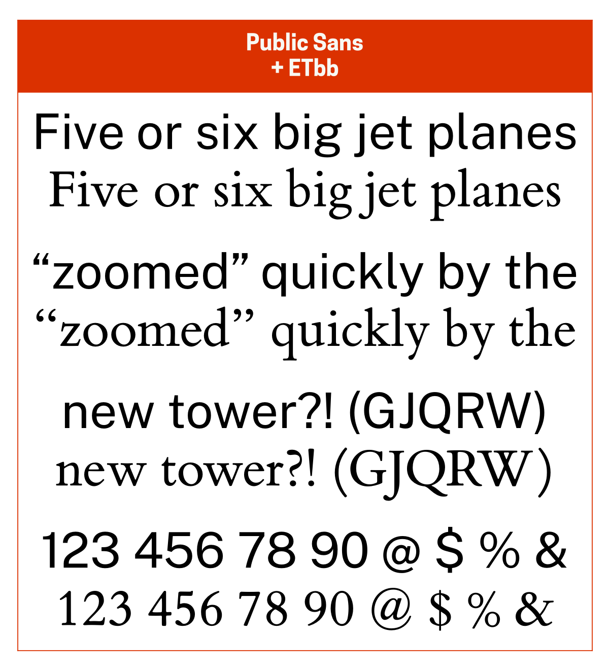
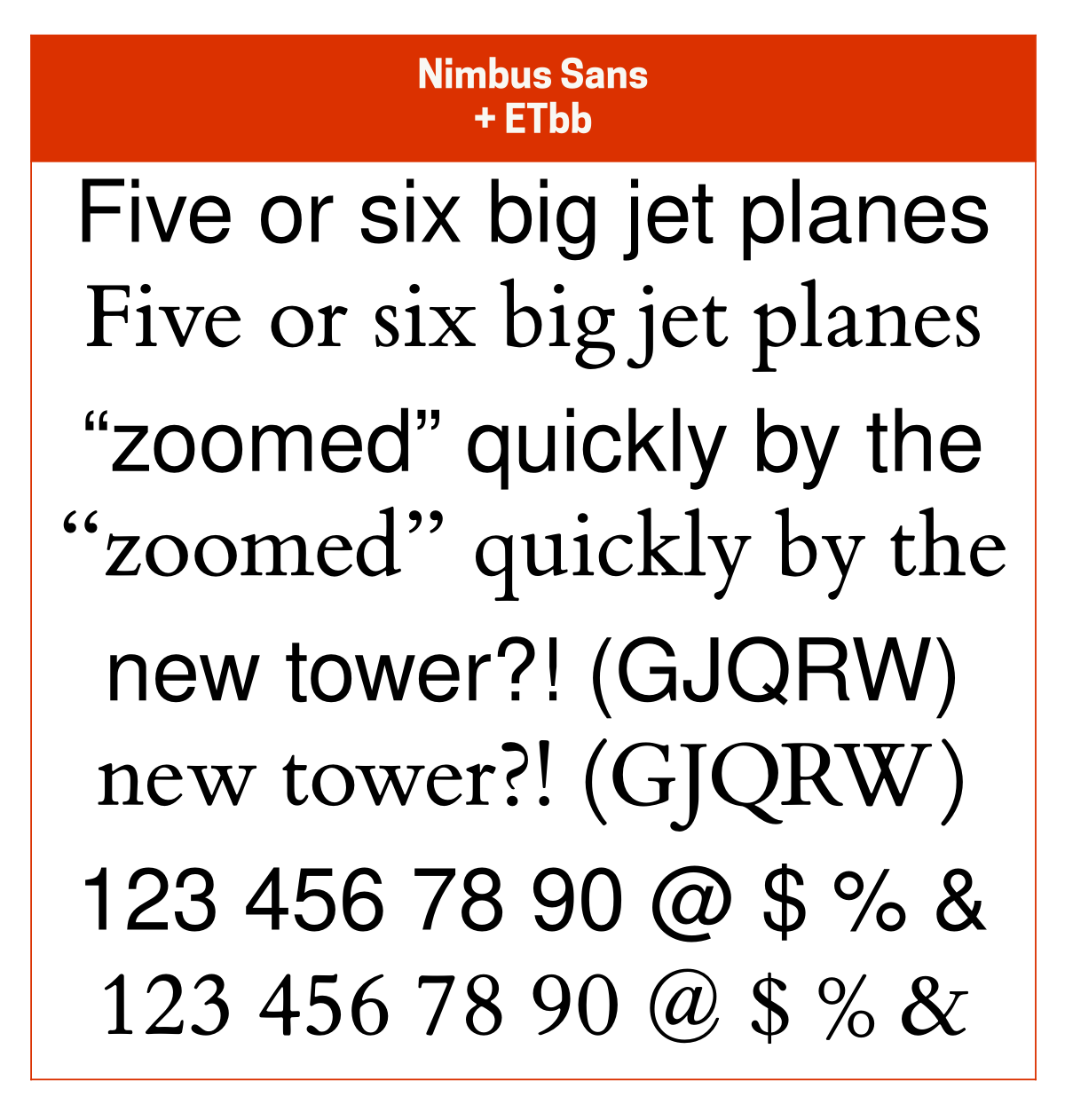
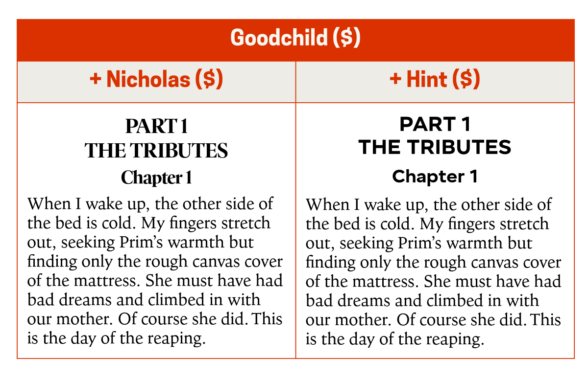
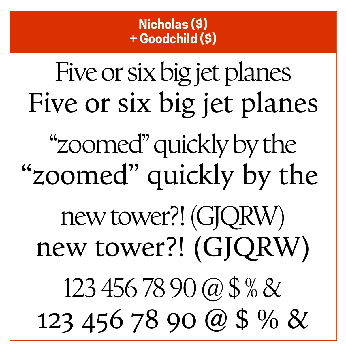
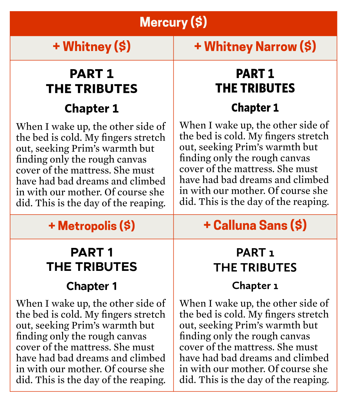
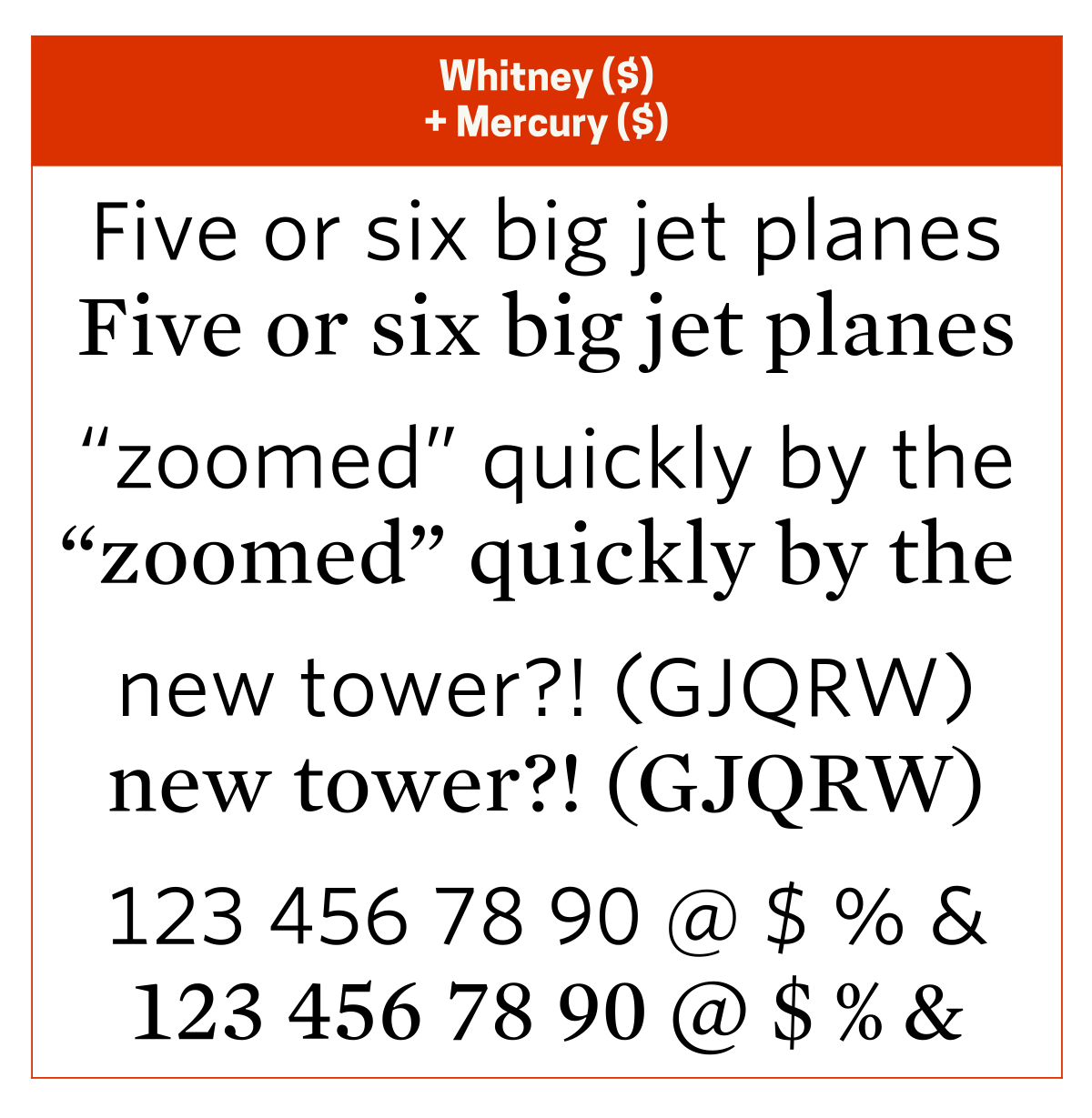
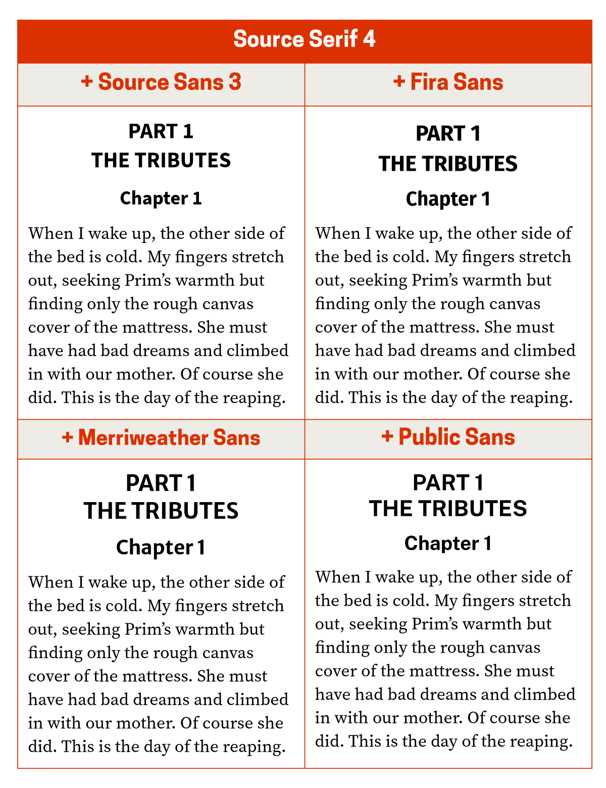
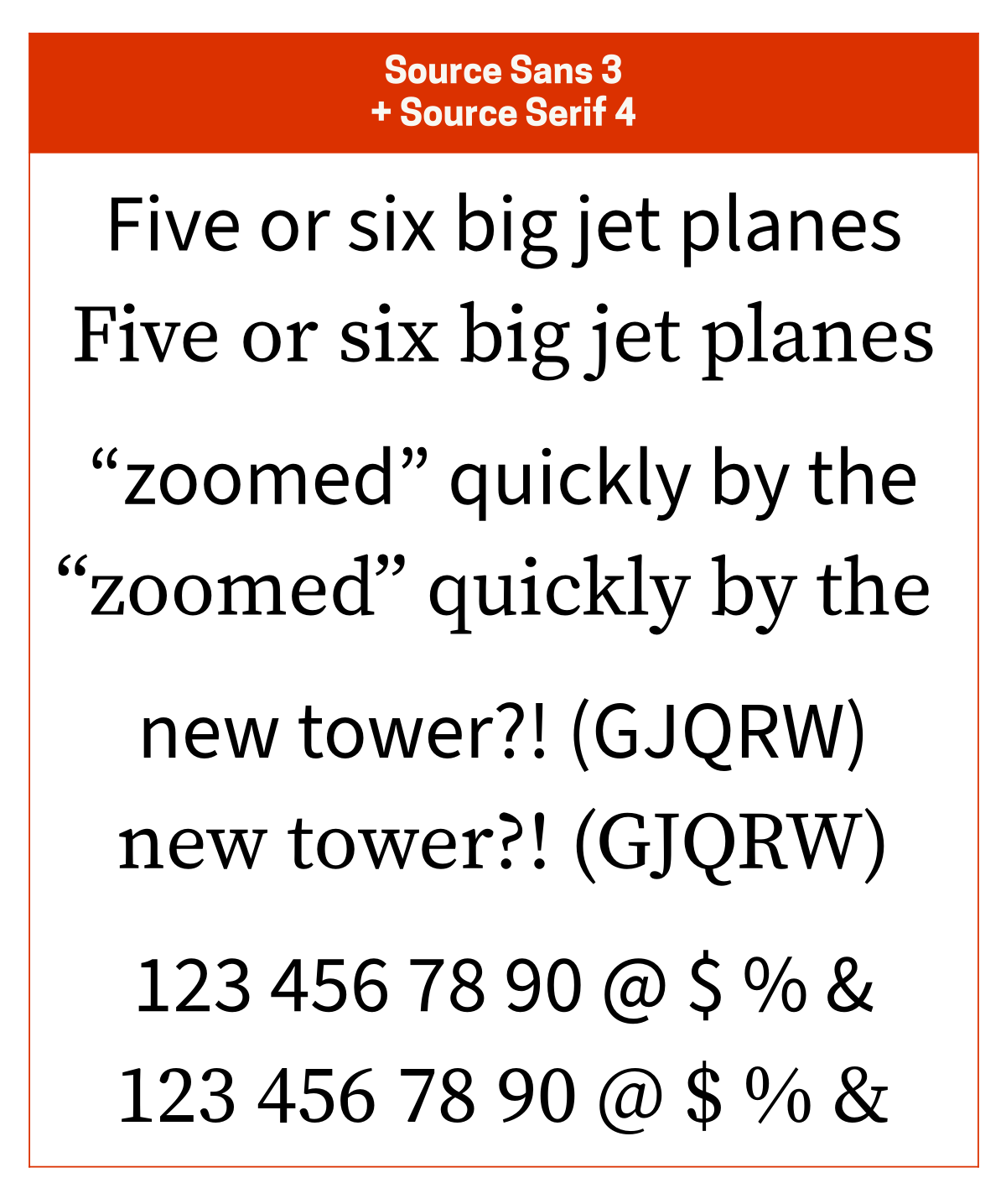
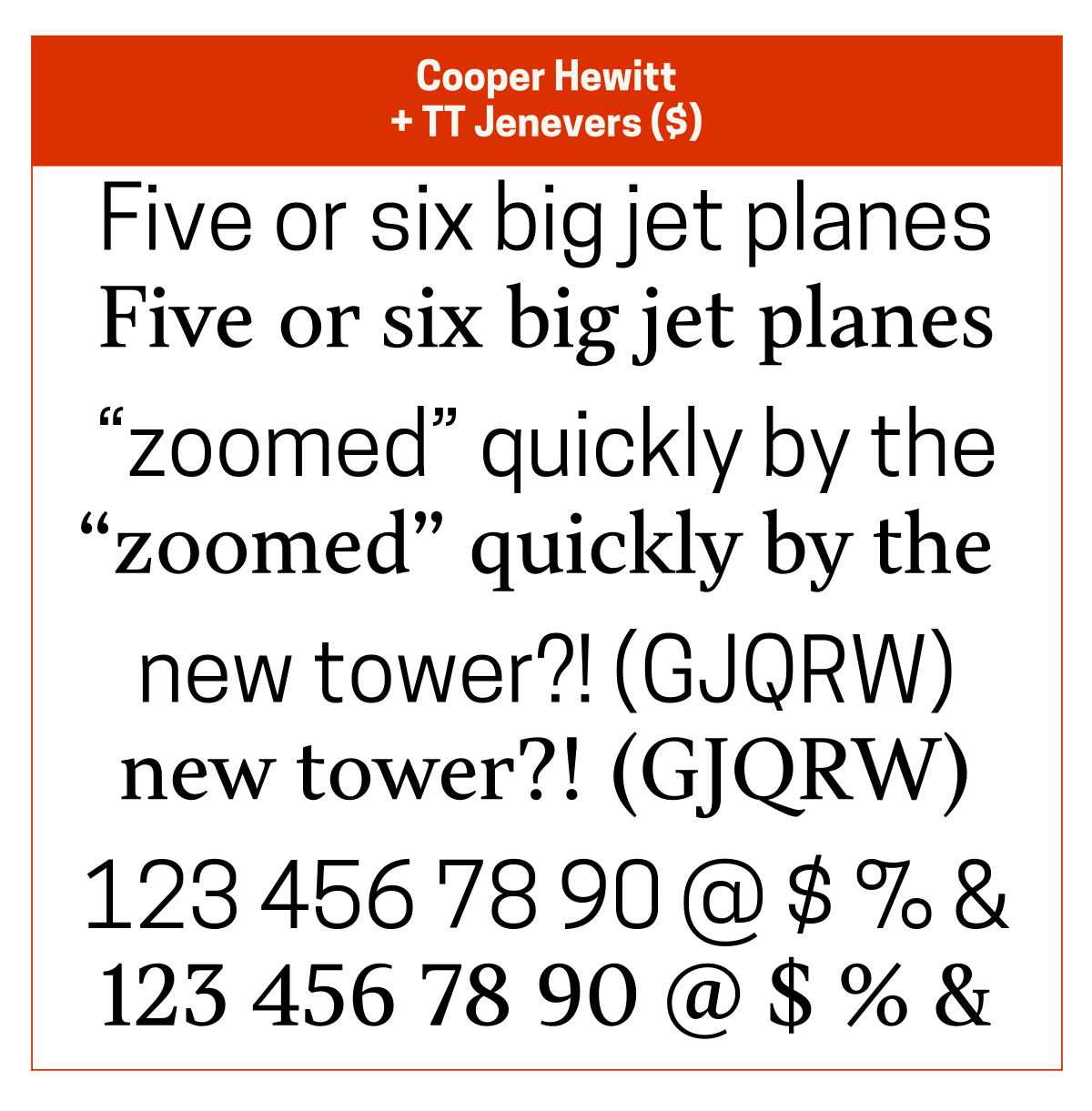
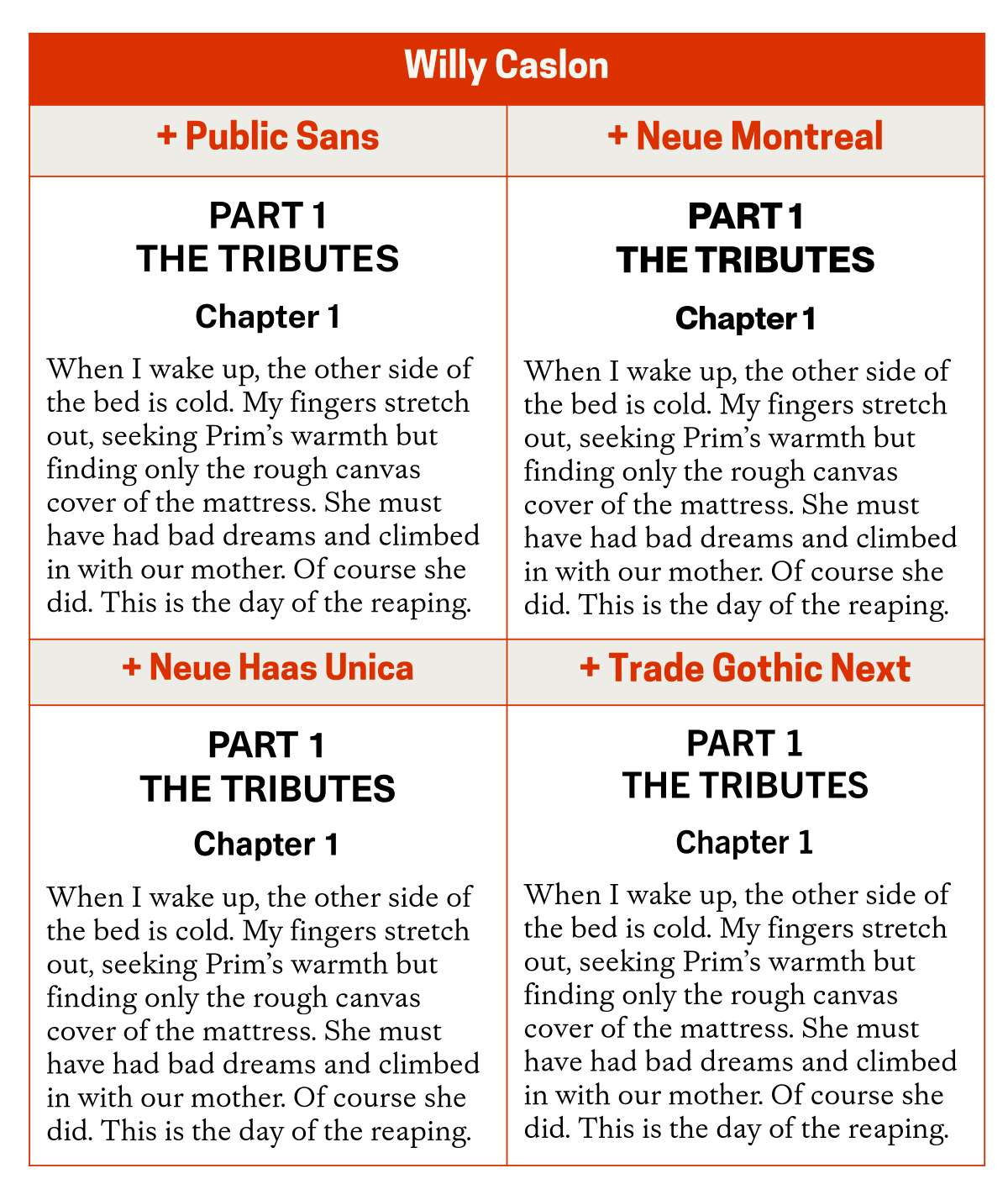
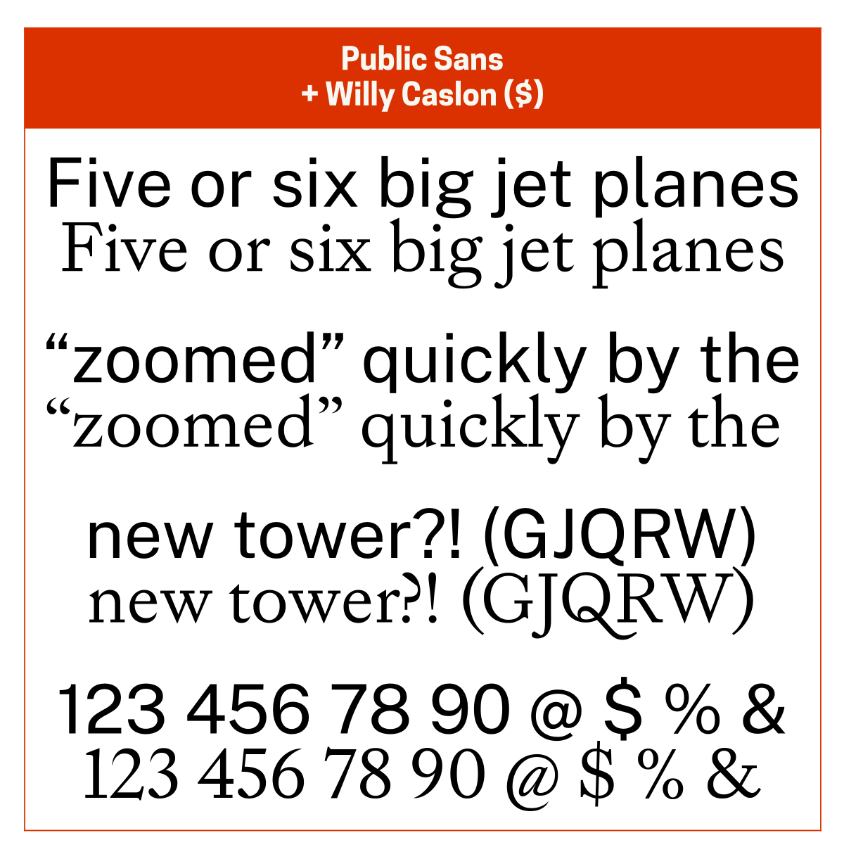
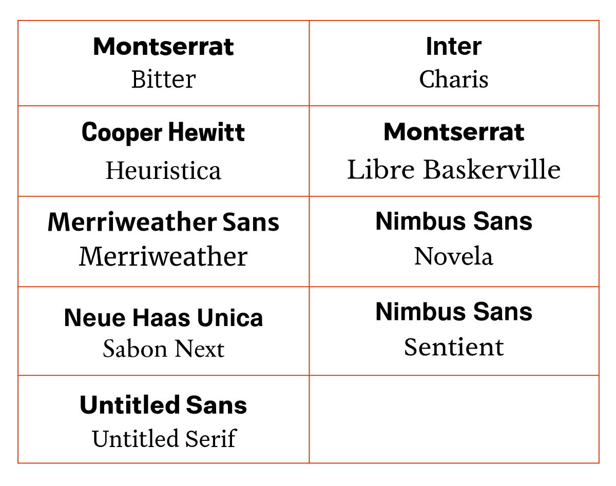
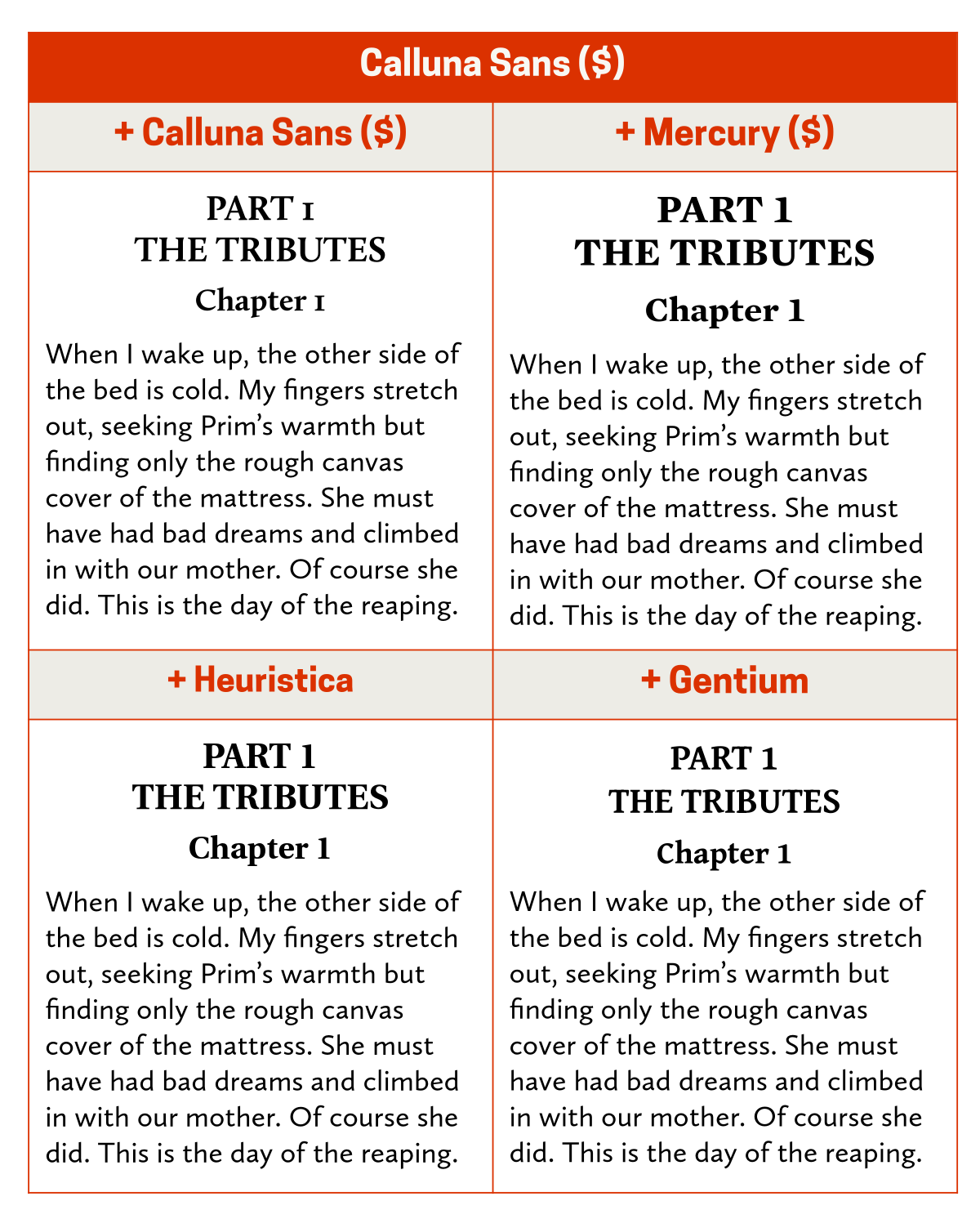
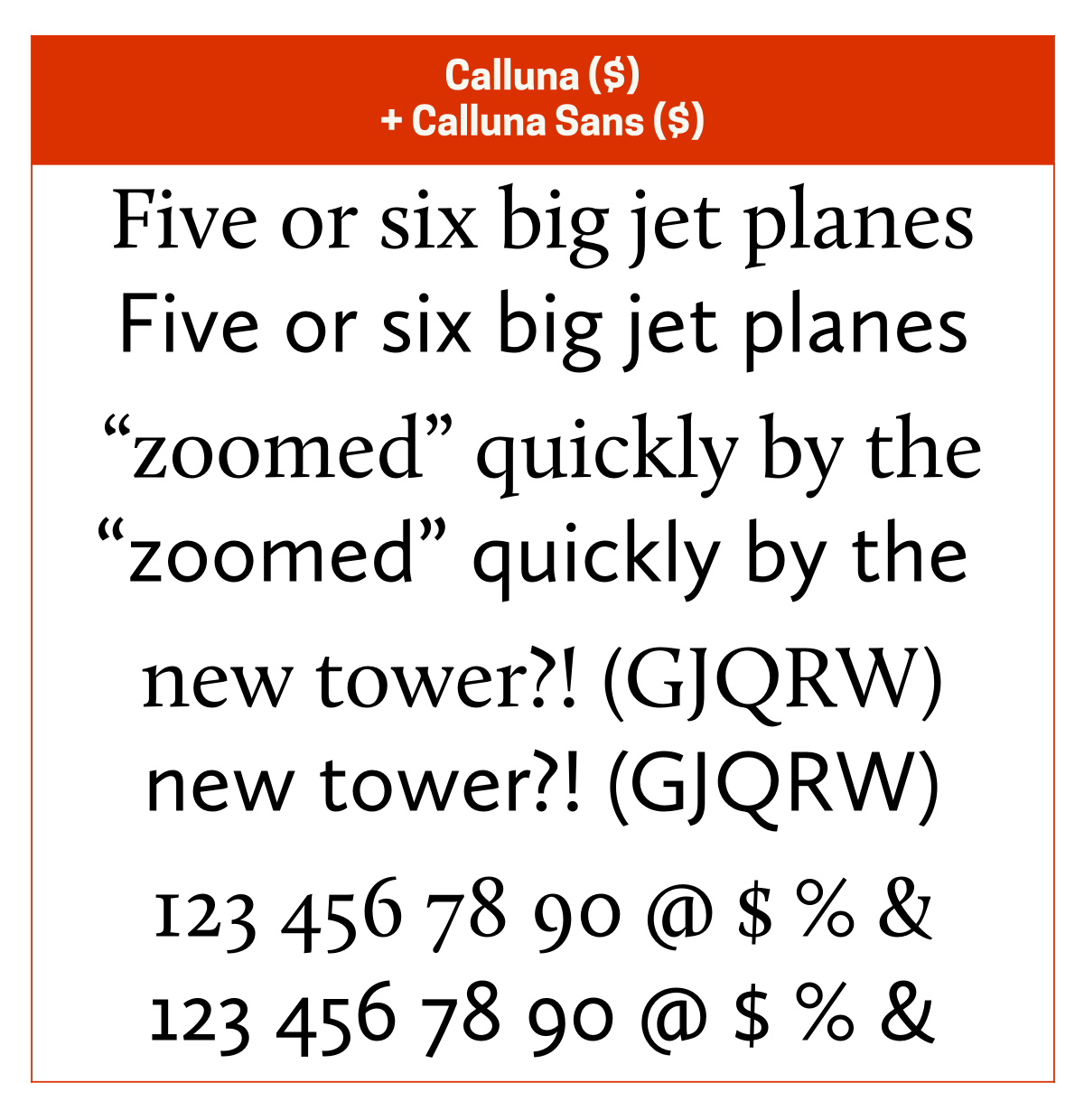
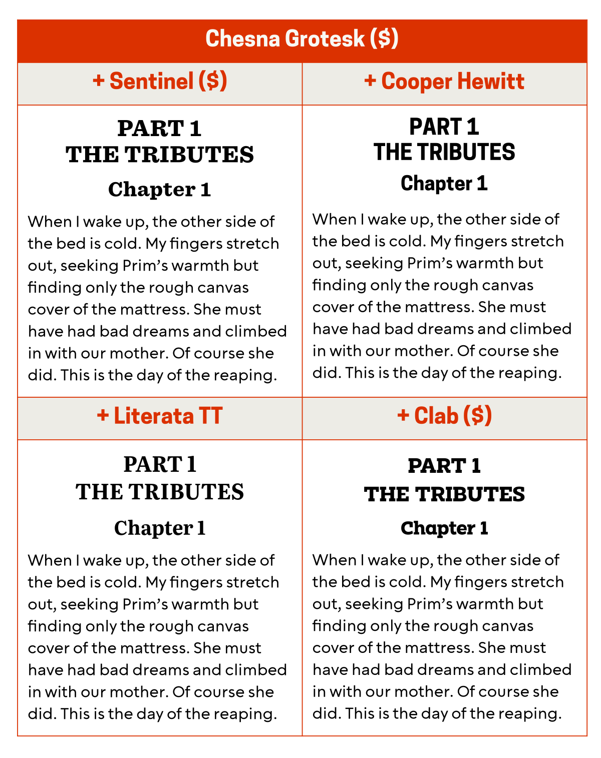
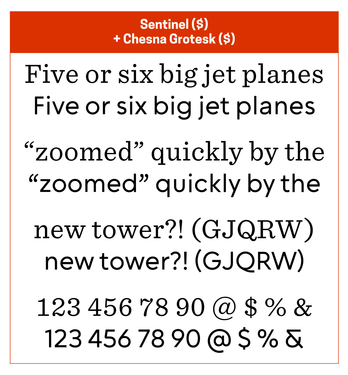
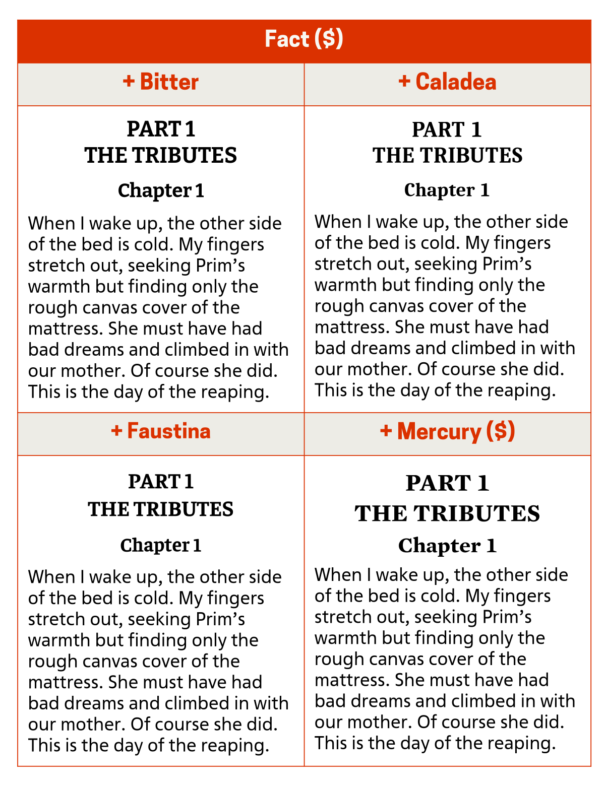
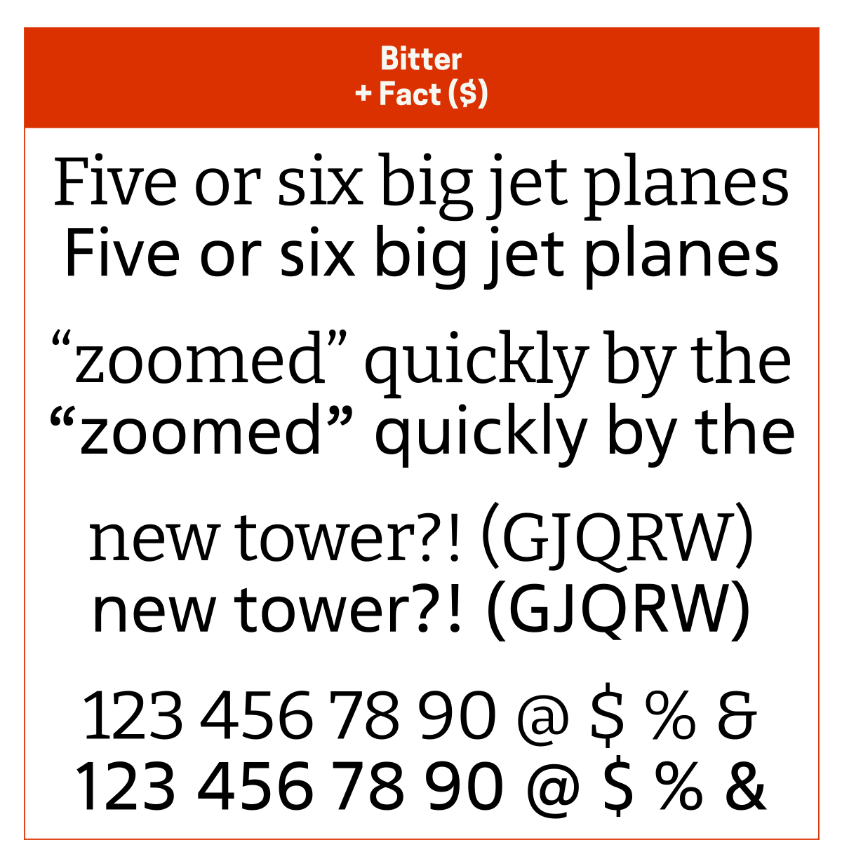
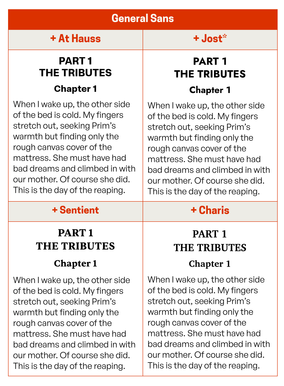
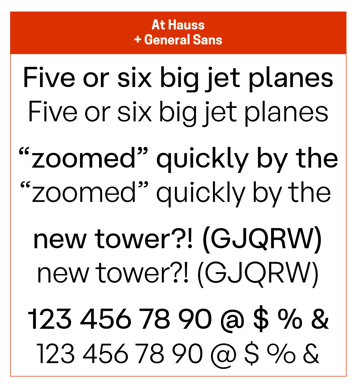
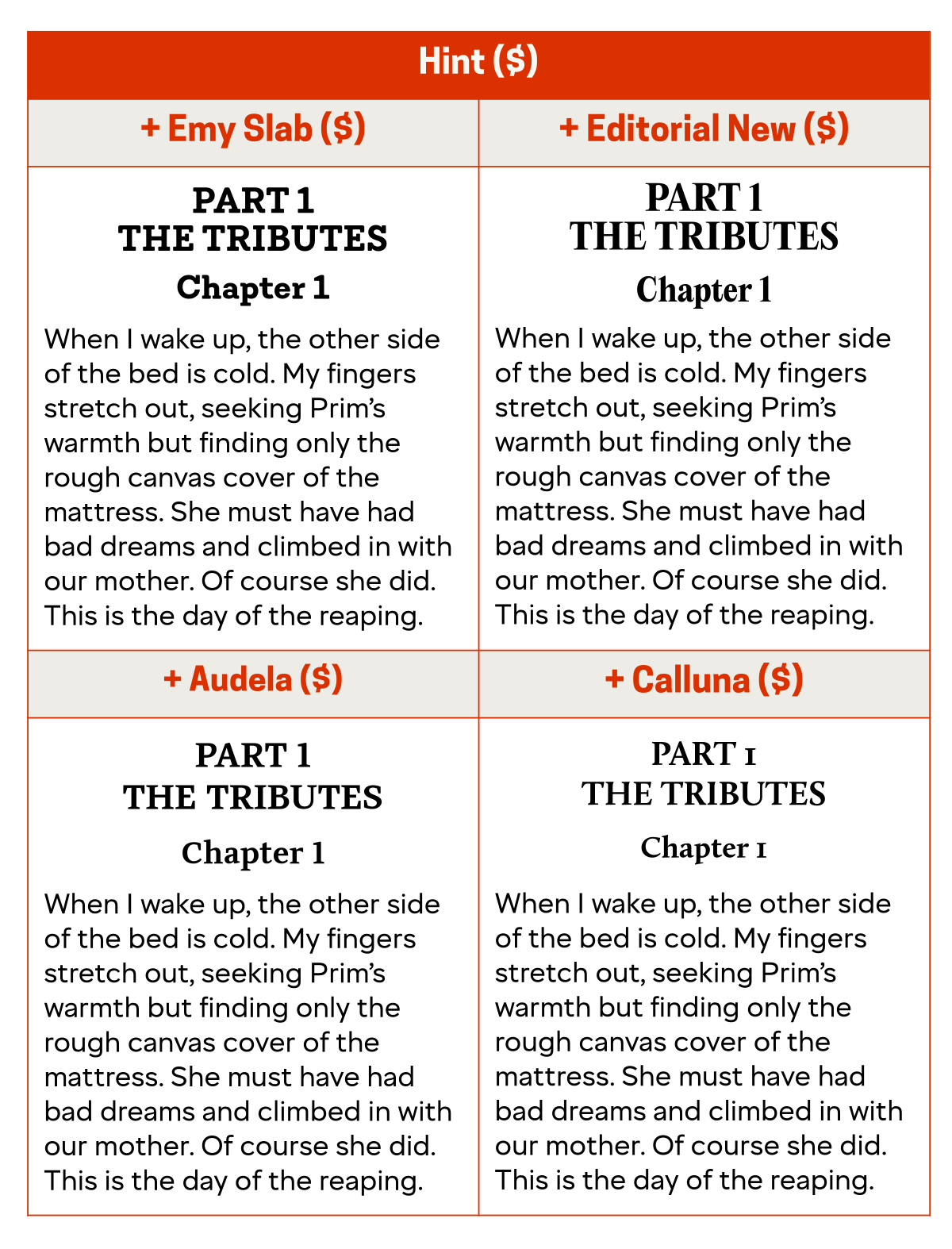
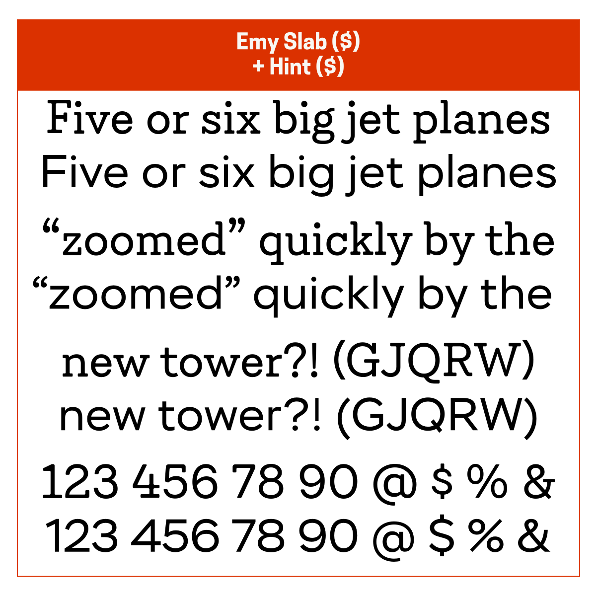
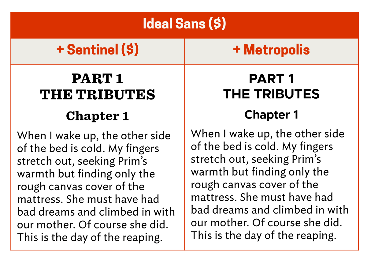
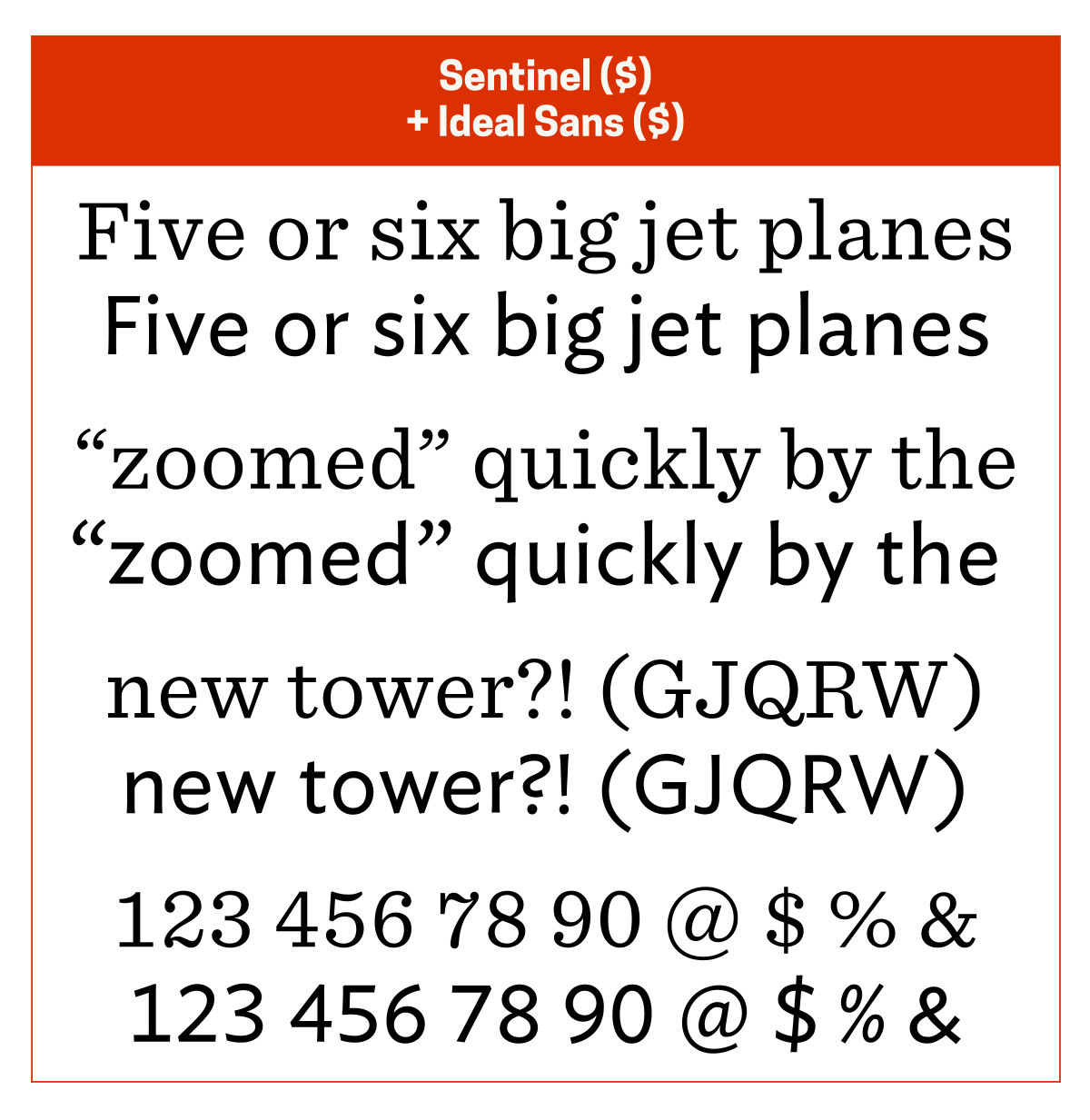
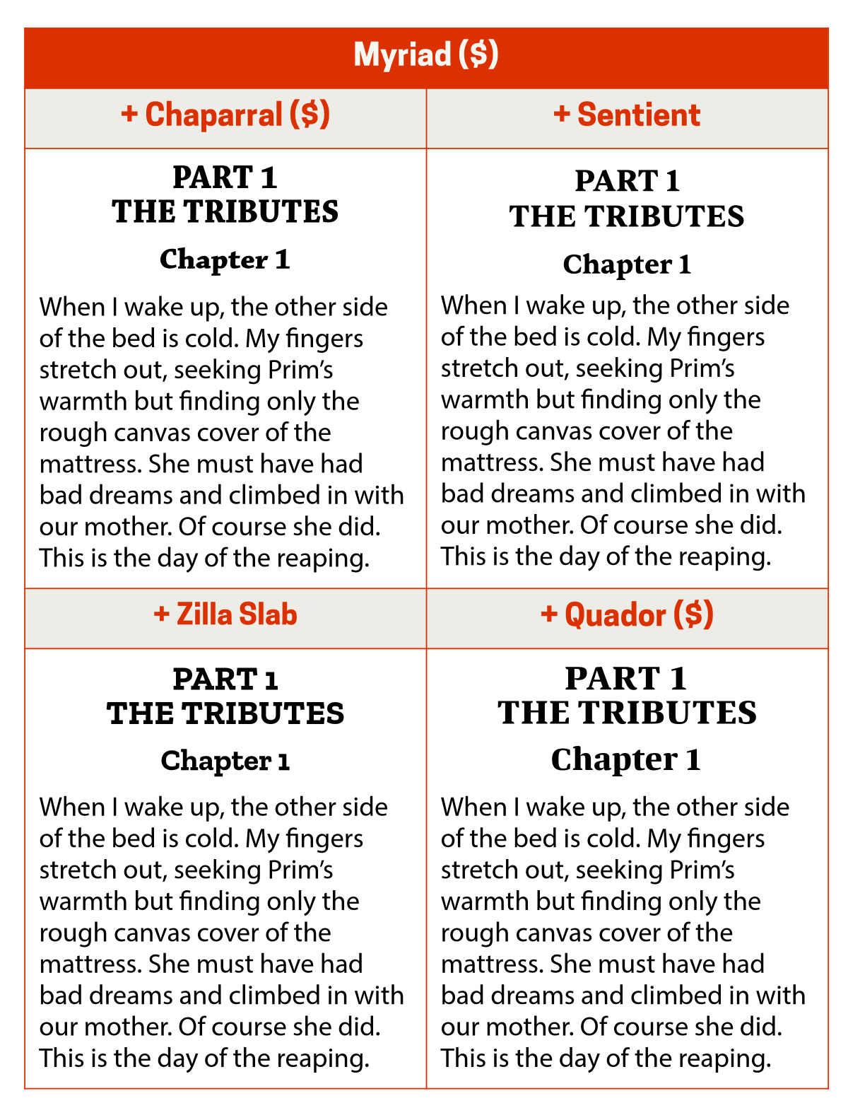
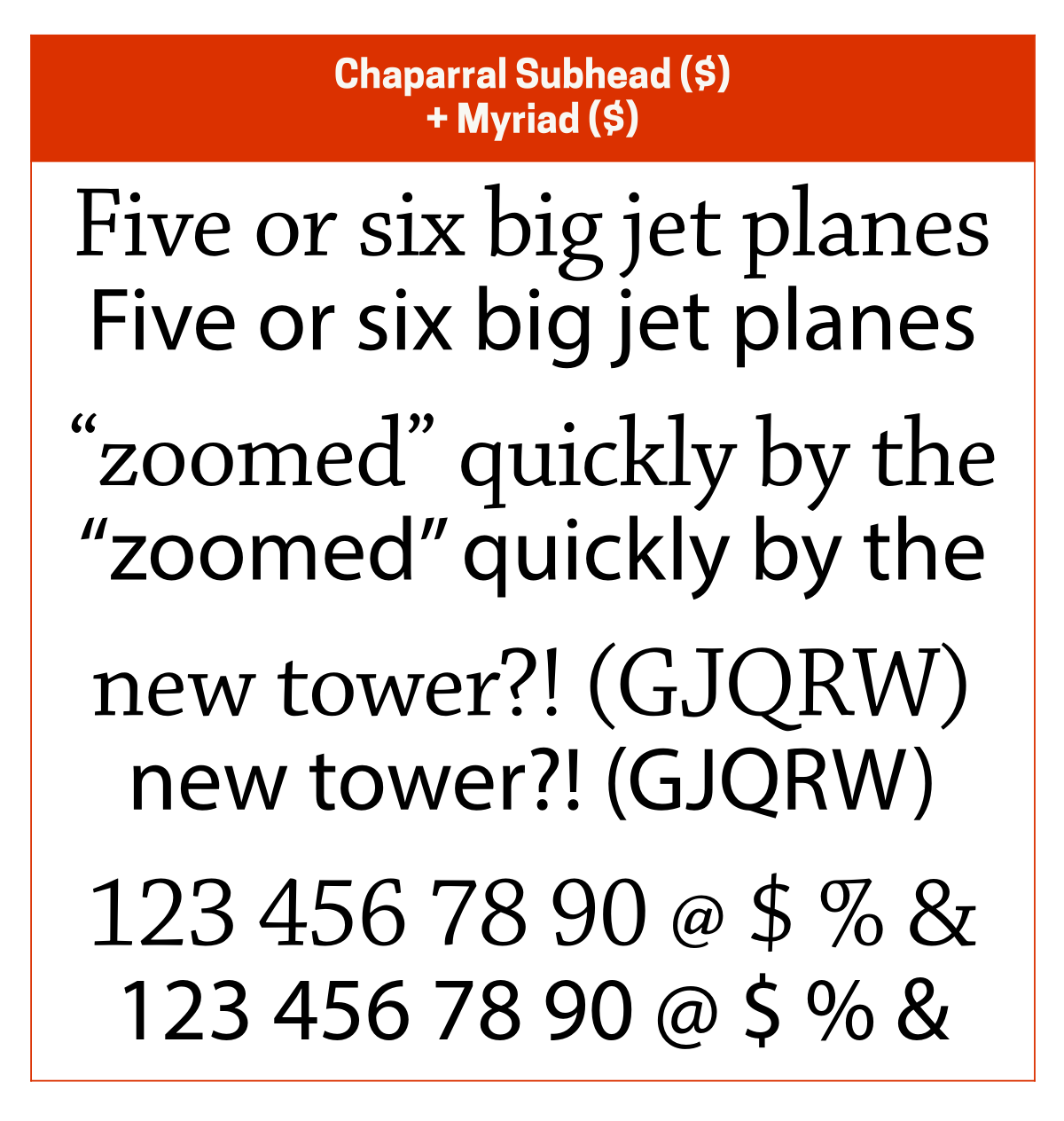
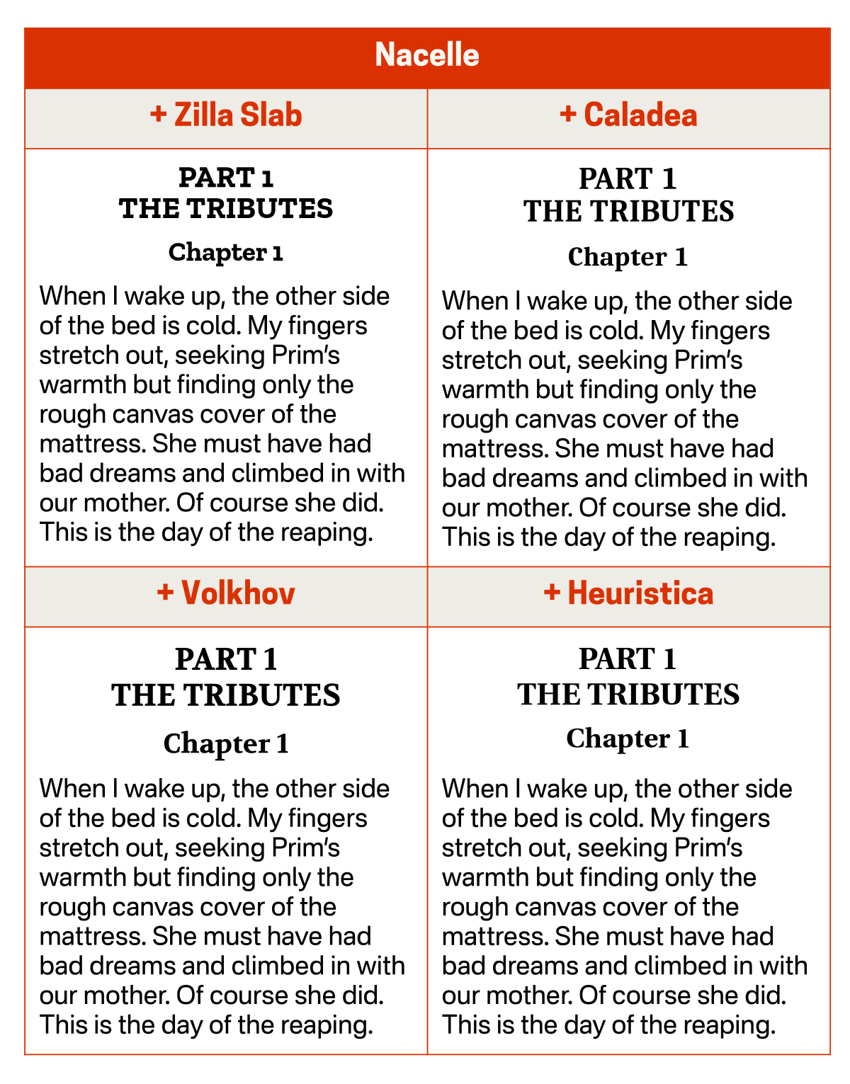
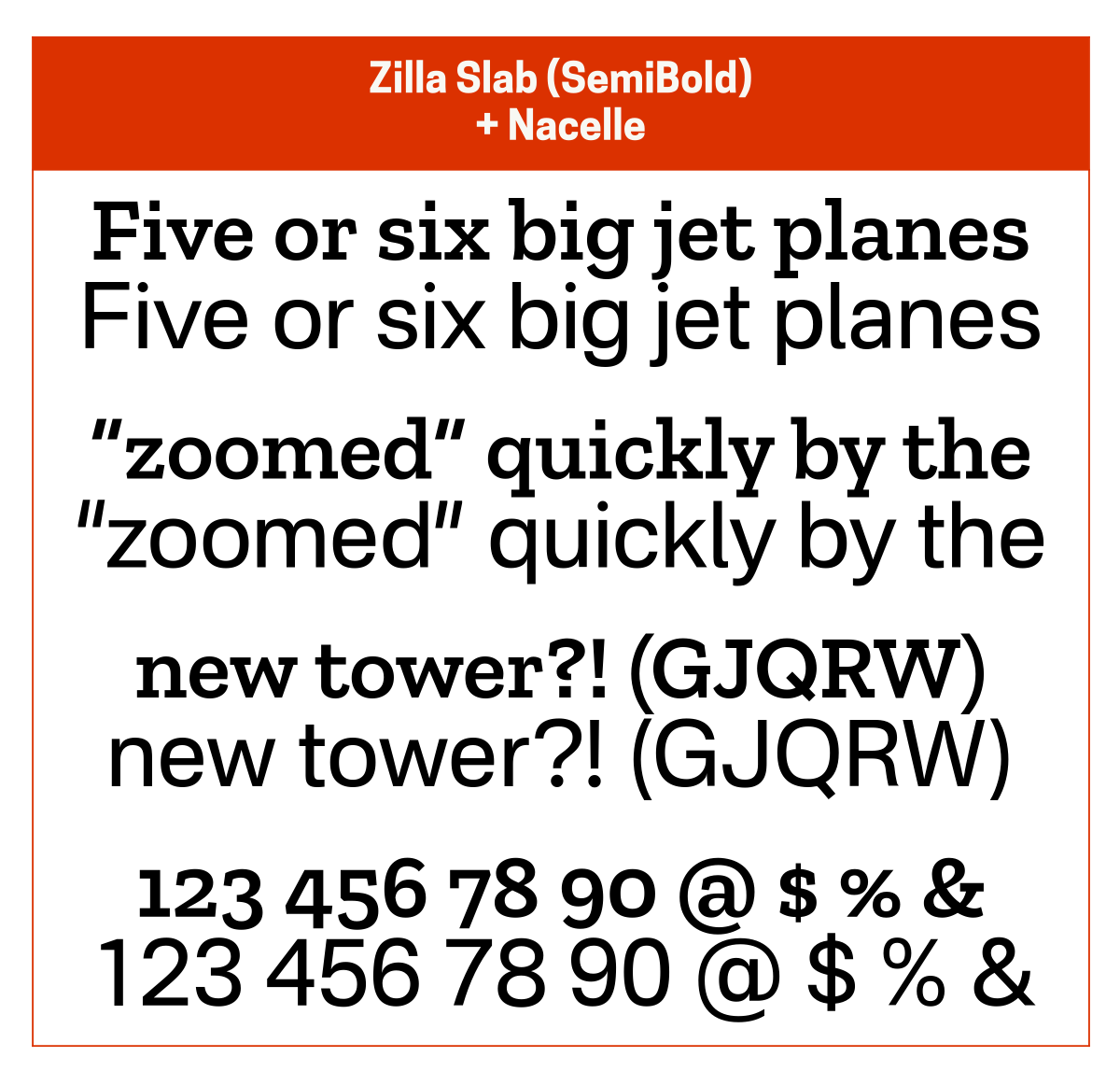
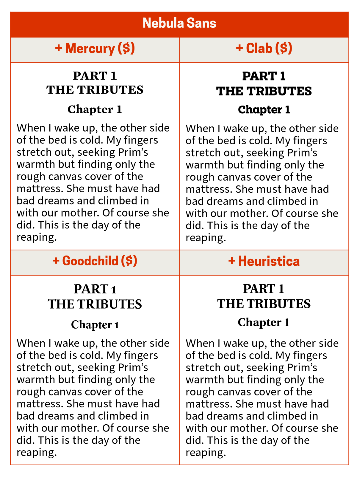
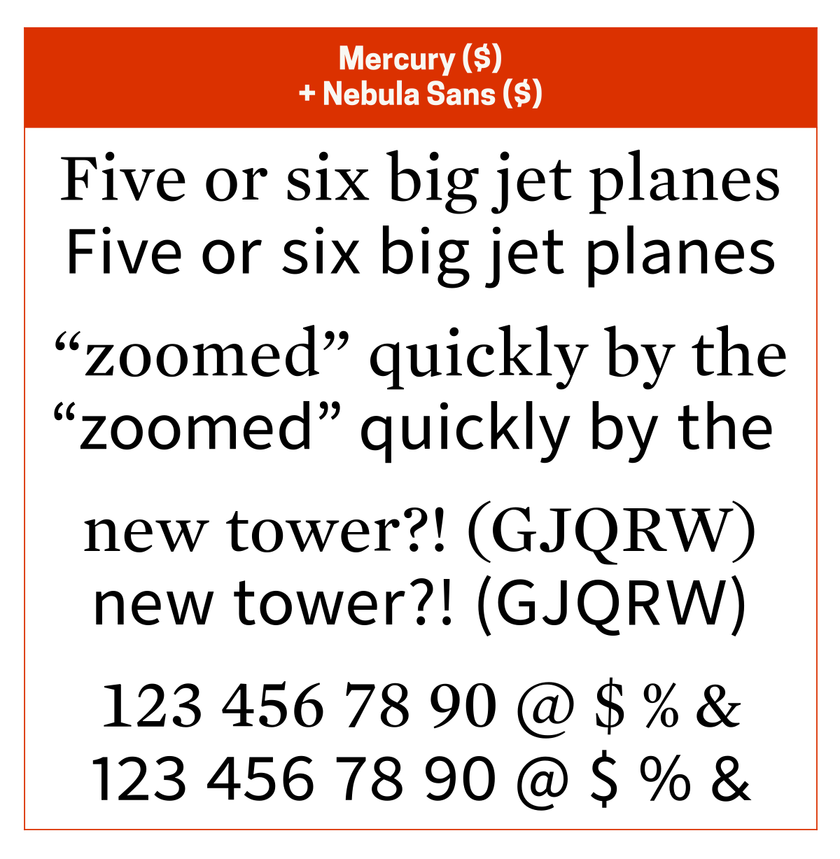
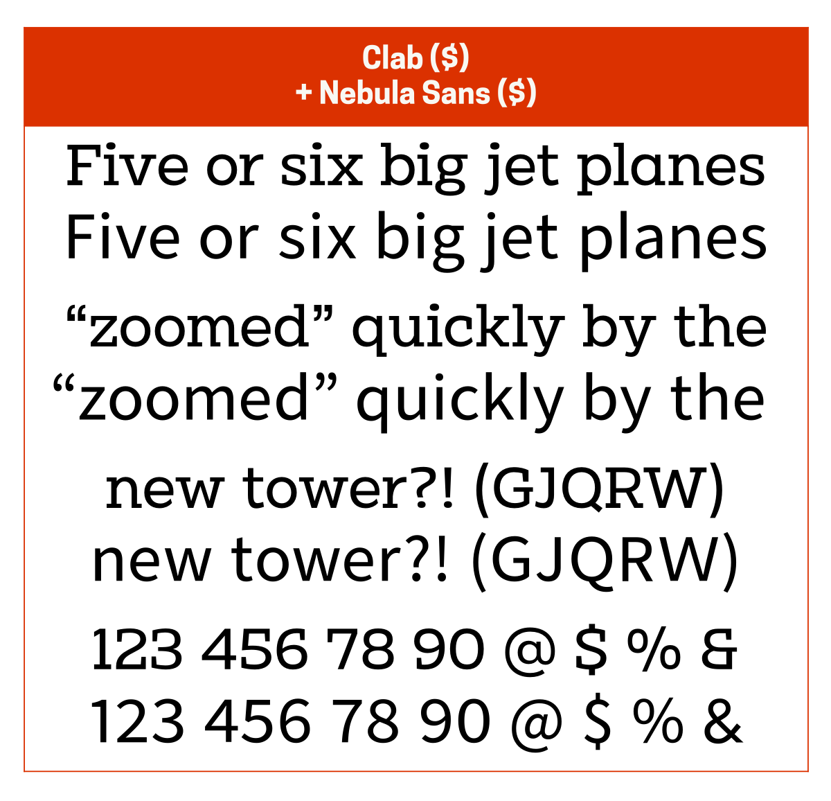
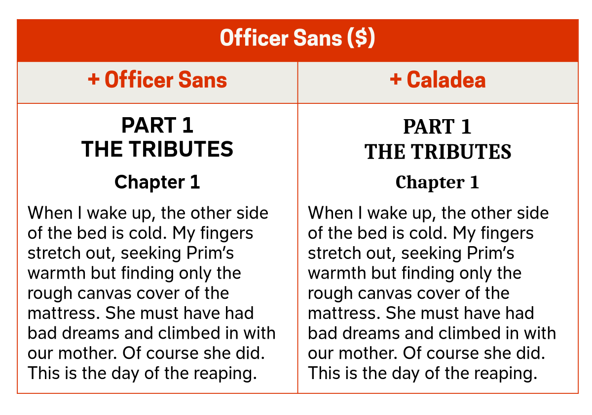
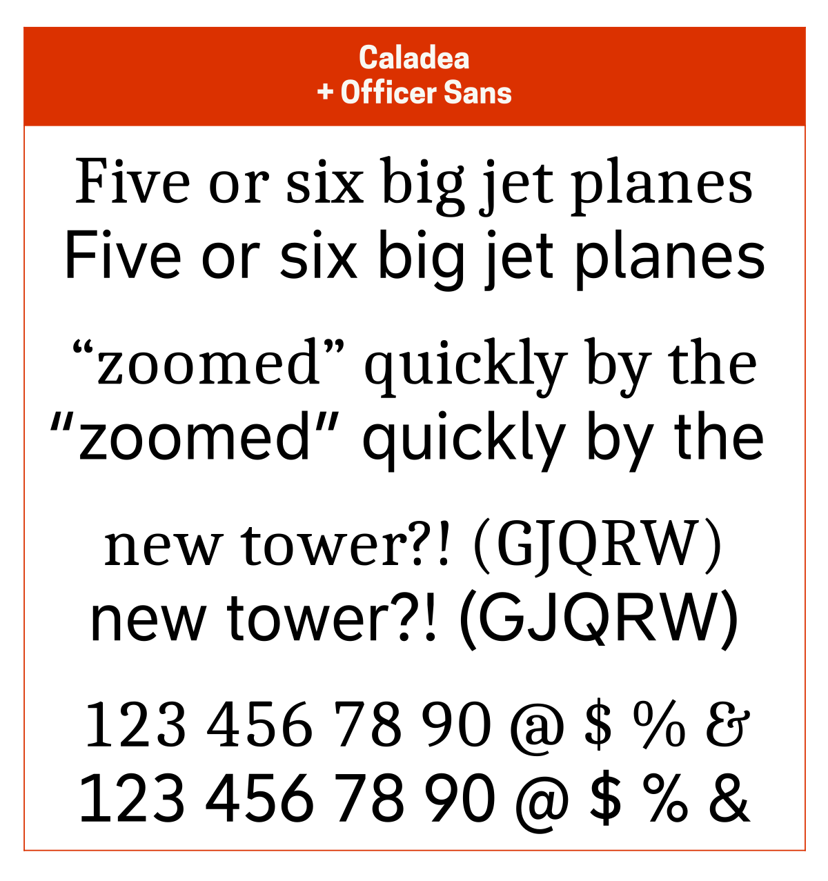
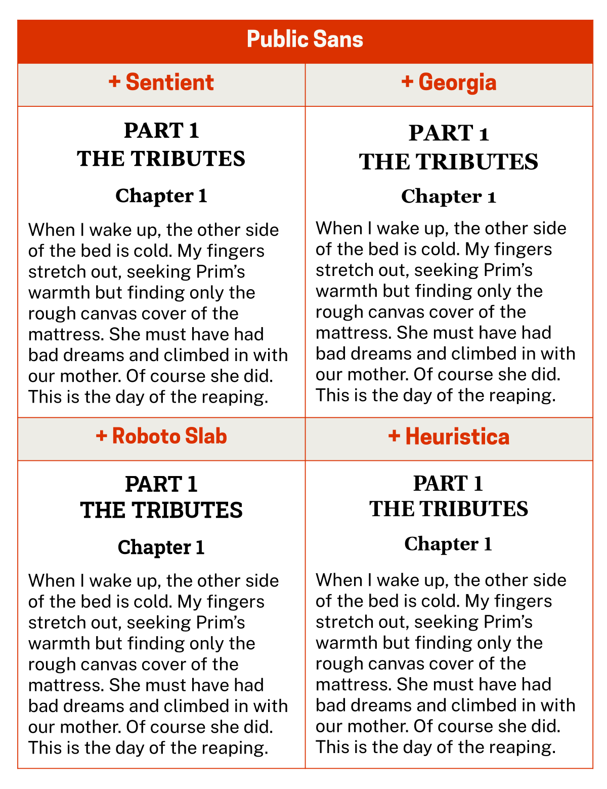
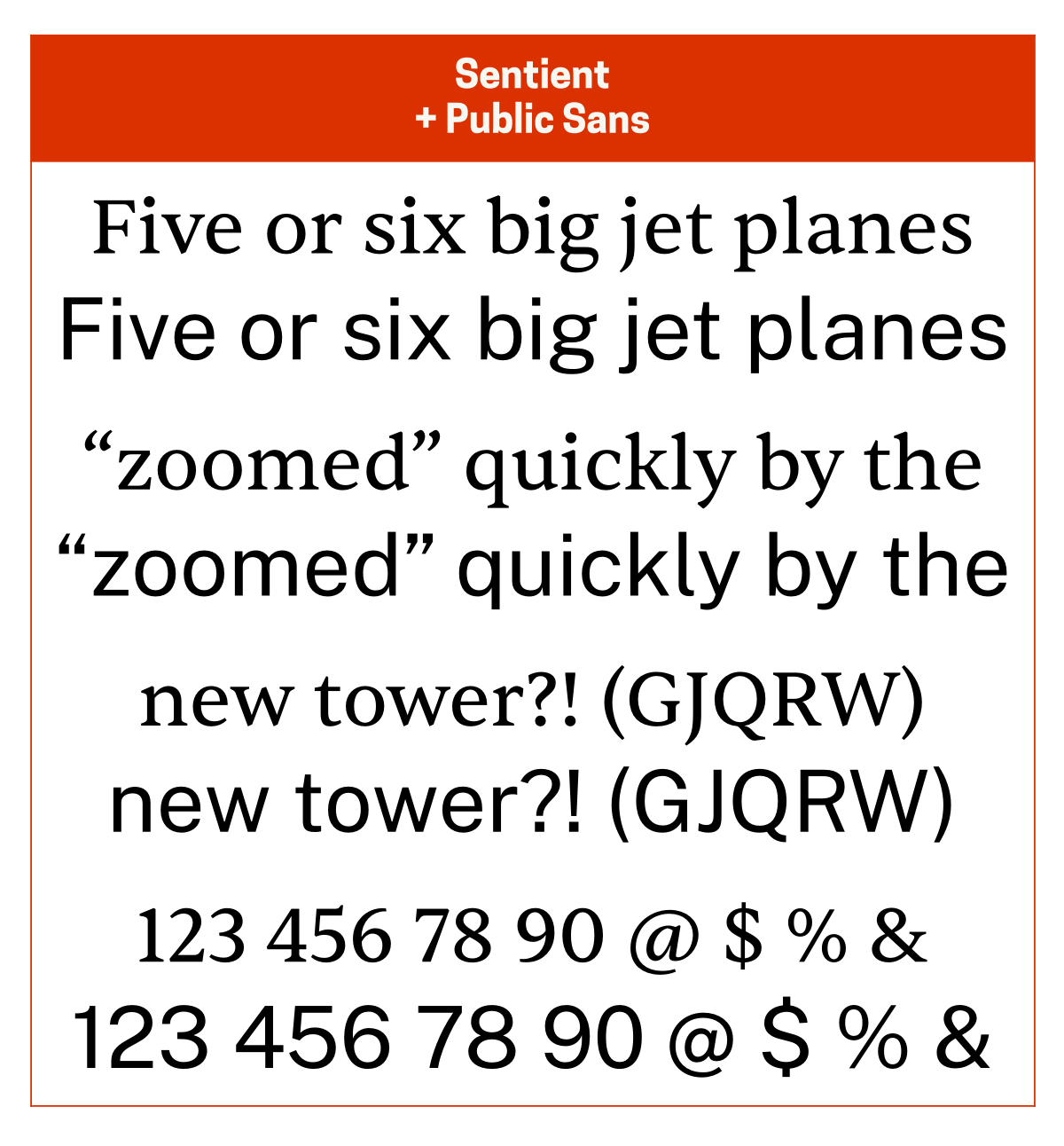
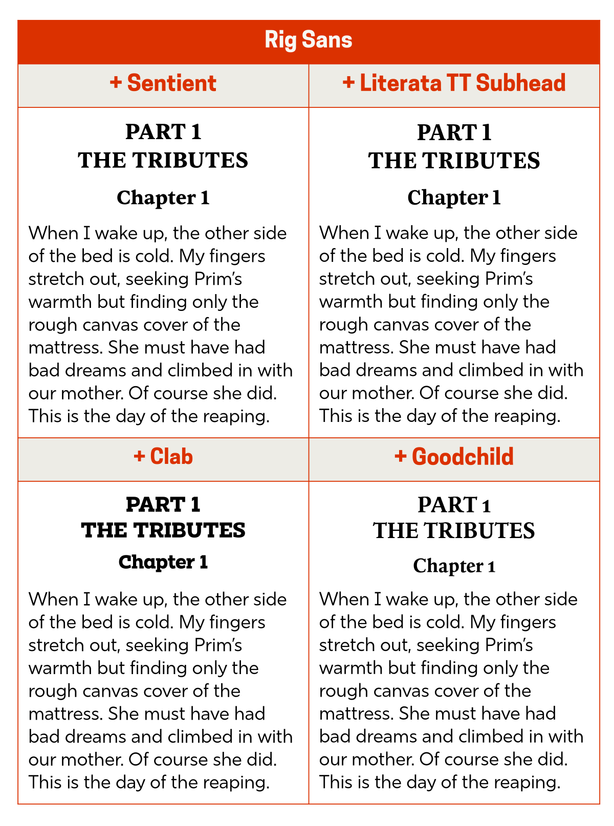
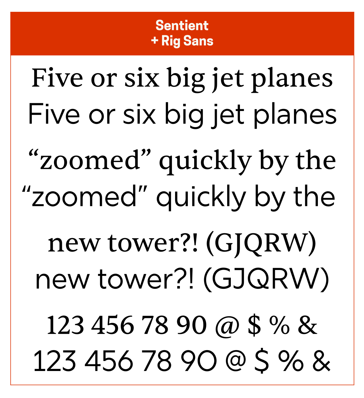
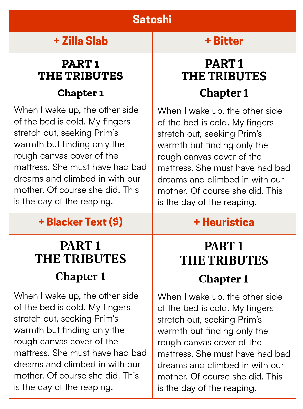
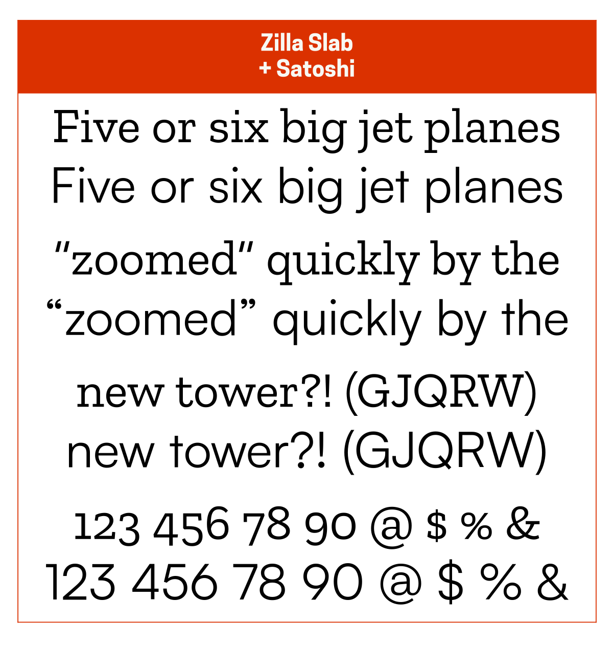
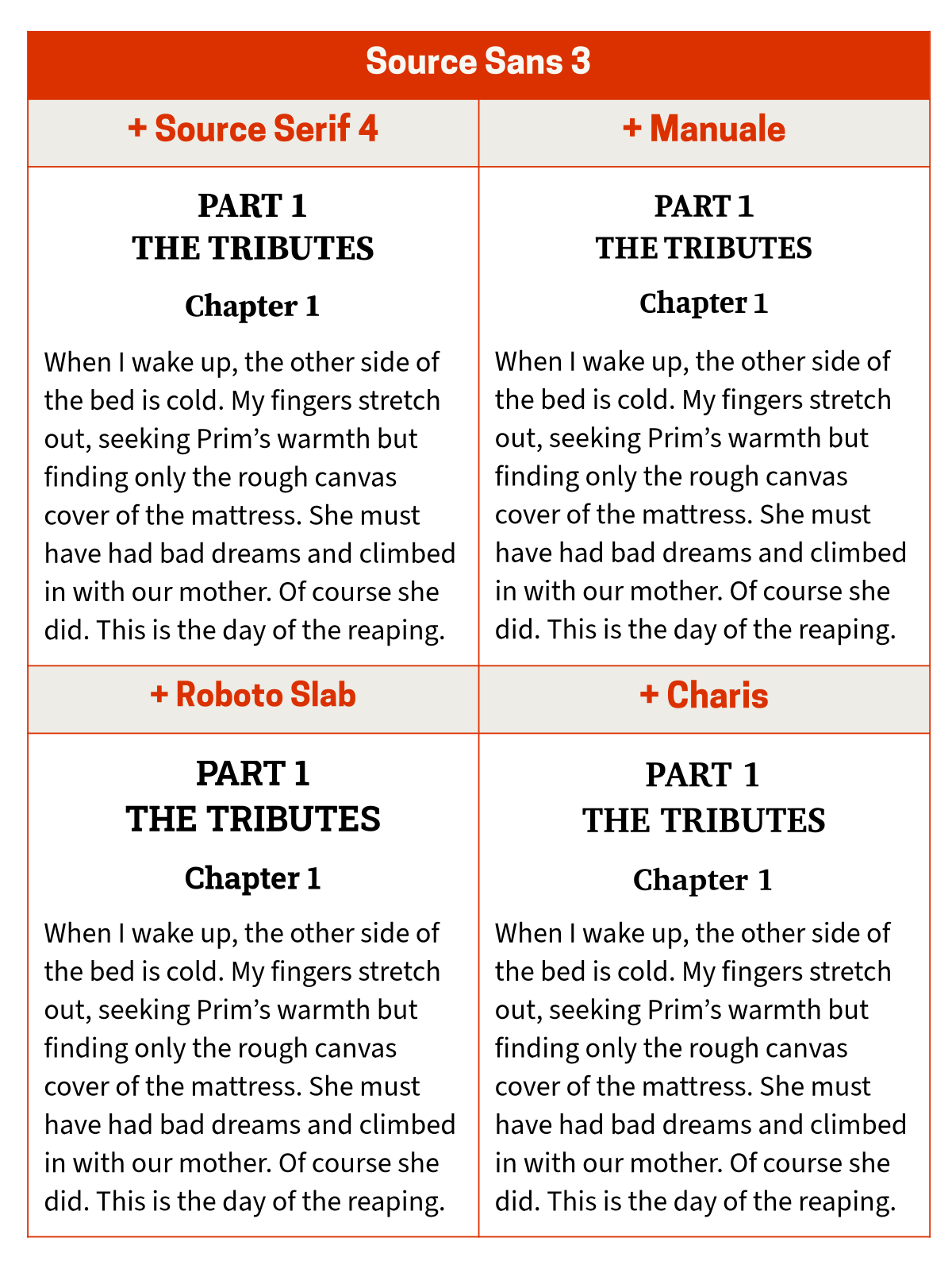
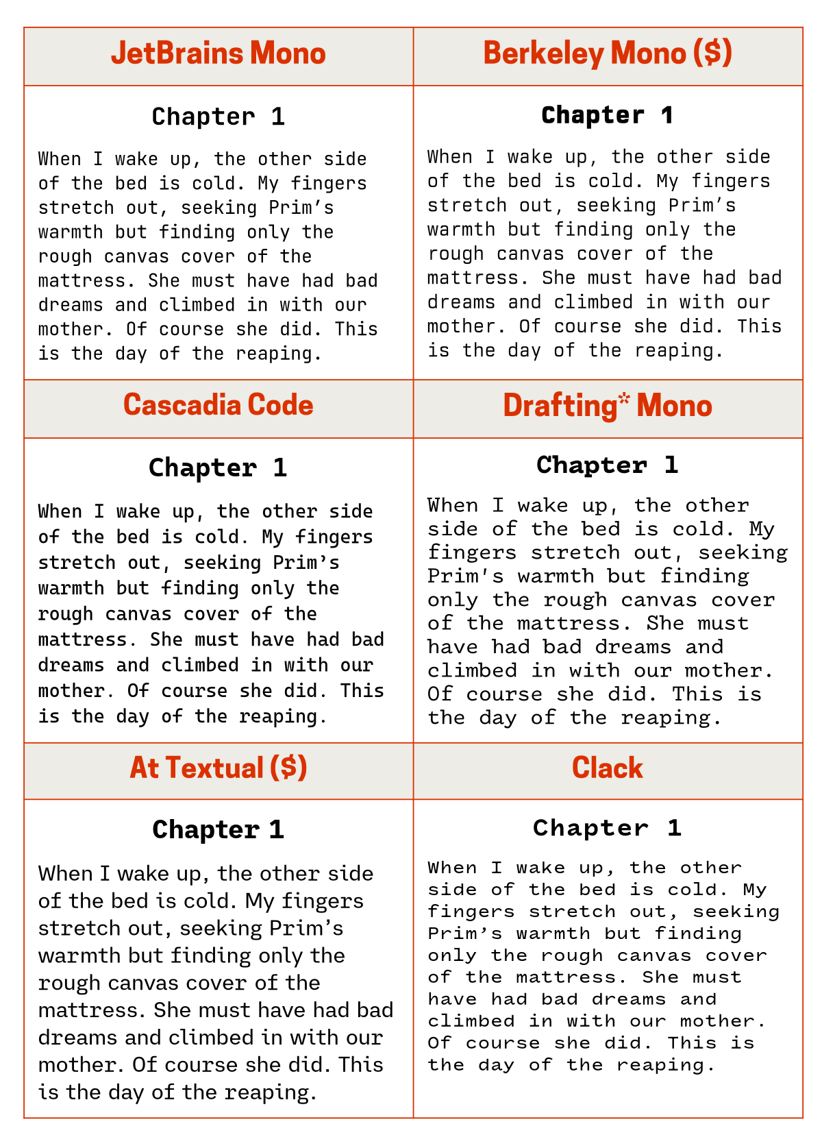
Having talked about my favourite typefaces, I figured I’d also talk about how I pair those typefaces when using them in various projects.
Here I’m talking mostly about pairing body text and heading typefaces for reading (like on websites or in PDFs) and for writing (like when writing blog posts like these in Microsoft Word).
How do you pair typefaces?
Select your body text typeface and then for the heading typeface choose between harmony and contrast…
Harmony
Use the same typeface and maybe pick one with a different weight (eg Regular for the body text and Extra Bold for the headings).
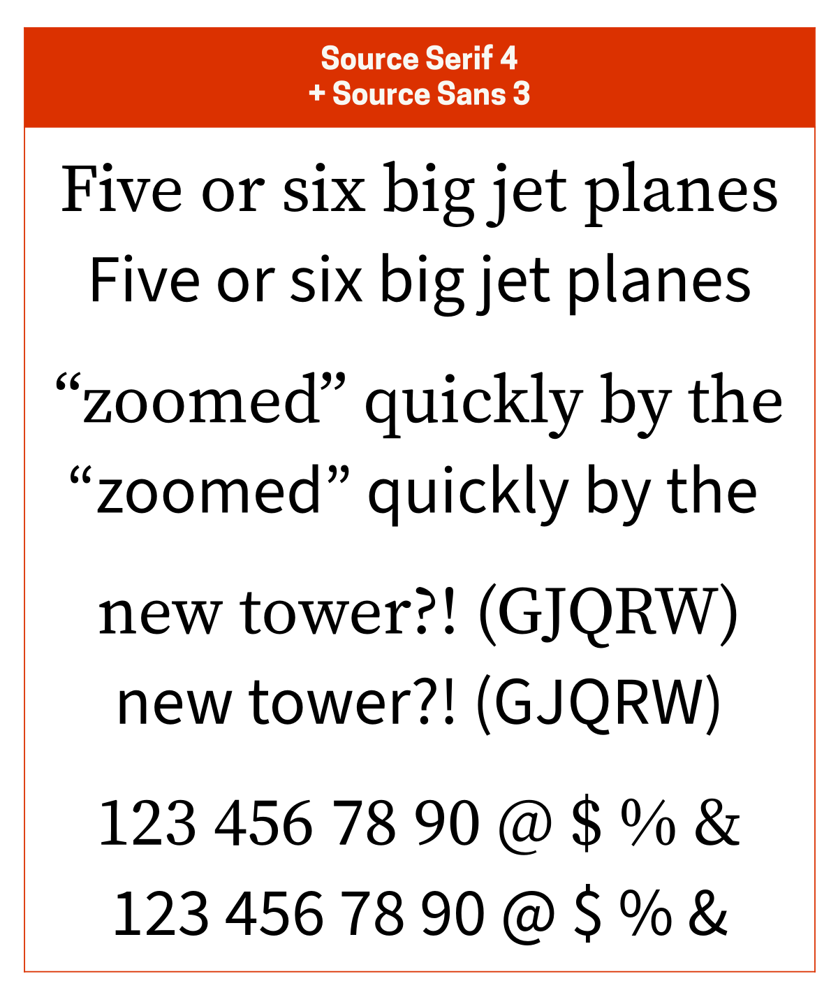
Pick a typeface from the same superfamily (eg body text in Source Sans and headings in Source Serif), though this isn’t guaranteed to be the best option in every scenario.
Stick to the same broad design classification, ie organic (friendly, warm, human) or mechanical (geometric, stiff, regular). Contemporary typefaces sometimes mix features so this works best with older typefaces.
Pick a typeface from the same type designer or type foundry. This doesn’t always work with large foundries like Linotype and Monotype, but works with smaller ones like Hoefler&Co.
Pick a typeface with the same mood, vibe, or feel.
Contrast
Pick a typeface from a different category, ie serifs with sans serif (or semi-serif).
Pick a neutral typeface that doesn’t change the vibe of the body text but still provides a visual difference.
Pick a typeface that maintains or enhances the vibe of the body text. If your body text is sharp and angular pick something equally (or even more) sharp and angular. This works best if your body text typeface has a distinct or strong character.
Pick a typeface that creates its own vibe if the body text you’re using is somewhat neutral, meaning it doesn’t have a distinct or strong character.
Pick a typeface that creates design tension. Don’t change the vibe (unless you really know what you’re doing), but you can change the feel. To use an analogy: don’t change cuisines in the middle of your meal, but you can pair something soft with something crunchy.
Whatever you do, do not pick typefaces that are only slightly different from each other. This ends up looking wrong.
(FYI, the Font Matrix is an incredibly useful concept when it comes to pairing typefaces.)
Acquiring these typefaces
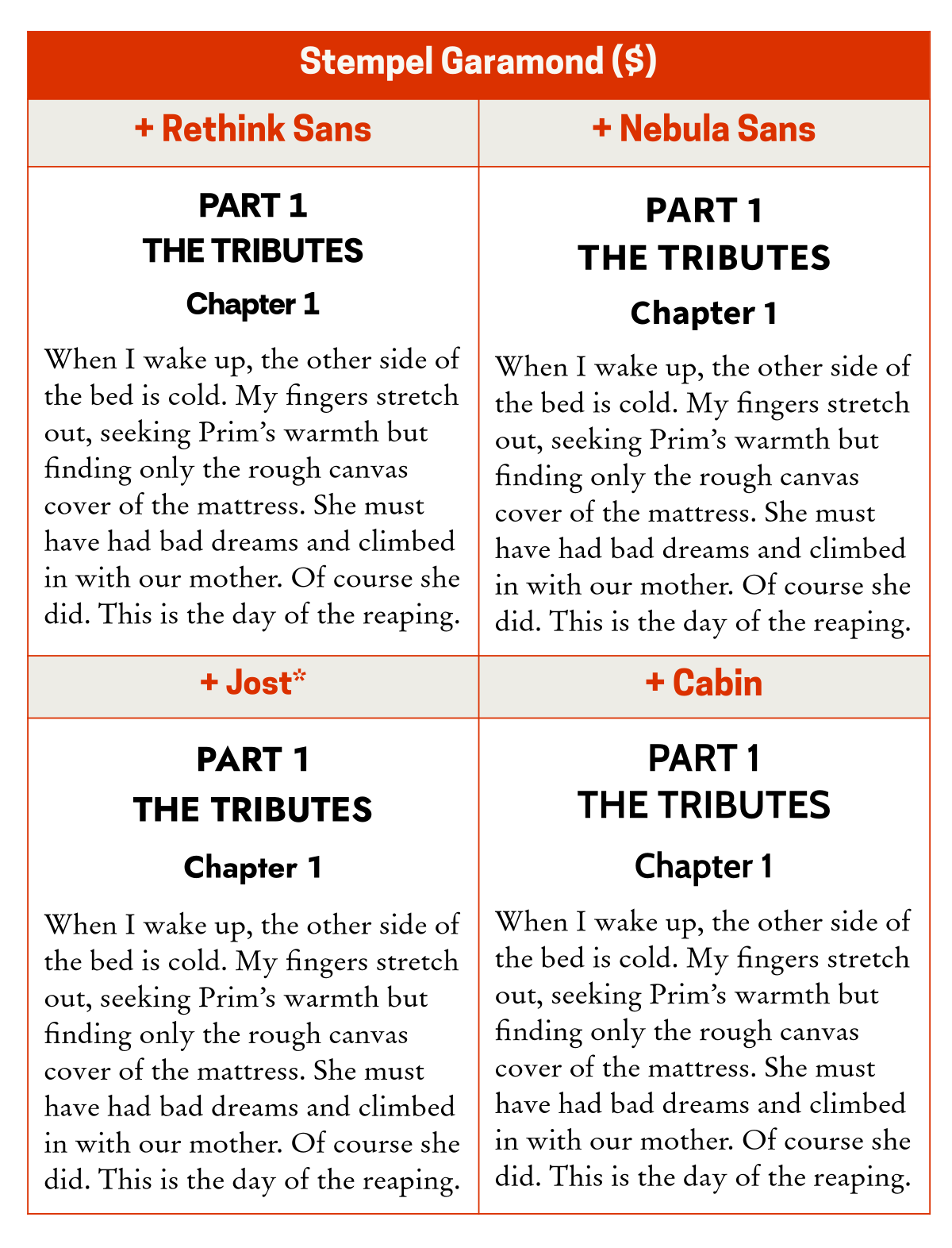
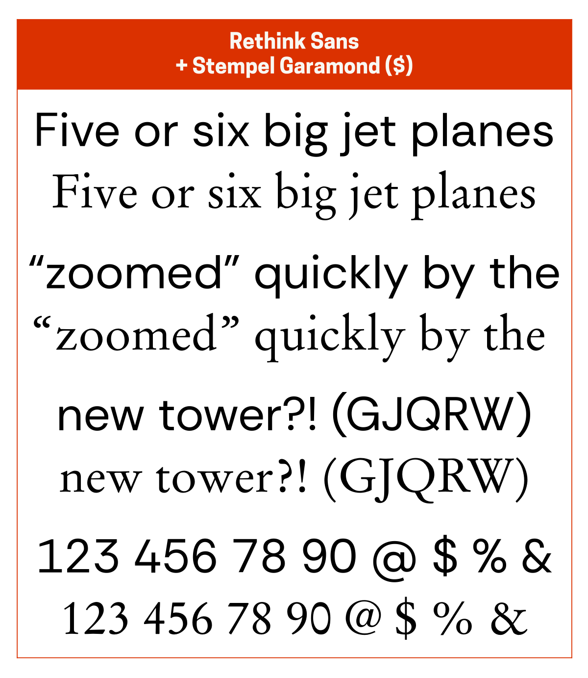
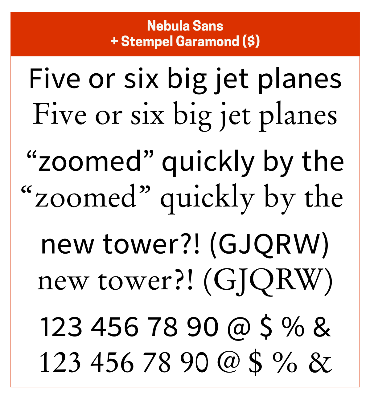
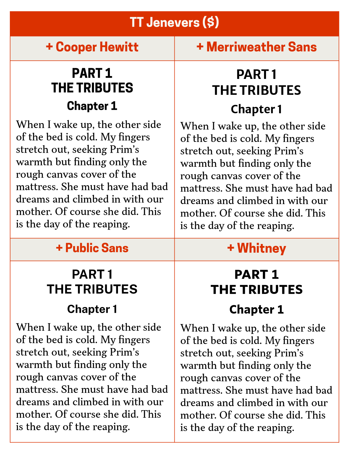
I’ve included links to all the typefaces mentioned below in case you want to purchase them or download the free ones:
Paid typefaces are in orange with a dollar sign next to them.
Default or free typefaces are in blue with a Windows, Mac, or download icon next to them.
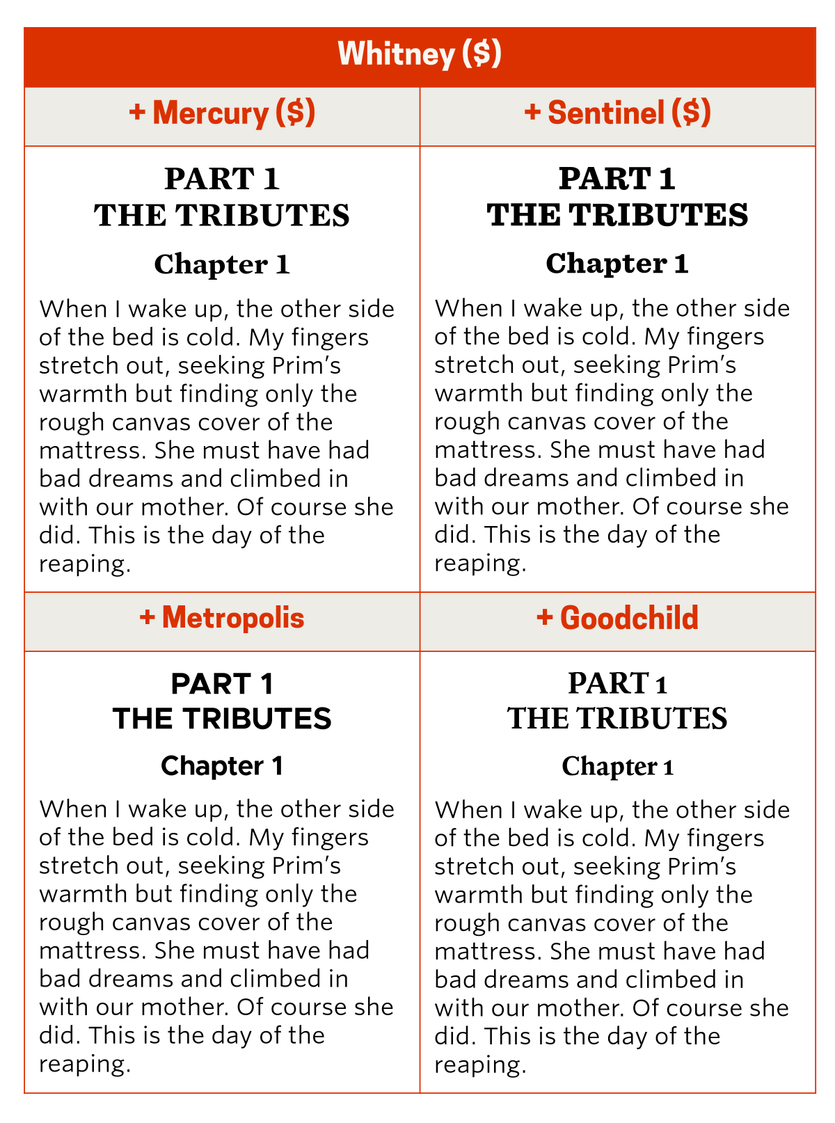
And, in case you’re wondering, the text I’m showing in the graphics below is from an anecdote I shared about a work trip to the Gold Coast ten years ago.
Serifs
TT Jenevers
TT Jenevers is one of my favourite typefaces. It works great in text but also works as a display typeface, so I usually pair it with its own Extra Bold weight. If I want an interesting contrast, I’ll pair it with Fact (a modern remake of Frutiger). But if I want something neutral, I’ll pair it with Helvetica.