
Jakob Nielsen's 29 September Alertbox newsletter talks about the importance of the About Us section on a company's website. In my opinion, this is the first section you should look at when establishing (or, as is often the case for me, re-establishing) a company's online presence.
Nielsen points out that, unfortunately, not everyone gets this section right:
Task success for finding out what the company or organization does actually dropped, from 90% to 81%. In place of a frank summary of the business, marketese and blah-blah text ruled the day on many sites.
And it's not just "blah-blah text" that's bad, often there's no text at all: just a big list of links that leaves you wondering where you should go next.
Some Australian Examples
Since Nielsen's research was US-based, I thought I'd do a quick check of some Australian websites to see how they measured up in this area. Since I wasn't going to do a scientific study like Nielsen's I figured I'd pick an industry and take a subjective (though knowledgeable) look at the the sites of the largest players.
I picked the telecommunications industry and looked at the 'About Us' landing pages of the five big telcos in Australia:
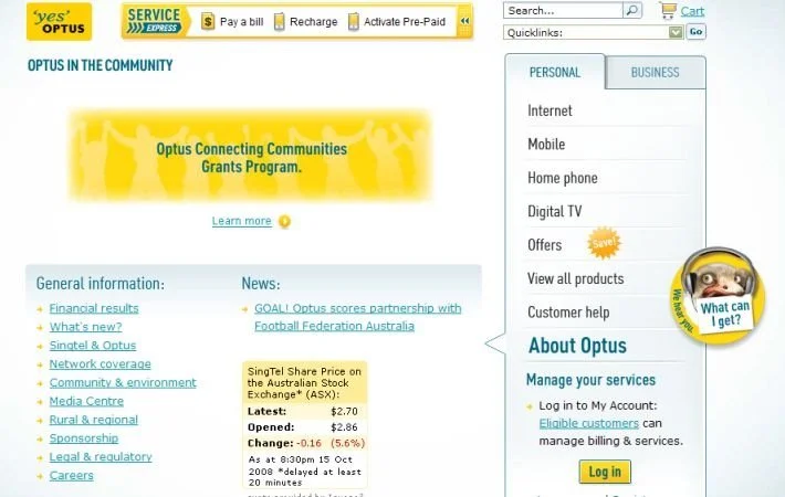
Optus has the worst page of the lot: 'About Optus' has no text, no explanation, and the none of the links in the main content area actually tell you anything about the company or where you could possibly go next to find the information you're looking for.
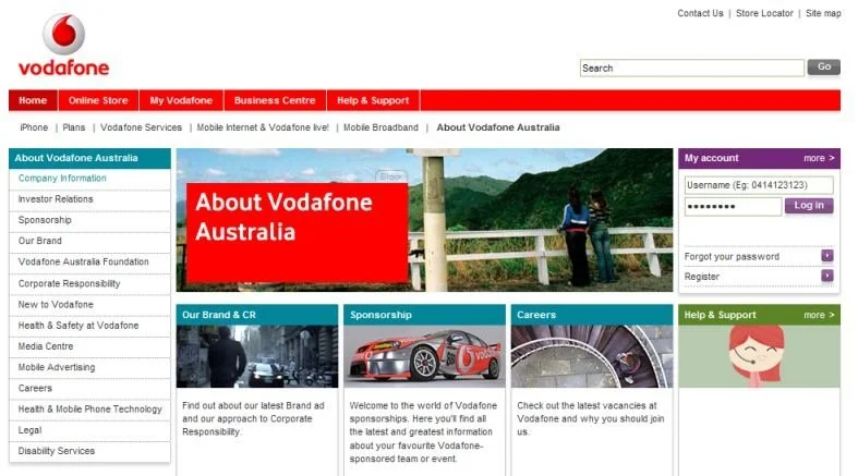
Vodafone's 'About Vodafone Australia' page does have some text...but it doesn't tell you anything either. You have to go to 'Company Information' > 'Company Overview' and then decipher the marketese to figure out what it is that Vodafone does (and even then you're not quite sure).
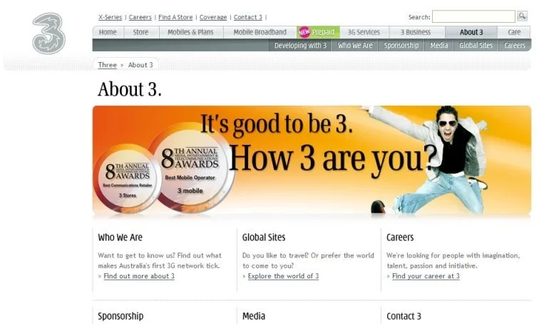
3 has a pretty bad page too: all you can tell from the 'About 3' page is that "It's good to be 3" and that this company seems to be Australia's first 3G network -- though, even then, you have to click on the 'Find out more about 3' link to be sure. At least they have a clearly-worded 'Find out more...' link that tells you where to go next for more information.
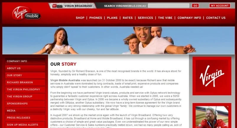
Virgin, meanwhile, has gone to the other extreme: its 'Company Info' page is chock full of words which is somewhat intimidating at first sight. Fortunately, the writing on this page is short, crisp, and clear. Strangely, the top three links in the left navigation bar ('Company Info', 'About Us', and 'Our Story') all point to this same page.
Telstra has a great page. Its 'About Telstra' page quickly tells you what the company is about, what it does, and what it wants to do. To complement that, the left navigation bar has clearly-worded links which makes it really straightforward to dig deeper for more information. And I love the "No one else can do what Telstra does." tagline :)

I guess Nielsen has a point, huh? :)
Seriously, though, have the web strategists (or webmasters or online marketing people) at Optus, Vodafone, and 3 not read something as basic as, say, Steve Krug's 'Don't Make Me Think'? I guess not.